The build plan is the design document
Iosevka configuration to mimic the look and feel of Berkeley Mono as closely as possible.
At a glance
- What is it?
- Ioskeley Mono is a programming typeface built with Iosevka by adjusting glyph forms, widths, slopes, spacing and vertical metrics from a build plan kept in the repository, and it ships as eight archives because three decisions vary independently: whether ligatures are allowed, whether patched icons are needed, and whether the target is an editor, a terminal or a web page. The terminal variant exists for one specific reason, which is cell overflow.
- Who is it for?
- Adopt Ioskeley Mono if you want a compact geometric coding font you can install without a licence fee and rebuild if a glyph annoys you, which the build plan makes possible. Do not adopt it expecting the original font, since the README states plainly that it is not Berkeley Mono and is not intended to replace it, and do not pick a package by guessing, because the difference between the terminal and editor builds is visible only when text overflows a cell.
- Can I use it commercially?
- Check first. The repository uses a licence we do not classify automatically, so read its LICENSE file before any commercial use.
- Is it still maintained?
- Yes. The repository last received commits 13 days ago.
- What is it written in?
- Mainly CSS, according to GitHub's language statistics.
Answers come from the project's GitHub data, last synced on November 22, 2026, and from our analysis. They are not legal advice.
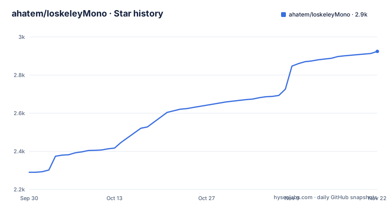
Star history
- ahatem/IoskeleyMono2,924 ★ · +634
| Repository | 2026-09-30 | 2026-11-22 |
|---|---|---|
| ahatem/IoskeleyMono | 2.3k | 2.9k |
634 Stars in the last 53 days, measured from the daily GitHub snapshot. Compare with other projects
Editorial analysis
A font is a build plan and a set of numbers
The design section says the important thing in one line, that this is not a stock Iosevka build, and that a file called private-build-plans.toml defines the glyph forms, widths, slopes, spacing and vertical metrics used across the family. That is the whole project in a sentence. Iosevka is a typeface builder that takes a specification and produces binaries, so what this repository actually contains is a specification. Glyph forms are the outlines, widths are the advance measurements that decide how much fits on a line, slopes are the italic angle, spacing is the pair of values around each glyph, and vertical metrics are how tall the line box is and where the baseline sits. Changing any of those changes how every piece of code on your screen looks, and because they live in a text file, that change is a diff. The unusual part is the file name, private, which suggests the plan is a design document kept private while the outputs are public. Everything else in the repository, the assets and the site, exists to show the result.
Three decisions, and eight archives because of them
The download table has two columns that decide everything, ligatures and patched icons, and a third column that decides the target. Ligatures are on in every package except the two no-ligature builds, which exist for applications that cannot turn them off, and Xcode is named as one. Nerd Font icons are on in the two patched packages, for editors and terminals that need symbol glyphs. The target is where the table gets long, with separate archives for desktop editors, for terminals, and for the web, and a second web archive for the full glyph set. Count the combinations and you get the eight files: a standard editor build, its Nerd Font version, a terminal build, its Nerd Font version, a no-ligature build, its Nerd Font version, and two web builds. The README tells you where to start, the plain archive for an editor and the terminal archive for a terminal, and that is the right advice because the table is a decision tree rather than a menu. Each archive is a direct download from the releases page, and the editor one is at:
https://github.com/ahatem/IoskeleyMono/releases/latest/download/IoskeleyMono.zipThe path ends in the word latest rather than a version, so the same link gives you the newest build, which is convenient for a trial and a decision to make deliberately if you care about pinning a specific release in a distributed product.
The terminal build exists because glyphs overflow cells
The tip under the table is the most technical explanation in the README and it is worth repeating. If you use a terminal, choose a Term package, because its spacing keeps arrows and box-drawing glyphs inside their cells. That is a real failure mode and it is invisible until you hit it. In a text editor, a glyph that is a little too wide is a cosmetic irritation. In a terminal, the grid is enforced by the cell, and a glyph that overflows it either draws into the neighbouring cell or is clipped, and a row of box-drawing characters that does not line up turns a border into a staircase. Terminal emulators also differ in how they handle a wide or overflowing advance width, so a font tuned for an editor can render a status line or a table wrong in a way that looks like a terminal bug. Splitting the family along that line is the single clearest justification in the table, and it is a better argument than any of the ones that come down to taste.
Web packages that share filenames on purpose
The second tip is about the web archives and it is a small decision that reveals how the author thinks. Start with the web archive for a site, and choose the full one only when you actually need Greek, Cyrillic, long arrows, or less common mathematical symbols. Then the detail that makes the tip worth reading: both web archives use the same filenames, so switching between them does not require new font-face rules. That is a packaging decision made for the person who will upgrade the font six months from now. A web font archive is a pile of files referenced by name in a stylesheet, so if the two variants shipped different filenames, every upgrade would be a find and replace across a codebase, and a project would put the change off indefinitely. Same filenames means the upgrade is unpacking a file over the old one. The same thinking appears in the width and rendering guidance, which is phrased as a rule about avoiding duplicate font entries rather than as a preference.
Width and rendering are separate decisions
Two tables sit below the package list and both are rules rather than preferences. The first is width, with a normal width at 100 percent and a semi-condensed at 90 percent, the second described as fitting more code on each line without changing the overall design. The second is rendering, with hinted files for Windows or Linux on a standard-density display and unhinted files for macOS or any high-density display. The hinting advice is the more consequential of the two, because getting it wrong is how you end up with two copies of the same family installed and no idea which one your editor picked. Hinting adjusts outlines to the pixel grid and matters on a low-density display, where it makes small text legible; on a high-density display the grid is fine enough that the hinting data can make stems uneven, which is why macOS and high-density screens get the unhinted set. One rule finishes the pair: install one rendering set per width, so that you do not collect the hinted and unhinted copies of the same width at once.
Forty styles, and a line raised above the baseline
The at-a-glance section does the arithmetic, with 40 static styles from 10 weights, 2 widths, and upright and italic. Then it lists the glyph choices that define the typeface, and most of them are aesthetic, but one is not. A dotted zero and a single-storey g, an open six and nine, a two-circle eight, flat-arc parentheses and square punctuation dots are all matters of character. A low line raised above the baseline is a functional decision instead: in a monospaced font that glyph normally sits on or below the baseline, where a descender runs into it, and raising it makes it visible where the code is. The ligature story has a neat symmetry, since ligatures are on in the standard, terminal and web families and the dedicated no-ligature builds exist only for the applications that cannot disable them. The optional slashed zero is the other clever bit, offered through the OpenType feature that applications toggle, so one file serves people who want a dotted zero and people who want a slashed one.
A hundred builds is the honest part of the story
The section explaining why the font exists is mostly about method. The author wanted Berkeley Mono, loved its compact proportions and geometric shapes and the character it gave to code, could not afford it, and kept looking for something free with a similar feeling. Finding Iosevka produced the realisation that a font could be shaped rather than chosen. The sentence that tells you what the project cost is that more than a hundred builds were generated and tested, with installing and uninstalling, zooming in and out, comparing individual glyphs, adjusting spacing and proportions, and repeatedly trying the font in real editors until it felt as close as possible. That is not a complaint about the tooling, it is an explanation of why the output is trustworthy, and it is also an explanation of why this is a two-year-old project with a version 2 rather than a weekend experiment. The audience is stated too, aimed at anyone who admires the kind of carefully designed programming typeface but cannot justify the price of a commercial one, especially students and people early in a career.
The position on the original is stated up front
Two lines in the story section settle a question that would otherwise sit under the whole project. It is not Berkeley Mono, and it is not intended to replace the original; it is an independent typeface built with Iosevka, shaped by the qualities that inspired it, and shared freely. That is the correct position and it is worth crediting, because a commercial typeface's character is exactly the kind of thing that gets copied without anybody saying so, and the alternative to a clean statement is a takedown notice. The licence settles the rest. It is the SIL Open Font License 1.1, which permits use in commercial and non-commercial work, permits modification and redistribution, and requires that the licence travel with the font and that the reserved font name not be reused for a modified version. So embedding it in a commercial product is fine, shipping a modified version is fine provided you do not call it by the reserved name, and there is no fee at any point. The README asks for stars, shared setups, bug reports and contributions instead, which is the normal ask for a project of this kind and is a reasonable one given what the licence permits.
Editorial conclusion
Adopt Ioskeley Mono if you want a compact geometric coding font you can install without a licence fee and rebuild if a glyph annoys you, which the build plan makes possible. Do not adopt it expecting the original font, since the README states plainly that it is not Berkeley Mono and is not intended to replace it, and do not pick a package by guessing, because the difference between the terminal and editor builds is visible only when text overflows a cell. Verify four things: that you install one rendering set per width, hinted for a standard-density Windows or Linux display and unhinted for macOS or any high-density display, otherwise you get duplicate font entries; that you need the no-ligature build, which is the one to use in an application such as Xcode that cannot turn ligatures off; that if you want a Nerd Font you accept having no hinted and unhinted choices, since those packages do not ship both; and that if you use the web build and later need Greek, Cyrillic or long arrows, you move to the full archive without touching your font-face rules, because the filenames are the same. The licence is SIL OFL 1.1, version 2.1.0 shipped on 2026-08-18, and the last push was 2026-09-01.
Frequently asked questions
Which Ioskeley Mono package should I download?
For an editor, the standard archive covers VS Code, JetBrains IDEs, Zed, Sublime Text and Cursor. For a terminal, the Term archive covers Kitty, Ghostty, WezTerm and Alacritty, and its spacing is adjusted so arrows and box-drawing glyphs stay inside their cells. For a site, start with the web archive and move to the full one only for Greek, Cyrillic, long arrows or uncommon mathematical symbols.
What is the difference between the hinted and unhinted builds?
Hinted files are for Windows or Linux on a standard-density display, and unhinted files are for macOS or any high-density display. The README says to install one rendering set per width to avoid duplicate font entries, and notes that the Nerd Font packages do not have separate hinted and unhinted copies.
What are the Nerd Font and no-ligature packages for?
The Nerd Font packages add patched symbols and icons, for editors and terminals that display them. The no-ligature packages turn programming ligatures off and are for applications that cannot disable them, with Xcode named as an example. All eight packages are produced by the release workflow.
How is Ioskeley Mono different from Berkeley Mono?
The README states that it is not Berkeley Mono and is not intended to replace the original. It is an independent typeface built with Iosevka, shaped by the qualities that inspired the author, whose build plan file defines the glyph forms, widths, slopes, spacing and vertical metrics.
Can I use Ioskeley Mono in a commercial product?
The licence is the SIL Open Font License 1.1, which covers commercial and non-commercial use, modification and redistribution, with the conditions that the licence travels with the font and the reserved font name is not reused for a modified version. The README asks for stars, setups, bug reports and contributions rather than a fee.
Official sources
Add this badge to your README
If you maintain this project, the badge below links readers to this analysis and shows its maintenance status from the daily GitHub snapshot. Paste the markdown into your README; add ?metric=license or ?metric=stars to the image URL for a different field.

[](https://hysenlabs.com/projects/ahatem-ioskeleymono)Star history chart for your README
[](https://hysenlabs.com/projects/ahatem-ioskeleymono)Was this useful?