Ant Design Pro v6: A Full-Featured React Boilerplate, But Know What You Clone
GitHub describes it as 👨🏻💻👩🏻💻 Use Ant Design like a Pro!. The repository metadata lists TypeScript as its primary language. The metadata lists the MIT license. This article stays within the project description and details documented in the GitHub repository README.
At a glance
- What is it?
- Ant Design Pro v6 is a TypeScript React boilerplate for enterprise admin dashboards, built on Umi Max 4 and antd 6. It offers many templates and a built-in AI assistant, but its irreversible 'simple' mode and heavy default setup demand careful evaluation.
- Who is it for?
- Adopt Ant Design Pro v6 if you need a rapid, opinionated start for a mid-to-large enterprise admin panel, accept its Umi Max 4 and antd 6 stack, and have time to learn its conventions. Avoid it if you prefer a minimal, framework-agnostic setup or cannot tolerate the irreversible 'npm run simple' command, which permanently deletes files.
- Can I use it commercially?
- Yes. MIT is a permissive licence: you can use, modify and sell software built on it, as long as you keep its copyright and licence notices.
- Is it still maintained?
- Yes. The repository last received commits 2 days ago.
- What is it written in?
- Mainly TypeScript, according to GitHub's language statistics.
Answers come from the project's GitHub data, last synced on November 15, 2026, and from our analysis. They are not legal advice.
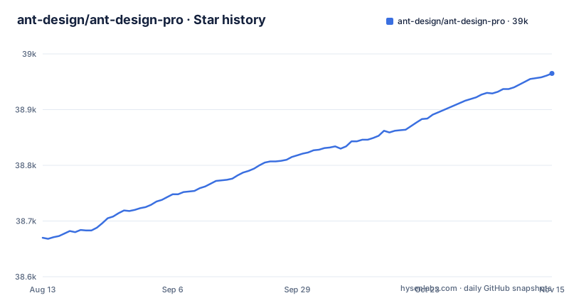
Star history
- ant-design/ant-design-pro38,965 ★ · +295
| Repository | 2026-08-13 | 2026-11-15 |
|---|---|---|
| ant-design/ant-design-pro | 38.7k | 39k |
295 Stars in the last 94 days, measured from the daily GitHub snapshot. Compare with other projects
Editorial analysis
What Ant Design Pro Solves and Who It Targets
Ant Design Pro is a React boilerplate for enterprise applications. It targets teams building admin dashboards, management consoles, and internal tools that need a polished, consistent UI without starting from zero. The README calls it an 'out-of-box UI solution', and that is accurate: it bundles common page templates, authentication flows, and a layout system. The intended user is a developer or team that already uses Ant Design and wants a production-like scaffold, not a lightweight starter. The project is built on React 19, Umi Max 4, and antd 6, so it assumes a modern JavaScript stack. It is not for static sites or simple landing pages; it is squarely aimed at data-heavy, form-heavy applications.
The Architecture: Umi Max 4, antd 6, and a Built-In AI Assistant
The architecture is visible from the README's feature list. The core is Umi Max 4, which is an enterprise-grade React framework, providing routing, build tooling, and plugin support. On top of that sits antd 6, the latest version of Ant Design's component library. The project also integrates 'utoopack', a build tool, and Tailwind CSS v4 for theming, alongside 'antd-style' for CSS-in-JS. A notable feature is the 'AI Assistant' page, powered by Ant Design X, which is a chatbot interface. This is not a minor widget; it is a full template page, suggesting the project expects AI features to be part of modern enterprise apps. The data flow is conventional for a React SPA: routes defined in Umi, components from antd, and state management likely handled by the framework's conventions, though the README does not detail that. What is clear is that the project is a tightly integrated stack, not a loose collection of libraries.
Getting Started: Clone, Install, and the Irreversible 'Simple' Command
The README gives a direct path to run the project. First, clone with depth 1: 'git clone --depth=1 https://github.com/ant-design/ant-design-pro.git myapp', then 'cd myapp'. Install dependencies with 'npm install', and start the development server with 'npm start'. That runs the full version, which includes all page templates. For a minimal setup, you can run 'npm run simple'. This command removes extra page directories like dashboard, form, list, profile, result, exception, and account. It also deletes extra mock files, replaces routes with a simple version, and removes extra dependencies from package.json. The README warns that this operation is irreversible and will permanently delete files. That is a critical constraint. If you run 'simple' and later realize you need a template you removed, you cannot get it back without re-cloning. This makes the command a one-way door, so you must be sure about your project's scope before using it.
Built-In Claude Code Skills: A Unique Maintenance Feature
A distinctive feature is the inclusion of two Claude Code Skills in the '.claude/skills/' directory. The first, '/pro-upgrade', is triggered by phrases like 'upgrade pro' or 'update to latest'. It auto-upgrades the project to the latest Ant Design Pro version by diffing the latest template and merging framework changes while preserving your business code. The second, '/antd', is for antd-related questions. It can query component APIs, props, tokens, and demos, lint for deprecated usage, and migrate between versions, all via '@ant-design/cli'. These skills are already included if you clone the repo, so no installation is needed. To refresh them, you can pull updates from the template or run 'npx skills add ant-design/ant-design-pro'. This is a practical answer to the common problem of keeping a boilerplate up to date without losing custom code. However, it only works if you use Claude Code, which is a specific AI coding tool, not a standard editor feature. Teams not using Claude Code will not benefit from this.
Template Breadth vs. Bloat: What You Get Out of the Box
The project ships with a wide array of page templates. The README lists Welcome, Dashboard with Analysis, Monitor, and Workplace, plus Form pages for Basic, Step, and Advanced forms. List pages include Search List, Table List, Basic List, and Card List. There are also Profile, Result, Exception (403, 404, 500), Account Center, Account Settings, and User pages for Login, Register, and Register Result. This is a comprehensive set for enterprise needs. But the breadth is a double-edged sword. The full version includes all of these, which means the initial clone has many directories and dependencies you may not need. The 'simple' command exists to trim that, but it is destructive. For a small project, the full template is overkill. For a large project, the templates provide a solid starting point, but you will likely spend time removing or adapting them. The trade-off is clear: you get speed from templates, but you pay for it in initial complexity.
Limitations and Failure Modes: Irreversible Scripts and Framework Lock-In
The most obvious limitation is the irreversible 'npm run simple' command. If you run it and later need a removed page, you must re-clone, losing any custom changes. That is a real failure mode for teams that experiment. Another limitation is the tight coupling to Umi Max 4 and antd 6. If your team or client requires a different React framework, like Next.js, or a different component library, this boilerplate is the wrong tool. You would spend more time stripping out Umi than you would save from the templates. The README also states browser support is 'Modern browsers' with last 2 versions of Firefox, Chrome, and Safari (the Edge cell reads just 'Edge'). That means no support for older browsers, which could be a problem for enterprise environments with legacy users. The AI Assistant, while interesting, depends on Ant Design X, and its actual functionality beyond a chat page is not described in the README. You should not assume it is a full AI integration out of the box.
Alternatives: Comparing Approach with Other React Admin Starters
A common alternative is to use a lighter admin template like React Admin, which is a separate library. React Admin focuses on data-driven admin panels with a declarative API for resources, whereas Ant Design Pro is a full boilerplate with predefined pages and a specific framework. The difference in approach is that React Admin is a library you integrate into your own app, giving you more control over the stack, while Ant Design Pro is a starting point that imposes its own architecture. Another alternative is to use the underlying pieces directly: take Umi Max and antd 6 and build your own structure. That gives you the same components and framework but without the extra templates and the 'simple' script. That approach requires more setup but avoids the bloat. The choice hinges on whether you want a scaffold with opinions or a toolkit you assemble yourself.
Maintenance and Upgrade Cost: Active Releases and the Upgrade Skill
The repository shows recent releases, with v6.0.3 pushed on 2026-08-17, v6.0.2 in May 2026, and v6.0.1 in May 2026. That indicates active maintenance, which is a positive sign for upgrade paths. The /pro-upgrade skill is designed to reduce the cost of upgrading to the latest version, but it relies on Claude Code, so its utility is limited to that environment. The project is licensed under MIT, which means you can use it commercially with few restrictions, but you should check the license file for any specific terms, as the README does not include them. The upgrade cost for a custom project is not trivial. The templates change between versions, and the skill tries to merge changes, but you will still need to test your business code after an upgrade. The maintenance burden is lower than building from scratch, but it is not zero. You must budget time for periodic updates.
Editorial conclusion
Adopt Ant Design Pro v6 if you need a rapid, opinionated start for a mid-to-large enterprise admin panel, accept its Umi Max 4 and antd 6 stack, and have time to learn its conventions. Avoid it if you prefer a minimal, framework-agnostic setup or cannot tolerate the irreversible 'npm run simple' command, which permanently deletes files. Before adopting, verify your team's comfort with Umi Max 4 and Tailwind CSS v4, test the AI assistant's usefulness in your workflow, and review the full v6.0.0 release notes for breaking changes. The project is actively maintained with recent v6.0.3 releases, but its strength is as a template, not a library, so treat it as a starting point, not a dependency.
Frequently asked questions
What is Ant Design Pro?
It is an out of box UI solution for enterprise applications delivered as a React boilerplate, built on the Ant Design 6 specification with React 19, Umi Max 4, utoopack, Biome, and Vitest. You clone it with git clone --depth=1 and then run npm install and npm start, and the package itself is marked private in package.json.
How much does Ant Design cost?
The template repository is MIT licensed and package.json marks it private, so there is no licence fee for the boilerplate itself. The README in this repository states no price for anything, and the paid offerings of the wider Ant Design ecosystem are not covered by this file.
is ant design pro free
The repository carries an MIT LICENSE file at its root, and the package is marked private, so the template is free to use and modify. What you install on top of it is a dependency list, including @ant-design/pro-components at ^3.1.14-2.
install ant design pro components
The Pro components come in as a dependency of the template, @ant-design/pro-components at ^3.1.14-2, so installing them means installing the project. The documented path is git clone --depth=1 https://github.com/ant-design/ant-design-pro.git myapp, then cd myapp, then npm install. This repository is React only and documents no Vue path.
ant design pro alternative
The README names no alternative and no comparison. What it does name is its own stack: React 19, Umi Max 4, antd 6, utoopack, Biome, Vitest, and theming through Tailwind CSS v4 with antd-style, so a swap means replacing that chain rather than one component library.
Official sources
Add this badge to your README
If you maintain this project, the badge below links readers to this analysis and shows its maintenance status from the daily GitHub snapshot. Paste the markdown into your README; add ?metric=license or ?metric=stars to the image URL for a different field.

[](https://hysenlabs.com/projects/ant-design-ant-design-pro)Star history chart for your README
[](https://hysenlabs.com/projects/ant-design-ant-design-pro)Was this useful?