Neumorphic: inner shadows and soft UI controls for SwiftUI
🚀Neumorphic is a SwiftUI utility to build Neumorphism Soft UI (supports both *outer shadow and *inner shadow)
At a glance
- What is it?
- Neumorphic is a SwiftUI package that turns the soft UI look into a reusable view modifier and button style, and its real contribution is the inner shadow that SwiftUI does not give you out of the box. It suits an app already committed to a neumorphic design language, and it adds a large control catalogue to a very small core API.
- Who is it for?
- Neumorphic fits a SwiftUI project that has already committed to a soft, extruded design language and wants the inner shadow effect without hand rolling shadow geometry for every shape, since the modifier and the themed button style cover most of that work.
- Can I use it commercially?
- Yes. MIT is a permissive licence: you can use, modify and sell software built on it, as long as you keep its copyright and licence notices.
- Is it still maintained?
- Yes. The repository last received commits 68 days ago.
- What is it written in?
- Mainly Swift, according to GitHub's language statistics.
Answers come from the project's GitHub data, last synced on November 7, 2026, and from our analysis. They are not legal advice.
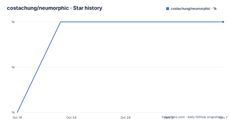
Star history
- costachung/neumorphic1,011 ★ · +2
| Repository | 2026-10-19 | 2026-11-07 |
|---|---|---|
| costachung/neumorphic | 1k | 1k |
2 Stars in the last 19 days, measured from the daily GitHub snapshot. Compare with other projects
Editorial analysis
The whole idea is one modifier SwiftUI does not have
The author explains the motivation directly. Creating an outer shadow in SwiftUI is simple, two lines of code. Creating an inner shadow is not easy, which is the reason the tool was built, to make it simple and reusable.
That is the whole scope of the core API, and it is worth saying plainly, because the package is often described in terms of the visual style rather than the feature. Neumorphism is a visual language where a surface appears to be extruded from the background by a light shadow on one side and a dark shadow on the other. SwiftUI can express the outer half of that with an ordinary shadow modifier, which is why the two-line version works. The inner half, the part where the light appears to fall inside the shape, needs a different construction.
The tool exposes that as a view modifier alongside the outer shadow, applied to any shape:
RoundedRectangle(cornerRadius: 20).fill(Color.Neumorphic.main).softOuterShadow()RoundedRectangle(cornerRadius: 20).fill(Color.Neumorphic.main).softInnerShadow(RoundedRectangle(cornerRadius: 20))The inner shadow takes the shape as a parameter, which is how it knows what to cut out of. The package is described as supporting all shapes, and the example code shows circles used the same way, with the shape passed in to match.
The language is Swift, the licence is MIT, and the package requires iOS 13 or macOS 10.15.
Colors and shadow geometry are the tuning surface
Everything the effect draws comes from four parameters on the outer shadow and four on the inner one. The outer shadow takes a dark shadow color, a light shadow color, an offset and a radius. The inner shadow adds a spread parameter, since an inner shadow can expand the lit edge inward.
The signatures are:
func softOuterShadow(
    darkShadow: Color = Color.Neumorphic.darkShadow,
    lightShadow: Color = Color.Neumorphic.lightShadow,
    offset: CGFloat = 6,
    radius: CGFloat = 3
) -> some Viewfunc softInnerShadow<S: Shape>(
_ content: S,
darkShadow: Color = Color.Neumorphic.darkShadow,
lightShadow: Color = Color.Neumorphic.lightShadow,
spread: CGFloat = 0.5,
radius: CGFloat = 10
) -> some ViewTwo things stand out. First, the defaults are drawn from a shared color namespace, `Color.Neumorphic.main`, `Color.Neumorphic.darkShadow` and `Color.Neumorphic.lightShadow`, so an app that sets up a theme gets consistent shading without touching every call site. Second, there is a preset path for the common case, since the documentation shows the same modifier called with a preset value instead of parameters, offering `.standard`, `.subtle` and `.none`:
RoundedRectangle(cornerRadius: 16)
    .fill(Color.Neumorphic.main)
    .softOuterShadow(.subtle)
The `.none` preset is the interesting one for a real app, because a screen full of extruded surfaces is hard to read, and a designer needs a way to opt a specific element out of the effect rather than reimplement the modifier.
The v2.x release added a control catalogue on top of the core
The current release notes describe v2.4.1 as adding new controls, themes, examples and documentation, and the README groups what shipped in the v2.x updates by category. The list is long enough to be worth reading, because it changes the character of the package from a two-modifier utility into a small component library.
Theme handling comes first, with `NeumorphicTheme` including accent and onAccent button roles and a `resolvedButtonColors` property. Buttons add `FixedSizeSoftDynamicButtonStyle` for fixed size soft buttons. Inputs cover `NeumorphicTextField`, `NeumorphicSlider`, `NeumorphicStepper`, `NeumorphicPicker` and `NeumorphicDatePicker`. Chrome includes `NeumorphicCard`, `NeumorphicLink`, `NeumorphicMenu` and `NeumorphicDisclosureGroup`.
Status and progress views are there, with `NeumorphicProgressView` and `NeumorphicCircularProgressView`, along with `NeumorphicSelectionControls` for selection and `NeumorphicFocusRing` and `NeumorphicHoverEffect` for interaction feedback. The macOS-specific entries are the focus ring and the hover effect, both listed as extras for that platform.
The usage table in the documentation groups them differently, into input, selection, status, layout and navigation, and the sample shows the controls being used together in a stack:
VStack(spacing: 20) {
    NeumorphicSlider(value: $volume, in: 0...100, step: 1)
    NeumorphicTextField("Name", text: $name)
    NeumorphicProgressView(value: progress)
    NeumorphicPicker(selection: $mode, options: ["Light", "Dark"])
}
The README also points at `ExampleShowcaseView.swift` for copy-ready usage, and suggests opening the example app and going to the settings screen to try the accent palettes and the new controls.
Button styles carry the pressed state and a role
The button style is where the theme system actually lands in user interface code. There are two overloads of `neumorphicThemedButtonStyle`, and the difference between them is the role parameter.
The plain form takes a shape, a padding and a pressed effect:
func neumorphicThemedButtonStyle<S: Shape>(
    _ shape: S,
    padding: CGFloat = 16,
    pressedEffect: SoftButtonPressedEffect = .hard
) -> some View
The second takes a `NeumorphicButtonRole` instead, which is what an accent or onAccent role maps to:
func neumorphicThemedButtonStyle<S: Shape>(
    _ shape: S,
    role: NeumorphicButtonRole,
    padding: CGFloat = 16,
    pressedEffect: SoftButtonPressedEffect = .hard
) -> some View
Using it looks like this:
Button(action: {}) {
    Text("Soft Button").fontWeight(.bold)
}
.neumorphicThemedButtonStyle(RoundedRectangle(cornerRadius: 20))
The `pressedEffect` parameter defaults to `.hard`, and the type name implies there is more than one option, which is the mechanism a neumorphic button needs in order to read as pressed. A flat extrusion does not obviously move when you touch it, so the pressed state has to be expressed somehow, and expressing it is a design decision the package exposes rather than hides.
The `role` parameter connects the button to the theme's accent colors, and the second example in the documentation uses it with a circular shape and a heart icon, with `role: .accent`.
Installing through Swift Package Manager
The package is distributed through Swift Package Manager, and the documentation gives both the in-Xcode route and the manifest form.
In Xcode you open the project, go to File, Swift Packages, Add Package Dependencies, paste the repository URL `https://github.com/costachung/neumorphic/`, click Next, select version for the rules, and click Finish. Choosing version rather than a branch is the detail that matters for an app, since it keeps the resolved version fixed within the major range.
The manifest form is a single line:
.package(url: "https://github.com/costachung/neumorphic/", .upToNextMajor(from: "2.4.1"))After the dependency resolves, the import is:
import NeumorphicThe requirements are stated as `.iOS(.v13)` and `.macOS(.v10_15)`, so a project targeting anything older will not build against it.
The repository structure gives a sense of the project's shape. There is a `Package.swift` at the root, `Sources/` and `Tests/` directories, a `docs/` folder, a `neumorphic-examples/` directory and a `neumorphic.xcworkspace`, plus a `.swiftpm/` folder and a `CHANGELOG.md`. A separate examples directory and workspace mean the example app is developed alongside the package rather than living inside it, which is why the README can point at a specific file such as `ExampleShowcaseView.swift` for copy-ready usage.
Soft UI has an accessibility problem the package acknowledges
Neumorphism is a style that depends on very low contrast to work, because a surface is distinguished from its background by a soft shadow rather than by a hard edge or a strong color difference. That is a problem for text legibility and for users who rely on high contrast settings, and the package ships helpers for it.
The v2.x list includes `NeumorphicAccessibility` helpers, described as contrast and accessibility label support for soft UI. The buttons also have a disabled appearance, added in v2.0.6, and a fix for inner shadows on macOS shipped in v2.0.7 alongside an update to the soft switch toggle style. Those are the kinds of changes that show a library being used on a real platform rather than a single developer’s simulator.
The honest framing is that this is a stylistic package, and stylistic packages carry an accessibility cost whether or not the vendor says so. If your application has a hard contrast requirement, a public sector obligation, or an audience that includes users with low vision, the soft look needs an escape hatch, and the `.none` preset plus the accessibility helpers are the pieces to lean on.
On the version history, the current release is 2.4.1 on 2026-09-01, and before that came 2.0.7 in 2024 and 2.0.6 in 2022, so the long 2.0.x stretch means the 2.4 line is a comparatively recent expansion of a package that had been stable for a while. The last push was on 2026-09-01, and the repository is not archived. The licence is MIT, and the package carries a SECURITY.md file for reporting.
Editorial conclusion
Neumorphic fits a SwiftUI project that has already committed to a soft, extruded design language and wants the inner shadow effect without hand rolling shadow geometry for every shape, since the modifier and the themed button style cover most of that work. Skip it if you are still choosing a design direction, because the package does not decide colors or layout for you, it only renders the look, and it is not the right tool for a project that needs to meet strict contrast requirements without extra work. Before you adopt it, check that your deployment targets are covered, iOS 13 and macOS 10.15 are the stated requirements, and read the accessibility helpers in the package, since soft UI by nature relies on low contrast and `NeumorphicAccessibility` exists for exactly that reason. The last push was on 2026-09-01 and version 2.4.1 is the current release.
Frequently asked questions
How do I add the Neumorphic package to a Swift project?
Through Swift Package Manager, either with File, Swift Packages, Add Package Dependencies in Xcode and pasting the repository URL, or with the manifest line `.package(url: "https://github.com/costachung/neumorphic/", .upToNextMajor(from: "2.4.1"))`.
What platforms and versions does Neumorphic support?
The stated requirements are `.iOS(.v13)` and `.macOS(.v10_15)`, and the package is written in Swift under the MIT licence.
How do I create an inner shadow in Neumorphic?
Apply the `softInnerShadow` modifier and pass the shape to cut out, for example `RoundedRectangle(cornerRadius: 20).fill(Color.Neumorphic.main).softInnerShadow(RoundedRectangle(cornerRadius: 20))`.
What controls does the Neumorphic package ship with?
Among them are `NeumorphicSlider`, `NeumorphicTextField`, `NeumorphicStepper`, `NeumorphicPicker`, `NeumorphicDatePicker`, `NeumorphicProgressView`, `NeumorphicCircularProgressView`, `NeumorphicCard`, `NeumorphicLink`, `NeumorphicMenu` and `NeumorphicDisclosureGroup`, along with `NeumorphicTheme` and `NeumorphicAccessibility` helpers.
Can I use a preset instead of tuning the shadow parameters?
Yes. The preset values `.standard`, `.subtle` and `.none` can be passed to the shadow modifier directly, for example `.softOuterShadow(.subtle)`.
Official sources
Add this badge to your README
If you maintain this project, the badge below links readers to this analysis and shows its maintenance status from the daily GitHub snapshot. Paste the markdown into your README; add ?metric=license or ?metric=stars to the image URL for a different field.

[](https://hysenlabs.com/projects/costachung-neumorphic)Star history chart for your README
[](https://hysenlabs.com/projects/costachung-neumorphic)Was this useful?