SwiftUINavigationTransitions: custom push and pop animations for NavigationStack
Pure SwiftUI Navigation transitions ✨
At a glance
- What is it?
- SwiftUINavigationTransitions is a Swift package that lets you replace the push and pop transitions of SwiftUI's own NavigationView and NavigationStack with custom ones, using a single modifier and a transition API shaped like the built-in SwiftUI transitions. It also back-deploys the iOS 26 full-screen pop gesture down to iOS 13.
- Who is it for?
- Adopt SwiftUINavigationTransitions if your app needs a non-default push or pop animation and you want to keep the system navigation stack rather than replace it. Do not adopt it if the stock transition is fine, since the dependency buys you animation control and nothing else.
- Can I use it commercially?
- Yes. MIT is a permissive licence: you can use, modify and sell software built on it, as long as you keep its copyright and licence notices.
- Is it still maintained?
- Yes. The repository last received commits 12 days ago.
- What is it written in?
- Mainly Swift, according to GitHub's language statistics.
Answers come from the project's GitHub data, last synced on November 7, 2026, and from our analysis. They are not legal advice.
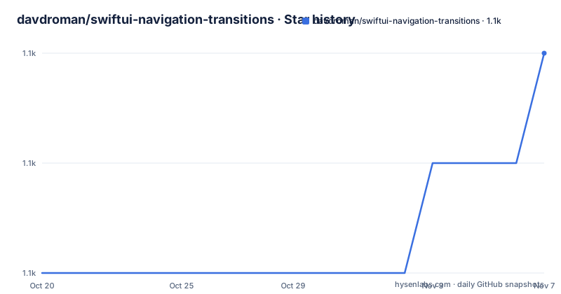
Star history
- davdroman/swiftui-navigation-transitions1,090 ★ · +2
| Repository | 2026-10-20 | 2026-11-07 |
|---|---|---|
| davdroman/swiftui-navigation-transitions | 1.1k | 1.1k |
2 Stars in the last 18 days, measured from the daily GitHub snapshot. Compare with other projects
Editorial analysis
A modifier instead of a replacement navigation stack
SwiftUI's NavigationStack and NavigationView ship with fixed push and pop animations, and changing them otherwise means stepping outside the system navigation. SwiftUINavigationTransitions exists to avoid that. It is a library that integrates with SwiftUI's NavigationView and NavigationStack and allows complete customization over push and pop transitions.
The design decision is the one in the Overview section. Instead of reinventing the entire navigation stack just to control its transitions, the library ships with a simple modifier that can be applied directly to SwiftUI's own first-party navigation components. That distinction matters more than it might look. A custom navigation stack means you own the back button behaviour, the deep link handling, the state restoration, the accessibility traits, and the interaction with system gestures, and each of those is a place where a reimplementation is subtly worse than the original. This package leaves all of that alone.
The adoption cost is one line in a view hierarchy. On iOS 16 and later it applies to a NavigationStack:
NavigationStack {
  // ...
}
.customNavigationTransition(.slide)
And on iOS 13 and later, where the older NavigationView is used, you also set the stack style:
NavigationView {
  // ...
}
.navigationViewStyle(.stack)
.customNavigationTransition(.slide)
The package is MIT licensed, written in Swift, and the recent releases are 0.19.0 on 2026-07-27, 0.18.0 on 2026-06-09, and 0.17.0 on 2026-03-09, with the last push to the repository on 2026-09-04.
The transition API mirrors SwiftUI's own
The API is designed to resemble that of the built-in SwiftUI transitions, for familiarity and ease of use. The point of that choice is that someone who has written a .transition modifier already knows how to use this one.
Custom animations work the way they do with standard SwiftUI transitions:
.customNavigationTransition(
    .fade(.in).animation(.easeInOut(duration: 0.3))
)
Transitions combine, using the same combined(with:) shape:
.customNavigationTransition(
    .slide.combined(with: .fade(.in))
)
And they can be chosen at runtime, which is the case that matters most in practice, since the choice often depends on state rather than on a constant:
.customNavigationTransition(
    reduceMotion ? .fade(.in).animation(.linear) : .slide(.vertical)
)
That last example is the honest reason to use this library rather than fight the system. A transition that respects the reduce motion setting cannot be expressed with the stock push animation at all, because the stock animation is the system's, and you do not get to change it. Once a custom transition is in your hands, honouring the accessibility setting becomes a normal conditional.
Three standard transitions ship with the library: default, which restores the system behaviour, fade(_:), and slide(axis:). The default one is worth noting, because it is the escape hatch that lets you apply the interactivity options to the system's own transition rather than a custom one.
Writing a custom transition from scratch
Beyond the bundled transitions, the package supports custom ones, and the README shows one built from a few lines of SwiftUI-like code. The example is a Swing type built out of a Slide and a MirrorPush, with an OnInsertion block and an OnRemoval block describing what happens at each end of the transition:
struct Swing: NavigationTransitionProtocol {
    var body: some NavigationTransitionProtocol {
        Slide(axis: .horizontal)
        MirrorPush {
            let angle = 70.0
            let offset = 150.0
            OnInsertion {
                ZPosition(1)
                Rotate(.degrees(-angle))
                Offset(x: offset)
                Opacity()
                Scale(0.5)
            }
            OnRemoval {
                Rotate(.degrees(angle))
                Offset(x: -offset)
            }
        }
    }
}
The structure is worth reading as a model. A transition is a value with a body, so it composes the way a SwiftUI view composes. MirrorPush appears to be the operation that mirrors the pushing view's movement, and the OnInsertion and OnRemoval blocks describe the modifications applied to the incoming and outgoing views respectively, which is why the angle and offset are mirrored between them. The modifiers used inside those blocks, ZPosition, Rotate, Offset, Opacity, and Scale, are the familiar ones, so a custom transition reads like SwiftUI view code rather than like an animation API from somewhere else.
The type is a protocol, NavigationTransitionProtocol, and the source files for the standard transitions are in Sources/NavigationTransition, with Default.swift, Fade.swift, and Slide.swift as separate files. That layout suggests each transition is a small, self-contained type you could read to learn the pattern.
Interactivity, and back-deploying the iOS 26 pop gesture
The gesture behaviour is the other half of the package, and it is where the version compatibility work shows. There are three interactivity options: .disabled, .edgePan, and .contentPan.
.customNavigationTransition(.slide, interactivity: .disabled) // disables back swipesDisabling is the simplest case, and it exists because a custom transition often cannot be interrupted cleanly by a swipe, so the library gives you the option to turn the gesture off rather than leave it half-working.
The other two relate to how far the interactive pop can be dragged. The .contentPan option back-deploys the iOS 26 full-screen pop gestures all the way down to iOS 13, so the gesture works across the whole content view rather than only at the edge, on older systems too:
.customNavigationTransition(.slide, interactivity: .contentPan) // works on iOS 13-26!And the same mode works while keeping the default system transition:
.customNavigationTransition(.default, interactivity: .contentPan) // works on iOS 13-26!That second example is arguably the most useful thing in the package. If the only thing you wanted was the newer, more forgiving back gesture on older systems, you can get it with the system transition, which is a different proposition from replacing the animation.
The distinction between edgePan and contentPan is the one to check before shipping. An edge pan is the classic iOS behaviour where the interactive pop only engages when the gesture starts near the screen edge. A content pan engages from anywhere in the content. A full-screen gesture is easier to discover and easier to trigger accidentally, so a screen with a horizontal scroll view or a swipeable card in it can conflict with it.
Installing with Swift Package Manager
The package is distributed through Swift Package Manager, and the installation is a dependency entry and a product entry:
dependencies: [
    .package(url: "https://github.com/davdroman/swiftui-navigation-transitions", from: "0.19.0"),
].product(name: "SwiftUINavigationTransitions", package: "swiftui-navigation-transitions"),The from clause pins to an up-to-next-major range, so you get 0.19.0 and later 0.x releases but never 1.0.0, which is a sensible default for a package that is still pre-1.0 and whose API is described in terms of a protocol that you implement yourself.
The repository layout shows a conventional Swift package with a Package.swift, a Package.resolved, Sources/, Tests/, and an Examples/ directory holding a Demo app that showcases the transitions in action. There is also an xcworkspace file, which usually indicates that the project opens both the package and the example app together, and the examples are a separate package with their own Package.swift, so you can build the demo without pulling it into your app's dependency graph.
The project uses a.swift-version file to pin the Swift toolchain and a.swiftformat configuration for formatting, and the development setup is driven by Mise, where installing the project tools and the git hooks is done with:
mise install
mise exec -- hk install --mise
The hk.pkl file is the hook configuration. The.spi.yml file is for the Swift Package Index, and the documentation badge points to the package's documentation page there.
Against building your own stack, and against the stock transition
The comparison with building a custom navigation stack is the one the project is really arguing against, and the argument is straightforward. A custom stack gives you total control over the animation, and it also makes you responsible for the back button, for programmatic navigation, for the interactive pop gesture, for accessibility, and for the many small behaviours users expect without noticing them. The system stack handles all of that, and the only thing you want to change is the animation.
The comparison with simply using the stock transition is a matter of requirements. If the standard push and pop are acceptable, this package does nothing for you and adds a dependency. The moment you need a different animation, a reduce motion variant, a branded transition, or a shared element effect between a list and a detail view, the stock API has no answer, and the alternatives are a custom stack or a package like this one.
There is also the option of reaching for the underlying UIKit machinery, since the repository topics list uiviewcontrollertransitioningdelegate, and that is what the system uses internally. Building a UIViewControllerAnimatedTransitioning and wiring it into SwiftUI through a representable is possible and is what the ecosystem did before this package existed. The difference in approach is that a UIKit transition delegate requires a hosting controller and a coordinator, and it works at a different level, whereas this package is a SwiftUI modifier operating on SwiftUI's own navigation components.
The cost of the package is the version range it has to support. Back-deploying behaviour from iOS 26 to iOS 13 means the implementation has to implement gesture handling that the system now does natively, and the library has to keep doing that as the system changes. The release cadence suggests that effort is ongoing, with three minor releases between March and July 2026.
Editorial conclusion
Adopt SwiftUINavigationTransitions if your app needs a non-default push or pop animation and you want to keep the system navigation stack rather than replace it. Do not adopt it if the stock transition is fine, since the dependency buys you animation control and nothing else. Verify first that the interactivity mode you pick matches your gesture expectations, because edgePan and contentPan behave differently at the screen edge than across the whole content.
Frequently asked questions
How do I add a custom push transition to a NavigationStack?
Apply the customNavigationTransition modifier to the NavigationStack. On iOS 16 and later you use NavigationStack with .customNavigationTransition(.slide), and on iOS 13 and later you use NavigationView with .navigationViewStyle(.stack) plus the same modifier.
How do I install SwiftUINavigationTransitions?
Through Swift Package Manager. Add the package with .package(url: "https://github.com/davdroman/swiftui-navigation-transitions", from: "0.19.0") and the product with .product(name: "SwiftUINavigationTransitions", package: "swiftui-navigation-transitions").
What interactivity options does the library offer?
There are three: .disabled, which turns off back swipes, .edgePan, and .contentPan. The contentPan option back-deploys the iOS 26 full-screen pop gestures down to iOS 13, and it also works with the default system transition.
Which transitions ship with the library?
Three standard ones: default, fade(_:), and slide(axis:), with their sources in Sources/NavigationTransition as Default.swift, Fade.swift, and Slide.swift. Custom transitions are written as a type conforming to NavigationTransitionProtocol, using MirrorPush with OnInsertion and OnRemoval blocks, as the Swing example shows.
Can I use a different transition depending on runtime state?
Yes. The modifier takes a transition value, so you can pass a conditional such as reduceMotion ? .fade(.in).animation(.linear) : .slide(.vertical), which is how you honour the reduce motion setting while keeping a custom transition otherwise.
Official sources
Add this badge to your README
If you maintain this project, the badge below links readers to this analysis and shows its maintenance status from the daily GitHub snapshot. Paste the markdown into your README; add ?metric=license or ?metric=stars to the image URL for a different field.

[](https://hysenlabs.com/projects/davdroman-swiftui-navigation-transitions)Star history chart for your README
[](https://hysenlabs.com/projects/davdroman-swiftui-navigation-transitions)Was this useful?