react-useportal: a React hook that renders overlays outside your DOM tree
🌀 React hook for Portals
At a glance
- What is it?
- react-useportal is a TypeScript hook that gives a component a Portal it can mount anywhere in the document, with built-in open and close state, server side rendering support and one dependency. The example code shows a stateless form and a stateful form, and it is explicit that the click event has to be passed to openPortal unless you set programmaticallyOpen.
- Who is it for?
- react-useportal suits a React project that needs modals, dropdowns, lightboxes or tooltips and wants the overlay to escape the parent's overflow and stacking context without hand-rolling a portal container. It does not suit a project that has already standardised on a component library providing these, and it is not a headless component library, since it ships no styling at all.
- Can I use it commercially?
- Yes. MIT is a permissive licence: you can use, modify and sell software built on it, as long as you keep its copyright and licence notices.
- Is it still maintained?
- Yes. The repository last received commits 117 days ago.
- What is it written in?
- Mainly TypeScript, according to GitHub's language statistics.
Answers come from the project's GitHub data, last synced on November 7, 2026, and from our analysis. They are not legal advice.
Star history
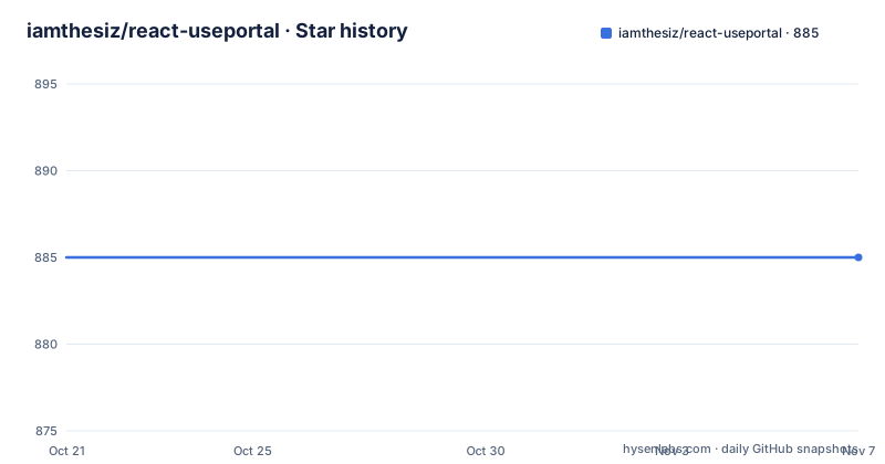
- iamthesiz/react-useportal885 ★ · +0
| Repository | 2026-10-21 | 2026-11-07 |
|---|---|---|
| iamthesiz/react-useportal | 885 | 885 |
0 Stars in the last 17 days, measured from the daily GitHub snapshot. Compare with other projects
Editorial analysis
The problem is rendering outside the parent's DOM
The opening line of the README states the use case plainly: need to make dropdowns, lightboxes, modals or dialogs, global message notifications, or tooltips in React. React Portals provide a first-class way to render children into a DOM node that exists outside the DOM hierarchy of the parent component. The problem that creates is the well known one, where an overlay rendered inside a container with overflow hidden gets clipped, and one rendered inside a transformed or positioned ancestor inherits that ancestor's stacking context and ends up behind the thing it is supposed to cover. A portal solves both by moving the DOM node, at the cost of breaking the CSS inheritance chain from the parent, which is why the hook gives you a bindTo option to choose the container. The hook is also isomorphic, meaning it works with server side rendering, and the feature list is short: SSR support, TypeScript support, one dependency, and built-in state.
Installing it and the two ways to call the hook
The package is published as react-useportal and the install line covers both package managers in one:
yarn add react-useportal or npm i -S react-useportalThere are two forms of the call and the difference is whether the hook manages state for you. The stateless form destructures only Portal and renders it unconditionally, so the children are always in the document:
import usePortal from 'react-useportal'

const App = () => {
  const { Portal } = usePortal()

  return (
    <Portal>
      This text is portaled at the end of document.body!
    </Portal>
  )
}
The stateless form also takes a bindTo option, which is the target node the children are mounted into, and the example resolves it from the document by element id, so the portal can be aimed at a specific part of your page rather than the end of the body.
With state, the hook gives you open, close and isOpen
The stateful form adds the three things you need to drive an overlay, and the README shows both the object and array destructuring forms:
import usePortal from 'react-useportal'

const App = () => {
  var { openPortal, closePortal, isOpen, Portal } = usePortal()

  // want to use array destructuring? You can do that too
  var [openPortal, closePortal, isOpen, Portal] = usePortal()

  return (
    <>
      <button onClick={openPortal}>
        Open Portal
      </button>
      {isOpen && (
        <Portal>
          <p>
            This Portal handles its own state.{' '}
            <button onClick={closePortal}>Close me!</button>, hit ESC or
            click outside of me.
          </p>
        </Portal>
      )}
    </>
  )
}
The isOpen flag is what you render on, so the common pattern is to keep the Portal mounted and let the hook decide whether the children are in the DOM. The text in the example also tells you the built-in dismiss behaviour, since it mentions hitting ESC or clicking outside. The hook also exposes togglePortal, which the stateful example does not use but the modal example later does, and the Portal component accepts a programmaticallyOpen option for the case where you open it without a click event.
The event object is the detail that breaks the overlay
There is a warning in bold in the README, and it is the one thing to read before you use the hook. Make sure you are passing the html synthetic event to the openPortal and togglePortal, i.e. onClick={e => openPortal(e)}. If you open the portal from a click event and do not pass the event object, you will need to attach a ref to the clicked element instead, and if you want to be able to open the portal without passing an event you will need to set programmaticallyOpen to true. The reason is that the hook needs to know where the click happened, in order to position the portal relative to it, and without the event it has no anchor. The ref route is described for the case where you do not want to pass the event around and are not using programmaticallyOpen, and the whole point of the built-in state is that you get that behaviour without writing the ref plumbing yourself.
Building your own modal on top, with the portal styled in onOpen
The library is deliberately unopinionated, and the example that shows this best is a useModal wrapper built on top of usePortal. The onOpen handler receives the portal element and modifies it directly, setting the cssText to position fixed, centring it with left and top at 50 percent and a translate transform, and raising the z-index. That approach works for animation too, since the same pattern where the className switches on isOpen between an animateIn and an animateOut class is shown in the animations section. The returned object renames the primitives to domain terms, with Modal as the Portal, openModal as openPortal, toggleModal as togglePortal and closeModal as closePortal, so the consumer never has to know the underlying names. The example also shows the event being passed correctly, with onClick={e => openModal(e)}.
Server side rendering and the examples directory
The isomorphism claim is the part that is easy to get wrong, because a portal has to exist on the server before it can be mounted on the client, and the hook has to not assume that document exists. The use-ssr dependency is what makes that work, and the test setup is arranged to prove it rather than assert it. There are two jest configurations, one running against jsdom for the browser and one running against node for the server, and the full test script runs both in sequence, with watch variants for each. A package that claims to work in both environments and only tests one of them is making an untested claim, and this one tests both. The examples directory is a Parcel project with an index.html and an index.js, and the dev script cleans the dist folder and runs Parcel over that html file with the open flag, so the examples open in a browser as you change them. The upstream examples are hosted as CodeSandboxes, one for the server side rendering case in Next.js, one for a modal with useModal on create-react-app, one for a dropdown in Next.js and one for a tooltip in Next.js, and the README notes that the server side rendering example is sometimes buggy, with an alternative link offered.
A small package with a versioned peer range and a lone dependency
The packaging tells you what you are adopting. The package name is react-useportal at version 1.0.12, it is published and not private, the main entry is dist/usePortal.js, and the licence is MIT. The peer dependencies are react and react-dom, each accepting a range that covers 16.8.6, 17 and 18, which means the hook assumes hooks are available and works across the React versions that have them. The single runtime dependency is use-ssr, which is what provides the server side rendering support, and the whole point of that dependency is the isomorphic behaviour rather than any rendering feature. The build is a TypeScript compile to CommonJS, the dev script runs Parcel over an examples directory and opens it in the browser, and there are separate test scripts for the browser and the server, with jest running against jsdom in one and node in the other, which is the pairing you need for a package that claims to work in both environments. The repository is small, with usePortal.ts at the root, a test file beside it, an examples directory and a license file.
Editorial conclusion
react-useportal suits a React project that needs modals, dropdowns, lightboxes or tooltips and wants the overlay to escape the parent's overflow and stacking context without hand-rolling a portal container. It does not suit a project that has already standardised on a component library providing these, and it is not a headless component library, since it ships no styling at all. Before you use it, read the note about passing the click event, because that is the detail that causes the overlay to open in the wrong place or not at all, and check that your React version is one of the peer dependency ranges the package supports.
Frequently asked questions
What does react-useportal do?
It is a React hook that renders children into a DOM node outside the DOM hierarchy of the parent component, so a modal, dropdown, lightbox or tooltip is not clipped by its parent's overflow and does not inherit its stacking context. It also ships server side rendering support and TypeScript types.
How do I install react-useportal?
Run yarn add react-useportal or npm i -S react-useportal. The package has one runtime dependency, use-ssr, and its peer dependencies are react and react-dom, each accepting version 16.8.6, 17 or 18.
Why does my portal open in the wrong place when I do not pass the event?
The hook needs the click event to know where to anchor the portal. The README states that if you open the portal from a click event you must pass the event object, i.e. onClick={e => openPortal(e)}, and that otherwise you need a ref on the clicked element, or to set programmaticallyOpen to true if you want to open it without an event.
Does react-useportal come with styling for the overlay?
No. The example that shows a centred modal does it by setting the portal element's cssText inside an onOpen handler, and the animation example switches a className on isOpen between an animateIn and an animateOut class. The library supplies the behaviour and the portal container, and you supply the styling.
Official sources
Add this badge to your README
If you maintain this project, the badge below links readers to this analysis and shows its maintenance status from the daily GitHub snapshot. Paste the markdown into your README; add ?metric=license or ?metric=stars to the image URL for a different field.

[](https://hysenlabs.com/projects/iamthesiz-react-useportal)Star history chart for your README
[](https://hysenlabs.com/projects/iamthesiz-react-useportal)Was this useful?