MingCute Icons, one artwork set published as ten framework packages
Carefully designed icons for modern interfaces. MingCute is a simple, elegant open-source icon library built for web and mobile products.
At a glance
- What is it?
- MingCute Icons publishes 1,663 icons in two styles as ten separate packages, from typed React components to raw SVG files and a WOFF2 icon font, and every one of them is generated from the same canonical geometry. The repository is a pnpm workspace with a release policy that is itself tested.
- Who is it for?
- MingCute Icons fits a product team that wants one icon language across a web app, a marketing site and a mobile app without maintaining three different sets of artwork, and it fits a team that wants icons as installable, versioned and tree-shakeable dependencies rather than copied files. It does not fit a project on Node 18 or on a package manager other than the ones the workspace assumes.
- Can I use it commercially?
- Yes. Apache-2.0 is a permissive licence: you can use, modify and sell software built on it, as long as you keep its copyright and licence notices.
- Is it still maintained?
- Yes. The repository last received commits 3 days ago.
- What is it written in?
- Mainly TypeScript, according to GitHub's language statistics.
Answers come from the project's GitHub data, last synced on November 7, 2026, and from our analysis. They are not legal advice.
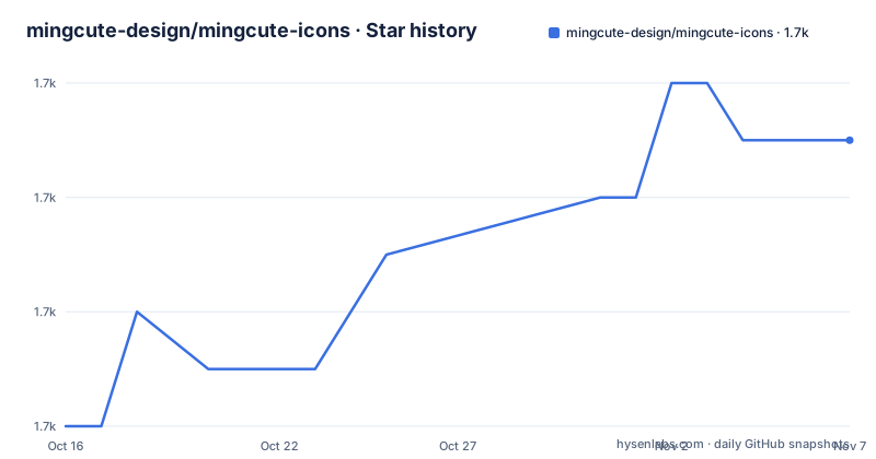
Star history
- mingcute-design/mingcute-icons1,655 ★ · +5
| Repository | 2026-10-16 | 2026-11-07 |
|---|---|---|
| mingcute-design/mingcute-icons | 1.7k | 1.7k |
5 Stars in the last 22 days, measured from the daily GitHub snapshot. Compare with other projects
Editorial analysis
One set of drawings, ten ways to ship them
MingCute Icons is the public, open-source distribution of the MingCute icon system, and the numbers give the size of it. There are 1,663 icons in both Core Regular and Core Filled, which is 3,326 styled icon definitions in total, and they are distributed across ten production packages. The frameworks covered are React, Vue, React Native, Svelte, SolidJS, vanilla JavaScript and Web Components, and the non-framework outputs are standalone SVG, WOFF2 icon fonts and the framework-neutral definitions themselves. The architectural decision underneath is stated in the overview, that every renderer uses the same generated @mingcute/icons definitions, and that the icon geometry is compiled once rather than duplicated across framework packages. That is the difference between an icon library and a collection of icon libraries, and it is why the same icon does not drift between a React button and a Vue menu.
A 24 by 24 grid and a two pixel stroke
The design foundation is short and specific. Every icon is drawn on a 24 by 24 grid with consistent visual proportions, and the public catalogue contains the two styles, Core Regular and Core Filled. Core Regular is designed around a consistent 2 px stroke, which is the value that decides whether a set of icons looks like one family or a pile of drawings. The canonical vector artwork remains editable in the source files and scales through SVG without losing its intended proportions, so the set is not frozen at the size it was drawn. The website at mingcute.com is the browsing tool, letting you search the catalogue, preview icons, adjust size and colour, and download individual SVG or PNG assets. The README draws a useful line between the two workflows, since the website is for finding and downloading an asset, while the packages in this repository are for the case where icons need to be installed, versioned, tree-shaken and rendered consistently inside an application.
Quick start: install one package, import one icon
The quick start picks React as the example, and the install is a single package.
npm install @mingcute/reactThe component is then imported from a style subpath, and the icon is used with a size and an accessibility attribute.
import { Home1Regular } from '@mingcute/react/core-regular';

export function HomeLink() {
  return (
    <a href="/">
      <Home1Regular size={20} aria-hidden="true" />
      <span>Home</span>
    </a>
  );
}
That import path is the tree-shaking story in practice. The highlights list tree-shakeable imports, with style entry points for convenience or direct icon paths for smaller module graphs, so an application that uses six icons does not end up shipping three thousand. For another framework the README says to replace @mingcute/react with the appropriate package, and the same style subpath structure applies, since the two importable styles are core-regular and core-filled, each with 1,663 icons.
Accessibility is opt-in, and the types are generated
Two details in the highlights are worth pausing on. The first is accessible behavior, where the components remain decorative unless given an accessible title or label. That default is deliberate and it is the opposite of what some component libraries do, so an application that relies on icons carrying their own accessible name has to add one, and an application that has visible text next to the icon gets the right behaviour for free. The second is that the framework adapters include generated declarations and typed component props, which is what makes the size prop in the example above a checked argument rather than a loose one. The rendering fidelity claim also has teeth, since high-fidelity SVG means gradients, masks, clipping paths and self-contained patterns are preserved rather than flattened, which matters for an icon set that includes filled variants of complex shapes.
Ten packages, and what each one is for
The package table in the README is the map of the whole project. @mingcute/icons holds the framework-neutral definitions and the rendering helpers, and it is the base that everything else consumes. @mingcute/react and @mingcute/vue give typed SVG components for React and Vue 3. @mingcute/react-native provides native components built on react-native-svg, and @mingcute/svelte targets Svelte 5, with @mingcute/solid for SolidJS. @mingcute/vanilla returns SVG strings and DOM helpers for plain JavaScript, and @mingcute/web-components provides explicitly registered custom elements for use in a document. @mingcute/svg holds optimized standalone SVG files, which is the route for a static site that just wants the files. @mingcute/font is the WOFF2 icon font with CSS classes and metadata. The README also notes that the framework packages use @mingcute/icons for the shared geometry and that the definitions package is installed automatically when required, so a React user ends up with two packages rather than one.
The build pipeline and its release policy
The repository root is a pnpm workspace, and the root package.json is marked private with the description of a public workspace for building and maintaining the free MingCute icon packages. The package manager is pinned to pnpm 9.15.0 and Node 22 or newer is required, with a .node-version file alongside. The build script fans out across the packages directory, and the check script is a chain of three things, the quality check, a per-package check and a release check. That last one is unusual and worth noting, because the release policy is itself covered by a test, run with node --test against scripts/release-policy.test.mjs, so the rules about when a release may happen are checked rather than written down. There is also a dry run for packing, which uses scripts/check-packable.mjs to see what would actually be published. The build toolchain is rollup with svgo for optimising the SVG output, TypeScript and tslib, and React and Vue are present for the type checking of the framework packages.
Version 3 and the pace of icon releases
The 3.0 line arrived quickly, with v3.0.0 on 2026-07-30, v3.0.1 on 2026-07-31 and v3.0.2 on 2026-07-31, and the last push to the repository was on 2026-07-31, so the whole line landed within two days. That pattern is a warning rather than a comfort for anyone pinning a version, because a major version bump of an icon set changes the identifiers, the import paths or the geometry, and the documentation here does not describe a migration path between 2.x and 3.x. The repository is not archived, and the licence is Apache-2.0, which is the permissive grant a commercial product usually wants from an icon set. There is a CHANGELOG.md at the root, a release.json describing the release configuration, and assets/ and images/ directories holding the design material that the README screenshots refer to. A team that treats icons as part of their design system should mirror the package version rather than floating on latest, because the geometry is the thing they are actually consuming.
Editorial conclusion
MingCute Icons fits a product team that wants one icon language across a web app, a marketing site and a mobile app without maintaining three different sets of artwork, and it fits a team that wants icons as installable, versioned and tree-shakeable dependencies rather than copied files. It does not fit a project on Node 18 or on a package manager other than the ones the workspace assumes. Verify three things first: that the two styles, Core Regular and Core Filled, cover the states your interface needs, since there is no third style to fall back on, that the accessibility behaviour matches your convention, because components stay decorative unless given an accessible title or label, and whether the framework package you pick pulls the shared definitions package in as a dependency, which the README says happens automatically.
Frequently asked questions
How many icons does MingCute Icons provide?
The public release contains 1,663 icons in Core Regular and the same 1,663 in Core Filled, which is 3,326 styled icon definitions in total. Every icon is drawn on a 24 by 24 grid, and Core Regular is designed around a consistent 2 px stroke.
Which frameworks does MingCute Icons support?
There are ten production packages, covering React, Vue, React Native, Svelte, SolidJS, vanilla JavaScript and Web Components, plus standalone SVG files, WOFF2 icon fonts and the framework-neutral definitions. The framework adapters consume the shared @mingcute/icons package, which is installed automatically.
How do the MingCute icons handle accessibility?
The components remain decorative unless given an accessible title or label, so an icon next to visible text is correctly hidden from assistive technology while an icon that carries meaning needs an accessible name added by the application.
How do I use a single MingCute icon in React?
Install @mingcute/react, then import the component from a style subpath such as '@mingcute/react/core-regular' and render it with a size, for example Home1Regular with size={20} and aria-hidden="true". Direct icon paths are available when you want a smaller module graph.
Official sources
Add this badge to your README
If you maintain this project, the badge below links readers to this analysis and shows its maintenance status from the daily GitHub snapshot. Paste the markdown into your README; add ?metric=license or ?metric=stars to the image URL for a different field.

[](https://hysenlabs.com/projects/mingcute-design-mingcute-icons)Star history chart for your README
[](https://hysenlabs.com/projects/mingcute-design-mingcute-icons)Was this useful?