Myna Font Review: Symbols, Ligatures, and Terminal Setup
monospace typeface designed for symbol-rich programming
At a glance
- What is it?
- Myna is a symbol-focused monospace typeface for programmers who want aligned operators and clearer distinctions between similar characters. It includes several weights, faux italic variants, APL support, and optional contextual forms, but some additions depend on compatible software.
- Who is it for?
- Myna fits programmers who prioritize readable symbols, fixed-width alignment, and editable ligatures, especially in editors and terminals that support OpenType features. It is a weaker fit for users who need a fully documented configuration procedure or want contextual forms to render everywhere.
- Can I use it commercially?
- Check first. The repository uses a licence we do not classify automatically, so read its LICENSE file before any commercial use.
- Is it still maintained?
- Yes. The repository last received commits 143 days ago.
- What is it written in?
- Mainly Python, according to GitHub's language statistics.
Answers come from the project's GitHub data, last synced on November 6, 2026, and from our analysis. They are not legal advice.
Star history
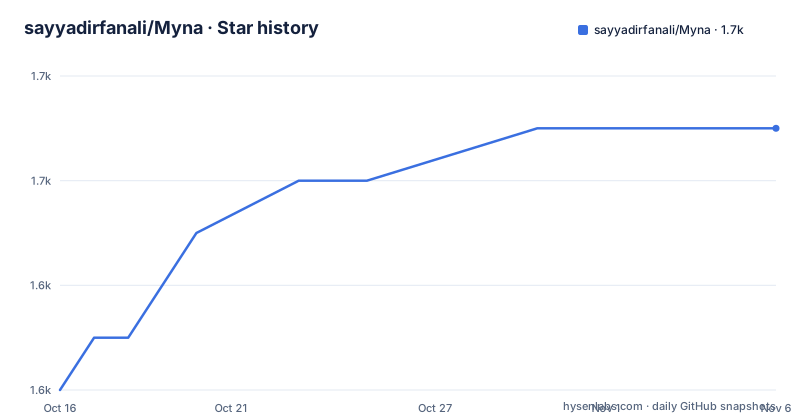
- sayyadirfanali/Myna1,651 ★ · +5
| Repository | 2026-10-16 | 2026-11-06 |
|---|---|---|
| sayyadirfanali/Myna | 1.6k | 1.7k |
5 Stars in the last 21 days, measured from the daily GitHub snapshot. Compare with other projects
Editorial analysis
Myna's Symbol-First Design Brief
Myna addresses a specific problem in code typography: symbols often occupy the same space as letters but receive less deliberate visual design. In languages built around operators, that can make short sequences harder to parse. The README specifically cites `->`, `$`, `@`, and `%` as examples of symbols that may feel mismatched in other monospace fonts.
The project is aimed at programmers, terminal users, and anyone who spends substantial time reading source code. Its design emphasizes ASCII symbols, balanced weight, geometric punctuation, and consistent character widths. Multi-character forms such as `->`, `>>=`, `=~`, and `::` are intended to align with surrounding code rather than floating within their cells.
Myna also gives attention to ambiguity involving similar characters. The README calls out `1 l I |` and `0 O o` as cases that should remain visually distinct. That matters because a font can be monospaced and still fail a basic code-reading task when capital letters, lowercase letters, digits, and vertical bars collapse into nearly identical forms.
This is a narrower proposition than choosing a general-purpose interface font. Myna does not present itself as a terminal emulator, editor, or programming language package. It changes how code looks after those tools are already in use. The user's editor and terminal must also support the font format and any optional rendering behavior they expect.
Glyph System, Weights, and Contextual Forms
The repository layout exposes the font's source-oriented workflow. It contains `Myna-Regular.sfd`, `features.fea`, Python utilities, and prepared files under `fonts/`. That structure is consistent with a project that maintains editable glyph sources and OpenType feature definitions rather than shipping only a final binary archive.
Myna provides Regular, Medium, and Bold weights. Faux italic variants are available for all three. These are described as faux italic variants rather than separate handwritten or calligraphic italics, so users should judge them against their editor and terminal instead of assuming they match a dedicated italic design.
The README says the v2 line includes contextual variants for glyph pairs such as `|>` and `:=`. Such pairs can appear differently depending on the surrounding characters or sequence. Applications must support font features for these forms to display as intended. This is an important boundary: installing the font file does not by itself guarantee that an editor or terminal will use every contextual variant.
The font also includes a reasonable subset of non-ASCII characters, focused mainly on geometrical and mathematical forms. Version 2 adds APL characters. Language-specific treatment includes sigils for Perl, operators for Haskell, and symbols for Rust. These claims concern glyph design and coverage, not syntax highlighting, parsing, or editor support for those languages.
Optional Nerd Font integration broadens the glyph inventory, but it changes the setup path. The `mknerdfont` script can attach Nerd Font glyphs to a chosen variant or weight, and the project also publishes a Regular Nerd Font release. The README says `fontpatcher` must be installed before using `mknerdfont`.
Installing Myna on Linux
The Linux instructions clone the repository, enter the font directory, copy the OpenType files into the user font directory, and refresh the font cache. The copied files are expected to appear in the destination so the editor or terminal can discover them.
git clone https://github.com/sayyadirfanali/Myna.git
cd ./Myna/fonts
cp *.otf ~/.local/share/fonts/
fc-cache -v
After the command completes, select a Myna font from the font list in the editor or terminal. The README does not provide a specific editor command or terminal configuration file, so the final activation step depends on the software in use. A useful first check is to display ordinary code containing arrows, comparison operators, punctuation, and ambiguous characters. Check that the glyphs remain inside their cells and that the editor's background and syntax colors do not change spacing or legibility.
Linux is also the documented route for running `mknerdfont` and `changeheight.py`. Those tools have separate dependencies and produce modified font assets. They should not be treated as part of the basic installation unless Nerd Font glyphs or tighter vertical spacing are actually required.
Installing Myna on macOS and Windows
For macOS, the README gives a shorter copy-based installation. It expects the repository to be available locally and places `Myna.otf` in the user's `~/Library/Fonts/` directory. The repository also documents released ZIP files as an alternative way to obtain the fonts.
git clone https://github.com/sayyadirfanali/Myna.git
cd Myna
cp Myna.otf ~/Library/Fonts/
The command is copied exactly from the README. If a user follows the earlier Linux sequence or selects another weight from `fonts/`, the relevant file name will differ. The documentation does not explain whether macOS needs a manual font-cache refresh after this copy operation.
On Windows, the documented route uses a release rather than a shell command. Download the release, locate `Myna.otf`, right-click it, and choose "Install for all users". The scope matters because installing for all users changes the set of local accounts that can select the font. The README does not document an unattended command-line installation, so there is no verified PowerShell procedure to reproduce here.
Once the operating system recognizes the font, it still has to be selected in the target editor or terminal. The repository does not document a universal application configuration file or a command that enables contextual font features.
Testing Alignment and Terminal Compatibility
The first practical use is visual validation rather than launching an application-specific installer. After installation, enter code that includes `->`, `>>=`, `=~`, `::`, `|>`, and `:=`, then include sequences such as `1 l I |` and `0 O o`. This exercises the alignment and clear-distinction goals stated in the README without assuming a particular language or editor.
A short code file is useful because the README includes a `sample.txt` entry at the repository root. The README does not explain its contents or present it as a required test suite, so it should be treated only as repository sample content. More reliable acceptance criteria come directly from the design goals: symbols should appear aligned, punctuation should retain a consistent geometric form, and similar characters should remain distinguishable.
Ligature behavior needs separate verification. Myna is designed for users who want ligatures without requiring the broader terminal setup sometimes associated with ligature-heavy fonts. However, the README specifically says contextual variants need a terminal capable of working with font features. A terminal can render the base font while suppressing those contextual forms, so successful font installation is not proof that every advertised variant appears.
The optional `changeheight.py` script offers a separate response to vertical spacing concerns. It can increase or decrease vertical spacing for users who want more compact terminal content. The README does not document its arguments or invocation syntax, so there is no justified command example to add. Users should inspect the script before running it and avoid treating compactness as a default requirement.
Trade-Offs Against General Monospace Fonts
Myna's main alternative is a conventional monospace font without a symbol-first design program. The practical difference is not simply appearance. Myna asks the user to evaluate specific operator sequences, language sigils, punctuation shapes, and contextual pairs, while a general font may offer a broader set of weights or styles and fewer rendering dependencies.
Its editable source also matters to technically inclined users. `Myna-Regular.sfd` exposes an editable font source, while `features.fea` identifies a separate feature-definition layer. The README also lists Python utilities such as `changeheight.py` and `build.py`. It does not document the complete build workflow, tool versions, or whether every release asset can be reproduced from the top-level commands, so the repository should not be presented as a fully specified reproducible build system.
The clearest limitation is feature support. Basic monospaced text has broad compatibility, but contextual forms depend on applications that work with font features. This makes Myna less predictable across editors, terminals, remote sessions, and operating systems unless each relevant component is checked.
Myna may also be the wrong choice for a reader who dislikes ligature substitutions or altered contextual forms. Even when the underlying glyphs are clear, a paired form can look unfamiliar if the goal is to see every input character as a separate shape. The README presents ligatures as a benefit, but it does not provide a project-specific switch for users who want to disable them.
Maintenance and upgrade work are modest but not zero. The repository is not archived, and its last push was on 2026-06-17. Releases include v1.0.0 from 2025-11-06 and v2.0.0.0-beta from 2025-12-14. Upgrading may mean replacing installed font files, reviewing new contextual variants, and checking whether local Nerd Font or vertical-spacing transformations remain appropriate. The README asks users to report spacing, kerning, rendering, and missing-glyph problems for the beta.
License and Modification Boundaries
Myna is distributed under the SIL Open Font License, Version 1.1, with the license recorded as `OFL-1.1` and included in the repository as `OFL.txt`. The repository also exposes source and transformation utilities, including `mknerdfont`, `changeheight.py`, `altl.py`, and `build.py`.
Users who redistribute or modify the font should read `OFL.txt` and verify what those actions require under the actual license text. This review does not provide legal advice. The relevant project-specific point is that the license file ships with the repository, while the README does not summarize redistribution, naming, or modification obligations.
The presence of scripts also does not mean every modified output has the same provenance as a release asset. Nerd Font patching and vertical-spacing changes are explicit transformations documented by the README. Anyone maintaining a private build should record which Myna variant it started from and which scripts were applied, especially if the resulting font is shared with other users.
Editorial conclusion
Myna fits programmers who prioritize readable symbols, fixed-width alignment, and editable ligatures, especially in editors and terminals that support OpenType features. It is a weaker fit for users who need a fully documented configuration procedure or want contextual forms to render everywhere. Before adoption, check the chosen font file in the actual editor and terminal, verify spacing and glyph distinctions, and confirm that any required rendering features are enabled. The documented install path is the repository's `fonts/` directory, while contextual pairs such as `|>` and `:=` require terminal support for font features.
Frequently asked questions
How do I install Myna on Linux?
Clone the repository, copy the `.otf` files from `fonts/` into `~/.local/share/fonts/`, and run `fc-cache -v`. The README does not provide a separate editor activation command.
Which weights and styles does Myna include?
Myna includes Regular, Medium, and Bold weights, with faux italic variants for all three. The v2 beta also adds more bold and faux italic variants.
Does Myna work with contextual forms such as `|>` and `:=`?
The v2 line provides contextual variants for selected glyph pairs, including `|>` and `:=`. They require a terminal that supports font features, so compatibility should be checked in the target terminal.
Official sources
Add this badge to your README
If you maintain this project, the badge below links readers to this analysis and shows its maintenance status from the daily GitHub snapshot. Paste the markdown into your README; add ?metric=license or ?metric=stars to the image URL for a different field.

[](https://hysenlabs.com/projects/sayyadirfanali-myna)Star history chart for your README
[](https://hysenlabs.com/projects/sayyadirfanali-myna)Was this useful?