Circuit UI: SumUp's design system, published as React packages
SumUp's design system for the web
At a glance
- What is it?
- Circuit UI is the web implementation of SumUp's Circuit Design System, split into a React component library plus separate packages for design tokens, icons, illustrations and lint rules. It is opinionated toward SumUp's own product work, and its multi-package layout is where the real cost and the real value sit.
- Who is it for?
- Circuit UI fits a team that wants a coherent React component set with tokens, icons and lint rules delivered together, and that can live with SumUp's visual language in a product of its own. It does not fit a project that needs a neutral, themeable set of primitives with no vendor opinions baked in, since the components and tokens encode SumUp's design decisions.
- Can I use it commercially?
- Yes. Apache-2.0 is a permissive licence: you can use, modify and sell software built on it, as long as you keep its copyright and licence notices.
- Is it still maintained?
- Yes. The repository received new commits within the last day.
- What is it written in?
- Mainly TypeScript, according to GitHub's language statistics.
Answers come from the project's GitHub data, last synced on November 7, 2026, and from our analysis. They are not legal advice.
Star history
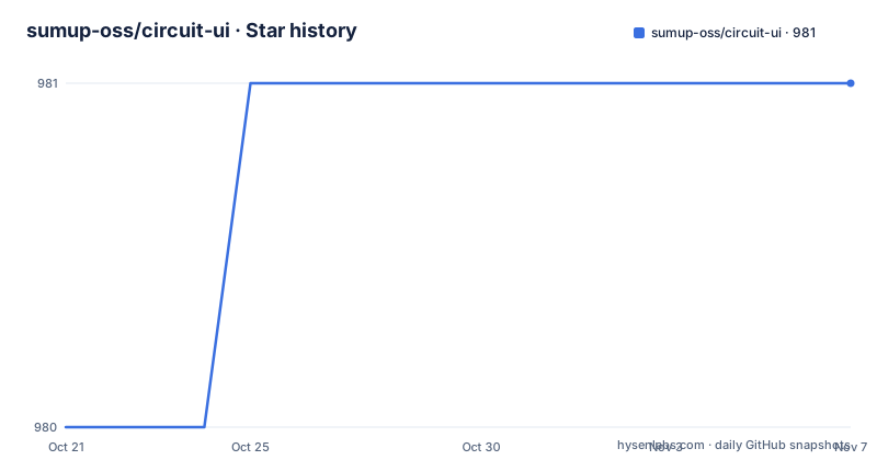
- sumup-oss/circuit-ui981 ★ · +1
| Repository | 2026-10-21 | 2026-11-07 |
|---|---|---|
| sumup-oss/circuit-ui | 980 | 981 |
1 Stars in the last 17 days, measured from the daily GitHub snapshot. Compare with other projects
Editorial analysis
One design system split across six published packages
Circuit UI is described as the web implementation of the SumUp Circuit Design System, with a stated goal of building a system that can be used for a wide variety of SumUp websites and apps while providing a consistent and inclusive user experience. The second half of the goal is the one that matters for adoption: the design system and the component library should be easy to use for developers and designers.
What makes it more than a component drop is the packaging. The repository publishes six packages, each with a separate job:
- @sumup-oss/circuit-ui, the core React component library - @sumup-oss/design-tokens, visual primitives such as typography, color and spacing - @sumup-oss/icons, a collection of SVG icons - @sumup-oss/illustrations, the Circuit UI illustration library - @sumup-oss/eslint-plugin-circuit-ui, ESLint rules for following Circuit UI practices - @sumup-oss/stylelint-plugin-circuit-ui, Stylelint rules for the same purpose
The last two are the unusual part. A design system that also ships the rules to catch misuse in your editor is treating adoption as a discipline rather than a download, and it means a team can find out that it is using a component incorrectly at lint time instead of at review time.
The licence is Apache-2.0, and the repository root holds a Contributor Covenant code of conduct alongside a CONTRIBUTING.md file.
Design tokens are a separate package, not a theme file
Splitting the tokens out changes how theming works in practice. Because typography, color and spacing live in their own package rather than inside the component library, an application can depend on the tokens alone and still get a consistent scale, and a change to the token set does not require a change to the component package.
The repository shows how the tokens reach the browser. The documentation build script assembles a static site from the package outputs:
"docs:build": "storybook build -c .storybook -o public && cp -R ./packages/icons/web ./public/icons && cp -R ./packages/illustrations/assets ./public/illustrations && mkdir ./public/design-tokens && cp -R ./packages/design-tokens/dist/*.css ./public/design-tokens && mkdir ./public/components && cp -R ./packages/circuit-ui/dist/styles.css ./public/components",Three separate CSS artefacts come out of that: the icons, the design tokens, and the component styles, each copied into its own directory under public. The split is not incidental. It mirrors how a consumer assembles the system, pulling the token stylesheet and the component stylesheet independently.
The same script shows that the component package publishes a single styles.css entry point rather than shipping per-component stylesheets, which keeps the import surface small.
The root package.json also declares workspaces covering packages, templates and templates/nextjs/template, so the repository contains application templates alongside the libraries, and the theme documentation describes foundations such as colors, spacing and typography.
Storybook is the development loop and the reference
The documentation site at circuit.sumup.com is where the components are viewed, and the getting started page is described as the place to set up a new app with Circuit UI or add it to an existing project.
The tooling behind it is Storybook. The dev script starts it on a fixed port:
"docs:start": "storybook dev -p 6006",Two other Storybook invocations matter. The plain build produces the static documentation site. The chromatic-build variant adds --test and --stats-json, which is what makes the visual regression story possible:
"chromatic-build": "storybook build -c .storybook -o public --test --stats-json",The project credits Chromatic with providing the visual testing platform that helps catch unexpected changes. That is a real safety net for a component library, because a prop default changing silently is exactly the kind of regression no unit test notices.
The coverage badge in the project readme points at codecov, and the repository root has a codecov.yml, so the component behaviour is also covered by tests rather than only reviewed visually.
Linting spans three tools with distinct jobs
The lint setup in the root package.json is unusual enough to be worth reading closely. A single lint command runs three separate checks in sequence:
"lint": "biome check --diagnostic-level=error && eslint . --quiet --concurrency=auto",Biome runs first as a formatter and general-purpose checker, with the diagnostic level set to error so only real problems fail the run. ESLint runs afterwards on the whole tree, in quiet mode with automatic concurrency. And a separate target covers styles:
"lint:ci": "biome ci --diagnostic-level=error && eslint . --quiet --concurrency=auto",Stylelint gets its own pass, described in the same scripts block as a target that runs the CSS rules quietly, because CSS in a design system carries its own class of mistakes and the repository ships a dedicated plugin for that. The root also has a stylelint.config.js and a stylelintignore file, plus an eslint.config.js for the flat-config ESLint setup, and biome.json for the Biome rules. There is a knip.json, which is what the knip script uses to find unused files, exports and dependencies across the monorepo.
The result is that a contributor touching a component runs Biome, ESLint, Stylelint and knip before pushing. That is heavier than a typical component library, and it is also the reason the packages stay consistent across a codebase the size of SumUp's products.
Release mechanics with lerna, changesets and npm provenance
The repository uses lerna to orchestrate the workspace, with scripts that fan out across packages:
    "build": "lerna run build",
    "test": "vitest",
    "test:ci": "vitest run --coverage",
Tests run under vitest, and the CI variant adds coverage. The release line publishes at least two packages independently: @sumup-oss/circuit-ui at 11.20.3 and at 12.4.0, and @sumup-oss/icons at 7.3.0, all within the same week in October 2026. A design system that ships icons on a separate version line means an icon fix does not force a component library upgrade, which is exactly the reason for splitting in the first place.
Two version-control details stand out. The root package.json carries a publishConfig with provenance set to true, which means published packages carry build provenance attestations rather than just a registry entry. And a .changeset directory at the root indicates that version bumps are driven by changeset files in pull requests, so the changelog for each package is assembled from the changesets that land with the code.
There is also a MIGRATION.md file at the repository root, which is the first thing to read before jumping between major versions.
Where Circuit UI is the wrong fit
The first limitation is vendor identity. The components, the tokens, the illustrations and the icons are SumUp's design language expressed in code. An outside team can adopt them, but the result will look like a SumUp product, and the tokens encode decisions about color, spacing and typography that were made for SumUp's brand. A project that wants a neutral primitive set to build its own system on top will find that it is fighting the defaults rather than starting from them.
The second limitation is the React dependency. The core package is a React component library, so this is not a framework-agnostic token set that a Vue, Svelte or server-rendered template can consume directly. The tokens package is closer to framework-neutral since it ships CSS, but the components themselves are React.
The third limitation is versioning velocity. A major release of the component library, 12.4.0, landed on 2026-10-12, one day before 11.20.3 on 2026-10-13. Two majors in one week is the opposite of a slow-moving dependency, and it means a team has to decide whether to track the newest major or to stay on a maintained older line. The MIGRATION.md file and the changeset history exist for that reason.
A practical note on scope: the packages cover components, tokens, icons, illustrations and lint rules. There is no charting, no data table and no form builder of the kind that a dashboard product would expect, so a project needing those will compose them from the primitives rather than importing them.
Editorial conclusion
Circuit UI fits a team that wants a coherent React component set with tokens, icons and lint rules delivered together, and that can live with SumUp's visual language in a product of its own. It does not fit a project that needs a neutral, themeable set of primitives with no vendor opinions baked in, since the components and tokens encode SumUp's design decisions. Before adopting it, read the MIGRATION.md file at the repository root and pin the version you test against, because a major release in the 12.x line landed within days of an 11.x release and the two will not behave identically.
Frequently asked questions
What packages does Circuit UI publish?
Six: @sumup-oss/circuit-ui for the React components, @sumup-oss/design-tokens for typography, color and spacing, @sumup-oss/icons for SVG icons, @sumup-oss/illustrations, plus an ESLint plugin and a Stylelint plugin that help users follow Circuit UI practices.
How do I add Circuit UI to an existing React project?
The documentation links to a getting started page described as covering setting up a new app with Circuit UI or adding it to an existing project, with the components viewable in Storybook on the circuit.sumup.com documentation site.
How are design tokens distributed in Circuit UI?
Tokens live in their own @sumup-oss/design-tokens package and are shipped as CSS files under a dist directory. The documentation build copies that CSS into a separate public/design-tokens directory, apart from the component stylesheet.
Does Circuit UI check visual regressions?
Yes. The repository credits Chromatic with providing the visual testing platform, and the chromatic-build script runs a Storybook build with the test flag enabled to produce the snapshot output for that service.
What licence is Circuit UI released under?
Apache-2.0. The licence is declared both in the repository metadata and in the root package.json, and the LICENSE file is at the repository root.
Official sources
Add this badge to your README
If you maintain this project, the badge below links readers to this analysis and shows its maintenance status from the daily GitHub snapshot. Paste the markdown into your README; add ?metric=license or ?metric=stars to the image URL for a different field.

[](https://hysenlabs.com/projects/sumup-oss-circuit-ui)Star history chart for your README
[](https://hysenlabs.com/projects/sumup-oss-circuit-ui)Was this useful?