TKRubberPageControl for UIKit and SwiftUI
A rubber animation pagecontrol
At a glance
- What is it?
- TKRubberPageControl is an iOS page control that replaces standard dots with a rubber-style bubble animation. It offers UIKit and SwiftUI interfaces, shared visual configuration, and page-count changes that reset the selection.
- Who is it for?
- Adopt TKRubberPageControl when an iOS app needs a compact animated page selector in UIKit or SwiftUI. Do not choose it for a dense or highly conventional navigation system without first checking its bubble sizing and bar layout.
- Can I use it commercially?
- Yes. MIT is a permissive licence: you can use, modify and sell software built on it, as long as you keep its copyright and licence notices.
- Is it still maintained?
- Yes. The repository last received commits 55 days ago.
- What is it written in?
- Mainly Swift, according to GitHub's language statistics.
Answers come from the project's GitHub data, last synced on November 7, 2026, and from our analysis. They are not legal advice.
Star history
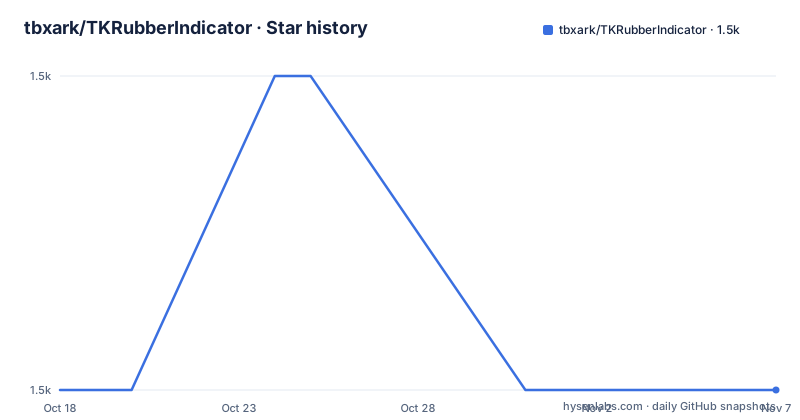
- tbxark/TKRubberIndicator1,467 ★ · +0
| Repository | 2026-10-18 | 2026-11-07 |
|---|---|---|
| tbxark/TKRubberIndicator | 1.5k | 1.5k |
0 Stars in the last 20 days, measured from the daily GitHub snapshot. Compare with other projects
Editorial analysis
What TKRubberPageControl changes in an iOS page selector
TKRubberPageControl addresses the visual behavior of a page indicator. Instead of presenting only static circular indicators, it animates a large bubble between pages while smaller bubbles move along a half-circle path and squash during the transition. The repository describes the result as a rubber animation page control for UIKit and SwiftUI. It is intended for app screens that use page selection as a visible, interactive part of the interface, such as onboarding, onboarding-like sequences, or a pager whose selection state is owned by the application.
The project is small in scope. It does not replace the content pages themselves, manage a page view controller, or define a complete navigation system. It supplies the indicator and a selection callback or binding. The application remains responsible for changing its displayed content when the selected page changes. This distinction matters when evaluating the library: it can make a transition more noticeable, but it does not remove the need for state management or page presentation code.
The repository is named `TKRubberIndicator`, while the package and public controls are named `TKRubberPageControl`. That naming difference is relevant when adding the dependency. The README uses `TKRubberPageControl` in package declarations and imports, so adopting the component should follow the package-facing name rather than the repository name.
The shared bubble model behind the animation
The README identifies a shared layout model for both implementations. The control uses a horizontal bar, a larger bubble behind the selected position, and smaller bubbles arranged beneath or around that bar. During a page change, the large bubble travels between page positions. The small bubbles follow a half-circle path under the bar, with a squash effect while they move. The documented animation duration defaults to `0.2`.
The UIKit implementation is based on `UIControl`. It exposes a page count, a current index, style configuration, and event behavior. The README shows both target-based handling through `.valueChanged` and a `valueChange` closure. Assigning `currentIndex` initiates an animation and fires the same events, which makes the control usable either through direct property changes or through its control event interface.
The SwiftUI implementation is described as native and `Binding` driven. It does not use `UIViewRepresentable`. The parent supplies `selection` and `pageCount`; the control writes a new selection into the binding when the user taps it. This creates a clear data flow. SwiftUI state changes flow into the control, while taps travel back into application state. The two interfaces are intended to look identical because they share the same layout model.
There is a practical boundary around structural changes. Assigning `numberOfPage` or `styleConfig` rebuilds the indicator and resets the selection to `0`. That is documented behavior, not an automatic preservation of the current page. An app that changes its page count while showing a later page must account for this reset.
Installing TKRubberPageControl with Swift Package Manager or CocoaPods
The project supports iOS 13.0 and later, Swift 5.9 and later, and Xcode 15 and later. In Xcode, add the package through `File → Add Package Dependencies` using the repository URL below. The resulting package declaration starts at version `2.0.0`, matching the latest release listed for the project.
dependencies: [
    .package(url: "https://github.com/TBXark/TKRubberIndicator.git", from: "2.0.0")
]
The package should be declared as `TKRubberPageControl` when imported, as shown in the UIKit and SwiftUI examples. If an existing project uses CocoaPods, add the documented pod and keep the version constrained to the documented 2.0 line.
pod 'TKRubberPageControl', '~> 2.0'The README does not provide a separate command for publishing the library or running an installer from the command line. It provides the package URL, Swift Package Manager declaration, and CocoaPods entry. The project also includes a demo app generated with XcodeGen, but that is a development path rather than a required installation step for using the control.
A first UIKit page control
The following example creates a five-page UIKit control, constrains it to a fixed size, and connects both a `UIControl` event and a closure to selection changes. The `frame: .zero` initializer is acceptable because Auto Layout supplies the final dimensions.
import TKRubberPageControl
import UIKit

final class ViewController: UIViewController {
    private let pageControl = TKRubberPageControl(frame: .zero, count: 5)
}
The full setup shown in the README adds the control as a subview, activates center, width, and height constraints, and registers `pageChanged(_:)` for `.valueChanged`. The reader should see a page control with a `220` point width and `100` point height. The callback prints the new index, either from `sender.currentIndex` or from the closure's `index` value.
For a direct page change, assign `currentIndex`. This is an animated operation and fires the selection events according to the README. In contrast, assigning `numberOfPage` or `styleConfig` rebuilds the control and returns the selection to page `0`. Applications that use those properties during runtime should treat the operation as a state reset rather than a transparent configuration update.
A first SwiftUI selection binding
SwiftUI usage is shorter because the selection is held in `@State`. Passing `$page` gives the control a binding that it reads and writes. Changing `pageCount` changes the number of positions, while assigning `page` updates the selected index.
import SwiftUI
import TKRubberPageControl

struct ContentView: View {
    @State private var page = 0

    var body: some View {
        RubberPageControl(selection: $page, pageCount: 5)
            .frame(width: 220, height: 100)
    }
}
On iOS 15 and later, the README states that selection changes animate automatically. On iOS 13 and 14, the documented approach is to wrap the assignment in `withAnimation`.
withAnimation {
    page = 3
}
This behavior is convenient for a screen whose content is already driven by the same state. It also means the control is not an independent source of truth. If another part of the view updates `page`, the indicator follows that value, and a user tap updates the binding. SwiftUI applications still need to connect the binding to the displayed page content.
Configuration limits and design trade-offs
The configurable surface covers bubble sizes, spacing, vertical padding, animation duration, bar color, and bubble colors. Defaults include a `16` point small-bubble diameter, a `40` point main-bubble diameter, `12` point bubble spacing, `8` point vertical padding, and a `0.2` second animation duration. The README also identifies default colors as plum, coral, and crimson.
The fixed example dimensions of `220` by `100` are useful as a starting point, but they are not presented as a universal layout rule. The control is built around a horizontal bar and a bubble arrangement, so the available width and the number of pages affect whether the result looks balanced. The project does not document automatic sizing beyond the frame modifiers in its examples, nor does it describe a compact mode for very large page counts.
Another limitation is the reset behavior for `numberOfPage` and `styleConfig`. A screen that reconfigures the control during a user session may need to restore its selection after the rebuild. The README does not document a rollback mechanism, persistence mechanism, or automatic synchronization with an external page-view model.
For accessibility, the README lists basic accessibility support and dark mode support, but it does not specify labels, traits, focus behavior, or testing results. The documentation is sufficient to identify those features, not to assess their exact implementation.
Maintenance, licensing, and the demo build
The repository is not archived, and its last push was on 2026-09-14. The release history lists `2.0.0` on 2026-09-14, followed by older releases including `1.4.0` on 2017-09-23 and `1.3.1` on 2017-02-01. The version jump also changes the stated requirements to iOS 13.0+, Swift 5.9+, and Xcode 15+. A project using the older 1.x line should therefore treat the 2.0 requirements and API changes as an upgrade decision rather than assuming compatibility.
The library is released under the MIT license. That identifies the license declared by the project, but it does not replace a review of the repository's `LICENSE` file or an assessment of how the code will be used in a particular application.
The repository includes `Sources`, `Tests`, `Demo`, and a `Makefile`. The documented demo commands are `./Scripts/demo.sh` and `make demo`. The Makefile also defines `build`, `test`, `format`, `lint`, and `ci` targets, which invoke `xcodebuild`, `swift format`, and a local simulator selection process. Those commands describe project development tasks, not a runtime feature. The README does not claim published performance measurements or benchmark results.
Why this differs from a conventional page indicator
A conventional page control usually presents a row of small dots whose selected state changes directly. TKRubberPageControl changes the transition itself. The selected position is represented by a large bubble, the other positions use smaller bubbles, and the movement introduces a half-circle hop and squash animation. That makes it more suitable when the page transition is a visible brand or product detail, rather than a quiet status marker.
The SwiftUI version also differs from the usual wrapper-based integration. The README describes it as a native `Binding` driven control without `UIViewRepresentable`. A wrapper-based alternative would embed a UIKit view inside SwiftUI, which can be convenient when sharing existing UIKit controls. TKRubberPageControl instead requires a separate SwiftUI interface and uses SwiftUI state directly. The trade-off is that developers choose between one package with two maintained public interfaces and a wrapper around a single UIKit implementation.
This is not a general-purpose navigation component. It has no documented routing, page content, scrolling container, or analytics behavior. If the requirement is animated page dots, it is a focused match. If the requirement is a complete tab bar, carousel, or page-view controller, the repository does not claim to provide that layer.
Editorial conclusion
Adopt TKRubberPageControl when an iOS app needs a compact animated page selector in UIKit or SwiftUI. Do not choose it for a dense or highly conventional navigation system without first checking its bubble sizing and bar layout. Verify the iOS 13, Swift 5.9, and Xcode 15 requirements, then confirm how resetting to page 0 after changing `numberOfPage` or `styleConfig` fits the screen that owns the control.
Frequently asked questions
Does TKRubberPageControl support SwiftUI without UIViewRepresentable?
Yes. The README describes a native, `Binding` driven SwiftUI implementation with no `UIViewRepresentable`. It receives `selection` and `pageCount`, and writes user selections back through the binding.
What are the system requirements for TKRubberPageControl 2.0.0?
The README requires iOS 13.0 or later, Swift 5.9 or later, and Xcode 15 or later. The package declaration shown for Swift Package Manager starts at version `2.0.0`.
What happens when the page count or style configuration changes?
Assigning `numberOfPage` or `styleConfig` rebuilds the indicator and resets the selection to `0`. Assigning `currentIndex` instead animates to the selected page and fires the selection events.
Official sources
Add this badge to your README
If you maintain this project, the badge below links readers to this analysis and shows its maintenance status from the daily GitHub snapshot. Paste the markdown into your README; add ?metric=license or ?metric=stars to the image URL for a different field.

[](https://hysenlabs.com/projects/tbxark-tkrubberindicator)Star history chart for your README
[](https://hysenlabs.com/projects/tbxark-tkrubberindicator)Was this useful?