TKSwitcherCollection, four animated switches for UIKit and SwiftUI
An animation switch collection
At a glance
- What is it?
- TKSwitcherCollection is a small Swift package with four animated switches, built as UIControl subclasses with SwiftUI wrappers over the same animations. It needs iOS 13 and the Swift 6 toolchain, and it behaves like UISwitch in the detail that matters most: programmatic changes do not fire events.
- Who is it for?
- TKSwitcherCollection suits an app whose design calls for a switch that UISwitch cannot provide, and who wants the same animation in UIKit and SwiftUI without writing Core Animation code. It does not suit a team that would rather use the system switch and spend the time elsewhere.
- Can I use it commercially?
- Yes. MIT is a permissive licence: you can use, modify and sell software built on it, as long as you keep its copyright and licence notices.
- Is it still maintained?
- Yes. The repository last received commits 55 days ago.
- What is it written in?
- Mainly Swift, according to GitHub's language statistics.
Answers come from the project's GitHub data, last synced on November 7, 2026, and from our analysis. They are not legal advice.
Star history
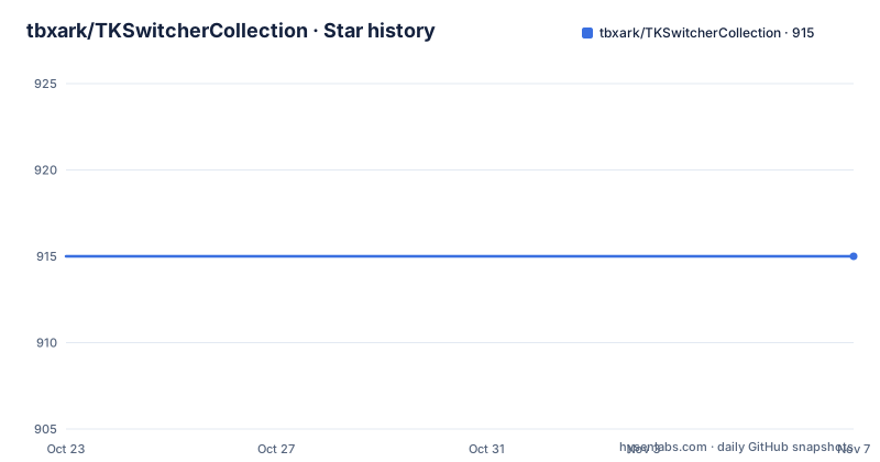
- tbxark/TKSwitcherCollection915 ★ · +0
| Repository | 2026-10-23 | 2026-11-07 |
|---|---|---|
| tbxark/TKSwitcherCollection | 915 | 915 |
0 Stars in the last 15 days, measured from the daily GitHub snapshot. Compare with other projects
Editorial analysis
Four switches where the system gives you one
TKSwitcherCollection is a collection of animated switches for UIKit and SwiftUI. There are four of them: TKSimpleSwitch, which comes with an optional rotate effect, TKExchangeSwitch, TKSmileSwitch and TKLiquidSwitch. The switch designs are credited to Oleg Frolov, whose Dribbble work these are.
The gap this fills is narrow but real. UISwitch is a system control with a fixed look and a fixed animation, and SwiftUI's Toggle inherits the same. If a design calls for a control that moves differently, or that expresses state through a shape rather than a knob position, you either draw it yourself with Core Animation or you find one that has been drawn for you. This package is the second option, with four designs and consistent behaviour across the two UI frameworks.
The engineering choices are modern for the platform. The requirements are iOS 13.0 or newer and the Swift 6 toolchain, which means Xcode 16 or newer. The UIKit controls are UIControl subclasses with target/action and @IBDesignable and @IBInspectable support, so they can be dropped into a storyboard and configured in the inspector. The SwiftUI side is a wrapper rather than a reimplementation, so the animations are identical between the two, and the state is a plain Binding<Bool>.
The project is MIT licensed, distributed through Swift Package Manager and CocoaPods, and it has a Chinese README alongside the English one.
The control contract matches UISwitch, including the awkward part
Every switch is a UIControl subclass, and a tap toggles the switch and sends .valueChanged. There is also a closure callback, onValueChange, fired when the user toggles, with the new value, and the familiar target/action route is available:
import UIKit
import TKSwitcherCollection

let switcher = TKSimpleSwitch(frame: CGRect(x: 0, y: 0, width: 100, height: 50))
switcher.onColor = .systemGreen
switcher.rotateWhenValueChange = true

// Closure callback: fired when the user toggles, with the new value
switcher.onValueChange = { value in
    print("switch -> \(value)")
}

// Or use target/action
switcher.addTarget(self, action: #selector(handleValueChanged(_:)), for: .valueChanged)
The behaviour worth reading twice is at the end of that listing. Programmatic changes do not fire events, which the README marks as the same as UISwitch.setOn(_:animated:). Setting isOn = false updates immediately with no animation, while setOn(true) animates.
That is a deliberate choice to match the platform rather than a limitation, and it is the kind of detail that saves an afternoon of debugging a binding that seems to have stopped working. It also means the onValueChange closure is a user-intent callback and not a state-change observer. If your code wants to know the value at all times, the value is on the control itself, and reading it from there is the way to do it.
The SwiftUI wrapper inherits the same semantics, since it wraps the UIKit implementation rather than reimplementing the behaviour.
SwiftUI views that wrap rather than reimplement
Every switch ships with a SwiftUI view that wraps the UIKit implementation, so the animations are identical, and isOn is a regular Binding<Bool>:
import SwiftUI
import TKSwitcherCollection

struct DemoView: View {
    @State private var isOn = true

    var body: some View {
        TKSimpleSwitchView(isOn: $isOn, rotateWhenValueChange: true)
            .frame(width: 100, height: 50)
    }
}
The available views are TKSimpleSwitchView, TKExchangeSwitchView, TKSmileSwitchView and TKLiquidSwitchView, matching the control names one for one.
The reason to wrap rather than reimplement is consistency. Two implementations of the same animation drift, and the drift is invisible until a user moves between a UIKit screen and a SwiftUI screen in the same app and sees the switch behave differently. Sharing one implementation means the timing, the curve and the drawing are the same object in both cases, and it also means a fix to the animation ships to both.
The cost is that the SwiftUI API is limited to what the UIKit control exposes. There is no SwiftUI-only parameter, and any new behaviour has to be added to the UIControl first and then surfaced by the wrapper.
What you can actually change on each switch
The customisation table in the README is worth reading before choosing a design, because the four switches do not offer the same amount of control.
TKSimpleSwitch exposes the most: onColor, offColor, lineColor, circleColor, lineSize and rotateWhenValueChange. TKExchangeSwitch exposes lineColor, onColor, offColor and lineSize. TKLiquidSwitch exposes only onColor and offColor. TKSmileSwitch exposes nothing at all, which the table marks with a dash.
All of them, regardless, expose isOn, animationDuration, onValueChange and setOn(_:animated:). So the state and timing are universal, while the appearance options are per design.
Two observations follow. The first is that a design with a fixed appearance is a design with a fixed identity, which is the point of a switch with a face rather than a knob. The second is that the set of properties per control is the API surface you will design around, and it is small enough to read in a minute.
Light and dark mode support is described as friendly when configured with semantic colors, which is a conditional rather than a guarantee. Setting onColor to .systemGreen works in both appearances because it is a semantic color; setting it to a fixed hex value does not, and the README does not document an automatic dark mode variant.
Two ways to add it to a project
Installation goes through Swift Package Manager or CocoaPods, and both are one step.
In Xcode, you select File > Add Package Dependencies and enter the package URL. Or you add it to your Package.swift:
dependencies: [
    .package(url: "https://github.com/TBXark/TKSwitcherCollection.git", from: "2.0.0")
]
For CocoaPods, the podspec in the repository is the integration point:
pod 'TKSwitcherCollection', '~> 2.0'The version floor of 2.0.0 matches the current major release, and the pod constraint of about 2.0 pins the same line. The package repository also carries a TKSwitcherCollection.podspec, a Package.swift, a .swift-format configuration and a Makefile, plus Sources/ and Tests/ directories.
The release history is worth a glance. Version 2.0.0 was tagged on 2026-09-14, the same day as the last push to the repository, and before that 1.4.2 added IBDesignable and IBInspectable support in February 2018, with 1.4.1 in January 2018. The jump from 1.4 to 2.0 is the one to look at, since the README's requirements of Swift 6 and Xcode 16 sit alongside it and the earlier version line predates both.
The demo project is generated, not committed
The demo app is built with a make target:
make demoIt is generated with XcodeGen from Demo/project.yml and shows every switch in both a UIKit and a SwiftUI tab, and make demo-build builds it from the command line.
Generating the project rather than committing the .xcodeproj is a modern choice with a practical benefit: the project file is derived from a YAML description, so there is no merge conflict in a binary-ish file when the demo changes, and the settings live in a diffable text file. The Makefile shows the whole workflow, with a demo target that runs a script, a build target that compiles the library for the simulator, a test target that runs the library tests on the simulator, format and lint targets that use swift format over Sources, Tests and Demo/Sources, and an xcodegen target that regenerates the demo project from the Demo directory.
There is a ci target that runs everything CI runs, and it is lint, build, test and demo-build in that order. The simulator destination is derived automatically by asking simctl for the first available iPhone, so the targets work without hardcoding a device name.
For a contributor, the practical sequence is make lint and make test before pushing, and make demo when you want to see the animations.
When a switch library is the wrong dependency
There are three cases where pulling in a switch package is a mistake.
The first is when the design does not need one. A settings screen built with UISwitch is native, accessible, localised and free. The cost of TKSwitcherCollection is not the four switches, it is the dependency, the Swift 6 toolchain floor and the review surface of a control that has to behave correctly for VoiceOver and for people who use reduced motion.
The second is accessibility, and the README does not address it. There is no mention of VoiceOver labels, of the switch announcing itself as a switch, or of what happens when animationDuration is set to zero. Those are exactly the questions to ask before shipping a custom control in a product with accessibility obligations, and a system UISwitch answers them already.
The third is when the design is a one-off. If the control is going to be a bespoke animation anyway, drawing it with Core Animation inside your own app keeps the behaviour, the accessibility traits and the dark mode handling in one place, and avoids a package whose API you would be working around.
The package is a good fit in the remaining case, which is a product with a distinctive visual language where four ready-made animated switches exist, in both UIKit and SwiftUI, with a design credit behind them, and the team wants to spend its time on the app rather than on Core Animation.
Editorial conclusion
TKSwitcherCollection suits an app whose design calls for a switch that UISwitch cannot provide, and who wants the same animation in UIKit and SwiftUI without writing Core Animation code. It does not suit a team that would rather use the system switch and spend the time elsewhere. Before you adopt it, check the Swift 6 and Xcode 16 requirement against your build setup, look at the per-switch property table, since TKSmileSwitch exposes no colour or size properties at all, and confirm that the behaviour you rely on, events firing only on user interaction, matches what your code expects.
Frequently asked questions
Which switches does TKSwitcherCollection provide?
Four: TKSimpleSwitch, which has an optional rotate effect, TKExchangeSwitch, TKSmileSwitch and TKLiquidSwitch, with matching SwiftUI views named TKSimpleSwitchView, TKExchangeSwitchView, TKSmileSwitchView and TKLiquidSwitchView. The switch designs are credited to Oleg Frolov.
How do I install TKSwitcherCollection?
Through Swift Package Manager, by adding the package URL in Xcode or a .package(url: "https://github.com/TBXark/TKSwitcherCollection.git", from: "2.0.0") entry to Package.swift, or through CocoaPods with pod 'TKSwitcherCollection', '~> 2.0. The requirements are iOS 13.0 or newer and the Swift 6 toolchain, which means Xcode 16 or newer.
Do programmatic changes to the switch fire its events?
No. The README states that programmatic changes do not fire events, in the same way as UISwitch.setOn(_:animated:). Setting isOn = false updates immediately with no animation while setOn(true) animates, and the onValueChange closure is fired when the user toggles the switch.
Which properties can I customize on each switch?
TKSimpleSwitch exposes onColor, offColor, lineColor, circleColor, lineSize and rotateWhenValueChange. TKExchangeSwitch exposes lineColor, onColor, offColor and lineSize. TKLiquidSwitch exposes onColor and offColor. TKSmileSwitch exposes no colour or size properties, and all of them expose isOn, animationDuration, onValueChange and setOn(_:animated:).
How do I run the demo app?
Run make demo, which generates the project with XcodeGen from Demo/project.yml and shows every switch in a UIKit and a SwiftUI tab. The demo project is generated rather than committed, and make demo-build builds it from the command line.
Official sources
Add this badge to your README
If you maintain this project, the badge below links readers to this analysis and shows its maintenance status from the daily GitHub snapshot. Paste the markdown into your README; add ?metric=license or ?metric=stars to the image URL for a different field.

[](https://hysenlabs.com/projects/tbxark-tkswitchercollection)Star history chart for your README
[](https://hysenlabs.com/projects/tbxark-tkswitchercollection)Was this useful?