VComponents: a SwiftUI component library built around layout variants
SwiftUI collection of UI components
At a glance
- What is it?
- VComponents is a MIT licensed SwiftUI collection of reusable UI components for iOS, structured by category rather than by screen. The interesting design decision is that every control comes in several shapes, and that modal presentation lives in a separate package, VCore.
- Who is it for?
- Adopt VComponents if you build iOS apps in SwiftUI and want a consistent component set that already encodes several layout variants per control, and you are willing to take a dependency on VCore for modal presentation. Do not adopt it if your app needs components outside the categories listed, or if a single library owning both components and presentation is a problem for your architecture.
- Can I use it commercially?
- Yes. MIT is a permissive licence: you can use, modify and sell software built on it, as long as you keep its copyright and licence notices.
- Is it still maintained?
- Yes. The repository last received commits 8 days ago.
- What is it written in?
- Mainly Swift, according to GitHub's language statistics.
Answers come from the project's GitHub data, last synced on November 7, 2026, and from our analysis. They are not legal advice.
Star history
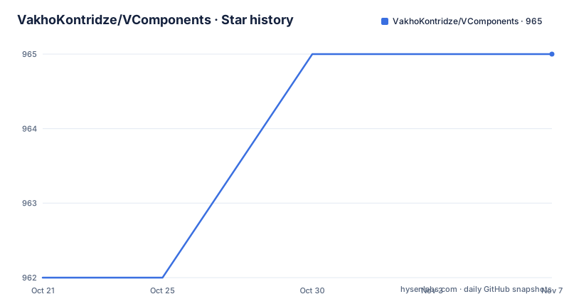
- VakhoKontridze/VComponents965 ★ · +3
| Repository | 2026-10-21 | 2026-11-07 |
|---|---|---|
| VakhoKontridze/VComponents | 962 | 965 |
3 Stars in the last 17 days, measured from the daily GitHub snapshot. Compare with other projects
Editorial analysis
A library organised by category, with the shape of the control in its name
VComponents is described in one sentence as a SwiftUI collection that contains reusable UI components. The catalogue in the README is organised into categories: buttons, state pickers, value pickers, inputs, containers, modals split into containers, alerts and notifications, indicators split into definite and indefinite, and a miscellaneous group.
What makes the catalogue unusual is the naming. Buttons come as VStretchedButton, VLoadingStretchedButton, VWrappedButton, VRectangularButton, VRectangularCaptionButton and VPlainButton. State pickers come as VToggle, VCheckBox, VRadioButton, VStretchedToggleButton, VWrappedToggleButton and VRectangularToggleButton. The pattern is that the geometry is part of the type, not a modifier you apply afterwards.
That is a real difference in how a team writes a screen. Instead of a Button with a frame modifier and a padding call and a background, you pick the variant that already has the layout you wanted. The cost is that the type list grows, and that a design that changes shape later may not fit any existing variant without adding one.
For a reader judging the library, the category structure is itself information. It says the author organised around what a control does and how it is sized, rather than around the screens of one product, which is the right way to build a reusable set.
Six button variants and what the loading one implies
The button group is the clearest evidence of the design philosophy. Six variants exist, and they are not styles of one button: they are different layouts.
Stretched is a button that fills the width it is given. Wrapped is a button that sizes itself to its content. Rectangular is a shape choice rather than a sizing one. RectangularCaptionButton is the same rectangle with caption styling. Plain removes the button chrome entirely, which is how you get a tappable label inside a custom row. VLoadingStretchedButton is the stretched button with a loading state built in.
That last one deserves attention because it shows where the author expects this library to be used. A loading state is not decoration, it is a state machine: a button that can be pressed, that shows progress, and that must not be pressed again while working. Building that into the component means every call site inherits the behaviour rather than reimplementing it.
The state picker group shows the same thinking applied to toggles. VToggle, VCheckBox and VRadioButton are the semantic controls, and VStretchedToggleButton, VWrappedToggleButton and VRectangularToggleButton are the layout variants of a toggle, mirroring the three sizing options offered by the buttons. A screen can therefore use a semantic checkbox in a form and a stretched toggle as a standalone element, and both come from the same family.
Three kinds of control, split by what the user is doing
The categories are not arbitrary. State pickers hold a boolean or a single choice, value pickers hold a number in a range, and inputs hold text.
Value pickers are VSlider and VRangeSlider. Inputs are VTextField, VTextView and VCodeEntryView, which is the one with an obvious domain: entering a code, as in a verification or one-time password field. Containers are VGroupBox, VDisclosureGroup, the indicator-backed static pager tab views, VDynamicPagerTabView and VCarousel, so the group covers grouping, progressive disclosure and paging in one category.
Indicators are split by whether the duration is known. The definite group is VProgressBar, VPageIndicator and VCompactPageIndicator, all of which can be told how far along they are. The indefinite group is VContinuousSpinner, the one case where the end is not known in advance.
The miscellaneous group is where the character of the library shows. VFetchingAsyncImage is a remote image with a loading state. VWrappingMarquee and VBouncingMarquee are scrolling text, one that wraps at the boundary and one that bounces back. VRollingCounter is a number that animates as it changes.
None of these are things SwiftUI gives you out of the box, and together they describe a library aimed at the everyday furniture of a consumer app rather than at data-heavy enterprise screens.
Modal presentation is deliberately not in this package
The modals in VComponents are VModal, VBottomSheet and VSideBar as containers, VAlert as an alert, and VNotification and VToast as notifications.
What the README does with them is the interesting part. For additional information on modal components it refers to the Modal Presenter documentation from VCore, a separate repository by the same author. So VComponents supplies the modal content views and VCore supplies the mechanism for presenting them.
That split is a deliberate architectural boundary and it has consequences for adoption. You will end up with two dependencies from the same author to get a full experience, and you need to read both documentations. The benefit is that the presentation logic, with its dismissal rules and animations, is in one place rather than duplicated per component.
The same author also publishes the customization and animations documentation referenced from the intro, so the story is coherent: VComponents for the views, VCore for the presentation mechanism, and shared documentation for how a component can be restyled and animated. The cost is that you are adopting an ecosystem with one maintainer, and the repository layout here does not contain the modal presentation code, so you cannot read it before deciding.
Adding the package through Swift Package Manager
The installation section of the README is short and points at Swift Package Manager, telling you to add the repository as a Swift package. The package reference itself is:
https://github.com/VakhoKontridze/VComponentsThe repository contains a Package.swift at the root, which is what makes the Swift Package Manager route work, along with a Package.resolved file. The Sources directory holds the component implementations, and a Documentation directory sits at the root next to a CHANGELOG.md, which is where the customization and animations material the README refers to is likely to live given that the README itself links to those documents by name.
There is a .swiftpm directory at the root, the standard location for Swift Package Manager configuration.
What the README does not state is worth noting, because it affects an evaluation. The Compatibility section is listed in the table of contents but the compatibility details are not stated in the README shown above, so the deployment target and the Swift version are not something to guess at. The Installation section likewise points at documentation rather than enumerating versions. For a library that is going into an app's dependency graph, those are the two facts to go and read before you commit.
A 9.x version line with releases days apart
The repository is not archived and the last push was on 2026-10-19. The recent releases show the cadence: 9.1.2 on 2026-10-19, 9.1.1 on 2026-10-14 and 9.1.0 on 2026-10-12.
Three patch releases in eight days is a fast pace for a UI component library. Read one way, it means the author ships fixes and refinements promptly, and a consumer on an older patch version is not far behind. Read another way, it means the API surface can still be moving, and a project that pins a version has a patch decision to make every week or two.
The major version being 9 rather than 1 tells you the project has been through breaking changes before. The CHANGELOG.md at the repository root is therefore the document to read before an upgrade, since with a library like this the breaking change is usually a rename or a changed initialiser signature of a view rather than a change in behaviour.
The licence is MIT, with the licence text in LICENSE.md at the repository root. That is the permissive end of the spectrum, so there is no question about using these components in a commercial app, and no copyleft obligation on the app you build with them.
Editorial conclusion
Adopt VComponents if you build iOS apps in SwiftUI and want a consistent component set that already encodes several layout variants per control, and you are willing to take a dependency on VCore for modal presentation. Do not adopt it if your app needs components outside the categories listed, or if a single library owning both components and presentation is a problem for your architecture. Verify first that the components you actually need exist in the current release, since the catalogue is organised into buttons, state pickers, value pickers, inputs, containers, modals, indicators and miscellaneous items, and that you can read the customization and animations documentation before committing to the API, because the README points to those documents for anything beyond the screenshots.
Frequently asked questions
How do I add VComponents to a SwiftUI project?
The README's installation section points at Swift Package Manager and asks you to add the repository as a Swift package. The package reference is https://github.com/VakhoKontridze/VComponents, and the repository contains a Package.swift at its root.
Does VComponents include bottom sheets and other modal presentation?
VComponents provides the modal views, including VModal, VBottomSheet, VSideBar, VAlert, VNotification and VToast, but the README refers to the Modal Presenter documentation from the separate VCore repository for how modals are presented.
What kinds of components does VComponents provide?
The catalogue covers buttons, state pickers, value pickers, inputs, containers, modals, indicators and miscellaneous items. Examples include VStretchedButton, VToggle, VCheckBox, VSlider, VRangeSlider, VTextField, VCodeEntryView, VCarousel, VProgressBar, VContinuousSpinner and VWrappingMarquee.
What licence is VComponents released under?
MIT, with the licence text in the LICENSE.md file at the repository root.
How often is VComponents released?
The recent releases include 9.1.2 on 2026-10-19, 9.1.1 on 2026-10-14 and 9.1.0 on 2026-10-12, and the last push was on 2026-10-19. The CHANGELOG.md at the repository root records the changes.
Official sources
Add this badge to your README
If you maintain this project, the badge below links readers to this analysis and shows its maintenance status from the daily GitHub snapshot. Paste the markdown into your README; add ?metric=license or ?metric=stars to the image URL for a different field.

[](https://hysenlabs.com/projects/vakhokontridze-vcomponents)Star history chart for your README
[](https://hysenlabs.com/projects/vakhokontridze-vcomponents)Was this useful?