Fast-Font: a font that bolds the first letters, and the OpenType file behind it
This font provides faster reading through facilitating the reading process by guiding the eyes through text with artificial fixation points.
At a glance
- What is it?
- Fast-Font is a set of fonts that emphasise the initial letters of words so the eye has artificial fixation points, shipped with an OpenType feature file and a userscript for applying it to arbitrary websites. Its engineering is a font feature, not an application.
- Who is it for?
- Adopt Fast-Font if you want to try bionic style emphasis for prose you control, such as an ebook, a long article or a reader mode setup, and you are willing to judge the effect yourself over a few sessions rather than expect a measured gain. Do not adopt it for body text on a product surface you do not own, since the technique changes the rendered glyphs of every word and the README documents the browser hack as something where you can expect glitching.
- Can I use it commercially?
- Yes. MIT is a permissive licence: you can use, modify and sell software built on it, as long as you keep its copyright and licence notices.
- Is it still maintained?
- Yes. The repository last received commits 142 days ago.
- What is it written in?
- Mainly HTML, according to GitHub's language statistics.
Answers come from the project's GitHub data, last synced on October 31, 2026, and from our analysis. They are not legal advice.
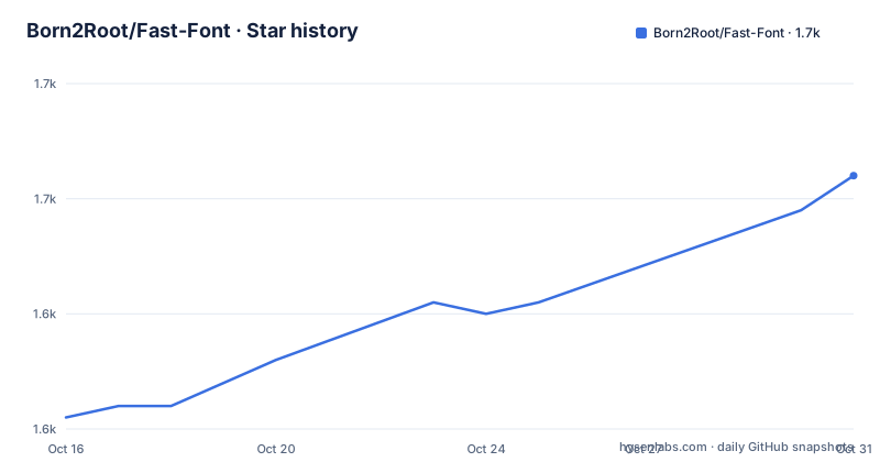
Star history
- Born2Root/Fast-Font1,652 ★ · +21
| Repository | 2026-10-16 | 2026-10-31 |
|---|---|---|
| Born2Root/Fast-Font | 1.6k | 1.7k |
21 Stars in the last 15 days, measured from the daily GitHub snapshot. Compare with other projects
Editorial analysis
The effect is a font feature, not a rendering service
Fast-Font's claim is that it provides faster reading by guiding the eyes through text with artificial fixation points. The reader focuses on the highlighted initial letters and lets the brain complete the word. The README headline demonstrates this on itself, with the first letters of each word in bold: "A fo nt to he lp you re ad fas ter."
The mechanism underneath is what makes it interesting to an engineer. This is not a service that reformats your text, and there is no client-side JavaScript in the font. The repository root contains `opentype_feature.fea`, an OpenType feature file, and the README's usage instructions turn on existing application features: in MS Word you select the text and enable "Use Contextual Alternates" in the OpenType Features panel. That is the whole trick. The font ships glyph substitutions keyed to that feature, and the reading application decides when to apply them.
That architecture has consequences. The font works offline with no network access and no additional code, which the README lists among its advantages. It also means the effect is entirely at the discretion of the host application. Anywhere you cannot enable contextual alternates, you are left with an ordinary font. That is the single constraint that shapes every usage section below.
Five variants, and only two of them are for code
There are five variations, and the choice among them is a language and context decision rather than a taste decision.
The first three are the reading variants: Fast Font with Serifs, Fast Font Sans without serifs, and Fast Font Sans with dots as spaces. The README states the first three are best suited for reading and offer support for the most languages. The serif and sans cuts give you the standard emphasis treatment.
The third variant is the interesting one technically. It inserts a little dot to stand in for whitespace, and the README credits the Space Reading technique Kam Knight discusses in "Speed Reading: Learn to Read a 200+ Page Book in 1 Hour". The reasoning is that instead of concentrating on individual words you look at the white spaces between every three or four words, and attention on the spaces stops the eyes narrowing their focus so you pick up more peripheral information. The font helps by making those gaps into a dot, because a dot is easier to fixate on than a gap. The README is honest that this is hard to get used to at the start.
The fourth variant, Fast Font Monospaced, is the one for editors, and it also supports coding ligatures. The README points at the FiraCode ligature documentation as a reference for what those ligatures look like. In VSCodium you select the font and set `"editor.fontLigatures": true`. Whether this is a good idea in your editor is your call: you are combining someone else's ligature scheme with an emphasis scheme on top of the same glyphs.
The fifth variant, Fast Font Dyslexic, is based on the OpenDyslexic typeface, which was designed against some common symptoms of dyslexia. That is a distinct design lineage, and it is worth evaluating on its own terms.
Firefox Reader Mode: a clean four-step install
The e-reader and browser cases get the most attention in the README, but the cleanest integration is Firefox Reader Mode, which turns the font into a selectable entry in a menu the reader already has.
You install the fonts, open `about:config`, search for `reader.font_type.values`, and set it to a JSON list of font family names:
["sans-serif","serif","monospace","Fast_Sans","Fast_Serif","Fast_Mono","Fast_Sans-Dotted","Fast OpenDyslexic"]The README warns that you must replace these with the actual family names installed on your system, which is the step people skip. Once a Reader Mode compatible page is open, the fonts appear in the Reader Mode font menu.
The userscript works on any site, with glitches
For arbitrary websites the approach is a userscript. Install Tampermonkey, which the README notes also works on mobile browsers, and load `AnyDeviceFastSerifBrowse.user.js` from the repository root. The file sits at the top level next to `index.html` and the `fast-fonts/` directory, so it is fetched from the repository rather than from a package registry.
The README sets expectations plainly: you can expect some glitching, but in general it should work, and on Firefox you can scale using text-only to reduce glitches. That is the honest characterisation of injecting a font into pages whose CSS you do not control. Layout shifts, fallback paths, and sites that set their own font stacks all produce artefacts, and the workaround offered is a Firefox-specific rendering mode rather than a fix in the script.
Two other entry points exist. There is a live text input demo at the project's GitHub Pages site, and a Hugging Face space that converts a PDF with the fast reading fonts applied, credited as a community deployment. For local testing the README points at `docs/test.html`, which you open directly in a browser.
The repository also carries `README_Tech.md` and `README_Tutorial.md` alongside the main README, plus a `docs/` directory and `fast-fonts-for-kindle/`. Note that the technical guide is linked from a fork URL rather than from this repository, which means the detailed background description is not guaranteed to track the current code.
Kindle: easy on new devices, tracked as a problem on older ones
The Kindle instructions are four manual steps: connect by USB so the device appears as a drive, create a `fonts` folder on it if one does not exist, copy the downloaded font files in, safely eject, then open a book and pick the font through the "Aa" display settings and the Font tab.
Two caveats are attached and both are worth reading before you start. The README says Kindle seems to handle fonts differently depending on the source of the books, bought from the store versus loaded locally from Calibre, and it points at issue #8 for problems. And it says only newer Kindles are that easy to handle, telling older devices below the 5th generation to consult that same issue. That is an admission that the easy path has a hardware generation boundary, and the boundary is documented only in an issue tracker.
Kobo is handled through a different route again, via the KoReader extension, with a GitHub issue and a corresponding Reddit thread linked as the reference. The pattern across all e-readers is the same: font files are copied in, and where the device has its own font pipeline you are relying on someone else's reported workaround rather than documented vendor behaviour.
A research artefact more than a library, and its licence
It is worth being clear about what kind of project this is. There is no package to install, no build step to run, and no API. You download font files. The repository is small: the fonts in `fast-fonts/`, the Kindle set in `fast-fonts-for-kindle/`, the userscript, the OpenType feature file, several markdown documents, an `index.html` for the demo, and a `docs/` directory with the demo GIF and screenshots.
There are no GitHub releases, so there is no versioned artefact to pin. The last push was on 2026-06-18, so the project is not dormant, but with no release tags you have to track the repository rather than a version number, and you have no way to say which state of the fonts you shipped.
The licence is MIT and the README states the project is completely open-source and free to use and distribute however you want, for anything from personal use to business. The one caveat is not legal but perceptual: the design's whole point is that it alters the appearance of text, so in contexts where the typography carries meaning, a presentation, a legal document, or anything where a reader's eyes are being guided, you are making a statement about readability on their behalf. That is a judgement call about your audience, and the MIT licence does not make it for you.
Editorial conclusion
Adopt Fast-Font if you want to try bionic style emphasis for prose you control, such as an ebook, a long article or a reader mode setup, and you are willing to judge the effect yourself over a few sessions rather than expect a measured gain. Do not adopt it for body text on a product surface you do not own, since the technique changes the rendered glyphs of every word and the README documents the browser hack as something where you can expect glitching. Verify first that your application exposes the contextual alternates feature, which is what MS Word requires, that the font family names you install match the names you configure, and that a monospaced cut with coding ligatures does not fight your editor's own ligature settings.
Frequently asked questions
How do I use Fast-Font in Microsoft Word?
Select the text and enable "Use Contextual Alternates" in the OpenType Features options. The font's emphasis is delivered through that existing OpenType feature, so if the application does not expose it the font renders normally.
How do I enable Fast-Font in Firefox Reader Mode?
Install the fonts, open `about:config`, search for `reader.font_type.values` and set it to a JSON list of the family names you actually installed, such as `["sans-serif","serif","monospace","Fast_Sans","Fast_Serif","Fast_Mono","Fast_Sans-Dotted","Fast OpenDyslexic"]`. The fonts then appear in the Reader Mode font menu.
Can I use Fast-Font on any website?
Yes, through a userscript. Install Tampermonkey and load `AnyDeviceFastSerifBrowse.user.js` from the repository. The README says to expect some glitching, and suggests Firefox text-only scaling to reduce it.
Which Fast-Font variation should I use for programming?
Fast Font Monospaced, which is intended for coding environments and supports coding ligatures. In VSCodium you select the font and set `"editor.fontLigatures": true`. The FiraCode ligature documentation is given as a reference for the ligature shapes.
Which Fast-Font variation is designed for dyslexia?
Fast Font Dyslexic, which is based on the OpenDyslexic typeface designed against some common symptoms of dyslexia. It is a separate design lineage from the serif, sans, dotted and monospaced reading variants.
Official sources
Add this badge to your README
If you maintain this project, the badge below links readers to this analysis and shows its maintenance status from the daily GitHub snapshot. Paste the markdown into your README; add ?metric=license or ?metric=stars to the image URL for a different field.

[](https://hysenlabs.com/projects/born2root-fast-font)Star history chart for your README
[](https://hysenlabs.com/projects/born2root-fast-font)Was this useful?