carbon-components-svelte: IBM's Carbon Design System as 100+ Svelte Components
Svelte implementation of the Carbon Design System
At a glance
- What is it?
- A Svelte component library that ports the Carbon Design System, with five themes, a typed TypeScript API and an optional preprocessor set for build size. It suits teams already committed to Carbon or Svelte, and it is a poor fit if you need a stable 1.0 API.
- Who is it for?
- Adopt carbon-components-svelte if your team has already chosen Svelte and wants Carbon's visual language without rebuilding it, especially if you need IBM's five themes and a typed component API. Do not adopt it if you need a stable 1.0 release line, since the latest release is v0.113.1 and the version is still 0.x, or if you are not using Svelte at all.
- Can I use it commercially?
- Yes. Apache-2.0 is a permissive licence: you can use, modify and sell software built on it, as long as you keep its copyright and licence notices.
- Is it still maintained?
- Yes. The repository received new commits within the last day.
- What is it written in?
- Mainly TypeScript, according to GitHub's language statistics.
Answers come from the project's GitHub data, last synced on November 22, 2026, and from our analysis. They are not legal advice.
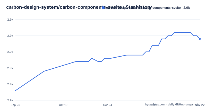
Star history
- carbon-design-system/carbon-components-svelte2,924 ★ · +16
| Repository | 2026-09-25 | 2026-11-22 |
|---|---|---|
| carbon-design-system/carbon-components-svelte | 2.9k | 2.9k |
16 Stars in the last 58 days, measured from the daily GitHub snapshot. Compare with other projects
Editorial analysis
The gap carbon-components-svelte fills
Carbon is IBM's open source design system, and its flagship implementation targets React. A Svelte team that wants Carbon's look and behaviour has two bad options otherwise: hand-port components, or wrap the React package and carry a framework runtime into a Svelte app. carbon-components-svelte exists to remove that choice. It is a Svelte component library that implements Carbon, and the README frames the goal plainly: ship accessible, consistent, production-ready interfaces.
The audience is narrow but real. You are building a Svelte or SvelteKit application, someone above you has decided the product should look like Carbon, and you would rather import a Button than reimplement one. The README lists the scope: 100+ components from inputs to data tables, five built-in themes (two light, three dark), a fully typed TypeScript API covering props, events and slots, and a WCAG 2.1 AA accessibility claim. The library also sits in a wider set of Carbon packages for Svelte, covering 2,700+ icons, 1,500+ pictograms, 25+ d3-powered charts, and a preprocessor collection.
That ecosystem is the actual selling point. A design system is not a button; it is a button, an icon set, a chart palette and a theme that agree with each other. If you only needed a button, you would not be reading about Carbon.
How styles, themes and components fit together
The library is published as ESM. The package.json sets "type": "module", points the svelte and main fields at ./src/index.js, and exposes types at ./src/index.d.ts. Components ship as .svelte source rather than a compiled bundle, which is why the exports map has entries for ./src/*.svelte and ./src/*.js. That matters: your bundler compiles the components, so Svelte version compatibility is decided at build time, not by a prebuilt artifact.
Styling is deliberately separate. The README states that you must apply Carbon component styles before importing components, and those stylesheets are compiled by a build script (scripts/build-css.ts) from Carbon's vendored carbon-components v10.58 SCSS, themed with Carbon v11 tokens and the library's own partials under css/. Six compiled stylesheets are shipped: white.css, g10.css, g80.css, g90.css, g100.css and all.css. The first five are single themes; all.css bundles all five using CSS custom properties.
Dynamic theming follows from that design. With all.css loaded, the active theme is read from a theme attribute on the html element, defaulting to "white". The README shows setting it declaratively in markup and programmatically through document.documentElement.setAttribute("theme", theme). There is also a Theme component for managing it reactively. The trade-off is honest: all.css ships every theme so you can switch at runtime, while a single-theme stylesheet ships less CSS but fixes the theme at build time.
The repository layout supports the claim that this is maintained as a real library rather than a demo: separate test trees for Svelte 3 and Svelte 4 (tests-svelte3/, tests-svelte4/), Playwright end-to-end tests, a bench/ directory, a perf Vite config, and example projects for Rollup, Vite, Webpack and SvelteKit. The last push to the repository was on 2026-11-02, and the most recent release listed is v0.113.1 on 2026-10-08.
Installing carbon-components-svelte and rendering a first component
Install the package with the package manager you already use. The README lists npm, pnpm, Yarn and Bun commands; the npm form is npm i carbon-components-svelte.
npm i carbon-components-svelteBefore any component renders correctly you need a Carbon stylesheet. Import exactly one theme at your top-level entry point, which the README describes as index.js or src/+layout.svelte. The default light theme is white.css.
import "carbon-components-svelte/css/white.css";If you want runtime theme switching instead, import the combined stylesheet and set the theme attribute on the html element. The default is "white", and valid values are white, g10, g80, g90 and g100.
<!doctype html>
<html lang="en" theme="g10">
  <body>
    ...
  </body>
</html>
Components are imported from the package root inside a Svelte script tag. The README's example uses Accordion and AccordionItem, where each item takes a title prop and an optional open flag.
<script>
  import { Accordion, AccordionItem } from "carbon-components-svelte";
</script>

<Accordion>
  <AccordionItem title="Section 1" open> Content 1 </AccordionItem>
  <AccordionItem title="Section 2"> Content 2 </AccordionItem>
</Accordion>
What you should see is a Carbon-styled accordion with the first section expanded. If the component renders but looks unstyled, check that the stylesheet import is present. The README points to the documentation site for per-component API details.
carbon-preprocess-svelte and the cost of barrel imports
The README states that carbon-preprocess-svelte is optional and not a prerequisite, and that it should be installed as a development dependency. It exists because the natural way to import from this library is also the slow way.
A barrel import like import { Button } from "carbon-components-svelte" makes the bundler walk a large index. The optimizeImports preprocessor rewrites those imports to direct source paths at compile time, and it does the same for carbon-icons-svelte and carbon-pictograms-svelte. The stated benefit is faster development and production compile times while keeping IDE typeahead and autocompletion intact.
The second tool, optimizeCss, is a build plugin that removes unused Carbon styles from production CSS.
npm i -D carbon-preprocess-svelteMy read: if you are shipping a Carbon app of any size, optimizeImports is close to mandatory in practice, because barrel imports of a 90+ component library are exactly the pattern that makes dev-server restarts feel slow. The library authors clearly know this, which is why the preprocessor package exists and why the README links it from the main page. The cost is one more build-time dependency and a preprocessor config to maintain.
Where carbon-components-svelte is the wrong choice
The version line is the first thing to weigh. The most recent release listed is v0.113.1, published on 2026-10-08, and the two before it are v0.112.2 and v0.111.3. This is a pre-1.0 library, and a minor version bump in a 0.x line can carry breaking changes. If your organisation requires a stable major version before adopting a component library, this is not that library today.
The second constraint is structural: the package ships Svelte source, not compiled components. That is good for tree-shaking and bad for anyone who wanted a framework-agnostic artifact. You cannot use this from React, Vue or plain HTML without a Svelte build step. If your application is not a Svelte application, the library has nothing to offer you.
Third, Carbon is a specific visual language. It is dense, enterprise-oriented and opinionated about spacing, type scale and colour. If your product's design direction is anything else, adopting this library means fighting it, and a smaller unstyled component set plus your own CSS would be less work. The five themes are Carbon themes, not a general theming system you can repoint at arbitrary brand tokens.
Finally, the repository has a CHANGELOG.md, so read it before moving between 0.x minor versions.
How this differs from React Carbon and from unopinionated Svelte kits
The closest comparison is Carbon's React implementation. Both implement the same design system. The Svelte stylesheets are compiled by scripts/build-css.ts from Carbon's vendored carbon-components v10 SCSS, themed with Carbon v11 tokens and this library's own partials. If your team is on React, use the React package; there is no reason to introduce Svelte to get Carbon.
The other comparison is with general-purpose Svelte component kits, such as Flowbite Svelte. Those give you a broad set of components with a lighter design opinion and let you supply the visual identity. Carbon Svelte does the opposite: it hands you IBM's identity and expects you to accept it. The difference shows up in the theming section. Flowbite-style kits typically expose design tokens you redefine; Carbon Svelte exposes five fixed themes selected by a theme attribute on the html element, with all.css bundling all five. That is a closed set by design.
If bundle size is your binding constraint, the README points to optimizeCss, which removes unused Carbon styles from production CSS, rather than swapping component libraries. It also notes that the SCSS sources are not published, and that compiling carbon-components v10 SCSS yourself gives v10 colors and type and misses styles for components and variants that only this library provides.
Maintenance, licensing and what upgrades cost
The repository is not archived, and its last push was on 2026-11-02. The most recent release listed is v0.113.1 on 2026-10-08. The test layout is a useful signal about what the maintainers actually support: tests-svelte3/ and tests-svelte4/ are separate test directories at the repository root. There is also a Playwright end-to-end suite and a perf config. That is more verification infrastructure than most component libraries carry, and it tells you which Svelte majors are in scope.
The upgrade cost is mostly the pre-1.0 version line. Because components ship as source and are compiled by your bundler, a minor release can change a component's internals or its TypeScript types in ways that surface as build errors in your app rather than at install time. Budget for reading CHANGELOG.md before bumping, and for running your own type checks, since the library's own svelte-check runs are not a substitute for checking your usage.
On licensing: the package declares Apache-2.0 in both the repository metadata and package.json, and the repository carries a LICENSE file plus a SECURITY.md and CONTRIBUTING.md. Apache-2.0 is a permissive licence with an explicit patent grant and notice requirements. I am not giving legal advice; if you redistribute the library or modified versions of it, have your own counsel confirm what notices you must carry.
Editorial conclusion
Adopt carbon-components-svelte if your team has already chosen Svelte and wants Carbon's visual language without rebuilding it, especially if you need IBM's five themes and a typed component API. Do not adopt it if you need a stable 1.0 release line, since the latest release is v0.113.1 and the version is still 0.x, or if you are not using Svelte at all. Before committing, verify that the components you need exist in the docs site, check that your Svelte version is covered by the tests-svelte3 and tests-svelte4 suites in the repository, and confirm which Carbon theme your product requires so you import one stylesheet rather than all.css.
Frequently asked questions
How do I install carbon-components-svelte?
Install it with your package manager, for example npm i carbon-components-svelte. Then import one Carbon stylesheet at your top-level entry point before importing any components.
Which themes does carbon-components-svelte support?
Five: white (the default light theme), g10 (light), and g80, g90 and g100 (dark). Each has its own compiled stylesheet, and all.css bundles all five using CSS custom properties for runtime switching.
How do I switch themes at runtime in carbon-components-svelte?
Import carbon-components-svelte/css/all.css instead of a single theme, then set the theme attribute on the html element to one of white, g10, g80, g90 or g100. The README also mentions a Theme component for managing this reactively.
What is carbon-preprocess-svelte used for?
It is an optional development dependency. Its optimizeImports preprocessor rewrites barrel imports from Carbon components, icons and pictograms to direct source paths to speed up compile times, and its optimizeCss build plugin removes unused Carbon styles from production CSS.
Does carbon-components-svelte work with Svelte 3 and Svelte 4?
The repository contains separate test workspaces named tests-svelte3 and tests-svelte4, which indicates both majors are covered by the project's test setup.
Official sources
Add this badge to your README
If you maintain this project, the badge below links readers to this analysis and shows its maintenance status from the daily GitHub snapshot. Paste the markdown into your README; add ?metric=license or ?metric=stars to the image URL for a different field.

[](https://hysenlabs.com/projects/carbon-design-system-carbon-components-svelte)Star history chart for your README
[](https://hysenlabs.com/projects/carbon-design-system-carbon-components-svelte)Was this useful?