Shimmer From Structure: skeleton loaders measured from your rendered UI
A structure-aware skeleton loader that mirrors your rendered UI at runtime. Zero layout duplication. Built for modern frameworks.
At a glance
- What is it?
- Shimmer From Structure is a TypeScript library that generates skeleton loading states by measuring a component's structure at runtime, so you wrap existing markup instead of maintaining a parallel skeleton component. It ships separate adapters for React, Vue, Svelte, Angular and SolidJS, and the repository is an npm workspace with one package per framework.
- Who is it for?
- Shimmer From Structure fits a team that has given up on maintaining hand-written skeleton components alongside real ones, and is willing to accept a runtime measurement step and a per-framework package instead of a single portable component, especially on React where the adapter lives in the main package.
- Can I use it commercially?
- Yes. MIT is a permissive licence: you can use, modify and sell software built on it, as long as you keep its copyright and licence notices.
- Is it still maintained?
- Yes. The repository last received commits 34 days ago.
- What is it written in?
- Mainly TypeScript, according to GitHub's language statistics.
Answers come from the project's GitHub data, last synced on November 7, 2026, and from our analysis. They are not legal advice.
Star history
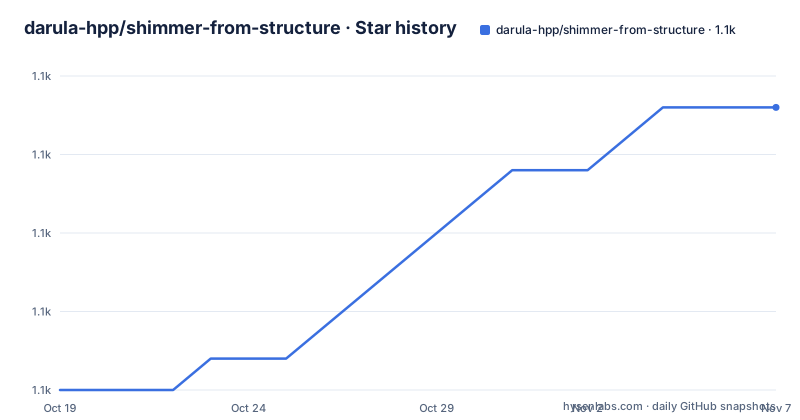
- darula-hpp/shimmer-from-structure1,134 ★ · +9
| Repository | 2026-10-19 | 2026-11-07 |
|---|---|---|
| darula-hpp/shimmer-from-structure | 1.1k | 1.1k |
9 Stars in the last 19 days, measured from the daily GitHub snapshot. Compare with other projects
Editorial analysis
The problem is maintaining two versions of every component
The library starts from a complaint about skeleton loaders, and the complaint is worth stating precisely because the whole design follows from it.
The traditional approach requires you to manually create skeleton components that mirror your real components, to maintain two versions of each component, one real and one skeleton, and to update the skeletons every time your layout changes. That last point is where it usually breaks down. The skeleton is a second implementation of the same layout, it is a copy, and copies drift.
Shimmer From Structure takes the opposite approach. It is described as a structure-aware skeleton generator that mirrors your rendered UI at runtime, and the claim in the project description is zero layout duplication. The mechanism is measurement rather than duplication: the library inspects the structure your component actually produced and generates a shimmer state that matches the real dimensions, so when a layout changes, the skeleton changes with it because it is derived from the same tree.
The features list names the consequences directly. It works with React, Vue, Svelte, Angular and SolidJS through simple framework-specific adapters, it automatically measures the component's structure at runtime, it generates shimmer effects that match actual dimensions, it needs zero maintenance, it works with complex nested structures, it supports dynamic data through `templateProps`, it preserves container backgrounds during loading, and it auto-detects border-radius from your CSS.
That last one is a small detail with a large visible effect. A skeleton whose corners are square under a rounded card looks broken, and inferring the radius from the stylesheet rather than asking the developer to pass it in keeps the two in sync.
React imports from the main package, the other four from scoped adapters
The packaging is the first thing that trips people up, and the documentation is explicit about the difference.
React support is built into the main package for backward compatibility, which means the import path is the bare package name:
// React projects (or @shimmer-from-structure/react)
import { Shimmer } from 'shimmer-from-structure';
Everything else needs its own adapter package. Vue 3 imports from `@shimmer-from-structure/vue`, Svelte from `@shimmer-from-structure/svelte`, Angular from `@shimmer-from-structure/angular` and SolidJS from `@shimmer-from-structure/solid`. The Angular one also differs in shape, since the Angular binding is a component rather than a wrapper function: it exports `ShimmerComponent` rather than `Shimmer`.
The comment in the React example also mentions `@shimmer-from-structure/react` as an equivalent path, which points at the repository's move towards one package per framework, with the main package kept working for existing React users.
The repository is an npm workspace that reflects this structure. The root `package.json` has `packages/*` and `examples/*` as its workspaces, and the build script runs a separate build per package in order: core, React, Vue, Svelte, Angular, Solid, then the main package. There is a `@shimmer-from-structure/core` package that the framework packages build on, and the root package is marked private at version 2.4.1, which makes it the monorepo root rather than a published artefact.
The scripts use the npm workspace flags throughout, so `npm run test` runs the test script in every workspace with `--if-present`, and `npm run dev` does the same for the dev script. Releases go through changesets, with a `changeset` script for adding one and a `release` script that builds everything and then publishes.
Wrapping existing markup is the whole integration surface
Usage in every framework follows the same shape. You import a `Shimmer` component, pass it a `loading` prop, and put your existing markup inside it.
In React:
import { Shimmer } from 'shimmer-from-structure';

function UserCard() {
  return (
    <Shimmer loading={isLoading}>
      <div className="card">
        <img src="avatar.jpg" className="avatar" />
        <h2>John Doe</h2>
        <p>Software Engineer</p>
      </div>
    </Shimmer>
  );
}
The Vue version uses a template with `:loading`, the Svelte version uses `$state` for the flag, the Angular version uses a signal and a standalone component with `imports: [ShimmerComponent]`, and the SolidJS version uses `createSignal`. The differences are the framework's, not the library's, which is the point of having adapters.
The API surface is deliberately small. One component, one loading flag, and the children are your real content. There is no configuration object for the shimmer colour, no separate skeleton markup to write, and no second component to keep in sync with the first.
The `templateProps` mechanism is the one addition. It exists for components that receive their data through props, where the real content cannot be rendered with empty values. The pattern is to pass mock data through `templateProps` so the structure can be measured:
<Shimmer loading={loading} templateProps={{ user: userTemplate }}>
  <UserCard user={user || userTemplate} />
</Shimmer>
The child is rendered with the template values while loading, which is how the library gets a structure to measure without your component having to survive null props. It also means the mock data is written once and used for both the measurement and the fallback render.
Runtime measurement means the skeleton only exists after something renders
The library's central strength is also its main constraint, and it deserves to be stated plainly rather than discovered in production.
If the shimmer is generated by measuring the structure your component produced, then something has to have produced that structure. On the very first paint of a page that has never rendered, there is no measured tree, so there is nothing for the skeleton to mirror. In practice this pushes the design towards a component that renders once with template or placeholder data, and the shimmer is the visual treatment applied to that first render rather than a separate pre-rendered placeholder.
That is a different model from a hand-written skeleton, and for most applications it is a better one, because the placeholder is guaranteed to be the real layout. But it means the library is not a way of showing a placeholder before any JavaScript has executed. If your requirement is a static, server-rendered placeholder that matches the final layout exactly, including the first byte, this approach does not provide that, and a hand-written skeleton or a CSS-only placeholder is the better fit.
The other runtime consequences are milder. The measurement costs work at render time, and the shimmer is a visual overlay on real content rather than a lighter substitute for it, so the underlying component is mounted during loading. For a list of many rows, that means many real components exist while loading, which is a different resource profile from rendering simple placeholder rectangles.
The `templateProps` option, the preserved container backgrounds and the auto-detected border radius all point the same way. This is a library that works with your real UI, not around it.
Adapters mean five packages to track instead of one
The framework breadth is the feature that makes the project interesting and the feature that costs you something.
Each framework package depends on the `@shimmer-from-structure/core` package, and each is published separately with its own version. The release history shows that happening in practice: the tags include `[email protected]`, `@shimmer-from-structure/[email protected]` and a `v2.4.6` release, and the Vue one was published on the same day as the 2.5.0 main package, with a separate 2.4.5 for Vue rather than a shared 2.5.0.
So a team that keeps both a React app and a Vue app inside one organisation ends up with two versions of the same library in the dependency tree, and the versions need not match. That is the practical cost of the adapter approach, and it is worth checking before you standardise on this across a multi-framework codebase.
A second versioning detail deserves attention. The root `package.json` in the repository is version 2.4.1 and marked private, while the published versions have run ahead of it, to 2.4.6 and 2.5.0. The root version is the monorepo's own number rather than the release number of any package, so do not read it as the version you will install.
The repository also carries a `MIGRATION.md` file at the root, next to `CHANGELOG.md` and `CONTRIBUTING.md`, which indicates that the import paths have changed at some point and that upgrading across that boundary is not automatic. The `.changeset/` directory and the `changeset` script confirm that version bumps are decided per package, so a release can touch one adapter without the others.
The last push was on 2026-10-04 and the project is MIT licensed.
Against a CSS-only placeholder or a maintained skeleton component
The realistic alternatives are the two things the project says you have to do today, and each wins on a different axis.
A CSS-only placeholder, a shimmering grey block on a background, is the cheapest option by a wide margin. One class, no JavaScript, no measurement, nothing to install. It also tells the user nothing about the shape of what is coming, so a screen of identical grey rectangles is a weaker signal than a skeleton that shows a card with a title line, an image block and a paragraph line in the right places. The library's argument is entirely about that signal quality, and it is a fair one on a screen where the layout is complex.
A hand-written skeleton component is the other alternative, and it is the one this library replaces. Its advantage is total control, including over what appears before any data exists, and it is a pure function of your own markup with no runtime cost. Its disadvantage is exactly the one the project describes: it is a second implementation of the layout, so it drifts, and someone has to update it every time the design changes.
The difference in approach is therefore: measurement derived from the real tree, versus a copy of the tree maintained by hand. Runtime cost and a first-paint gap on one side, maintenance churn and layout drift on the other. For a fast-changing product with a complex screen, the trade usually favours measurement. For a stable screen, or a critical first impression on a slow connection, the hand-written skeleton still wins.
Editorial conclusion
Shimmer From Structure fits a team that has given up on maintaining hand-written skeleton components alongside real ones, and is willing to accept a runtime measurement step and a per-framework package instead of a single portable component, especially on React where the adapter lives in the main package. It does not fit a project that needs the loading placeholder to be pixel-identical before any data exists, because the structure is only known once something has rendered, nor a team that wants one dependency for all five frameworks. Before adopting, read the MIGRATION.md file at the root of the repository and check which adapter import path your framework expects, because React imports from the main package while the other four import from a scoped adapter package.
Frequently asked questions
How do I install Shimmer From Structure?
The main package installs with `npm install shimmer-from-structure`, or `yarn add shimmer-from-structure` and `pnpm add shimmer-from-structure` for the other package managers. The other frameworks install from their own scoped adapter package, for example `@shimmer-from-structure/vue`.
Which frameworks does Shimmer From Structure support?
React, Vue, Svelte, Angular and SolidJS. React support is built into the main package for backward compatibility, while Vue, Svelte, Angular and SolidJS import from their own adapter packages, and Angular uses a `ShimmerComponent` rather than a `Shimmer` function.
What is templateProps for in Shimmer From Structure?
It supplies mock data for components that receive their content through props, so the library has a structure to measure while loading. The child is rendered with those template values, which is how the skeleton matches the real layout without the component having to handle null props.
Is Shimmer From Structure still being updated?
The repository is not archived and the last push was on 2026-10-04. Recent releases include 2.4.6 and 2.5.0, with per-framework packages versioned separately, for example `@shimmer-from-structure/[email protected]`. The project is MIT licensed.
Official sources
Add this badge to your README
If you maintain this project, the badge below links readers to this analysis and shows its maintenance status from the daily GitHub snapshot. Paste the markdown into your README; add ?metric=license or ?metric=stars to the image URL for a different field.

[](https://hysenlabs.com/projects/darula-hpp-shimmer-from-structure)Star history chart for your README
[](https://hysenlabs.com/projects/darula-hpp-shimmer-from-structure)Was this useful?