React Bits: 215+ animated React components delivered through shadcn and jsrepo registries, not npm
React Bits is a library of 140+ animated, customizable React components for text, backgrounds, and UI, offered as copy-paste-ready JS/TS variants with CSS or Tailwind.
At a glance
- What is it?
- React Bits is DavidHDev's free catalog of animated text, backgrounds and interface components for React, each offered in JavaScript or TypeScript with CSS or Tailwind. It installs component by component from registry URLs, which gives you editable source but no versioned package, and its license field does not resolve to a standard license.
- Who is it for?
- React Bits fits React developers who want a single animated effect, such as split text or a shader background, dropped into a project as editable source and are happy to own that code afterwards. It fits poorly if you need a versioned npm dependency with release notes, or a clear standard license for a commercial product.
- Can I use it commercially?
- Check first. The repository uses a licence we do not classify automatically, so read its LICENSE file before any commercial use.
- Is it still maintained?
- Yes. The repository received new commits within the last day.
- What is it written in?
- Mainly JavaScript, according to GitHub's language statistics.
Answers come from the project's GitHub data, last synced on November 13, 2026, and from our analysis. They are not legal advice.
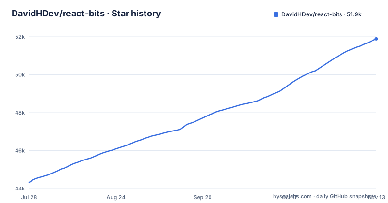
Star history
- DavidHDev/react-bits51,889 ★ · +7,571
| Repository | 2026-07-28 | 2026-11-13 |
|---|---|---|
| DavidHDev/react-bits | 44.3k | 51.9k |
7,571 Stars in the last 108 days, measured from the daily GitHub snapshot. Compare with other projects
Editorial analysis
A name suffix picks one of four flavors per component
Every component exists in four versions: JavaScript or TypeScript, styled with plain CSS or with Tailwind. You choose by suffix on the component name, first JS or TS, then CSS or TW. SplitText-TS-TW is the TypeScript, Tailwind build of the split text animation. With the shadcn CLI the registry is addressed as @react-bits:
npx shadcn@latest add @react-bits/SplitText-TS-TWWith jsrepo you pass the full registry URL instead:
npx jsrepo@latest add https://reactbits.dev/r/SplitText-TS-TWThe third route is manual: open a component's Code tab on reactbits.dev, pick the flavor and paste the files into your project. The suffix scheme is simple, but it puts a decision on you at the first install. Mixing SplitText-TS-TW with another component in its JS-CSS form leaves a codebase with two styling approaches, so settle on one pair before you add the second component.
There is no versioned package to pin or upgrade
The repository's package.json is named react-bits, marked private and set to version 0.0.0, and the project has no GitHub releases. The library is a website plus a component registry, built with the registry:build script, which runs jsrepo build, and configured in jsrepo.config.ts. Components are served from reactbits.dev/r/ as JSON files that the CLIs resolve. For a reader this changes how maintenance works. You do not add React Bits to your dependencies and bump a version when a fix lands. Once a component's files are in your project they are your code, and pulling a later improvement means adding it again and reconciling any edits you made. There is also no release changelog to tell you which components changed. Teams that audit dependencies by version number will need another way to track what they copied and when.
Coding agents reach the catalog through the shadcn MCP server
React Bits works with the shadcn MCP server, and the named clients are Claude Code, Cursor, Codex, VS Code and Antigravity. The setup is two steps. First, register the React Bits registry in your project's components.json:
{
  "registries": {
    "@react-bits": "https://reactbits.dev/r/{name}.json"
  }
}
Then connect your client. For Claude Code the command is:
npx shadcn@latest mcp init --client claudeAfter that you can ask the agent for a component and it finds and adds it. The MCP guide at reactbits.dev/get-started/mcp covers the other clients. The {name} placeholder in the registry URL is the same suffixed name used on the command line, so an agent still has to choose a flavor, and it is worth telling it which JS or TS and CSS or TW pair your project uses.
Backgrounds are the largest of five categories
The catalog is split into five categories, each with a live demo and controls on the site. Backgrounds is the biggest at 63 entries: gradients, particles, grids and shader effects meant to fill whole sections. Components has 48 cards, navigation pieces, carousels and galleries. Animations has 38 cursor effects, hover interactions, borders and image effects. Micro has 34 buttons, toggles, indicators and other small interface details. Text Animations has 33, covering split text, typewriters, rotating words and scroll reveals. That totals 216, matching the project's own 215+ figure. The weighting tells you what React Bits is for. It is a visual effects library first, and the Components category is about presentation pieces like carousels and galleries, not form controls or data tables. If you need a full interface kit, this catalog will cover the decorative layer and leave the rest to something else.
The license is not detected as a standard one
GitHub reports the license as NOASSERTION, which means the LICENSE.md file in the repository does not match a standard license it recognizes. The project describes itself as open source and says React Bits stays free forever, but free to use and a known license with known terms are not the same thing. The consequence is practical for anyone shipping commercial work: you cannot assume MIT or Apache terms just because the code is public and the site says free. Read LICENSE.md yourself before copying components into a client project or a product, and keep a note of which components you used. The same applies to Pro, whose files are sold as source you own, under terms set on pro.reactbits.dev rather than in this repository.
Five browser tools export assets, not just code
Alongside the components, reactbits.dev hosts five free creative tools that run in the browser. Background Studio lets you start from a preset of any animated background, tune it live and export code, a high resolution image, or a looping MP4 or WebM video. Center Stage places a screenshot or screen recording on phone, laptop and browser frames with 3D tilt, depth of field, shadows and type, and exports 4K images, 4K video, GIFs or a link. Shape Magic builds a logo mark from shapes, patterns, text or your own SVG, applies materials such as chrome, glass or neon, and exports SVG, PNG, favicons, video or React. Texture Lab runs photos, video or camera input through 160 one-click styles and 75+ stackable effects. Sound Lab offers 200 interface and video sounds with reverb, echo and filter, downloadable as WAV, MP3 or OGG. The video export in Background Studio is useful when a page cannot afford a live shader.
Complete pages and templates sit behind React Bits Pro
The free catalog stops at individual effects. React Bits Pro is the paid tier that goes from those effects to complete pages, product UI, templates and an Agent Kit, delivered as source you can edit. Pricing is pay once, with lifetime access to future updates. A free template and agent skill are available at reactbits.dev/pro without checkout, which is the way to see how Pro fits before paying. For a reader the boundary is clear: the open repository gives you building blocks, and assembling them into a landing page is your work unless you buy Pro. The README links to Pro several times, so expect the free library to function partly as the entry point for the paid one.
Contributing means running a Vite site beside a registry watcher
The repository is the reactbits.dev site itself. The dev script uses concurrently to run two processes, labelled registry and docs: npm run registry:dev, which runs scripts/watchRegistry.js, and vite. The build is a long chain: check:prop-docs, sounds:build, registry:build, llms:text, sitemap, rss, vite build, og:routes and verify:seo, so a missing prop doc fails the build before Vite starts. A new:component script runs scripts/generateComponent.js to scaffold an entry, and lint runs ESLint with --max-warnings 0, so any warning fails it. Contribution rules are in CONTRIBUTING.md. The last push to main was on 31 October 2026.
Editorial conclusion
React Bits fits React developers who want a single animated effect, such as split text or a shader background, dropped into a project as editable source and are happy to own that code afterwards. It fits poorly if you need a versioned npm dependency with release notes, or a clear standard license for a commercial product. Before adopting it, read LICENSE.md in the repository, pick one flavor suffix for the whole project, and decide whether complete pages and templates matter enough to need the paid Pro tier.
Frequently asked questions
Is React Bits free to use?
Yes. React Bits offers 215+ free animated components and backgrounds and says it stays free forever. React Bits Pro, with complete pages, templates and an Agent Kit, is a paid one-time purchase.
How do I install React Bits components?
Add one component at a time with npx shadcn@latest add @react-bits/SplitText-TS-TW, or with npx jsrepo@latest add https://reactbits.dev/r/SplitText-TS-TW. You can also copy the files from a component's Code tab on reactbits.dev.
What is React Bits?
React Bits is an open source collection of animated, interactive and customizable React components for websites. Each component comes in JavaScript or TypeScript, styled with CSS or Tailwind.
How do I use React Bits backgrounds?
The Backgrounds category has 63 gradients, particles, grids and shader effects that install like any other component. Background Studio on reactbits.dev also lets you tune a background and export code, an image, or MP4 or WebM video.
Official sources
Add this badge to your README
If you maintain this project, the badge below links readers to this analysis and shows its maintenance status from the daily GitHub snapshot. Paste the markdown into your README; add ?metric=license or ?metric=stars to the image URL for a different field.

[](https://hysenlabs.com/projects/davidhdev-react-bits)Star history chart for your README
[](https://hysenlabs.com/projects/davidhdev-react-bits)Was this useful?