ShapeView: shape backgrounds as Android layout attributes
Shape 支持在布局中直接定义啦,支持设置阴影,文字渐变色,状态选择器
At a glance
- What is it?
- ShapeView is an Android library that lets a layout declare rounded, gradient and state aware backgrounds directly on a widget, with attributes for the shape type, per corner radii, per state colours and gradient geometry, plus a builder API for changing them at runtime. It suits Android teams that write a lot of custom UI, and it adds a large attribute namespace and a support library boundary to consider.
- Who is it for?
- Adopt ShapeView if your Android screens are full of custom buttons and panels and you want the shape, the corner radii, the gradient and the pressed or disabled colours declared next to the widget instead of in a separate drawable resource, because that is what the library is for.
- Can I use it commercially?
- Yes. Apache-2.0 is a permissive licence: you can use, modify and sell software built on it, as long as you keep its copyright and licence notices.
- Is it still maintained?
- Yes. The repository last received commits 31 days ago.
- What is it written in?
- Mainly Java, according to GitHub's language statistics.
Answers come from the project's GitHub data, last synced on November 7, 2026, and from our analysis. They are not legal advice.
Star history
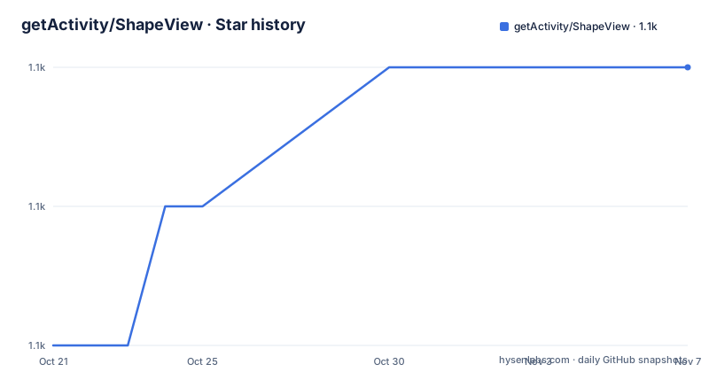
- getActivity/ShapeView1,059 ★ · +2
| Repository | 2026-10-21 | 2026-11-07 |
|---|---|---|
| getActivity/ShapeView | 1.1k | 1.1k |
2 Stars in the last 17 days, measured from the daily GitHub snapshot. Compare with other projects
Editorial analysis
What the library actually changes
ShapeView is an Android library whose purpose is to let you declare the shape of a view directly in the layout, rather than pointing the view at a drawable resource.
The description in the project puts it as supporting direct definition in a layout, with shadows, text gradient colours and state selectors. The list of view types the repository topics name gives the coverage, and it is broad: ShapeButton, ShapeTextView, ShapeEditText, ShapeImageView, ShapeFrameLayout, ShapeLinearLayout, ShapeRelativeLayout, ShapeConstraintLayout, alongside the older SuperTextView name.
So the pitch is that a button with a rounded, gradient, press-aware background is described with attributes on the button, in the same file, next to its text and its constraints, rather than in a drawable XML file that lives somewhere else and has to be kept in step with the layout.
That is a real convenience and a real trade. The convenience is locality and the reduction of file count. The trade is a namespace full of attributes, a dependency on JitPack, and a documented rule about which attribute names work in which version, which the README handles with a separate adaptive documentation file.
The licence is Apache-2.0, the current release is 11.3 from 2026-10-08, and the previous ones are 11.0 from 2026-05-01 and 10.0 from 2025-09-03, so the version numbers move quickly.
The shape model: type, size and the many corner attributes
The attribute reference in the README is the substance of the library, and the shape type comes first.
The shape_type attribute is an enum with four values: rectangle as the default, oval, line and ring. The width and height are separate dimension attributes, so a line is described by its own size rather than by a fill.
The corner radii are where the attribute count starts to grow, and the reason is localisation. There is a general shape_radius, and then a specific attribute for each corner in both the left and right variants of the API level: shape_radiusInTopLeft and shape_radiusInTopStart, shape_radiusInTopRight and shape_radiusInTopEnd, shape_radiusInBottomLeft and shape_radiusInBottomStart, and shape_radiusInBottomRight and shape_radiusInBottomEnd.
The Start and End variants are the direction aware ones, and they exist so that a radius follows the reading direction of the locale, which is a small piece of internationalisation that most custom backgrounds get wrong.
The documentation also mentions per corner radius overrides elsewhere, so a radius can be set per corner rather than only for the shape as a whole, which is what you need when one corner is rounded and the others are not.
State colours and gradients, all in the layout file
The colour attributes are the same idea repeated for every state and every layer, and understanding the pattern is easier than reading all of them.
For the fill, there is shape_solidColor for the default state, and then shape_solidPressedColor, shape_solidCheckedColor, shape_solidDisabledColor, shape_solidFocusedColor and shape_solidSelectedColor for the pressed, checked, disabled, focused and selected states. The stroke has the same set of six, with shape_strokeColor as the default and the matching state variants.
That is a state selector expressed as attributes rather than as a separate selector resource and a reference to it, which is the feature the description calls state selectors.
The gradients are where the attribute list gets long. For the fill there are three gradient colours, shape_solidGradientStartColor, shape_solidGradientCenterColor, which the documentation marks as optional, and shape_solidGradientEndColor, and the same pattern for the stroke.
The geometry is configurable too. The gradient type is an enum of linear, which is the default, radial and sweep. The orientation is another enum with a set of angles, from leftToRight at 0 degrees through rightToLeft at 180 and bottomToTop at 90 to the four diagonals, with both the plain and the Start/End variants for the ones where direction matters. And there are the centre coordinates, shape_solidGradientCenterX and shape_solidGradientCenterY, both defaulting to 0.5, plus shape_solidGradientRadius for the radial case, whose format is a float, a fraction or a dimension.
So a gradient fill with a specific geometry, a separate gradient stroke, and a different colour for the pressed state, is all expressible in the layout without a single drawable file.
The Java API, and the call you must not forget
The runtime API is a builder, and it has one sharp edge that the code comments point out twice.
ShapeButton shapeButton = findViewById(R.id.btn_main_test);
shapeButton.setOnClickListener(new View.OnClickListener() {
    @Override
    public void onClick(View v) {

        shapeButton.getShapeDrawableBuilder()
                .setSolidColor(0xFF000000)
                .setStrokeColor(0xFF5A8DDF)
                // 注意:最后需要调用一下 intoBackground 方法才能生效
                .intoBackground();

        shapeButton.getTextColorBuilder()
                .setTextColor(0xFFFFFFFF)
                // 注意:最后需要调用一下 intoTextColor 方法才能生效
                .intoTextColor();

        shapeButton.setText("颜色已经改变啦");
    }
});
The builder accumulates changes, and nothing happens until you commit it. The comment on the background builder says that in the end you need to call the intoBackground method for it to take effect, and the comment on the text colour builder says the same about intoTextColor.
That is the footgun. A builder that silently does nothing until a terminal call is called is a different thing from a builder that applies each setter as it goes, and the difference shows up as a button that does not change colour and a developer who cannot work out why.
There are two builders, one for the shape itself and one for the text colour, which is what lets a widget have a gradient text colour separate from its background. And the pattern is not limited to a click handler, it is the same builder you would use to restyle a widget when a state changes.
Installing through JitPack, and where the repository goes
The integration is a remote dependency, and the repository declaration depends on your Gradle version.
If your Gradle configuration is below 7.0, the repository goes in the build.gradle file, in an allprojects block.
allprojects {
    repositories {
        // JitPack 远程仓库:https://jitpack.io
        maven { url 'https://jitpack.io' }
    }
}
From Gradle 7.0 onwards, it goes in the settings.gradle file instead, inside dependencyResolutionManagement.
dependencyResolutionManagement {
    repositories {
        // JitPack 远程仓库:https://jitpack.io
        maven { url 'https://jitpack.io' }
    }
}
Then the dependency itself is declared in the app module's build.gradle file, and the README also sets the Java compatibility while it is there.
dependencies {
    // ShapeView:https://github.com/getActivity/ShapeView
    implementation 'com.github.getActivity:ShapeView:11.3'
    // ShapeDrawable:https://github.com/getActivity/ShapeDrawable
    implementation 'com.github.getActivity:ShapeDrawable:5.0'
}
Two artifacts, ShapeView and ShapeDrawable, at versions 11.3 and 5.0. The version numbers in the dependency string are the release numbers, so a JitPack coordinate here is a tag in the repository, which means the upgrade path is a version bump in the build file.
There is a jitpack.yml at the root of the repository, which is the configuration for that build, and the app module in the repository is the demo application, with a downloadable APK attached to the releases.
The AndroidX boundary, and the support library escape hatch
There is a compatibility section in the README, and its conclusion is that the escape hatch is not a good idea.
The first option is to stay on the old remote dependencies, with ShapeView at 10.0 and ShapeDrawable at 3.3. That is the path for a project that has not migrated.
The second option is to use Google's Jetifier standalone tool to convert the published aar packages from the releases into Support compatible aar packages, in reverse mode.
The README says to choose one of the two, but still advises against both, because they are expedient measures rather than long term ones, and because the framework's later versions no longer support Support projects. The recommended solution is to migrate the project to AndroidX, and there is a linked guide for that migration.
That is a genuine constraint for an Android team, because it means the library is a reason to migrate rather than a reason to stay. A team that is still on Support has to either take version 10.0, run a conversion step in the build, or move.
The version numbers line up with that split. 10.0 is the last release that supports the old library, and 11.x is the AndroidX line, with 11.0 in May 2026 and 11.3 in October 2026, so the churn since the split has been fast.
The limits, and how it compares to a drawable resource
Two things to weigh before you adopt it.
The first is the alternative. The conventional way to do all of this is a shape drawable in a drawable resource, referenced with android:background, and for state colours a selector resource. That approach has no dependency, no JitPack repository to configure, no large attribute namespace, and no version compatibility question at all. What it does not have is locality, since the background lives in a different file from the widget, and it makes a per-widget gradient or a per-corner radius an extra file each.
So the honest comparison is file count against coupling. ShapeView reduces the number of files and puts the shape next to the widget, and it charges for that with a dependency, an attribute namespace that will collide with nothing but will occupy your attention, and a version policy that has already broken Support once.
The second limit is the builder semantics. A builder that only takes effect when you call a terminal method is a design choice with a real cost, and the framework documents it by commenting on the two call sites in the example. A developer who misses intoBackground gets a widget that does not change, and nothing in the API says why.
And the attributes are versioned. The README points to a separate adaptive documentation file for the attributes of different versions, which is the clearest signal that the attribute set moves between releases, and that a layout written against one version will not behave identically against another. That is a maintenance consideration for a team with a lot of layouts, and it is the price of the convenience.
Editorial conclusion
Adopt ShapeView if your Android screens are full of custom buttons and panels and you want the shape, the corner radii, the gradient and the pressed or disabled colours declared next to the widget instead of in a separate drawable resource, because that is what the library is for. Do not adopt it for a project that is still on the Support library, since the current versions require AndroidX and the documented workaround is a conversion step the author calls a temporary measure. Before you start, read the adaptive attribute documentation, because the attribute set differs between versions and a layout written for one release will not look the same in another.
Frequently asked questions
How do I add ShapeView to an Android project?
Add the JitPack repository, in allprojects in build.gradle for Gradle below 7.0 or in dependencyResolutionManagement in settings.gradle from 7.0 onwards, then add the dependency implementation 'com.github.getActivity:ShapeView:11.3' and implementation 'com.github.getActivity:ShapeDrawable:5.0' in the app module.
How do I change a ShapeView button's colour at runtime?
Use the shape drawable builder, call setSolidColor and setStrokeColor, and then call intoBackground, since the comment in the example notes that intoBackground must be called for the change to take effect. Text colour is changed through the text colour builder and its intoTextColor method.
Does ShapeView support the old Support library?
The README gives two options for Support projects, using the older remote dependencies at ShapeView 10.0 and ShapeDrawable 3.3, or converting the published aar packages with Jetifier standalone. It advises against both, since later versions no longer support Support, and recommends migrating the project to AndroidX.
What can I set with the shape attributes in a layout?
The shape type from rectangle, oval, line or ring, the width and height, the general and per corner radii, the fill and stroke colours for the default, pressed, checked, disabled, focused and selected states, gradient start, center and end colours for fill and stroke, the gradient type of linear, radial or sweep, the gradient orientation angles, the gradient centre coordinates and the radial gradient radius.
Official sources
Add this badge to your README
If you maintain this project, the badge below links readers to this analysis and shows its maintenance status from the daily GitHub snapshot. Paste the markdown into your README; add ?metric=license or ?metric=stars to the image URL for a different field.

[](https://hysenlabs.com/projects/getactivity-shapeview)Star history chart for your README
[](https://hysenlabs.com/projects/getactivity-shapeview)Was this useful?