vue3-carousel gives a Vue 3 app a slider without a UI framework
A highly customizable, lightweight Vue 3 carousel component for your next awesome project.
At a glance
- What is it?
- vue3-carousel is a Vue 3 carousel component with infinite wrap, drag and wheel navigation, autoplay, vertical mode, RTL and keyboard accessibility, shipped as a single package with a separate CSS import. It suits a Vue or Nuxt project that needs a slider today, and it is a component rather than a design system.
- Who is it for?
- vue3-carousel suits a Vue 3 or Nuxt project that needs a slider with wrap, touch and keyboard support this week, and that is comfortable importing a component's stylesheet alongside its JavaScript.
- Can I use it commercially?
- Yes. MIT is a permissive licence: you can use, modify and sell software built on it, as long as you keep its copyright and licence notices.
- Is it still maintained?
- Yes. The repository last received commits 5 days ago.
- What is it written in?
- Mainly TypeScript, according to GitHub's language statistics.
Answers come from the project's GitHub data, last synced on November 7, 2026, and from our analysis. They are not legal advice.
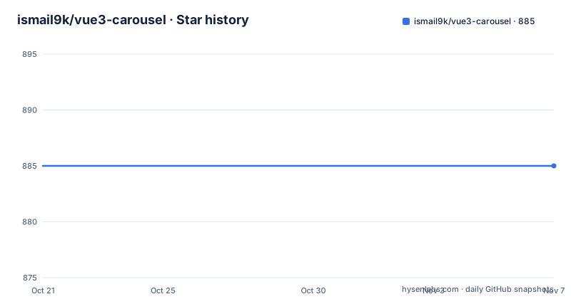
Star history
- ismail9k/vue3-carousel885 ★ · +0
| Repository | 2026-10-21 | 2026-11-07 |
|---|---|---|
| ismail9k/vue3-carousel | 885 | 885 |
0 Stars in the last 17 days, measured from the daily GitHub snapshot. Compare with other projects
Editorial analysis
One component, one stylesheet, two imports
vue3-carousel describes itself as a modern lightweight Vue 3 carousel component, and the installation section is three package manager commands:
# npm
npm i vue3-carousel

# yarn
yarn add vue3-carousel

# pnpm
pnpm install vue3-carousel
The detail that catches people is in the basic usage example rather than the install line. There are two imports, not one. The stylesheet comes from vue3-carousel/carousel.css and the components from vue3-carousel, and the example carries a comment about it directly: if you are using PurgeCSS, make sure to whitelist the carousel CSS classes.
That comment tells you what kind of component this is. It ships CSS, and the CSS uses class names, and a build step that removes unused CSS will remove those class names unless you tell it not to. A component that ships zero CSS and leaves styling entirely to the consumer does not have this problem. This one does, and it is honest enough to document it in the first code block.
The exports map in the package manifest shows the shape of the distribution. The main entry offers types, an ES module import, a CommonJS require and a default, with the same four for a ./dist/carousel subpath, a wildcard for ./dist/* and a named export for ./carousel.css. The manifest also sets main to dist/carousel.cjs, module to dist/carousel.mjs, style to dist/carousel.css, types to dist/carousel.d.ts, and both unpkg and jsdelivr pointing at dist/carousel.min.js, so a plain script tag works as well as a bundler.
The build is Rollup, the package is ESM with a type field of module, and pnpm 11.10.0 is the pinned package manager.
The configuration object is where the behaviour lives
The basic usage example shows a configuration object bound to the Carousel component with v-bind, and two options in it:
const carouselConfig = {
  itemsToShow: 2.5,
  wrapAround: true
}
Those two lines are the whole mental model. The component takes a plain object of options, the options are bound with v-bind, and the slides are children.
The fractional value is the interesting one. itemsToShow: 2.5 means the carousel shows two and a half slides at a time, so the next slide is visibly peeking, which is the standard trick for signalling that there is more content to the side. A carousel that shows exactly as many slides as fit looks like a static grid, and users read it as one.
wrapAround: true is the infinite scroll, described in the feature list as wrap around sliding. When it is on, moving past the last slide comes back to the first, which is the behaviour people expect from a slider and which the alternative, a stop at the end, always draws complaints about.
The feature list names nine capabilities overall, and the options behind them live on a Carousel Configuration page in the documentation rather than in the README. The list is: responsive with breakpoints support, infinite scroll with wrap around sliding, mouse and touch dragging support, mouse wheel scroll navigation, auto play for automatic sliding, slide classes exposing active and visible states, RTL right-to-left support, accessibility through keyboard navigation and ARIA labels, and a vertical sliding mode.
The slide classes point is the one that affects your own markup. If the component emits classes for the active slide and for the visible ones, you can style the current slide differently without tracking the index yourself in application state, which is the sort of small thing that removes a class of component from a project.
The template shows how the addon slots work
The example template is worth reading as a whole, because it shows the shape of the API and the one detail that is easy to miss.
<Carousel v-bind="carouselConfig">
  <Slide v-for="slide in 10" :key="slide">
    <div class="carousel__item">{{ slide }}</div>
  </Slide>

  <template #addons>
    <Navigation />
    <Pagination />
  </template>
</Carousel>
There are two components at work. Carousel is the container that holds the configuration and the slides, and Slide is the wrapper for each item, here produced by a v-for over ten slides with a key. Your own content goes inside the Slide, and the example uses a div with a class of carousel__item, which is the class name convention the stylesheet expects.
The addons slot is the part that people usually miss. Navigation and Pagination are not children of the Carousel directly, they go into a template with the #addons name, so you compose the controls you want and leave out the ones you do not. The documentation site has a separate page for each of the four components, Carousel, Slide, Navigation and Pagination, plus a getting started page and the configuration page.
The consequence is that the component set is small and composable rather than a kitchen sink. A carousel with no visible controls, navigated by drag and keyboard only, is a legitimate configuration here, and that is not something a component with built-in arrows usually lets you do.
For Nuxt there is a separate module, vue3-carousel-nuxt, maintained in another repository, so the Nuxt path is a wrapper rather than a second implementation inside this package.
Accessibility and RTL are features, not afterthoughts
Two of the nine features are worth an adopter's attention because they are the ones that are often missing.
The accessibility entry is listed as keyboard navigation and ARIA labels. For a slider, keyboard navigation is not a nicety, since a component that only responds to a pointer is unusable without one, and the ARIA label part means the slide container announces itself to a screen reader rather than being an unlabelled region of the page. Whether the implementation is complete is something you have to check in the docs, since the README names the capability rather than describing it, and a partially implemented ARIA story is common in this kind of component.
The RTL entry is right-to-left support. A carousel in an RTL layout is not the mirror of the LTR one. The direction of the drag, the order the slides advance in, and the position of the pagination dots all have to be handled, and getting that wrong is a common defect in components written for an LTR-first audience. The fact that it is named in the feature list rather than left as an implicit behaviour of the browser is a reasonable signal that it was dealt with.
The vertical mode belongs to the same family. A vertical sliding carousel is a different component in some libraries and a mode flag in others, and here it is a feature of the same one, which means it shares the configuration, the classes and the accessibility work.
Breakpoints support is the fourth of the nine that changes how the component behaves rather than what it draws. itemsToShow is presumably part of what a breakpoint can set, and a carousel whose visible count changes with the viewport is what you want on a phone and what you do not want on a desktop, where the fractional peek can look like a layout bug.
Where the limits are, and the documentation written for machines
There are two limits an adopter should know about, and one unusual piece of infrastructure.
The first is that this is a component with a stylesheet, and the stylesheet carries the design. A team with an existing design system will find that the component brings its own breakpoints, its own class names and its own visual decisions, and reconciling those with a house style is work. The PurgeCSS comment in the example is the visible edge of that problem; the invisible edge is the same problem when the brand requires a different spacing scale.
The second is that a drag-based component depends on the browser's pointer and touch behaviour. A carousel driven by Pointer Events needs a browser that implements them, and the README does not state a browser support matrix, so a project with older browsers in scope has to verify that itself rather than assume it.
The unusual piece is the documentation. The README has a section addressed to AI agents, and it is worth reading carefully because it changes how you should approach this project. The documentation is published as Markdown, with llms.txt indexing every page, each of which is also served at its .md URL, and llms-full.txt holding all of it in one file.
That is a deliberate accommodation to a reading pattern, and it is the reason a full configuration reference can be read without a browser. It also signals where the project expects to be used from, and it makes the documentation unusually cheap to consume in full before deciding anything.
On maintenance, the facts are that the repository is not archived, the last push was on 2026-10-02, and the recent releases are v0.19.0 on 2026-10-03, v0.18.0 on 2026-09-23 and v0.17.0 on 2025-10-26. The version is still below one, and the 0.17 to 0.18 to 0.19 sequence over a year is a slow, minor-version cadence, which for a component means the API surface is still moving.
Editorial conclusion
vue3-carousel suits a Vue 3 or Nuxt project that needs a slider with wrap, touch and keyboard support this week, and that is comfortable importing a component's stylesheet alongside its JavaScript. It is the wrong tool for a design system team that needs a slider to match an existing visual language down to the breakpoint, because the package brings its own styles and its own breakpoints, and it is the wrong tool for a site that has to support a browser without Pointer Events. Before you adopt it, read the Carousel Configuration page for the options the README does not list, check the release history since the version numbers are still below one, and read the getting started page in the Markdown form, since the project publishes its documentation as llms.txt and llms-full.txt for exactly this kind of reading.
Frequently asked questions
How do I install vue3-carousel?
The README gives three commands, npm i vue3-carousel, yarn add vue3-carousel and pnpm install vue3-carousel. The component's own stylesheet has to be imported separately with vue3-carousel/carousel.css, and the README notes that PurgeCSS users must whitelist the carousel CSS classes.
How do I make a vue3-carousel wrap around infinitely?
Set wrapAround to true in the configuration object you bind to the Carousel component. The feature list calls it infinite scroll with wrap around sliding, so moving past the last slide returns to the first.
How do I add the navigation arrows and pagination dots to vue3-carousel?
Put the Navigation and Pagination components inside a template slot named addons within the Carousel. The documentation site has separate pages for the Carousel, Slide, Navigation and Pagination components, and a Carousel Configuration page listing the options.
Does vue3-carousel work with Nuxt?
The README points Nuxt users to a separate module, vue3-carousel-nuxt, which lives in its own repository. The documentation is also published as Markdown through llms.txt and llms-full.txt, with every page also served at its .md URL.
Official sources
Add this badge to your README
If you maintain this project, the badge below links readers to this analysis and shows its maintenance status from the daily GitHub snapshot. Paste the markdown into your README; add ?metric=license or ?metric=stars to the image URL for a different field.

[](https://hysenlabs.com/projects/ismail9k-vue3-carousel)Star history chart for your README
[](https://hysenlabs.com/projects/ismail9k-vue3-carousel)Was this useful?