Mini Media Player for Home Assistant Lovelace
Minimalistic media card for Home Assistant Lovelace UI
At a glance
- What is it?
- Mini Media Player is a TypeScript-built Lovelace card for controlling Home Assistant media players with a compact interface. It supports artwork, volume, TTS, speaker groups, shortcuts, and multiple display modes, while requiring users to install and register the card resource themselves.
- Who is it for?
- Adopt Mini Media Player when you want a configurable Home Assistant media control card and can maintain its local resource registration. Do not choose it if you need a fully managed Home Assistant frontend component without manual updates.
- Can I use it commercially?
- Yes. MIT is a permissive licence: you can use, modify and sell software built on it, as long as you keep its copyright and licence notices.
- Is it still maintained?
- Yes. The repository last received commits 153 days ago.
- What is it written in?
- Mainly TypeScript, according to GitHub's language statistics.
Answers come from the project's GitHub data, last synced on November 7, 2026, and from our analysis. They are not legal advice.
Star history
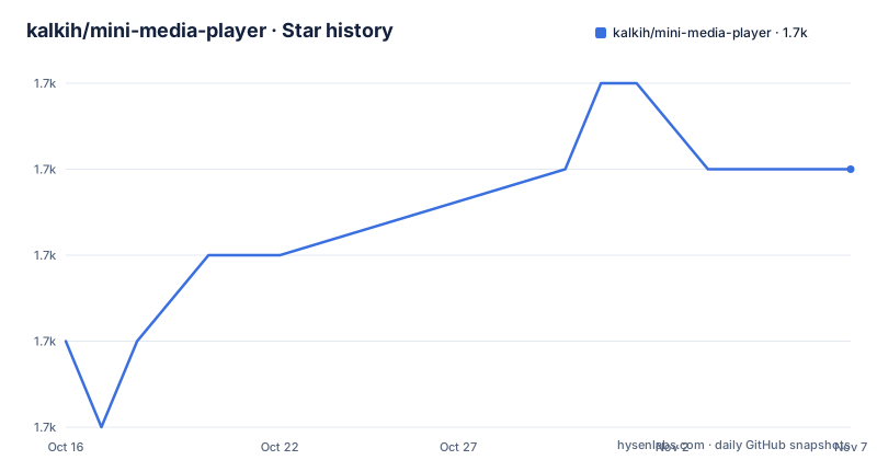
- kalkih/mini-media-player1,726 ★ · +2
| Repository | 2026-10-16 | 2026-11-07 |
|---|---|---|
| kalkih/mini-media-player | 1.7k | 1.7k |
2 Stars in the last 22 days, measured from the daily GitHub snapshot. Compare with other projects
Editorial analysis
What Mini Media Player Adds to Lovelace
Mini Media Player solves a focused Home Assistant dashboard problem: presenting a media player in a compact Lovelace card while still exposing controls for common playback tasks. The card is not a media server, an audio player, or a Home Assistant integration. It works with entities that Home Assistant exposes in the `media_player` domain.
The project describes itself as a minimalistic but customizable media player card. Its options cover both presentation and interaction. A dashboard author can replace the friendly name, choose an icon or image, change artwork behavior, hide interface elements, alter source and sound mode selectors, and adjust media information layout. Playback options include tap actions, jump controls, mute behavior, volume limits, and stateless volume buttons.
The card also includes features that go beyond basic playback. Its TTS object can expose a text-to-speech input through a configured platform. Speaker group settings support multiroom management, while shortcuts can present media actions as a list or as buttons. An idle view can reduce clutter when a player is idle, paused, or in standby. These options make the card useful for dashboards where several media devices need to share a predictable layout.
The Card Architecture and Configuration Surface
The repository is a TypeScript frontend project built around a release bundle that Home Assistant loads as a JavaScript module. `package.json` identifies the package as `mini-media-player`, sets its version to `1.16.12`, and lists Lit, `home-assistant-js-websocket`, `node-vibrant`, and a `ResizeObserver` polyfill as runtime dependencies. The repository includes `src/`, Rollup configuration files, TypeScript configuration, and Babel configuration. This layout indicates a browser-side card that is bundled for delivery rather than a server-side Home Assistant component.
At runtime, the card receives a Home Assistant media entity identifier and uses the Home Assistant frontend environment to represent and control that entity. The documented options are declarative. The required `type` value identifies the custom card as `custom:mini-media-player`, while `entity` identifies a media player. The remaining settings are nested objects for hiding controls, TTS, idle behavior, speaker groups, and shortcuts. This configuration model fits Lovelace because a dashboard can describe the card in YAML without requiring a separate plugin-specific application setup.
Artwork has several explicit modes. `cover` uses current artwork as the card background, `full-cover` displays the artwork more prominently, `full-cover-fit` avoids cropping, `material` uses alternate artwork display with dynamic colors, and `none` hides artwork. The documented `adaptive_color` option extends contrast-aware text coloring to several artwork modes. The option is disabled by default for backward compatibility, which is an important deployment consideration for existing dashboards.
The card can also switch volume controls into up and down buttons with `volume_stateless`. The `volume_step` option changes the increment used by those buttons and the slider, but the README notes that this requires an entity with a `volume_level` attribute. The boundary is useful because it prevents an editor from assuming that every media entity exposes the same capabilities.
HACS Installation and a First Lovelace Card
The README identifies HACS as the recommended installation route. HACS is the Home Assistant Community Store. The documented flow is to open HACS, select the `Frontend` section, use the button with the `+` icon, and search for `Mini Media Player`. The README does not provide a separate Home Assistant YAML example for the first card, so the supported installation steps stop at registering the frontend resource.
For YAML mode, the repository gives this resource configuration. The URL includes the documented version query and the resource is loaded as a module.
lovelace:
  resources:
    - url: /local/mini-media-player-bundle.js?v=1.16.12
      type: module
The same resource can be added through the Home Assistant UI under `Sidebar -> Settings -> Dashboards -> Menu (top right corner) -> Resources`. For a manual UI installation, download `mini-media-player-bundle.js` from the latest release, copy it into `config/www`, select `+ ADD RESOURCE`, enter the local URL, and choose `JavaScript Module`. The expected result is that Home Assistant registers the custom card resource, after which a Lovelace dashboard can reference `custom:mini-media-player` with a valid `media_player` entity. The README does not document a separate card-creation screen or a required restart procedure.
Display Modes, Controls, and Entity Constraints
The options reveal the main trade-off in this card. It can become a small playback card, a detailed control surface, or an artwork-led panel, but each choice changes the amount of information and interaction available. Setting `group` removes padding, background color, and box shadow, which suits placement inside a larger dashboard group. `info` can limit media information to one row with `short`, or scroll overflowing information with `scroll`. `scale` provides a UI scale modifier, with a default of `1`.
The `hide` object manages visible UI elements, while `idle_view` can switch to a less cluttered state after a player becomes idle, paused, or enters standby. The optional `after` value is measured in minutes and is only supported on platforms exposing `media_position_updated_at`. This limitation matters because a delayed idle view cannot be implemented identically on every media platform.
Playback actions are configurable through `tap_action`, `jump_amount`, `replace_mute`, and `toggle_power`. The README says `jump_amount` defaults to 10 seconds. `replace_mute` accepts `play_pause`, `stop`, `play_stop`, or `next`. The default power behavior is a toggle, while setting `toggle_power` to `false` changes the button to `media_player.turn_on` or `media_player.turn_off`. These are direct entity-service choices, not a separate automation layer.
The `speaker_group` object handles multiroom and speaker group management, and `shortcuts` exposes media shortcuts as a list or buttons. Source and sound mode selectors can show icons or full names. The card therefore supports several interaction patterns, but entity capabilities still determine which controls can function. The README does not claim universal support for every media player feature.
Maintenance, Upgrades, and the MIT License
The repository is not archived, and its last push was on 2026-06-08. The release history lists v1.16.12 on 2026-05-18, v1.16.11 on 2026-03-06, and v1.16.10 on 2025-10-02. These dates show recent release activity before the repository's last push, but they do not by themselves establish compatibility with every future Home Assistant release.
Manual installation creates a small but real upgrade task. The README says to replace `mini-media-player-bundle.js` with the file from the latest release and edit the resource version. It also says the browser cache may need to be emptied if the updated card does not load. This is different from a frontend component whose deployment is handled entirely by Home Assistant. A dashboard operator using the manual route must preserve the local file and keep the registered URL aligned with the installed bundle.
The project uses the MIT license. That is the license stated in `package.json` and the repository metadata. The license affects how the source and distributed bundle may be used under its terms, but this review does not interpret the license text or provide legal advice. The package also contains development dependencies for TypeScript, Rollup, ESLint, Babel, Prettier, and related tooling, while the runtime dependency list is much smaller. That distinction is relevant when assessing build and maintenance scope.
The documented scripts are `npm run start` for Rollup watch mode, `npm run build` for linting and bundling, and `npm run lint` for ESLint over `src/*.ts`. The repository includes `package-lock.json`, so the lockfile is available as the dependency record for development work.
Why Choose a Native Lovelace Card Instead
Mini Media Player accepts a local module and gives the dashboard author options for artwork, TTS, speaker groups, shortcuts, idle states, and detailed playback controls.
That extra control has a cost. The project depends on Home Assistant entity attributes and services, so a missing capability such as `volume_level` or `media_position_updated_at` can limit a configuration. Manual users also need to update the bundle and resource URL. HACS users still depend on the card release remaining compatible with their dashboard and Home Assistant environment.
Mini Media Player is the better fit when the dashboard needs a specialized media control layout. A built-in card is the simpler fit when standard playback controls are sufficient and avoiding a custom resource is more important than the added configuration surface.
Editorial conclusion
Adopt Mini Media Player when you want a configurable Home Assistant media control card and can maintain its local resource registration. Do not choose it if you need a fully managed Home Assistant frontend component without manual updates. Verify first that your target entity is in the `media_player` domain and that its supported attributes match the controls you plan to expose, especially `volume_level` and `media_position_updated_at`.
Frequently asked questions
How do I install Mini Media Player in Home Assistant?
The README recommends installing it through HACS, opening the `Frontend` section, and searching for `Mini Media Player`. Manual installation uses the release bundle in `config/www` and registers `/local/mini-media-player-bundle.js?v=1.16.12` as a `JavaScript Module` resource.
Does Mini Media Player support volume controls?
Yes. It supports a volume slider or stateless volume up and down buttons. The README says `volume_step` and the slider require a media entity that exposes the `volume_level` attribute.
What artwork modes does Mini Media Player provide?
The documented values are `cover`, `full-cover`, `material`, `none`, and `full-cover-fit`. The `adaptive_color` option can extend contrast-aware text coloring to several artwork modes, but it is disabled by default for backward compatibility.
Can Mini Media Player manage speaker groups and TTS?
The card documents a `speaker_group` object for multiroom and speaker group management, plus a `tts` object for text-to-speech input. The TTS configuration requires a platform, with examples including `google_translate` and `amazon_polly`.
Official sources
Add this badge to your README
If you maintain this project, the badge below links readers to this analysis and shows its maintenance status from the daily GitHub snapshot. Paste the markdown into your README; add ?metric=license or ?metric=stars to the image URL for a different field.

[](https://hysenlabs.com/projects/kalkih-mini-media-player)Star history chart for your README
[](https://hysenlabs.com/projects/kalkih-mini-media-player)Was this useful?