Kobalte: accessible, unstyled UI primitives for SolidJS
A UI toolkit for building accessible web apps and design systems with SolidJS.
At a glance
- What is it?
- Kobalte gives SolidJS developers unstyled components for accessible applications and design systems, with separate styling integrations for Tailwind CSS and Vanilla Extract. Its main trade-off is that applications must supply the visual layer themselves.
- Who is it for?
- Kobalte fits SolidJS teams that want accessible primitives while owning their visual design. It is unsuitable for teams seeking a fully styled component catalog without integration work.
- Can I use it commercially?
- Yes. MIT is a permissive licence: you can use, modify and sell software built on it, as long as you keep its copyright and licence notices.
- Is it still maintained?
- Yes. The repository last received commits 2 days ago.
- What is it written in?
- Mainly TypeScript, according to GitHub's language statistics.
Answers come from the project's GitHub data, last synced on October 23, 2026, and from our analysis. They are not legal advice.
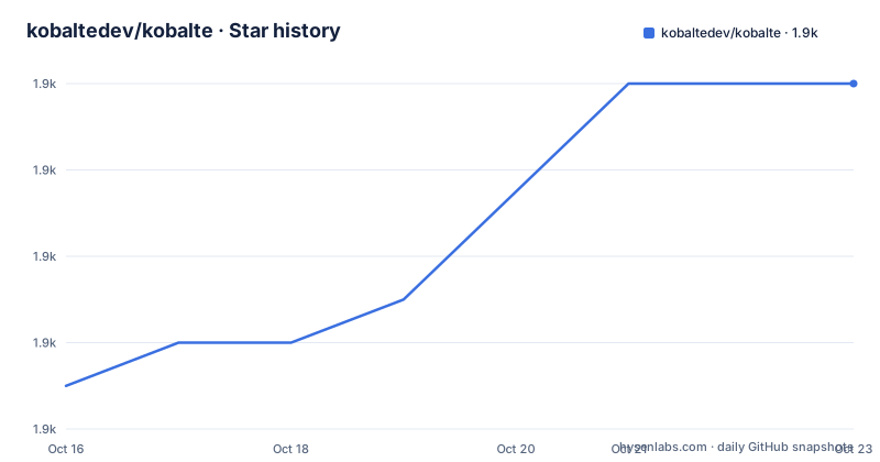
Star history
- kobaltedev/kobalte1,880 ★ · +7
| Repository | 2026-10-16 | 2026-10-23 |
|---|---|---|
| kobaltedev/kobalte | 1.9k | 1.9k |
7 Stars in the last 7 days, measured from the daily GitHub snapshot. Compare with other projects
Editorial analysis
Kobalte's unstyled SolidJS component boundary
Kobalte addresses a specific problem in SolidJS development: implementing interactive interface behavior correctly while preserving control over the resulting visual design. Its principal package, `@kobalte/core`, is described in the README as a collection of unstyled components and primitives for accessible web applications and design systems. This makes it relevant to teams creating application interfaces, reusable component packages, or multi-product design systems rather than only individual prototypes. Accessibility is part of the package's stated purpose, but the README does not enumerate which interaction patterns it covers or document compliance with a particular accessibility standard. The unstyled boundary is equally important. Kobalte does not arrive as a fixed visual catalog, so product teams remain responsible for layout, typography, color, spacing, transitions, responsive behavior, and other presentational decisions. That division can suit organizations with an established design language. It is less convenient for a small project that expects ready-to-render buttons, dialogs, menus, or forms with a finished theme.
How Kobalte exposes state to styling layers
The README shows that Kobalte separates interaction primitives from styling integrations. `@kobalte/core` provides the unstyled foundation. `@kobalte/tailwindcss` targets Tailwind CSS projects and styles component states by reading `data-*` attributes through modifiers such as `ui-expanded:*`. `@kobalte/vanilla-extract` serves projects using Vanilla Extract and exposes the same category of component state through a utility function. This creates a visible data flow: a component changes its interaction state, Kobalte represents that state through DOM attributes, and a styling integration maps it to a visual rule. Application styles can therefore depend on explicit state markers instead of duplicating component logic in CSS-in-JS callbacks. The README does not document the full attribute set for every primitive, nor does it explain how custom unstyled components should map their states. The two official styling packages are useful alternatives to one another, but the choice is primarily constrained by the application's styling stack. Neither package removes the need to define the actual visual design.
Kobalte packages and their division of responsibility
Kobalte is published as a set of related packages rather than a single installed component bundle. `@kobalte/core` is the behavioral layer and the required starting point for its accessible component primitives. `@kobalte/tailwindcss` is specifically a TailwindCSS plugin, not a second component library. Its purpose is to connect Kobalte's `data-*` state attributes to Tailwind modifiers. `@kobalte/vanilla-extract` is likewise a styling plugin, with a utility function for state styling. The root `package.json` identifies the repository as a private `kobalte-monorepo`, with workspaces covering `apps/*` and `packages/*`. It uses pnpm workspaces and Turbo scripts for building, testing, type checking, formatting, and documentation work. Those repository commands concern maintainers and contributors. They should not be mistaken for a consumer installation procedure. Consumers looking for visual outputs may find the package list underwhelming if they interpret “UI toolkit” as a conventional component suite. The package descriptions show a narrower and more composable product: accessible primitives plus adapters for two styling approaches.
Starting a first Kobalte application from the documentation
The README does not provide consumer installation commands, version-specific setup instructions, or a first-component code example. It directs users to `https://kobalte.dev/` for the full documentation, so that site is the authoritative place to begin rather than inventing a package command here. A first real use therefore consists of selecting a component in the Kobalte documentation, following that page's installation guidance, and applying its API to an existing SolidJS project. The README alone cannot confirm the component names, imports, props, or expected rendered output. Users should also inspect the package-specific documentation under `packages/core` when the website omits version details. If the application uses Tailwind CSS, the README identifies `@kobalte/tailwindcss` as the relevant state integration. If it uses Vanilla Extract, the corresponding package is `@kobalte/vanilla-extract`. A repository contributor can inspect the workspace tooling through `package.json`, whose documented scripts include `pnpm dev:core`, `pnpm dev:docs`, `pnpm build`, `pnpm test`, and `pnpm typecheck`. Those scripts operate in the monorepo and are not substitutes for the consumer guide.
Kobalte's accessibility claim and documentation boundaries
Kobalte states that its primitives are intended for accessible web apps and design systems, which makes accessibility a core design constraint rather than an optional styling feature. However, the README does not specify supported assistive technologies, browser support, keyboard interaction tables, screen-reader tests, focus-management guarantees, or conformance under standards such as WCAG. It also does not provide a component-by-component explanation of accessible behavior. That makes the full documentation, examples, and project tests necessary during evaluation. The package descriptions support a claim that Kobalte aims to reduce the need to rebuild common interaction primitives, but they do not support a claim that every application built with it will automatically be accessible. Application developers still need correct labels, semantic content, focus order, announcements, error presentation, and contrast. Kobalte can provide accessible foundations, yet the README does not establish the limits of that responsibility. Teams with strict accessibility procurement requirements should inspect the documentation and tests for their exact interaction patterns before treating the project description as evidence of conformance.
Release lines and maintenance signals in the Kobalte repository
The repository is not archived, and the last push was on 2026-10-15. Recent release records show three relevant lines: `@kobalte/[email protected]` dated 2026-09-07, `@kobalte/[email protected]` dated 2026-10-15, and `@kobalte/[email protected]` dated 2026-09-07. The `2.0.0-alpha` naming is the clearest upgrade concern. The README does not provide a migration guide, compatibility policy, or statement saying that the 2.0 line is ready as a drop-in replacement for `0.13.x`. Projects should therefore treat the stable-looking 0.13 line and the alpha 2.0 line as separate adoption decisions unless project documentation establishes otherwise. The repository uses Changesets, with release and versioning scripts in `package.json`, so published changes are connected to an explicit versioning workflow. That reduces ambiguity about release tooling, but it does not answer breaking-change handling for a particular application. Dependency updates, component API changes, and styling-adapter compatibility remain the main upgrade costs implied by the repository structure.
Licensing and ownership implications for Kobalte adoption
Kobalte is licensed under the MIT License, as stated in both the README and the root `package.json`. The repository also includes `LICENSE.md` and `NOTICE.txt`, which are the files to inspect for the exact license text and any required notices. The README does not identify a separate commercial license, dual-license arrangement, or sponsor-dependent feature gate. That makes the licensing model comparatively easy to record in an internal dependency review, although this review is not legal advice. The MIT designation covers the project as identified by the repository; package-level metadata and transitive dependencies still need separate review in a production application. Maintenance has an engineering cost as well as a licensing cost. Teams adopting `@kobalte/core` own their styles, accessibility-sensitive composition, and validation of version upgrades. Teams using one of the official adapters add another package relationship that must be checked for compatibility with their styling setup. The unstyled approach can reduce visual lock-in, but it shifts work from the library's packaged styles into each consuming codebase.
Editorial conclusion
Kobalte fits SolidJS teams that want accessible primitives while owning their visual design. It is unsuitable for teams seeking a fully styled component catalog without integration work. Before adoption, verify the component behavior required by the product, the maturity of the selected release line, and the fit of the chosen styling package.
Frequently asked questions
What is Kobalte used for in SolidJS projects?
Kobalte provides unstyled components and primitives intended for accessible web apps and design systems built with SolidJS. It leaves the final visual presentation to the application.
Which styling integrations does Kobalte provide?
Kobalte provides `@kobalte/tailwindcss` for Tailwind CSS and `@kobalte/vanilla-extract` for Vanilla Extract. These packages style Kobalte's `data-*` component states.
Is the Kobalte 2.0 release stable?
The listed 2.0 releases use an alpha identifier, including `@kobalte/[email protected]`. The README does not document migration guidance or declare the 2.0 line a stable replacement for 0.13.x.
Official sources
Add this badge to your README
If you maintain this project, the badge below links readers to this analysis and shows its maintenance status from the daily GitHub snapshot. Paste the markdown into your README; add ?metric=license or ?metric=stars to the image URL for a different field.

[](https://hysenlabs.com/projects/kobaltedev-kobalte)Star history chart for your README
[](https://hysenlabs.com/projects/kobaltedev-kobalte)Was this useful?