Kuma UI for React: Installation, Styling, and Trade-Offs
🐻❄️ A Headless, Utility-First, and Zero-Runtime UI Component Library ✨
At a glance
- What is it?
- Kuma UI is a headless, utility-first React component library built around CSS-in-JS and a zero-runtime extraction model. It fits TypeScript applications that want JSX-based layout props and styled CSS blocks, but its build-oriented design adds integration considerations.
- Who is it for?
- Kuma UI fits TypeScript and React teams that want headless component primitives, responsive style props, and CSS blocks without runtime style generation. It is a weaker choice for a plain React setup that must run immediately after package installation without framework-specific extraction.
- Can I use it commercially?
- Yes. MIT is a permissive licence: you can use, modify and sell software built on it, as long as you keep its copyright and licence notices.
- Is it still maintained?
- Yes. The repository last received commits 163 days ago.
- What is it written in?
- Mainly TypeScript, according to GitHub's language statistics.
Answers come from the project's GitHub data, last synced on November 7, 2026, and from our analysis. They are not legal advice.
Star history
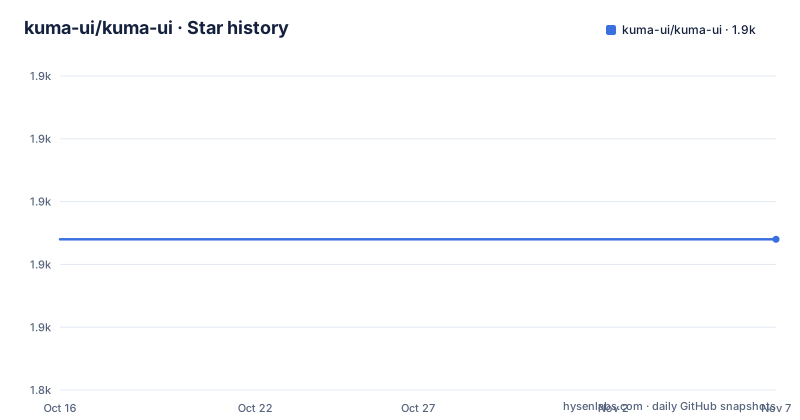
- kuma-ui/kuma-ui1,864 ★ · +0
| Repository | 2026-10-16 | 2026-11-07 |
|---|---|---|
| kuma-ui/kuma-ui | 1.9k | 1.9k |
0 Stars in the last 22 days, measured from the daily GitHub snapshot. Compare with other projects
Editorial analysis
Why Kuma UI Targets React and Next.js Teams
Kuma UI addresses teams that want component composition and CSS styling to coexist in TypeScript or JSX files. It is intended for developers who prefer JSX elements with explicit layout props, such as display and flex direction, while retaining the ability to write conventional CSS when a component needs media queries or a direct declaration block. The README calls the library headless and utility-first. Its example does not prescribe a complete visual design, so teams retain control over component markup, styling, and structure.
The project is aimed more directly at React application work than at framework-independent component publishing. Its documentation names Next.js and Vite as setup targets, and the feature list includes RSC support. The repository also contains examples for Next.js App Router, the older Next.js example, Vite, and Webpack. Those directories show that several build contexts are represented, but the README does not identify one example as the preferred production configuration.
Kuma UI is not simply a collection of polished interface templates. The visible example uses semantic choices through the as prop, including main and h3. A team can therefore assemble its own interface while delegating common layout and spacing behavior to the library. This makes Kuma UI relevant when a shared design system needs flexible primitives instead of a fixed set of branded controls.
How Kuma UI Connects JSX Styles to CSS
The README example exposes two styling paths. The first is a set of component props. Box receives display="flex" and flexDir={["column", "row"]}, while Text receives fontSize={24}. Flex, Heading, Button, and Spacer also use direct props. This API lets TypeScript tooling inspect style information at the JSX call site instead of requiring a separate stylesheet for every rule.
The second path is the css tagged template. Heading assigns a className produced by that construct and places color and a responsive media query inside it. Values can therefore remain close to the component, while declarations that are clearer as CSS stay in CSS syntax. The library describes this as a hybrid approach. Style props and CSS blocks are two supported forms within the same component tree rather than separate examples from unrelated libraries.
Kuma UI labels itself a zero-runtime CSS-in-JS library. Its Cargo workspace contains packages/wasm, while the root build uses Turbo across JavaScript packages. Those repository details are consistent with a build-time extraction component, but the README does not specify the complete extraction pipeline. It does not explain how the WASM package is invoked, when collected classes become a stylesheet, or how integration with a particular bundler is configured. The confirmed point is that zero-runtime behavior is part of the project's stated design. It is not documented as a guarantee that any installation works without the linked framework instructions.
Autocomplete is another stated feature, especially relevant for editors that understand the library's prop types and tagged CSS. The README does not list supported editors or explain how that analysis is installed, so those details should be checked in the framework guides rather than inferred from the feature list.
Installing @kuma-ui/core in a React Project
The README gives one package installation command. Add it to the React or TypeScript application that already has its framework integration in place.
npm install @kuma-ui/coreThe README then directs users to the installation documentation for Next.js or Vite. That handoff matters because the package installation command alone is not presented as a complete setup. The README does not identify required compiler packages, Vite plugins, framework configuration files, or environment variables, so none should be added on guesswork.
The repository examples include Next.js App Router, Next.js, Vite, and Webpack directories. An engineer can use those examples as concrete setup references when matching the target application. However, the README does not state whether one configuration applies uniformly to all of them. In particular, RSC support and zero-runtime extraction should not be assumed to mean that every component can be imported across every server and client boundary.
For repository contributors rather than library consumers, the root package defines pnpm workspaces under packages/* and several orchestration scripts. The development bootstrap uses pnpm, while ordinary documentation installation uses npm. Those package workflows serve different purposes and should not be conflated.
Building a First Responsive Kuma UI Component
The README's App example creates a flex Box as the page's main element, adds a Heading, inserts vertical spacing, and places text and a button in another Flex container. Its flexDir array illustrates a responsive direction change, while the Heading's css block changes color at a named breakpoint.
function App() {
  return (
    <Box as="main" display="flex" flexDir={["column", "row"]}>
      <Heading
        as="h3"
        className={css`
          color: red;
          @media (max-width: sm) {
            color: blue;
          }
        `}
      >
        Kuma UI
      </Heading>
      <Spacer size={4} />
      <Flex flexDir={`column`}>
        <Text as="p" fontSize={24}>
          Headless UI Component Library
        </Text>
        <Button variant='primary'>Getting Started</Button>
      </Flex>
    </Box>
  )
}
This excerpt is the README example rather than a complete standalone file. The README does not show imports for Box, Heading, Spacer, Flex, Text, Button, or css, and it does not show an application export. A reader must obtain those integration details from the linked installation guide. That omission matters for a first use because copying the function alone does not confirm that extraction is configured correctly.
The example also exposes a customization boundary. Button accepts variant='primary', but the README does not define that variant, its CSS, or its accessible states. Developers should not assume from this example alone that Kuma UI supplies complete interaction behavior, focus management, keyboard logic, or design-token decisions. Its clearest demonstrated behavior is composition and styling.
Package Boundaries, Upgrades, and MIT Licensing
Kuma UI is a monorepo rather than a single published directory. The root workspace covers packages/*, and the release history includes separate packages such as @kuma-ui/next-plugin, @kuma-ui/system, and @kuma-ui/sheet. The root package is marked private and has version 0.0.1, while the published packages carry their own versions. Consumers should therefore track the versions of every installed @kuma-ui package rather than assigning one project-wide release number to Kuma UI.
The most recent listed release is @kuma-ui/[email protected] on 2026-05-29. The repository's last push was also on 2026-05-29. Other listed packages were released earlier in April. This package split creates an upgrade consideration for applications using the Next.js plugin together with core or system packages, although the README does not provide compatibility ranges or a migration procedure.
The repository includes a .changeset directory, which is consistent with a changeset-based release process, but the README does not provide an upgrade command or migration policy. Recent release activity also does not answer whether existing APIs require migration. Engineers evaluating an upgrade need the changelogs and installation guide for each package version.
The repository and root package metadata identify the MIT license. That supplies the basic licensing information visible in the repository, but consumers remain responsible for reviewing the LICENSE file and any package-specific notices. No legal interpretation is needed to note the operational point: the repository metadata states no commercial-use restriction.
Where Kuma UI Is the Wrong Choice
Kuma UI's strongest fit is a React codebase prepared for compile-time CSS extraction and interested in headless primitives. It is a poor match for a project that wants to add a styling dependency with no bundler configuration or framework-specific setup. The README's separate Next.js and Vite guidance shows that installation is not presented as a universal one-command integration.
Zero-runtime styling can also be the wrong choice when application changes must not require a CSS extraction or production build step. A runtime CSS-in-JS system may fit that workflow better because it can insert styles during application execution. That is a real architectural difference, not merely a preference between syntaxes. Kuma UI's props are represented in JSX, but the README's zero-runtime claim implies that their CSS must be prepared outside ordinary browser rendering.
There is a second limitation for teams seeking a complete accessibility layer. The visible Button has a variant, but the README does not evidence keyboard behavior, focus management, ARIA handling, disabled states, or interaction testing. Headless does not automatically establish that those concerns are solved. A team needing an off-the-shelf accessible control set should inspect the relevant package documentation before choosing it.
A static CSS framework is another genuine alternative when predictable class output and minimal build integration matter more than JSX-native style props. That approach keeps styling in external files and does not depend on Kuma UI's extraction stage. Conversely, a runtime style engine may suit applications that need client-generated styles. The meaningful comparison is build-time versus runtime generation, followed by semantic prop APIs versus plain CSS classes.
Editorial conclusion
Kuma UI fits TypeScript and React teams that want headless component primitives, responsive style props, and CSS blocks without runtime style generation. It is a weaker choice for a plain React setup that must run immediately after package installation without framework-specific extraction. Check the Next.js or Vite installation documentation first, confirm that your required React Server Components behavior is documented for the version you intend to adopt, and compare the build cost with a runtime styling library before committing to the model.
Frequently asked questions
How do I install Kuma UI in a React project?
The README instructs users to run `npm install @kuma-ui/core`. It also directs users to the framework-specific installation guide for Next.js or Vite, since the package command alone is not documented as a complete setup.
Does Kuma UI add CSS-in-JS runtime code?
Kuma UI describes itself as zero-runtime and CSS-in-JS, with CSS extracted as part of its build model. The README does not explain the detailed extraction pipeline or framework configuration.
Can Kuma UI work with Next.js and Vite?
The README points to setup guides for Next.js and Vite and lists RSC support as a feature. It does not document one configuration that applies to every framework or repository example.
Official sources
Add this badge to your README
If you maintain this project, the badge below links readers to this analysis and shows its maintenance status from the daily GitHub snapshot. Paste the markdown into your README; add ?metric=license or ?metric=stars to the image URL for a different field.

[](https://hysenlabs.com/projects/kuma-ui-kuma-ui)Star history chart for your README
[](https://hysenlabs.com/projects/kuma-ui-kuma-ui)Was this useful?