headless-tree: a tree view that leaves the markup to you
The definitive tree component for the Web
At a glance
- What is it?
- headless-tree gives React applications the behaviour of a complex tree view, ordered and unordered drag and drop, hotkeys, search, renaming and asynchronous data sources, while leaving the rendering entirely to the application. It is the official successor to react-complex-tree, and it reaches for accessibility rather than leaving it as an afterthought.
- Who is it for?
- headless-tree suits a React team that needs a file tree, a hierarchy explorer or a nested selection UI, and that wants to own the markup, the styling and the accessibility layer rather than fight a component library over them. It does not suit a project that wants a finished tree widget with a theme on day one, and it does not suit a framework other than React without checking the bindings.
- Can I use it commercially?
- Yes. MIT is a permissive licence: you can use, modify and sell software built on it, as long as you keep its copyright and licence notices.
- Is it still maintained?
- Yes. The repository last received commits 13 days ago.
- What is it written in?
- Mainly TypeScript, according to GitHub's language statistics.
Answers come from the project's GitHub data, last synced on November 7, 2026, and from our analysis. They are not legal advice.
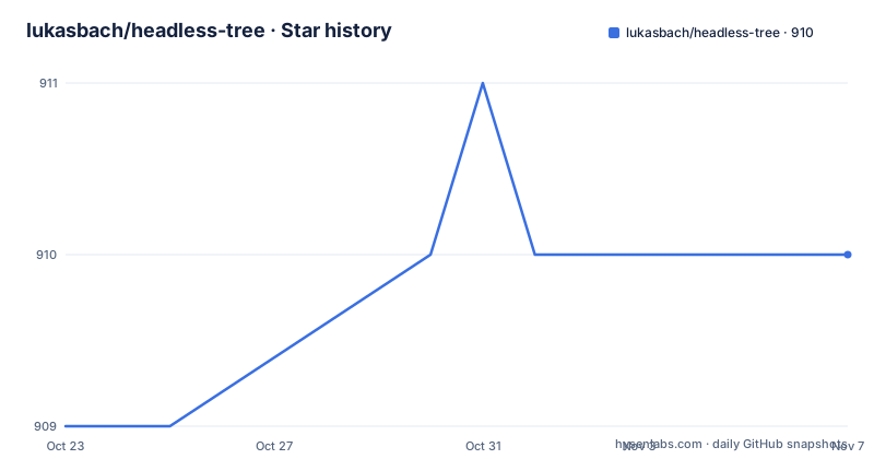
Star history
- lukasbach/headless-tree910 ★ · +1
| Repository | 2026-10-23 | 2026-11-07 |
|---|---|---|
| lukasbach/headless-tree | 909 | 910 |
1 Stars in the last 15 days, measured from the daily GitHub snapshot. Compare with other projects
Editorial analysis
A tree view with no views
headless-tree is described as the definitive tree component for the Web, and the README frames it as super-easy integration of complex tree components into React.
The idea is that a tree view is two problems. One is behaviour: expansion state, focus, selection, drag and drop reordering, keyboard navigation, typeahead search, inline renaming. The other is presentation: how the row looks, what icon goes beside it, how the indent is drawn, what the selected state looks like. Most component libraries solve both and hand you a styled tree. headless-tree solves only the first and hands you a list of items with props.
The result is a flat list of tree nodes that you can easily render yourself, which the README says keeps the complexity of the code low and allows you to customize the tree to your needs. The same flat structure also allows you to virtualize the tree with any virtualization library you want, which is what makes a tree with a hundred thousand items possible at all.
The audience is a React developer building a file tree, a navigation sidebar or any hierarchical interface, who wants the behaviour without the styling. The README describes it as being unopinionated about the styling and rendering of the tree itself, and says accessibility is ensured by default and the integration is extremely simple and flexible.
The project is also the official successor to react-complex-tree, which matters if you have seen that library before: the feature set is recognisably the same, with a different architecture underneath.
How a flat list emulates a nested tree for assistive tech
The interesting technical claim in the README is that the library automatically provides the necessary aria tags to emulate a nested tree structure, so that accessibility requirements are met despite the flat structure.
This is worth understanding, because a flat list of nodes is genuinely harder for a screen reader to navigate than a nested one. The ARIA tree pattern expects a tree role with treeitem elements nested inside groups, and the keyboard model depends on knowing which item owns which children. A flat array of items has none of that structure on its own.
So the library derives it. The items carry metadata about their level and their parent, which the rendering snippet uses for the indent, and the props the library attaches supply the roles and relationships. The consumer renders a flat list of buttons; the library makes that list behave and announce like a tree.
That division is what makes the customization story work. If you want a different DOM shape, you still get correct roles and keyboard semantics, because those come from the library's props rather than from your markup. The alternative, building your own tree on a div per node with the ARIA wiring done by hand, is exactly the work this package removes.
The trade-off is that you are responsible for the visual affordances that ARIA does not cover: the visible focus ring, the expand chevron, the drop target highlight. The library gives you the state to render those, and the README is explicit that the styling is yours.
Features as pieces you opt into
The feature list is organised as independent capabilities, and the composition is visible in the code. A tree is created with a useTree hook and a list of features:
import {
  hotkeysCoreFeature,
  selectionFeature,
  syncDataLoaderFeature,
} from "@headless-tree/core";
import { useTree } from "@headless-tree/react";

const tree = useTree<string>({
  initialState: { expandedItems: ["folder-1"] },
  rootItemId: "folder",
  getItemName: (item) => item.getItemData(),
  isItemFolder: (item) => !item.getItemData().endsWith("item"),
with the features array closing the configuration:
  features: [syncDataLoaderFeature, selectionFeature, hotkeysCoreFeature],
});
That is the whole API surface in miniature, and it explains the rest of the feature list. Drag and drop, hotkeys, search, renaming, expand all and selection are separate features that you add to the array. A tree that needs none of them runs with an empty array. A tree that needs everything lists them all.
Two features are worth pulling out. Customize Behaviour lets you overwrite internal behaviour such as requiring double clicks on items to expand, and Customize Logic goes further and lets you overwrite or expand any internal behaviour of Headless Tree, which is how you would change what a hotkey does or how a drag is resolved. Async Data Support lets you use synchronous or asynchronous data sources, with optional caching for async data, which is the feature that matters for a tree backed by a server.
Manage State is the other one: you can let Headless Tree manage tree state internally, or manage any part of it yourself, which is what you need when the expanded set has to live in a URL or in a store.
The bundle size table and what tree shaking does
The README publishes a bundle size table, and it is the kind of thing that gets a library adopted or rejected in a design review. The listed sizes are min and gzipped bundles based on the Bundlephobia report as of Headless Tree v0.0.15.
The entries are small: Tree Core at 3.1kB, Sync Data Loader at 0.8kB, Async Data Loader at 1.4kB, Selections at 1.1kB, Drag and Drop at 2.8kB, Keyboard Drag and Drop at 2.7kB, Hotkeys at 0.8kB, Tree Search at 1.3kB, Renaming at 0.9kB, Expand All at 0.7kB and React Bindings at 0.4kB.
The total is stated as 9.5kB plus 0.4kB for the React bindings, and the README explains why the sum of the features is larger than the total: several features share code. Tree shaking is what ensures that only the minimum amount of code is included in your bundle.
That sharing is the reason the feature-as-plugin design is not just an API preference. If the features were separate packages with duplicate helpers, the numbers would not compose, and the total would be the sum. Because they share an implementation, adding search and drag and drop costs less than the sum of their parts.
One caveat on the numbers themselves. They are stated as of version 0.0.15, which is far behind the current 1.8.0 release, so the table is a snapshot rather than a current measurement. The shape of the argument still holds, but the exact numbers should be checked against the version you are about to install.
Rendering the flat list in your own markup
Rendering is where the library hands control back to you. The tree instance gives you the container props and the items, and you map over them:
<div {...tree.getContainerProps()} className="tree">
  {tree.getItems().map((item) => (
    <button
      {...item.getProps()}
      key={item.getId()}
      style={{ paddingLeft: `${item.getItemMeta().level * 20}px` }}
    >
The container props come from tree.getContainerProps(), and each item has its own props from item.getProps(), which is where the ARIA attributes and event handlers are attached. The indent comes from item.getItemMeta().level, multiplied by the indent value passed to useTree, which was 20 in the configuration.
The rest of the snippet in the README shows the per-item state being turned into class names, with focused, expanded, selected and folder derived from the item methods isFocused(), isExpanded(), isSelected() and isFolder(). That is the whole rendering contract: props in, state out, markup in between.
Two of the methods deserve a note. isItemFolder in the configuration decides whether an item can be expanded, and here it is derived from whether the name ends with the word item, which is a fixture convenience rather than a real rule. And getItemName returns the item data directly, which is why the data loader in the configuration returns the id as its own data.
For a real application the data loader is where your own types enter: the library is generic over the item type, useTree is called with a type parameter, and your getItem and getChildren functions supply the data.
The monorepo behind two published packages
The repository is a workspace with packages/ and five example workspaces: examples/basic, examples/comprehensive, examples/nextjs, examples/react-compiler and examples/nextjs-react-compiler. The presence of React Compiler examples says the author is tracking that direction rather than ignoring it.
The published packages are @headless-tree/core and @headless-tree/react, and the root scripts reveal that there are more bindings in the workspace than are published to npm under those two names: the start scripts scope @headless-tree/sb-react and @headless-tree/sb-react-native, which suggests Solid and React Native bindings are in progress. The build script also has a build:sb target.
The tooling is a lerna and nx setup with yarn 4 and volta pinning node 23.6.1, changesets for versioning, typedoc for API documentation with a markdown plugin, and eslint through a shared config from the author. The postinstall hook runs a zx script named prepare.mjs, and there is an llmtxt script that generates a llms.txt, with a llms.txt file at the root of the tree.
On maintenance and licensing, the repository is not archived and the last push was on 2026-10-15, the same day as the @headless-tree/[email protected] and @headless-tree/[email protected] releases, with @headless-tree/[email protected] from 2026-05-17 before that. The licence field says MIT, with the LICENSE file at the top of the tree, and there is a .changeset/ directory, which is how the version bumps are recorded.
The one thing the README does not document is a compatibility matrix across React versions, which for a library that attaches ARIA attributes and keyboard handlers to your DOM is worth asking about before you upgrade React.
Editorial conclusion
headless-tree suits a React team that needs a file tree, a hierarchy explorer or a nested selection UI, and that wants to own the markup, the styling and the accessibility layer rather than fight a component library over them. It does not suit a project that wants a finished tree widget with a theme on day one, and it does not suit a framework other than React without checking the bindings. Before adopting, install @headless-tree/core and @headless-tree/react, render the flat list from tree.getItems() with the ARIA props the library attaches, and verify that the keyboard navigation reaches every node, because that is the part a tree view is judged on.
Frequently asked questions
What is headless-tree and what does it provide?
It is a React library for complex tree components that leaves rendering to you. It provides ordered and unordered drag and drop, extensive keybindings, typeahead search, renaming, selection, expand all, asynchronous data sources with optional caching, and the ARIA attributes needed for a nested tree.
How do I install headless-tree?
Run npm install @headless-tree/core @headless-tree/react. The React bindings sit on top of the core package, and the README lists the library as free of dependencies.
How do I create a tree in headless-tree?
Call the useTree hook from @headless-tree/react with a configuration object that includes rootItemId, getItemName, isItemFolder, a dataLoader and a features array, then render the items from tree.getItems() with the props from item.getProps().
Is headless-tree accessible and how does it work with a flat list?
The README states that the library automatically provides the necessary aria tags to emulate a nested tree structure, so accessibility requirements are met despite the flat structure. The flat structure also means you can virtualize the tree with any virtualization library.
Is headless-tree related to react-complex-tree?
Yes. The README describes Headless Tree as the official successor for react-complex-tree, and describes it as unopinionated about the styling and rendering of the tree itself.
Official sources
Add this badge to your README
If you maintain this project, the badge below links readers to this analysis and shows its maintenance status from the daily GitHub snapshot. Paste the markdown into your README; add ?metric=license or ?metric=stars to the image URL for a different field.

[](https://hysenlabs.com/projects/lukasbach-headless-tree)Star history chart for your README
[](https://hysenlabs.com/projects/lukasbach-headless-tree)Was this useful?