react-insta-stories for React story viewers
A React component for Instagram like stories
At a glance
- What is it?
- react-insta-stories is a TypeScript React component for timed image and video story sequences with taps, hold-to-pause controls, progress bars, custom renderers, and lifecycle callbacks. It fits interfaces that reproduce a story viewer, and also supports custom React content; check the documented API for application-specific navigation.
- Who is it for?
- Adopt react-insta-stories when the application needs a configurable, Instagram-like image story viewer and its lifecycle API fits the product. Do not choose it for an undocumented media format or for a product requiring tested behavior, since the repository has no test script and the README does not cover those cases.
- Can I use it commercially?
- Yes. MIT is a permissive licence: you can use, modify and sell software built on it, as long as you keep its copyright and licence notices.
- Is it still maintained?
- Yes. The repository last received commits 18 days ago.
- What is it written in?
- Mainly TypeScript, according to GitHub's language statistics.
Answers come from the project's GitHub data, last synced on November 7, 2026, and from our analysis. They are not legal advice.
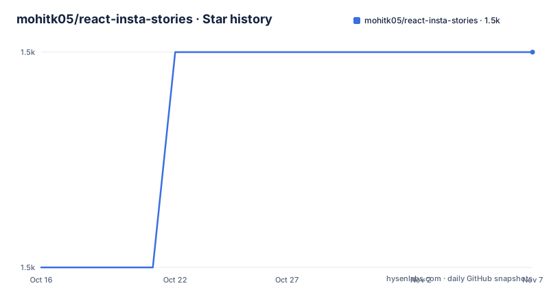
Star history
- mohitk05/react-insta-stories1,487 ★ · +1
| Repository | 2026-10-16 | 2026-11-07 |
|---|---|---|
| mohitk05/react-insta-stories | 1.5k | 1.5k |
1 Stars in the last 22 days, measured from the daily GitHub snapshot. Compare with other projects
Editorial analysis
Why react-insta-stories Exists
react-insta-stories addresses a narrow interface problem: presenting an ordered collection of stories inside one React component. Its documented model is closer to an Instagram-style story viewer than a general-purpose carousel. Each story advances after a configured interval, progress is represented visually, and user input can move backward or forward through the sequence.
The intended users are React developers who already have story media and application state but do not want to implement the viewer mechanics themselves. The component accepts an array of image URLs or richer story objects. It also exposes callbacks for story starts, story endings, navigation, and completion of the full sequence. That makes it relevant when the host application needs to react to progress without coupling those actions to a particular backend.
This is not a general Instagram client. The repository describes it as “A React component for Instagram like stories,” and the README documents image URLs and story objects. It does not identify account authentication, Instagram API access, publishing, analytics for an external platform, or media ingestion. The project supplies a presentation component rather than an end-to-end social media service.
Timed Progress and Input in react-insta-stories
The documented interaction model is straightforward. Tapping the right side advances to the next story, tapping the left side returns to the previous story, and pressing and holding pauses playback. `defaultInterval` sets the time for which each story remains visible, with a default of 1200 milliseconds. A story-specific duration can also be supplied, according to the README.
Progress is represented by progress bars around the story container. The props table provides separate style objects for the outer story container, the progress container, the wrapper around individual progress bars, and the bars themselves. This separation allows an application to alter placement and appearance without needing to reproduce the complete component.
Playback state is not limited to internal interaction. The `isPaused` prop can toggle whether the story is playing, while `currentIndex` sets the active story. Lifecycle hooks include `onStoryStart`, `onStoryEnd`, and `onAllStoriesEnd`, with additional navigation callbacks listed in the props documentation. The `loop` prop controls whether the final story returns to the first story and restarts.
The README does not describe the internal timer implementation, reducer structure, or accessibility behavior in enough detail to assess them. In particular, it does not document keyboard controls, focus management, reduced-motion handling, or screen-reader announcements. Those behaviors should not be inferred merely from the pointer interactions described above.
Installing react-insta-stories on Node.js 20
The package requires Node.js 20 or later and React 16.8.2 or later. Install it as a saved npm dependency with the command documented by the project:
npm install --save react-insta-storiesThat command adds `react-insta-stories` to the application and records it in the npm manifest. The repository's current `package.json` identifies package version 3.0.1, publishes ESM and CommonJS entry points through the `exports` field, and includes TypeScript declarations at `dist/index.d.ts`. Consumers using TypeScript therefore have a declared package entry, although compatibility with each application still needs to be checked.
Before installing across a major version boundary, read `MIGRATION.md`. The README specifically directs users upgrading from v2.x to that guide for breaking changes and upgrade steps. This matters because story object shapes, renderer props, or public TypeScript declarations may differ between major releases. The README does not reproduce those migration details, so it would be misleading to claim that a v2 application can change package versions without code review.
Rendering the First react-insta-stories Sequence
The README's basic example imports the default component and passes a `stories` array, playback interval, width, and height. The following is the documented example, with the JavaScript fence label used for JSX syntax:
import React, { Component } from 'react';

import Stories from 'react-insta-stories';

const App = () => {
	return (
		<Stories
			stories={stories}
			defaultInterval={1500}
			width={432}
			height={768}
		/>
	);
};
The `stories` value must be an array of image URLs or an array of supported story objects. In this example, `stories` must already exist in the surrounding application. The README documents story objects, including video entries and custom content. Check the current README and declarations for the supported fields and behavior before integrating them.
At a minimum, a first use should confirm four visible results: the component appears at the requested `432` by `768` dimensions, each item remains for 1500 milliseconds, a right-side tap advances, and holding pauses. Those checks follow directly from the documented props and interactions. The package uses a default Ripple loader while an image loads unless the `loader` prop supplies another component.
Story Objects, Headers, and Custom Renderers
A basic consumer can pass image URLs directly because the `stories` prop accepts strings or objects. Object entries support richer per-story behavior. The `header` prop defines a component placed at the top of each story, and that component receives the story object's `header` value. This creates a path for application-specific identity or contextual controls without requiring the viewer to own their presentation.
The `renderers` prop accepts renderer objects, with an empty array as its default. The README does not show a complete renderer declaration, its matching rules, or its render method signature. That omission matters for more advanced integrations. A developer cannot safely choose a renderer type or assume which media formats it handles from the documented props alone.
Dimensions are flexible rather than fixed to mobile pixels. `width` accepts a number or string, with examples including `600`, `'100vw'`, and `'inherit'`; `height` similarly accepts values such as `1000`, `'100%'`, and `'inherit'`. The default values are 360 for width and 640 for height. Story and progress styling are also configurable through the documented style props. The project is therefore useful for matching a surrounding layout, although visual adaptation still depends on application CSS and the behavior of the supplied style objects.
Package Maintenance, Validation, and MIT Terms
The repository is not archived, and its last push was on 2026-10-11. That is recent, but recency alone does not establish release maturity or behavioral coverage. The listed releases are v2.0.4 from 2020-07-19, v1.5.0 from 2019-04-22, and v1.4.1 from 2019-04-16, while `package.json` reports version 3.0.1. This version history leaves an important review item for adopters: repository activity is recent, but the available release list does not document when v3.0.1 was published.
Validation is a concrete limitation. The `test` script prints `Error: no test specified` and exits with status 1. The repository therefore does not provide an automated test suite through its package script. It does have `build`, `build:types`, `typecheck`, `dev:example`, and `build:example` scripts, but those commands build or inspect code rather than prove runtime behavior. Upgrade work may therefore require application-level checks of timing, navigation, callbacks, looping, custom renderers, and image loading.
The package is marked MIT in both `package.json` and `LICENSE`. The `files` field limits the published package contents to `dist` and `README.md`, while the repository separately includes source, examples, and documentation. MIT terms permit use, modification, distribution, and sublicensing subject to the license conditions. This is a statement about the declared license, not legal advice about a particular distribution.
When react-insta-stories Is the Wrong Choice
The clearest wrong-tool case is an application that requires media types or interactions not documented by this project. The README documents image and video stories, custom headers, and renderer objects, but it does not establish support for live media, background uploads, moderation, persistence, or network-backed story retrieval. A team that needs those capabilities would have to confirm their existence in the source and declarations or choose a different architecture.
A second case is strict quality assurance for an interactive consumer product. The absent test script means the component does not arrive with a documented automated regression suite. That does not make the package unusable, but it shifts verification toward the adopting application, especially after React upgrades or major-version migrations.
A conventional alternative is to implement the viewer as a local React pager backed by a timer. Instead of importing story defaults, progress bars, loaders, and interaction handlers, the application would directly own the current index, timeout cleanup, and progress rendering. That approach requires more component code, but it also provides direct control over keyboard behavior, analytics, transition semantics, and media fallbacks. react-insta-stories is the better fit when the documented story behavior matches the requirement; the custom pager is the more transparent option when application-specific behavior dominates.
Editorial conclusion
Adopt react-insta-stories when the application needs a configurable, Instagram-like image story viewer and its lifecycle API fits the product. Do not choose it for an undocumented media format or for a product requiring tested behavior, since the repository has no test script and the README does not cover those cases. Verify compatibility with the application's React version, the selected story object shape, and `MIGRATION.md` before upgrading across major versions. For releases after v2.x, the repository's own migration guide is the first project-specific compatibility check.
Frequently asked questions
How do I install react-insta-stories?
Use `npm install --save react-insta-stories`. The documented requirements are Node.js 20 or later and React 16.8.2 or later.
How do I pause or navigate stories in react-insta-stories?
Tap the right side to advance and the left side to go to the previous story. Tap and hold to pause playback.
Does react-insta-stories provide automated tests?
No test suite is exposed through the documented package workflow. The `test` script prints `Error: no test specified` and exits with status 1.
Official sources
Add this badge to your README
If you maintain this project, the badge below links readers to this analysis and shows its maintenance status from the daily GitHub snapshot. Paste the markdown into your README; add ?metric=license or ?metric=stars to the image URL for a different field.

[](https://hysenlabs.com/projects/mohitk05-react-insta-stories)Star history chart for your README
[](https://hysenlabs.com/projects/mohitk05-react-insta-stories)Was this useful?