Pigment CSS moves CSS-in-JS to the build step, and the project is on hold
⚠️ 𝐀𝐥𝐩𝐡𝐚 𝐩𝐡𝐚𝐬𝐞, currently, on hold. Pigment CSS is a zero-runtime CSS-in-JS library that extracts the colocated styles to their own CSS files at build time.
At a glance
- What is it?
- Pigment CSS is a zero-runtime CSS-in-JS library that extracts colocated styles into their own CSS files at build time, positioned as a successor to Emotion and styled-components for React Server Components era applications. The catch is in the repository description itself: the project is in alpha phase and currently on hold, with a discussion thread linked as its homepage.
- Who is it for?
- Pigment CSS suits a team that wants Emotion style authoring without the runtime cost, and that has already committed to React Server Components or to a design system built on CSS variables and color-mix, since the library is built on WyW-in-JS and is the intended path from Emotion v5 to Material UI v6.
- Can I use it commercially?
- Yes. MIT is a permissive licence: you can use, modify and sell software built on it, as long as you keep its copyright and licence notices.
- Is it still maintained?
- Yes. The repository last received commits 17 days ago.
- What is it written in?
- Mainly TypeScript, according to GitHub's language statistics.
Answers come from the project's GitHub data, last synced on November 7, 2026, and from our analysis. They are not legal advice.
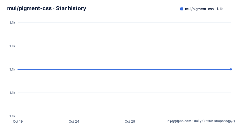
Star history
- mui/pigment-css1,120 ★ · +0
| Repository | 2026-10-19 | 2026-11-07 |
|---|---|---|
| mui/pigment-css | 1.1k | 1.1k |
0 Stars in the last 19 days, measured from the daily GitHub snapshot. Compare with other projects
Editorial analysis
The status line is the first thing an adopter should read
The repository description begins with a warning, and it is the most decision relevant sentence in the project: alpha phase, currently, on hold. Pigment CSS is a zero-runtime CSS-in-JS library that extracts the colocated styles to their own CSS files at build time, and the project is not being actively developed right now.
The homepage link in the repository metadata points at a discussion thread rather than at a documentation site or a product page, which is consistent with a project that is paused and whose community is discussing what happens next.
The release history supports the same reading. The versions are all in the zero series: v0.0.29 on 2024-12-24, v0.0.30 on 2025-01-14 and v0.0.31 on 2026-05-22, with more than a year between the last two. The last push was on 2026-10-08 with the repository not archived, so the code is still there and still being touched, but the release cadence is not that of a supported dependency.
The rest of this article describes what the library does and how it is set up, because that is what an adopter needs to know, but the status has to be the first thing you weigh. A zero runtime styling library is infrastructure that ends up woven through every component in an application, and choosing one that is on hold means accepting that you may be the one maintaining the integration.
The licence is MIT, with the LICENSE file in the repository root, and the package is published to npm as @pigment-css/react.
What zero-runtime CSS-in-JS actually changes
The technical argument for the approach is stated in the documentation, and it is about CSS rather than about JavaScript.
Thanks to recent advancements in CSS, such as CSS variables and color-mix(), the traditional CSS-in-JS solutions that process styles at runtime are no longer required for unlocking features like color transformations and theme variables, which are necessary for maintaining a sophisticated design system. That is the core claim: the reason runtime CSS-in-JS existed was that CSS could not express a theme, and now it can, so the runtime can go.
The consequences of moving the work to build time are concrete. Pigment CSS provides a zero-runtime CSS-in-JS styling solution as a successor to tools like Emotion and styled-components. Compared to its predecessors it offers improved developer experience and runtime performance, at the cost of increased build time. It is also compatible with React Server Components, which is arguably the more important point, because a runtime style injection library and a server component tree do not sit together comfortably.
Underneath, the library is built on top of WyW-in-JS, the zero-runtime extraction engine, and that choice is what enables the smoothest possible experience for Material UI users when migrating from Emotion in v5 to Pigment CSS in v6. So this is not a general purpose styling library that happens to work with Material UI, it is a library built around the Material UI migration path.
The build time cost is the honest trade-off. You pay once per build instead of paying on every render, which is the right trade for a server rendered application and the wrong one for a project with a very fast inner loop, since every style change now goes through the build.
Setting it up in Next.js
Pigment CSS supports Next.js and Vite, with support for more bundlers in the future, and you must install the corresponding plugin.
The quickstart downloads a prepared example project rather than installing anything:
curl https://codeload.github.com/mui/pigment-css/tar.gz/master | tar -xz --strip=2  pigment-css-master/examples/pigment-css-nextjs-ts
cd pigment-css-nextjs-ts
The manual installation is two packages, the runtime package and the plugin as a development dependency:
npm install @pigment-css/react
npm install --save-dev @pigment-css/nextjs-plugin
Then the Next.js configuration is wrapped by the plugin's helper, and the exported config object is passed through it:
import { withPigment } from '@pigment-css/nextjs-plugin';

export default withPigment({
  // ... Your nextjs config.
});
Finally the stylesheet is imported once, in the root layout file, and the documentation shows that as a diff against the generated layout:
 import type { Metadata } from 'next';
+import '@pigment-css/react/styles.css';

 export const metadata: Metadata = {
   title: 'Create Next App',
Two things stand out. The stylesheet import is a plain CSS import of a file that comes from the package, which is the whole zero-runtime idea made visible: there is no provider to mount, no theme context to wire up, and no style injection at runtime. And the config change is a wrapper rather than a plugin array, so it sits around the entire config object rather than alongside other plugins.
The same three steps in Vite
The Vite path mirrors the Next.js one, which is a good sign for a library that has to integrate with two very different build systems.
The quickstart again fetches a prepared example:
curl https://codeload.github.com/mui/pigment-css/tar.gz/master | tar -xz --strip=2 pigment-css-master/examples/pigment-css-vite-ts
cd pigment-css-vite-ts
The manual installation swaps the plugin package:
npm install @pigment-css/react
npm install --save-dev @pigment-css/vite-plugin
And the configuration is a plugin added to the plugins array rather than a wrapper:
import { pigment } from '@pigment-css/vite-plugin';

export default defineConfig({
  plugins: [
    pigment(),
    // ... Your other plugins.
  ],
});
The stylesheet import then goes in the entry file, the root main.tsx, in the same position as the layout import in the Next.js case:
 import * as React from 'react';
 import { createRoot } from 'react-dom/client';
+import '@pigment-css/react/styles.css';
 import App from './App';
So the mental model is simple: install the runtime package and the bundler plugin, add one plugin or wrapper, and import one stylesheet. There is no provider component, no hydration step and no client boundary to think about, which is the developer experience argument the project makes, and it is a real difference from Emotion.
The examples directory in the repository goes further than the two documented paths. There are example projects for Next.js, Vite, Remix and Webpack, which is interesting given the statement that only Next.js and Vite have plugins, so the extra examples show the shape of a possible integration rather than a supported one.
The documented API, from the css function to the sx prop
The documentation table of contents is the best available map of the library's surface, and it is a substantial one.
The entry point is a css API for creating reusable styles, and then a component creation API with a set of specific capabilities. Styling based on props is the case a design system needs most, since a component that changes appearance with its properties is the point of a system. Styling based on runtime values is the harder case, where the style depends on something that is only known at render time. A styled component used as a CSS selector is the third, which lets a component be targeted from another component's styles. Media and container queries are supported, and there is a section on typing props so the component's props are checked at the call site.
Animation keyframes have their own section, which matters because keyframes are the part of a CSS-in-JS API that a build time extractor has to get right. Global styles are supported as well.
The theming section is the longest in the table of contents, and it is where the design system story lives. There is a section on accessing theme values, one on CSS variables support, one on adding a prefix to CSS variables, and then a group around color schemes, covering switching color schemes and styling based on color scheme, with a TypeScript section inside the group. The prefix option for CSS variables is the one to notice, because the variables end up as global names in the final stylesheet and a prefix is what stops two design systems on the same page from colliding.
Then there is the sx prop, which is the Material UI convention for a one-off style override on an instance, and a right-to-left support section, which for a system that has to ship in more than one writing direction is a substantial piece of work rather than a detail.
Migration and library authoring, and the tooling around it
Two how-to guides in the documentation are aimed at adopters rather than at users of the API.
The first is coming from Emotion or styled-components, which is the migration path for most of the intended audience, and it ties back to the Material UI story: the library is built on WyW-in-JS precisely so that the move from Emotion in v5 to Pigment CSS in v6 is smooth. The second is building reusable components for UI libraries, which is aimed at the other half of the audience, the teams who publish a component library and want their components to work with this styling approach.
There is also a file at the repository root called HOW_PIGMENT_CSS_WORKS.md, which is the sort of document that tells you more about a library's design than the API reference does, and it is worth reading before committing to it.
The repository is a large monorepo in the usual Material UI style. There is a packages/ directory for the published packages, an apps/ directory for the applications, a docs/ directory, and an examples/ directory with the four example projects. The build is driven by lerna with nx for caching, on pnpm workspaces, with a preinstall script that runs only-allow pnpm to keep the package manager consistent, and the release scripts that version, build, tag and publish the packages with pnpm publish recursive.
The quality tooling is thorough enough to be worth listing. There is a typecheck of the code, an eslint pass with --max-warnings 0, a stylelint pass with a script that checks invalid scope disables and needless disables, a markdown lint through markdownlint-cli2, a prettier setup that runs pretty-quick against the master branch, a vale configuration for prose linting, a dangerfile for pull request checks, a codecov configuration, a size snapshot script for tracking bundle size, and an extract-error-codes script that sets an environment variable during the build. The CI is on CircleCI, there are Codesandbox definitions, and the deployment configuration covers Vercel and Netlify.
Editorial conclusion
Pigment CSS suits a team that wants Emotion style authoring without the runtime cost, and that has already committed to React Server Components or to a design system built on CSS variables and color-mix, since the library is built on WyW-in-JS and is the intended path from Emotion v5 to Material UI v6. It is the wrong choice for a product team that needs a supported dependency, because the repository description puts the project in alpha phase and on hold, and a poor match if you are on a bundler other than Next.js or Vite, since those are the only two with plugins. Before adopting, read the discussion linked from the repository, check that the alpha package on npm is the one you can live with, and confirm that the extra build time is acceptable for your pipeline.
Frequently asked questions
What is Pigment CSS and how does it differ from Emotion?
Pigment CSS is a zero-runtime CSS-in-JS library that extracts colocated styles into their own CSS files at build time. It is positioned as a successor to tools like Emotion and styled-components, offering improved developer experience and runtime performance at the cost of increased build time, and it is compatible with React Server Components.
How do I set up Pigment CSS in a Next.js project?
Install @pigment-css/react and, as a development dependency, @pigment-css/nextjs-plugin, wrap the exported config in next.config.js with withPigment, and import @pigment-css/react/styles.css once in the root layout file.
Which bundlers does Pigment CSS support?
Next.js and Vite, with support for more bundlers in the future, and you must install the corresponding plugin. The repository also ships example projects for Remix and Webpack, and the CSS API is built on the WyW-in-JS extraction engine.
Is Pigment CSS ready to use in production?
The repository description states the project is in alpha phase and currently on hold, and the published versions are all in the zero series, with the most recent being v0.0.31. The project is MIT licensed, but the status means you should weigh the risk of depending on it before starting a migration.
Official sources
Add this badge to your README
If you maintain this project, the badge below links readers to this analysis and shows its maintenance status from the daily GitHub snapshot. Paste the markdown into your README; add ?metric=license or ?metric=stars to the image URL for a different field.

[](https://hysenlabs.com/projects/mui-pigment-css)Star history chart for your README
[](https://hysenlabs.com/projects/mui-pigment-css)Was this useful?