react-uwp: UWP and Fluent Design components for React
📱⌨ React Components that Implement Microsoft's UWP Design & Fluent Design.
At a glance
- What is it?
- react-uwp is a React component library implementing Microsoft's UWP Design and Fluent Design System, with a theme provider that supplies the styling every component reads, and per-component imports so a bundler only ships what you use. It suits a team building a Windows-flavoured interface in the browser, and the component set is essentially frozen at its 2019 state.
- Who is it for?
- Adopt react-uwp if you are building a React interface that has to look like Microsoft's UWP or Fluent design, and you want per-component imports with a single theme provider. Skip it if you need an actively maintained design system, since the published releases date from 2019 and the last push was on 2026-04-18, so expect to maintain it yourself.
- Can I use it commercially?
- Yes. MIT is a permissive licence: you can use, modify and sell software built on it, as long as you keep its copyright and licence notices.
- Is it still maintained?
- Activity is slowing. The repository last received commits 6 months ago.
- What is it written in?
- Mainly TypeScript, according to GitHub's language statistics.
Answers come from the project's GitHub data, last synced on November 8, 2026, and from our analysis. They are not legal advice.
Star history
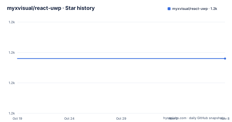
- myxvisual/react-uwp1,168 ★ · +0
| Repository | 2026-10-19 | 2026-11-08 |
|---|---|---|
| myxvisual/react-uwp | 1.2k | 1.2k |
0 Stars in the last 20 days, measured from the daily GitHub snapshot. Compare with other projects
Editorial analysis
What the library is
react-uwp is a set of React components that implement Microsoft's UWP Design and the Fluent Design System. The description is a design language, not a feature list, and that is the right way to read the project. The audience is a developer who has been handed a mockup in the Windows 10 style and wants matching controls in a web application, or who is porting a desktop-style tool to the browser. The primary language is TypeScript, the licence is MIT, and the homepage is react-uwp.com, which doubles as the documentation site with live component examples. The last push was on 2026-04-18, and the published releases are v1.2.3, v1.2.2 and v1.1.5, all dated 2019-03-08, with the package manifest at version 1.3.4. That gap between the newest tag and the newest commit is worth holding onto, because the component set is effectively a fixed artefact and anything you need beyond it you write yourself.
Installation, and the theme requirement
The install is a single npm command, and the README says all you need is node.js and gulp:
``` bash npm install --save react-uwp ```
The more important constraint is the next one. React-UWP components require a theme to be provided, and the quickest way to get up and running is to use the `Theme` to inject the theme into your application context, after which you can use any of the components as the documentation demonstrates. That is a design decision rather than a convenience. A component library that carries its own CSS file works without setup, but one where every component reads colours, spacing and typography from a context object can be themed at the application level, which is what makes the custom theme feature work. The cost is that there is no way to use a single component without a provider above it, and an application with two design languages in it needs two providers or a merged theme.
The provider, and the four theme options
The provider is used as a theme provider component wrapping the application, and it takes a theme object produced by a `getTheme` call:
<UWPThemeProvider
  theme={getTheme({
    themeName: "dark", // set custom theme
    accent: "#0078D7", // set accent color
    useFluentDesign: true, // sure you want use new fluent design.
    desktopBackgroundImage: "http://127.0.0.1:8092/staticimages/jennifer-bailey-10753.jpg" // set global desktop background image
  })}
>
  <MyComponent />
</UWPThemeProvider>
Those four options are the whole of the top-level theme surface. `themeName` selects between the light and dark variants, `accent` sets the accent colour, `useFluentDesign` switches between the older UWP styling and the newer Fluent styling, and `desktopBackgroundImage` sets a global background. The `useFluentDesign` flag is the significant one, because a single library carries two design languages, and the `desktopBackgroundImage` option is the sort of detail that comes from the UWP era where the desktop itself was a themable surface.
Per-component imports, and why they matter
The usage example imports a single component rather than the package barrel:
import Button from "react-uwp/Button";instead of
import { Button } from "react-uwp";The README states the reason directly, that this will make your build process faster and your build output smaller, and for a complete mapping of React-UWP components to import, it points at `/src/index.ts` inside the npm package root directory. The barrel exists, so `import { Button }` works, but it pulls in the module graph for every component in the library whether you use them or not. For a design system of any size this is the difference between a component library that costs you nothing to include and one that dominates your bundle. The docs site is a separate directory in the repository, with its own package.json, and the root scripts drive it with `cd docs && npm start` for the local documentation server.
Theming a component, two ways
The customisation story has exactly two routes, and the documentation gives a page for each. With the theme, you can use a custom theme to style components. With the inline style, you can override individual component styles via the style property. The split matters because the two operate at different levels. A custom theme changes the defaults for every instance of a component type across the application, while an inline style changes one instance, which is what you want for a single button that has to stand out. The README also states that a default theme is implemented to render all React-UWP components, so the out-of-the-box appearance is the library's own design rather than an unstyled skeleton, and there is a four-theme-style image in the documentation showing Fluent Design and UWP Design side by side.
TypeScript, and the tsconfig step people miss
Because the package ships type definitions, a TypeScript project needs one extra configuration step, and the README calls it out. If you are coding by TypeScript, add the `ReactUWP` namespace to `tsconfig.json`, which in the given example means pointing `typeRoots` at `./node_modules/@types`, listing the TypeScript and TSX file globs, and adding `node_modules/react-uwp/index.d.ts` to the `files` array. The manifest confirms the shape with a `types` field pointing at `index.d.ts`. The peer dependencies are the other detail worth checking, and they are `react` and `react-dom` at `^16.0.0`, so the library expects React 16. That is the constraint to verify before anything else, because a component library pinned to an old React major will not install cleanly alongside React 18 or 19 without overrides, and the peer dependency range is the part a package manager will complain about.
The repository, and what state the project is in
The tree is conventional for a component library of its era, with a `src/` directory, a `packages/` directory, a `docs/` directory for the documentation site, `__assets__/` and `__mocks__/` directories, a `typings/` directory, `scripts/`, an `images/` directory, a `DEV.md`, a `ROADMAP.md` and a `CHANGELOG.md`. The build is TypeScript compiler driven, with `build:source` running `tsc --rootDir ./src --outDir ./build` and then a `write-package-files` script that generates the package.json files for the published output, and a `build:watch` variant using tsc-watch that copies the index.d.ts. The release flow runs `nextGitTag build:npm publish:npm publish:docs` through npm-run-all, with `commit` wired to git-cz and the changelog generated by conventional-changelog with the angular preset. The test script is a placeholder, `echo "Error: no test specified" && exit 0`, which is worth knowing before you rely on the library's correctness beyond the visual match.
Editorial conclusion
Adopt react-uwp if you are building a React interface that has to look like Microsoft's UWP or Fluent design, and you want per-component imports with a single theme provider. Skip it if you need an actively maintained design system, since the published releases date from 2019 and the last push was on 2026-04-18, so expect to maintain it yourself. Before you start, check the peer dependency, because the manifest asks for React 16, and note that the theme is required, since the components read their styling from the provider rather than from a stylesheet you import.
Frequently asked questions
How do I install react-uwp?
Run `npm install --save react-uwp`. The README says all you need is node.js and gulp, and the package is also available on cdnjs.
Do react-uwp components need a theme?
Yes. React-UWP components require a theme to be provided, and the quickest way to get started is to use the Theme component to inject the theme into your application context, after which you can use any of the components.
Why should I import react-uwp components individually?
Importing a single component, for example `import Button from "react-uwp/Button"`, rather than `import { Button } from "react-uwp"` makes the build process faster and the build output smaller. A full mapping of components to imports is in /src/index.ts inside the package.
How do I customise the look of react-uwp components?
Two ways. You can use a custom theme to style components, or override individual component styles via the style property. A default theme is implemented so the components render correctly out of the box, and getTheme takes options for the theme name, accent colour, whether to use Fluent Design and a global desktop background image.
Which React version does react-uwp support?
The package manifest lists peer dependencies on react and react-dom at ^16.0.0, and a TypeScript project needs the ReactUWP namespace added to tsconfig.json, including node_modules/react-uwp/index.d.ts in the files array.
Official sources
Add this badge to your README
If you maintain this project, the badge below links readers to this analysis and shows its maintenance status from the daily GitHub snapshot. Paste the markdown into your README; add ?metric=license or ?metric=stars to the image URL for a different field.

[](https://hysenlabs.com/projects/myxvisual-react-uwp)Star history chart for your README
[](https://hysenlabs.com/projects/myxvisual-react-uwp)Was this useful?