Cult UI: 150+ animated shadcn registry components you copy into your own project
Components crafted for Design Engineers. Styled using Tailwind CSS, fully compatible with Shadcn, and easy to integrate—just copy and paste. MIT 🤌
At a glance
- What is it?
- Cult UI is an MIT-licensed set of Tailwind CSS v4 and Motion components delivered as shadcn/ui registry items. Installing copies source into your repo, which gives you ownership and also leaves you without a release or version to track.
- Who is it for?
- Cult UI suits a shadcn/ui project on Tailwind CSS v4 where you want animated cards, device mockups and charts as editable source you own. It is a poor fit for a project still on an older Tailwind setup, or for a team that needs version tags and a release history to pin against.
- Can I use it commercially?
- Yes. MIT is a permissive licence: you can use, modify and sell software built on it, as long as you keep its copyright and licence notices.
- Is it still maintained?
- Yes. The repository last received commits 10 days ago.
- What is it written in?
- Mainly TypeScript, according to GitHub's language statistics.
Answers come from the project's GitHub data, last synced on November 7, 2026, and from our analysis. They are not legal advice.
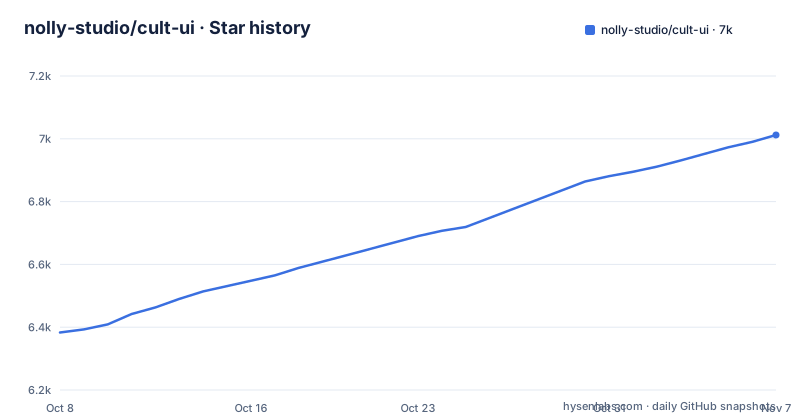
Star history
- nolly-studio/cult-ui7,012 ★ · +629
| Repository | 2026-10-08 | 2026-11-07 |
|---|---|---|
| nolly-studio/cult-ui | 6.4k | 7k |
629 Stars in the last 30 days, measured from the daily GitHub snapshot. Compare with other projects
Editorial analysis
The CLI copies source into your repo, so every component becomes your code to maintain
Cult UI is not installed as a package you import from node_modules. Every component is a shadcn/ui registry item, and the shadcn CLI copies the source into your project. The README puts it directly: you own the code.
That has a plain consequence. Once a component such as the shift card lands in your tree, it stops tracking the upstream repository. If the author later changes an animation, you get that change only by running the add command again and reconciling it with whatever you edited. The upside is that nothing hides behind a package boundary, so a design engineer can change spacing, easing or markup without a fork. The downside is that a bug fix has no version number to look for.
Two install paths: a full URL per component, or a registered namespace
The direct route names the registry JSON file of a single component:
npx shadcn@latest add https://www.cult-ui.com/r/shift-card.jsonIf you install several components, you can register the namespace once in components.json and then install by name:
{
  "registries": {
    "@cult-ui": "https://www.cult-ui.com/r/{name}.json"
  }
}npx shadcn@latest add @cult-ui/shift-cardBoth routes resolve to files served from cult-ui.com. The registry URL carries no version, so the same command run in a month can return different source from the one you installed today. Because the repository publishes no GitHub releases, there is no tag to pin against either. If a reproducible build matters, commit the copied files and treat them as your own.
Tailwind CSS v4 and shadcn theme tokens are assumed, and each page lists extra dependencies
Components use Tailwind CSS v4 and shadcn theme tokens, and most animate with Motion. That sentence carries the compatibility requirements. A project on an older Tailwind configuration, or one that has replaced the shadcn token names with its own, will need to adapt class names and colors in every component it copies.
The word most matters. Not every component uses Motion, and the README says only that each docs page lists its dependencies. There is no single dependency list in the README to install up front, so the check happens per component: open its docs page, read the list, then run the add command. For a team adding a dozen components, that is a dozen pages to read. The root package.json of the repository itself pins @tailwindcss/postcss at ^4.1.13, which matches the v4 claim.
58 new components are listed, but the README shows only six of them
The headline reads 150+ animated components, all free, with 58 just added. The just-added section groups them as illustrations, device mockups, cards and more, with the same docs and one-line install as the rest. The visible examples are Globe, Kanban board, Fluted glass, Mac screen, Analytics chart and Folded card, each linked to a page under cult-ui.com/docs/components, with dark-mode preview images.
That leaves most of the library out of sight in the README. Dynamic island is the link behind the Browse components entry. For anything else, the docs site is the place to look. If your design depends on a specific component, such as a kanban board with drag behavior, confirm on its docs page that it does what you expect before building around it.
The AI SDK Agents apps are a separate product, not part of the free component set
The README has a Built with Cult UI section that separates two things. The components are free. The full-stack AI apps built from them are AI SDK Agents, hosted at aisdkagents.com, offered as agent patterns on the Vercel AI SDK with live previews. You can install them with shadcn, download a Next.js app, or open them in v0.
The listed patterns include a competitor research agent that takes a URL and returns positioning, pricing and a sales battle card; a data analysis agent that takes CSV or JSON and returns charts, outliers and insights with confidence scores; an accessibility audit agent producing a WCAG 2.1 audit with a prioritized fix plan; and a table editor artifact, a spreadsheet you edit by chatting with it. The README presents these as a separate product built from the components, not as part of the free component set.
A Turborepo and pnpm workspace sits behind the registry, and the root package is private
The top-level package.json is named ui, version 0.0.1, and marked private. It is a workspace root rather than something to install. Workspaces cover apps, packages and templates, and the scripts run through Turborepo: build, dev, lint, typecheck, format:check and test. Two registry-specific scripts matter for contributors: registry:build and registry:check, both filtered to the www app, plus build:registry.
The CLI has its own package. build:cli and cli:dev filter on a package named cult-ui, and pub:beta and pub:release run from packages/cli. The repository also carries a changeset setup, husky hooks, commitlint and a vitest config. A contributor needs pnpm and should run registry:check before sending changes, since the registry files are what users download. A reader who only wants components never needs this layer.
Active pushes but no releases: the changelog lives on the docs site
The repository is not archived, and its last push was on 29 October 2026. It has no GitHub releases. The README links to a Changelog on the docs site instead, so that is the place to look for what changed, not the GitHub release page.
The tree also holds agent tooling folders: .agents, .claude and .cursor, alongside a DESIGN.md. These show that the project is set up for AI-assisted editing, but the README does not describe how they are used, and they do not affect what you install. The practical reading is simple. Recent activity means the library is being worked on, while the absence of tags means you decide when to refresh a copied component, and you should record the date you copied it.
Editorial conclusion
Cult UI suits a shadcn/ui project on Tailwind CSS v4 where you want animated cards, device mockups and charts as editable source you own. It is a poor fit for a project still on an older Tailwind setup, or for a team that needs version tags and a release history to pin against. Open the docs page of each component you plan to use and read its dependency list before running the add command.
Frequently asked questions
What UI components are available based on Shadcn?
Cult UI advertises 150+ animated components as shadcn/ui registry items, including Globe, Kanban board, Fluted glass, Mac screen, Analytics chart, Folded card and Dynamic island.
What are UI libraries?
Cult UI is one example: a library of ready-made interface components. Instead of an npm package, it hands you the source through the shadcn CLI, so you own and edit the code.
How do I install a Cult UI component?
Run npx shadcn@latest add https://www.cult-ui.com/r/shift-card.json, or register the @cult-ui namespace in components.json and run npx shadcn@latest add @cult-ui/shift-card.
Does Cult UI work with Tailwind CSS v3?
The README says components use Tailwind CSS v4 and shadcn theme tokens, so a Tailwind v3 project would need adjusting.
Official sources
Add this badge to your README
If you maintain this project, the badge below links readers to this analysis and shows its maintenance status from the daily GitHub snapshot. Paste the markdown into your README; add ?metric=license or ?metric=stars to the image URL for a different field.

[](https://hysenlabs.com/projects/nolly-studio-cult-ui)Star history chart for your README
[](https://hysenlabs.com/projects/nolly-studio-cult-ui)Was this useful?