Unity UI Toolkit Design System: one USS stylesheet, 42 components and a world-space gallery
Drop-in design system for Unity 6 UI Toolkit (UIDocument + PanelRenderer, UXML + USS): tokens, fx shader material support, 42 components, 120 icons, mobile-responsive, dark-themed. One stylesheet, zero dependencies. Battle-tested in a shipping cross-play game.
At a glance
- What is it?
- This repository is a dark-themed design system for Unity 6 UI Toolkit, with tokens, 42 components, 120 icons and a runtime helper. Its most unusual parts are the world-space panels that need Unity 6000.5 or newer and the theming rules that keep colours in stylesheets.
- Who is it for?
- This design system suits Unity 6 teams that build UI Toolkit screens in UXML and USS and want ready-made tokens, components and icons driven from one stylesheet, including on mobile. It is a poor match for projects on older Unity versions, and world-space panels require 6000.5 or newer.
- Can I use it commercially?
- Yes. MIT is a permissive licence: you can use, modify and sell software built on it, as long as you keep its copyright and licence notices.
- Is it still maintained?
- Yes. The repository last received commits 4 days ago.
- What is it written in?
- Mainly C#, according to GitHub's language statistics.
Answers come from the project's GitHub data, last synced on November 15, 2026, and from our analysis. They are not legal advice.
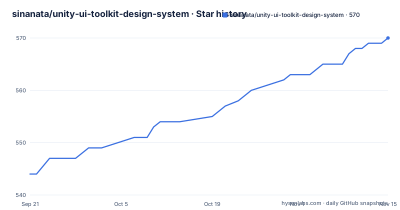
Star history
- sinanata/unity-ui-toolkit-design-system570 ★ · +26
| Repository | 2026-09-21 | 2026-11-15 |
|---|---|---|
| sinanata/unity-ui-toolkit-design-system | 544 | 570 |
26 Stars in the last 55 days, measured from the daily GitHub snapshot. Compare with other projects
Editorial analysis
One stylesheet drives tokens, components and icons
The project is a drop-in design system for Unity 6 UI Toolkit, meaning UIDocument or PanelRenderer with UXML and USS. It bundles tokens, components, icons, mobile responsiveness and a runtime helper, all themed dark, built for keyboard and touch input, and editable from one stylesheet. The repository description counts 42 components and 120 icons, claims zero dependencies, and mentions fx shader material support.
The single-stylesheet design is the main selling point and also the main constraint. Components are styled through ds- classes and design tokens, so a change in one place spreads across the interface, but a screen written with ad hoc styles will not pick up the system. The repository ships an AGENTS.md and an llms.txt so coding assistants such as Copilot, Cursor, Codex and Claude Code use those classes and tokens instead of guessing.
The README also lists a table of contents with sections on requirements, installation, quick start, fonts, materials, mobile, icons, architecture and a components reference, so the written guidance covers more than the stylesheet. Fonts and materials get their own sections, which is a hint that text rendering and GPU materials need setup beyond copying a USS file into a project.
World-space panels need Unity 6000.5 or newer
The system works on flat screens, and on Unity 6000.5 and later the same components also render on 3D surfaces in world space. The live demo includes a walkable gallery to demonstrate this: a 3D corridor where every section hangs on the walls as a live, interactive world-space panel using the same UXML and USS.
The gallery is built on PanelRenderer with world-space PanelSettings, with one panel per section, driven by the same DesignSystemBehaviour backends the drop-in uses. The README notes that UIDocument can host world-space UI too, and that the demo chose PanelRenderer because it is Unity's go-forward native renderer for UI Toolkit and its reload-callback model fits one procedural panel per section. If you stay on an older Unity 6 build, plan on flat screens only.
The gallery is also a stress test for the claim that the components are keyboard and touch ready: the same inputs, toggles and theme pickers work from inside the 3D space, and choosing a Codigrate theme there repaints every exhibit. If you only ship flat screens, the gallery is optional reading, but it shows that the stylesheet does not assume a screen-space panel.
A WebGL crash led to an upstream fix, and 6000.5 still needs a patch
While putting GPU materials on world-space panels, the author traced a WebGL crash, a CopyBufferRanges read out of bounds, to one line in Unity's UI geometry updater. A report with the root cause and a suggested fix became Unity issue UUM-151098, and the UI Toolkit team fixed it the way the report proposed.
The fix landed in Unity 6000.6.2f1 and 6000.7.0b1. On those editors world-space materials work in WebGL with no patch and no flag. On 6000.5 the issue is marked Won't Fix upstream, so you need the Tools/UirStagingPatch folder, which the repository provides. The consequence is a version split: on 6000.5, WebGL builds with world-space materials depend on a local build-machine patch, while newer editors do not. Check your editor version before you ship WebGL.
Theming flows through the var() cascade, except for the randomised palette
Toggling day or night in the colors section re-themes the whole tree over 240 ms through the var() cascade. The demo also offers a dropdown of 12 Codigrate IDE themes, each baked into a ThemeData asset at build time. Picking one adds a single stylesheet to the panel root, and the cascade repaints everything, including hover, disabled and checked states. The design system USS stays the single source of truth for spacing, radii, transitions and layout, and only colours come from the external source.
Two behaviours follow. The day and night toggle is suppressed while a third-party palette is active, because Codigrate carries its own appearance field, and it returns when you choose the default. The Randomize button builds an HSV-driven palette at runtime, and that is the one palette that cannot be an asset, because Unity cannot compile a stylesheet from a string in a player build. Randomised colours are stamped inline onto every element.
Building the web demo pulls in a submodule orchestrator
You can build the interactive demo locally with PowerShell. Clone with submodules, or initialise them after a plain clone, then run the build script with the serve switch:
git clone --recurse-submodules https://github.com/sinanata/unity-ui-toolkit-design-system
# or, after a plain clone: git submodule update --init --recursive
.\Tools\Build\Build-Showcase.ps1 -Serve
The demo serves at http://localhost:3000. The build flow lives in a shared cross-platform orchestrator that is vendored as a submodule at Tools/.orchestrator, which is why a plain clone without submodules leaves the build script without its helper. The orchestrator is a separate repository by the same author. The script is PowerShell, so on macOS or Linux you need PowerShell installed, and the Build README in Tools/Build covers the rest.
The demo doubles as a selector inspector, with a phone layout below 768 px
In the web demo you hover on desktop, or tap on mobile, any component to see its selector chain: every parent class on the way down to the leaf, plus the leaf's class list ready to copy. Clicking the classes line copies it to the clipboard. That makes the demo a practical way to find the right ds- class without reading the stylesheet.
Other details show the target use. A slim themed scrollbar is used throughout, and the layout flips to a mobile arrangement below 768 px. In the world-space gallery you walk with W, A, S, D or the arrow keys, look with the right mouse button or Q and E, and exit with Esc or the Screen Space tab. On touch devices two on-screen sticks handle walking and looking, so taps stay reserved for the components themselves.
One shipping game is the evidence, and there are no tagged releases
The project says it was built for and battle-tested in Leap of Legends, a cross-platform multiplayer game with cross-play across Steam, iOS and Android, where every menu, HUD, lobby and store screen uses the design system. That is a single production reference from the author's own game, not independent adoption data.
The repository has no GitHub releases, so you cannot pin a tagged version. The changelog is the version record: entries such as 1.4.7 from 2026-07-13 and 1.4.0 from 2026-05-16 are cited in the README. The last push was on 2026-10-24 and the license is MIT. The same author publishes an Unreal version, unreal-umg-design-system, and other Unity tools such as a mesh fracturer and a build orchestrator, so the repository sits inside a small family of related projects.
Editorial conclusion
This design system suits Unity 6 teams that build UI Toolkit screens in UXML and USS and want ready-made tokens, components and icons driven from one stylesheet, including on mobile. It is a poor match for projects on older Unity versions, and world-space panels require 6000.5 or newer. Before adopting, check the Unity version you ship on against the WebGL fix notes, and remember that the project has no tagged releases to pin.
Frequently asked questions
What is the Unity UI toolkit?
In this project UI Toolkit means Unity's UI system built from UIDocument or PanelRenderer with UXML and USS files. This repository is a design system that sits on top of it for Unity 6.
What is a UI design kit?
This one is a set of tokens, 42 components, 120 icons and a runtime helper, themed dark and styled from a single stylesheet, for Unity 6 UI Toolkit.
Which Unity version does the design system need?
It targets Unity 6 UI Toolkit. World-space rendering of the components needs Unity 6000.5 or newer, and the WebGL crash fix is in 6000.6.2f1 and 6000.7.0b1.
Official sources
Add this badge to your README
If you maintain this project, the badge below links readers to this analysis and shows its maintenance status from the daily GitHub snapshot. Paste the markdown into your README; add ?metric=license or ?metric=stars to the image URL for a different field.

[](https://hysenlabs.com/projects/sinanata-unity-ui-toolkit-design-system)Star history chart for your README
[](https://hysenlabs.com/projects/sinanata-unity-ui-toolkit-design-system)Was this useful?