jest-styled-components: readable snapshots and precise style assertions
🔧 💅 Jest utilities for Styled Components
At a glance
- What is it?
- jest-styled-components is a test utility package for styled-components v5 and later. It replaces unstable generated class names with sequential placeholders, includes CSS in snapshots, and adds a `toHaveStyleRule` matcher for Jest, Vitest, and Bun.
- Who is it for?
- Adopt jest-styled-components if your team tests styled-components v5 or later and finds ordinary snapshots hard to review. Do not add it if generated class names are not a problem or you need a framework-independent browser test runner.
- Can I use it commercially?
- Yes. MIT is a permissive licence: you can use, modify and sell software built on it, as long as you keep its copyright and licence notices.
- Is it still maintained?
- Yes. The repository last received commits 1 day ago.
- What is it written in?
- Mainly JavaScript, according to GitHub's language statistics.
Answers come from the project's GitHub data, last synced on November 7, 2026, and from our analysis. They are not legal advice.
Star history
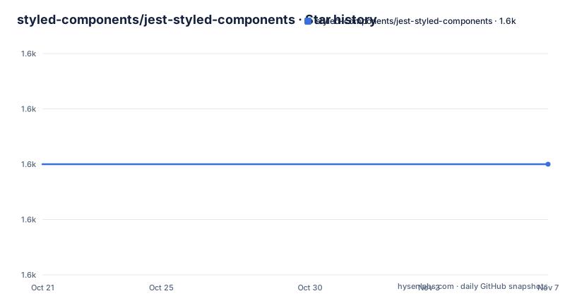
- styled-components/jest-styled-components1,580 ★ · +0
| Repository | 2026-10-21 | 2026-11-07 |
|---|---|---|
| styled-components/jest-styled-components | 1.6k | 1.6k |
0 Stars in the last 17 days, measured from the daily GitHub snapshot. Compare with other projects
Editorial analysis
Why styled-components snapshots need a specialized serializer
Styled-components creates CSS from component definitions at runtime. In a normal snapshot, the rendered markup can therefore contain opaque hashed class names, while the CSS rules that explain those names are absent from the snapshot. A style change may produce a diff dominated by a class-name replacement rather than a readable change such as `color: green` becoming `color: blue`.
`jest-styled-components` addresses that specific testing problem. Its serializer assigns sequential placeholders such as `c0` and `c1` to classes, and placeholders such as `k0` and `k1` to keyframes. It also prepends the matching CSS rules to the snapshot output. The package is therefore most useful for teams that render styled components in unit tests and inspect snapshots during code review.
The README says the utility supports styled-components v5 and later. It is not a general CSS assertion library. Its purpose is to make snapshots and assertions align with the CSS emitted by styled-components. A project that does not use styled-components, or a component suite whose rendered output is already clear without this serializer, gains little from adding the dependency.
The snapshot and matcher data flow
The package registers a Jest snapshot serializer and a custom matcher from a setup file. When a styled element is passed to `toMatchSnapshot()`, the serializer examines the relevant stylesheet output, replaces generated identifiers with stable placeholders, and includes the associated CSS rules in the snapshot. The resulting snapshot communicates both the DOM structure and the style declaration that a reviewer needs to understand.
The `toHaveStyleRule` matcher provides a separate path for explicit assertions. Its documented signature is `expect(element).toHaveStyleRule(property, value?, options?)`. The property argument identifies a CSS declaration. The value may be a string, `RegExp`, asymmetric matcher such as `expect.stringContaining()`, or `undefined` when the test needs to assert that the property is not set. When the matcher is used with `.not`, the README says the value argument is optional.
The options object is where the matcher becomes more precise than a basic declaration check. It can target `@container`, `@layer`, `@media`, and `@supports` rules through `container`, `layer`, `media`, and `supports`. It can also use `modifier` for selector refinements, `namespace` for styles generated under a `StyleSheetManager`, and `selector` for raw CSS selectors. This distinction matters because a component may define the same property under different conditions. A plain matcher call can confirm a value exists, while an option-qualified call can identify which rule is expected to provide it.
Installing jest-styled-components and registering it in Jest
Install the package as a development dependency. The README gives separate commands for npm, pnpm, Yarn, and Bun. For a Jest project, the import must run in a setup file registered after the test environment is initialized. Because styled-components needs a DOM, the README also requires `testEnvironment: 'jsdom'` for Jest.
Create the setup file first. This import registers the serializer and `toHaveStyleRule` matcher globally:
// setupTests.js
import 'jest-styled-components'
Then register that file in `jest.config.js`:
module.exports = {
  testEnvironment: 'jsdom',
  setupFilesAfterEnv: ['<rootDir>/setupTests.js'],
}
For Jest 27 and later, the README specifically calls out the changed default test environment. Jest 28 and later may also require installing `jest-environment-jsdom` separately. If a test fails because no DOM is available, check this configuration before changing the matcher or component code.
A first styled-components assertion with Testing Library
The following example follows the README's quick example. It defines a styled button, renders it with `@testing-library/react`, writes a snapshot, and checks one generated CSS rule. The snapshot is useful for reviewing the component's complete output, while `toHaveStyleRule` makes the expected declaration explicit.
import React from 'react'
import styled from 'styled-components'
import { render } from '@testing-library/react'
import 'jest-styled-components'

const Button = styled.button`
  color: red;
`

test('it works', () => {
  const { container } = render(<Button />)
  expect(container.firstChild).toMatchSnapshot()
  expect(container.firstChild).toHaveStyleRule('color', 'red')
})
A useful first check is the generated snapshot on the next test run. The README explains that the output should contain a placeholder class and the actual CSS rule rather than only the opaque runtime class. The exact snapshot shape is generated by Jest, so use the first successful run to create the committed snapshot and then inspect the diff when a style changes.
For prop-dependent CSS, the matcher accepts values calculated by the component. The README gives examples for a disabled button, including `expect.stringContaining('transparent')` for a partially matching border and `undefined` for a property that should not be emitted. This is more readable than asserting the generated class string.
Vitest and Bun entry points are not interchangeable by accident
The package supports test runners other than Jest, but each runner needs its own registration path. Vitest users must import the dedicated `jest-styled-components/vitest` entry point. The README states that this entry point imports `expect` and `beforeEach` explicitly from Vitest, and that TypeScript types are included.
// setupTests.ts
import 'jest-styled-components/vitest'
Register the file with Vitest:
// vitest.config.ts
import { defineConfig } from 'vitest/config'

export default defineConfig({
  test: {
    setupFiles: ['./setupTests.ts'],
  },
})
Bun uses the package's standard entry point because Bun provides the globals that the library hooks into:
// setupTests.ts
import 'jest-styled-components'
The file must be listed under Bun's test preload configuration:
# bunfig.toml
[test]
preload = ["./setupTests.ts"]
The distinction is an integration requirement, not a cosmetic naming difference. Using the Jest import with Vitest does not follow the documented setup, while the Vitest entry point explicitly binds to Vitest's own expectation and lifecycle APIs.
Selector options expose a real matching boundary
`toHaveStyleRule` can test more than the default component rule, but its options also define where the matcher searches. A media query assertion requires both the at-rule and the selector modifier. The README's example uses a button with a `@media (max-width: 640px)` block and a `:hover` selector, then asks for `color` with both options.
const Button = styled.button`
  @media (max-width: 640px) {
    &:hover {
      color: red;
    }
  }
`

test('media + modifier', () => {
  const { container } = render(<Button />)
  expect(container.firstChild).toHaveStyleRule('color', 'red', {
    media: '(max-width:640px)',
    modifier: ':hover',
  })
})
The same approach applies to `@supports`, `@container`, and `@layer`. For global styles, `selector` allows matching by a raw CSS selector, which the README identifies as useful for `createGlobalStyle`. `namespace` supports selectors generated through `StyleSheetManager`, while `modifier` can contain pseudo-selectors, combinators, `&` references, or a component selector supplied through the `css` helper.
This specificity is a feature, but it creates a maintenance cost. Tests can fail when formatting changes in a query or selector even when the rendered result is visually equivalent. The package does not document a fallback that treats all matching declarations as equivalent, so teams should use the narrowest documented option that expresses the behavior they intend to protect.
Compatibility, maintenance, and a practical alternative
The repository is not archived, and its last push was on 2026-09-10. The recent release history includes `[email protected]`, released on 2026-03-27. That indicates recent project activity, but the README does not promise a particular release cadence or long-term support schedule. The package metadata identifies `[email protected]` as its package manager and includes scripts for web, native, Preact, and Vitest checks, plus `publint` and `attw` package validation.
The project is MIT licensed. The repository includes a `LICENSE` file, and the package metadata declares `"license": "MIT"`. The README does not provide legal interpretation, warranty terms, or details about how license changes would be communicated. Upgrade planning should therefore check the changelog and compatibility notes for the installed version rather than infer a migration cost from the package description.
The real alternative is to use the test runner's ordinary snapshot and DOM assertions without this package. That approach avoids the serializer and custom matcher, but snapshots remain less informative for styled-components because they may contain generated classes without CSS rules. Another alternative is to assert computed styles through a general browser or DOM testing tool. That can verify rendered values, but it does not replace `toHaveStyleRule`'s documented access to styled-components CSS structure, selectors, at-rules, namespaces, and global selectors. The choice depends on whether readable snapshots and rule-level matching are the problem you need solved.
Editorial conclusion
Adopt jest-styled-components if your team tests styled-components v5 or later and finds ordinary snapshots hard to review. Do not add it if generated class names are not a problem or you need a framework-independent browser test runner. Before adoption, verify that your Jest environment uses `jsdom`, choose the correct Jest, Vitest, or Bun entry point, and confirm that your assertions cover the selectors and at-rules used by the components under test.
Frequently asked questions
How do I install jest-styled-components for Jest?
Install it as a development dependency, import `jest-styled-components` in a setup file, and register that file through `setupFilesAfterEnv`. Jest tests for styled-components also need `testEnvironment: 'jsdom'` according to the README.
What does jest-styled-components change in a snapshot?
Its serializer replaces generated class names with sequential placeholders such as `c0` and includes the matching CSS rules. This makes style changes visible as CSS differences rather than only as opaque class-name changes.
Can I use jest-styled-components with Vitest or Bun?
Yes. The README documents a dedicated `jest-styled-components/vitest` entry point for Vitest and the standard import for Bun. Vitest needs its setup file in `test.setupFiles`, while Bun needs it in the `preload` list under `[test]`.
How do I assert a media-query rule with toHaveStyleRule?
Pass the media condition through `options.media` and refine the selector through `options.modifier`. The README uses `media: '(max-width:640px)'` with `modifier: ':hover'` to target a rule inside a media query.
Is jest-styled-components compatible with styled-components v5?
The README describes the package as testing utilities for styled-components v5 and later. It is intended for styled-components CSS snapshots and style-rule assertions rather than for unrelated CSS libraries.
Official sources
Add this badge to your README
If you maintain this project, the badge below links readers to this analysis and shows its maintenance status from the daily GitHub snapshot. Paste the markdown into your README; add ?metric=license or ?metric=stars to the image URL for a different field.

[](https://hysenlabs.com/projects/styled-components-jest-styled-components)Star history chart for your README
[](https://hysenlabs.com/projects/styled-components-jest-styled-components)Was this useful?