styled-icons: 20 icon packs, thirty-six packages, one build
💅 Popular icon packs like Font Awesome, Material Design, and Octicons, available as React Styled Components
At a glance
- What is it?
- styled-icons repackages Font Awesome, Material Design, Feather and seventeen other icon sets as React styled components, published as one metapackage or thirty-six scoped packages. It fits React codebases already running styled-components, and nobody else.
- Who is it for?
- Adopt styled-icons when your React app already runs on styled-components 4.1.0 or newer and you want Material Design or Font Awesome weights without wiring up icon fonts yourself. Skip it if you are on Emotion or on plain SVG, because the README redirects both cases to emotion-icons and svg-icons.
- Can I use it commercially?
- Yes. MIT is a permissive licence: you can use, modify and sell software built on it, as long as you keep its copyright and licence notices.
- Is it still maintained?
- Yes. The repository last received commits 75 days ago.
- What is it written in?
- Mainly JavaScript, according to GitHub's language statistics.
Answers come from the project's GitHub data, last synced on November 7, 2026, and from our analysis. They are not legal advice.
Star history
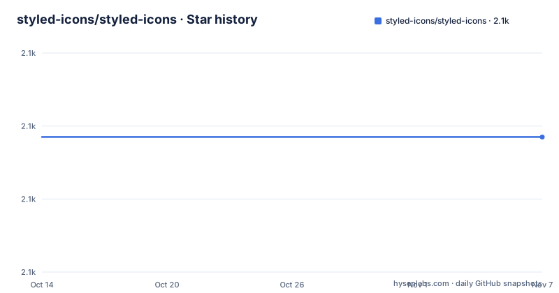
- styled-icons/styled-icons2,097 ★ · +0
| Repository | 2026-10-14 | 2026-11-07 |
|---|---|---|
| styled-icons/styled-icons | 2.1k | 2.1k |
0 Stars in the last 24 days, measured from the daily GitHub snapshot. Compare with other projects
Editorial analysis
Twenty icon packs split into thirty-six scoped packages
The README names twenty icon packs, but the per-pack install list runs to thirty-six entries, because packs that ship several weights are broken into separate packages. Font Awesome becomes `@styled-icons/fa-brands`, `@styled-icons/fa-regular` and `@styled-icons/fa-solid`. Material Design becomes material, material-outlined, material-rounded, material-twotone and material-sharp. Remix splits into remix-fill, remix-editor and remix-line, and Ionicons covers three weights as ionicons-sharp, ionicons-solid and ionicons-outline. Feather and Octicons get one package each. Over 20,000 icons ship in total, and every one of them is a styled component rather than a font glyph or a sprite.
Imports follow the same split. The metapackage hands you named pack objects, while each scoped package is taken as a namespace:
import {material, octicons} from 'styled-icons'

import * as feather from '@styled-icons/feather'
import * as faSolid from '@styled-icons/fa-solid'
The narrower route is the one this packaging exists for. Whether a given import actually tree-shakes cannot be read off the repository, though: the README claims tree-shaking and ES module support, no bundle sizes are published, and the build scripts measure nothing. Check your own output before committing to one route.
Installing the metapackage or a single scoped pack
Two install routes are documented, and they land the same metapackage in your tree:
yarn add styled-iconsor with npm:
npm install styled-icons --saveThat package pulls all twenty packs. If your application uses four icons out of a library this size, install scoped packages instead:
yarn add @styled-icons/feather
yarn add @styled-icons/material
yarn add @styled-icons/octicons
Scoped names have to match the namespace you import later, character for character, so a typo surfaces as a failed module lookup rather than as the wrong glyph. One floor is fixed before anything renders: styled-components must already be in the project at 4.1.0 or newer, because styled-icons declares it as a peer dependency instead of bundling it. The README states no upper bound for that dependency and no React version at all. Individual exports are looked up on the Icon Explorer at https://styled-icons.dev before you write the import.
Two Babel passes and a declaration-only pass per package
Icon sources are compiled three times. The root `build:icons` script runs the per-package generate step first, fans the compiler passes out in parallel, then repairs the manifests:
"build:icons": "pnpm generate && run-p 'build:icons:*' && pnpm generate:pkg",
"build:icons:cjs": "env BABEL_ENV=legacy pnpm babel packages --extensions '.ts,.tsx' --out-dir packages",
"build:icons:esm": "env BABEL_ENV=modern pnpm babel packages --extensions '.ts,.tsx' --out-dir packages --out-file-extension .esm.js",
"build:icons:typescript": "pnpm tsc --emitDeclarationOnly",
`BABEL_ENV=legacy` writes CommonJS back into the package directories, `BABEL_ENV=modern` writes ES modules under a `.esm.js` extension, and the TypeScript pass emits declarations and nothing else. The closing step, `generate:pkg`, finds every `package.built.json` under the packages directory and renames it to `package.json`, so each published manifest is a build artefact rather than a file you edit by hand.
Contributors run this through a pnpm workspace: the root manifest is marked private, the lockfile is `pnpm-lock.yaml`, and a `pnpm-workspace.yaml` sits beside it. The generate step that opens `build:icons` is `pnpm run -r generate`, so every package under `packages` emits its own icon modules before any compiler touches them. Babel is pinned at `^7.20.7`, with `@babel/preset-env` at `^7.20.2`.
Changesets publish every package from a private root manifest
Publishing runs through Changesets. The `.changeset/` directory holds pending change entries, and two root scripts carry the maintenance load:
"update-all": "ncu -u -p npm --deep --dep dev,optional,prod,bundle --reject typescript && pnpm i --no-frozen-lockfile",
"release": "pnpm build:icons && pnpm changeset publish"
The workspaces the tool walks are declared in the root manifest as `packages/*`, `packages/@styled-icons/*`, `storybook` and `tools/*`, so one recorded version bump reaches every scoped package. Dependency upkeep is the other half: `update-all` runs `ncu` across dev, optional, prod and bundle dependencies, refuses to touch typescript, then reinstalls with a non-frozen lockfile.
In the published version history, `[email protected]` dates to 2024-04-05, the two entries before it are 10.47.0 from 2022-12-22, and the last push on the default branch is dated 2026-08-24. Both the metapackage and `@styled-icons/octicons` carry 10.47.0 with the same 2022-12-22 timestamp, which is the shared-version model showing through. Commits have landed on the default branch for well over a year past the newest published version, and anyone pinning a version gets the 2024 build rather than the current tree.
The root also holds a single LICENSE file under the MIT licence, and the README table of contents carries a License anchor.
Every glyph is a styled component, which sets the ceiling
The dependency you are really signing up for is the styling layer itself. Every icon rendered here goes through styled-components, which costs nothing in a React codebase already running 4.1.0 or newer. Anywhere else it is the entire reason to choose a different library, and the README says so directly: Emotion users are pointed at emotion-icons, and people who want raw SVG files are pointed at svg-icons.
Two packaging costs sit underneath that. Installing `styled-icons` installs all twenty packs, reasonable for a design system shell and heavy for one page that needs a checkmark. And the peer dependency floor carries no stated upper limit, so whether your styled-components major is compatible is something you verify against your own version rather than against this documentation.
The README table of contents promises sections on Props, Icon Dimensions, Styled Components, Base Icon Styles, Accessibility, Tree Shaking and TypeScript. The install path needed for a first render stops right after the peer dependency note.
Emotion Icons and SVG Icons hold the same packs elsewhere
The comparison worth making is the one the README itself points at. emotion-icons carries the same icon libraries and swaps the rendering layer for Emotion components, which is the answer for a project that never installed styled-components. svg-icons removes styling altogether and hands back plain SVG assets, which fits non-React targets and anything that needs the raw file on disk.
Inside styled-icons the same choice appears as scope. One metapackage install gives you every pack and the shortest imports. A handful of scoped installs keeps all other packs out of the dependency tree and out of the lockfile. A direct dependency on an upstream pack leaves you owning the icon component, the sizing convention and the colour handling, and that becomes real work once the count passes a few dozen.
Root tooling pairs a pnpm workspace with a leftover Travis file
Generated sources inherit one Prettier profile from the root manifest:
"prettier": {
  "bracketSpacing": false,
  "printWidth": 120,
  "semi": false,
  "singleQuote": true,
  "trailingComma": "all"
},
Every icon file in every pack therefore ships semicolon-free, single-quoted and wrapped at 120 columns, which keeps diffs small when a pack regenerates. Tooling in the same manifest is pinned less evenly: `@babel/cli` sits at `^7.20.7`, the Storybook webpack5 builders at `^6.5.15`, and the monorepo linter at `0.5.0-alpha.97` with no range prefix at all. A lint tool still on an alpha, pinned at one exact version, decides whether a fork stays maintainable, since it has to be moved deliberately rather than resolved by install. Linting runs through `@monorepolint/cli` at `^0.5.0-alpha.96`, and the versioning tool is `@changesets/cli` at `^2.26.0`.
Two root files disagree with the rest of the setup. The build badge points at the GitHub Actions workflow while `.travis.yml` still sits in the root, and `package.json` still declares yarn-style `workspaces` even though every script calls pnpm and the root holds `pnpm-workspace.yaml` alongside `.pnpmfile.cjs`. None of that stops an install of the published packages.
Editorial conclusion
Adopt styled-icons when your React app already runs on styled-components 4.1.0 or newer and you want Material Design or Font Awesome weights without wiring up icon fonts yourself. Skip it if you are on Emotion or on plain SVG, because the README redirects both cases to emotion-icons and svg-icons. Before installing the metapackage, measure it against two or three scoped packages, and check that your bundler actually shakes the narrower import, since the repository publishes no bundle sizes for any pack.
Frequently asked questions
Does styled-icons work with Emotion or with plain SVG instead of styled-components?
No. styled-icons depends on styled-components as a peer dependency at 4.1.0 or newer, so the styling runtime has to be present already. The README sends Emotion users to emotion-icons and people who want raw SVG files to svg-icons.
How do I install only the icon pack I need from styled-icons?
Install the scoped package instead of the metapackage, for example `yarn add @styled-icons/feather`, then import it as a namespace in your code. Font Awesome splits into three scoped packages and Material Design into five, so pick the weight you actually render.
What version of styled-icons is current and is the project still moving?
The newest version in the published history is 10.47.1 from 2024-04-05, while the last push on the default branch is dated 2026-08-24. Commits are landing well after that version, so a pinned install gets the 2024 build rather than the current tree.
How many icons does styled-icons include?
The README states over 20,000 icons across twenty named packs. Those packs publish as thirty-six scoped packages, because multi-weight sets such as Font Awesome and Material Design are split one package per weight.
Can I use styled-icons without installing styled-components first?
Not according to the stated setup. You need a version of styled-components at least 4.1.0 in the project, since styled-icons depends on it as a peer dependency and the README names no upper bound or React version.
Does styled-icons ship TypeScript types and ES module output?
The README claims full support for TypeScript types and tree-shaking with ES modules, and the build emits declarations with tsc plus a second Babel pass writing .esm.js files. No bundle sizes are published for any pack, so the tree-shaking claim is not quantified anywhere.
Official sources
Add this badge to your README
If you maintain this project, the badge below links readers to this analysis and shows its maintenance status from the daily GitHub snapshot. Paste the markdown into your README; add ?metric=license or ?metric=stars to the image URL for a different field.

[](https://hysenlabs.com/projects/styled-icons-styled-icons)Star history chart for your README
[](https://hysenlabs.com/projects/styled-icons-styled-icons)Was this useful?