react-menu implements the WAI-ARIA menu pattern without shipping styles
React component for building accessible menu, dropdown, submenu, context menu, and more
At a glance
- What is it?
- react-menu is an MIT licensed React component library for menus, dropdowns, submenus and context menus that implements the WAI-ARIA menu pattern with full keyboard interaction, and it is deliberately unstyled so the application owns the appearance. The runtime dependency list is one package, react-transition-state, and it ships CommonJS, ESM and type declarations.
- Who is it for?
- react-menu fits a team that needs an accessible menu with correct keyboard behaviour, focus management and ARIA wiring without adopting somebody else's design system, and it fits a project that already has its own styling and wants the behaviour without the CSS. It does not fit a team that wants a styled dropdown out of the box, and it does not fit a project that needs the newer ARIA patterns for comboboxes, since this implements the menu pattern specifically.
- Can I use it commercially?
- Yes. MIT is a permissive licence: you can use, modify and sell software built on it, as long as you keep its copyright and licence notices.
- Is it still maintained?
- Yes. The repository last received commits 1 day ago.
- What is it written in?
- Mainly JavaScript, according to GitHub's language statistics.
Answers come from the project's GitHub data, last synced on November 7, 2026, and from our analysis. They are not legal advice.
Star history
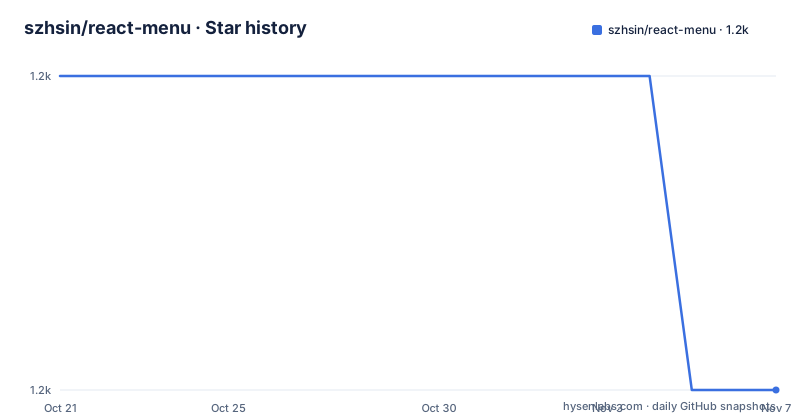
- szhsin/react-menu1,218 ★ · -1
| Repository | 2026-10-21 | 2026-11-07 |
|---|---|---|
| szhsin/react-menu | 1.2k | 1.2k |
-1 Stars in the last 17 days, measured from the daily GitHub snapshot. Compare with other projects
Editorial analysis
Unstyled on purpose, and the WAI-ARIA menu pattern is the spec
react-menu is described as an accessible, keyboard-friendly React menu library, and the feature list names both the accessibility target and the styling position.
It implements the WAI-ARIA menu pattern from the ARIA Authoring Practices Guide, and it is a lightweight, unstyled React menu components library. Both halves of that sentence matter, and together they define the package.
The styling position is a deliberate constraint rather than a missing feature. A menu library that ships its own CSS takes a decision away from the application, and any application whose design system does not match has to override it, which is more work than writing the four rules yourself. Leaving the styles out means the component provides behaviour and semantics and the application provides everything visual.
The accessibility position is the reason to use it at all. The WAI-ARIA menu pattern is a specification, and it covers the parts of a menu that are easy to get subtly wrong. Which key opens a submenu and which closes it, where focus goes when a submenu opens and when it closes, how arrow keys move between items, how the typeahead behaviour works, what happens on Escape, how the menu returns focus to its trigger when it closes, and what roles and aria attributes each element needs so a screen reader announces the structure correctly.
Getting that right by hand for every menu in an application is a lot of repeated work, and getting it wrong produces a menu that is unusable with a keyboard, which is the most common accessibility failure in application interfaces.
The feature list also names React 18+ concurrent rendering compatibility and server-side rendering support, and unlimited submenu nesting, along with dropdown, hover and context menus, radio and checkbox menu items, and flexible positioning options.
The live examples and documentation are at szhsin.github.io/react-menu/, and there is a CodeSandbox link for editing the example, plus an FAQs document and migration guides for anyone on an old version.
The usage example is deliberately complete
The usage example in the README is short and it shows the whole component vocabulary in one block.
import { Menu, MenuItem, MenuButton, SubMenu } from '@szhsin/react-menu';

export default function App() {
  return (
    <Menu menuButton={<MenuButton>Open menu</MenuButton>}>
      <MenuItem>New File</MenuItem>
      <MenuItem>Save</MenuItem>
      <SubMenu label="Edit">
        <MenuItem>Cut</MenuItem>
        <MenuItem>Copy</MenuItem>
        <MenuItem>Paste</MenuItem>
      </SubMenu>
      <MenuItem>Print...</MenuItem>
    </Menu>
  );
}
Four components carry the example. Menu is the container and takes a menuButton prop, which is the element that opens it, and here that is a MenuButton. MenuItem is a single action. SubMenu is a nested menu and takes a label, so the parent item is labelled and the children are items again.
The point of the example is that it is complete, and that completeness is the accessibility argument. The menu button, the menu, the items and the submenu are all present, and the ARIA relationships between them are established by the library rather than by attributes the developer has to remember. A developer who copied this snippet gets a keyboard-navigable menu with a labelled submenu, and the difference between that and a div with an onClick is the whole value of the package.
The SubMenu usage is also the part with the most behaviour behind it. A submenu has to open on a key and on hover, position itself relative to its parent, move focus into itself, and return focus when it closes, and it has to do that without the developer writing any of it.
The package is published on npm as @szhsin/react-menu, which is a scoped name, so the import path carries the scope and the install command is npm install @szhsin/react-menu or yarn add @szhsin/react-menu.
One runtime dependency and three output formats
The package.json is where the engineering story is, and the dependency section is remarkable for its size.
"peerDependencies": {
  "react": ">=16.14.0",
  "react-dom": ">=16.14.0"
},
"dependencies": {
  "react-transition-state": "^2.4.0"
}
So React and React DOM are peer dependencies, which is the correct arrangement for a component library, and there is exactly one runtime dependency, react-transition-state, which is a small hook for managing the open and closed states of a transition with proper handling of the leave phase, so the menu can animate out rather than disappearing the instant it closes.
That single dependency is a reasonable place to pause. A menu library that manages focus, keyboard navigation, ARIA, positioning, and animation is not small, and the fact that it needs one helper package rather than a positioning library and a state machine library is worth noticing. The positioning is done by the component itself, and the README lists flexible positioning options as a feature without a separate dependency for it.
The build outputs are three, and they are declared in the conventional way. The main field is ./dist/cjs/index.cjs, the module field is ./dist/esm/index.mjs, and the types field is ./types/index.d.ts, with the publishConfig setting access to public.
The sideEffects field is an array containing the CSS glob, which is a precise and unusual choice. The usual value is false, which tells a bundler it can drop any module it thinks is unused. Listing the CSS pattern instead tells the bundler that the stylesheets must be kept and that the JavaScript is otherwise side-effect free, which is exactly right for a library that ships stylesheets separately.
The files array publishes three things, the dist directory, the type declarations and the style-utils directory, so the style helpers are available to consumers.
The build script chains the steps, and the order is the one that matters.
"build": "run-s pret clean lint types css bundle"Prettier checks the formatting first, then the clean, lint, types, css and bundle steps run in sequence. The css step is sass src/styles:dist --no-source-map, and the bundle step is rollup -c. The types step is a separate cd types && tsc, which is how a project with hand-maintained or separately generated declaration files handles them.
Testing, and the example app that ships with the package
The test tooling is Jest with the React Testing Library, and the setup has a specific piece of configuration that tells you something about the library.
"test": "jest",
"test:watch": "jest --watch --verbose",
"test:cov": "jest --coverage=true"
The dev dependencies include @testing-library/react at ^16.3.3 and @testing-library/jest-dom at ^7.0.1, and there is a jest.config.js and a setup-jest.js at the root. The Testing Library is the right choice for a component like this, because the tests query the rendered output by role and by name rather than by implementation detail, and a role-based query is exactly what a screen reader would use, so a test that finds a menu item by its accessible role is testing the accessibility at the same time.
That matters more for this library than for a typical component. The contract here is that a menu item is announced as a menu item, that a submenu is announced as a menu and has the right expanded state, and that keyboard interaction moves focus in the right order. All of that is observable through roles and accessible names, so a test suite written that way covers the feature that makes the library worth using.
The repository top level listing shows the shape of the project. There is a src/ directory for the components, a style-utils/ directory published to consumers, a types/ directory built separately, a dist/ directory for the build output, a docs/ directory holding the FAQs and the migration guides, an example/ directory with a Next.js app, its own package.json and a gh-pages.sh script for deploying it, and a .browserslistrc.
That example directory is a full application rather than a demo snippet, and the gh-pages.sh script alongside it means the live documentation site is built from the same example code. So the documentation you read is the code that runs, which is the arrangement that keeps an accessibility library's examples honest.
The build also runs the lint and type steps before bundling, and the eslint config is a flat config at eslint.config.mjs, with @eslint/js at ^10.0.1 and the Prettier config as a .prettierrc.yaml file.
Where react-menu is the wrong choice
The first wrong case is a project that wants a styled dropdown. The library ships no styles, so a team that expected a drop-in dropdown with a paper-white panel and a shadow will find a component that needs four CSS rules before it looks like anything. That is the intended contract, and it is fine if the team has a design system, and it is friction if it does not.
The second wrong case is a project that needs a different ARIA pattern. This implements the WAI-ARIA menu pattern, and that pattern is the right one for a menu of commands. It is not the right one for a combobox with typeahead, for a listbox, for a disclosure widget, or for a tree. Several of these look similar and are not interchangeable, and a pattern like the menu one brings with it a keyboard contract that is different from the one a combobox needs, in particular the typeahead behaviour and the arrow key semantics.
The third wrong case is a team with a design system that already has a menu. If your organisation has a component library with an accessible menu in it, this is a second implementation to keep in step, and the migration guide in the docs is there for people moving between the major versions of this library rather than for people integrating it with something else.
The fourth wrong case is a mobile-first application that relies on touch. The feature list is built around keyboard interaction, and the WAI-ARIA menu pattern assumes a keyboard and a pointer. A menu that is operated by thumb on a phone has different ergonomics, and the hover submenu behaviour in particular is not the interaction a touch user expects.
How it differs from a headless UI library
The comparison worth making is with the headless component libraries, and the difference in approach is where the accessibility logic lives.
A headless library gives you the behaviour and the ARIA attributes and leaves the rendering entirely to you, but it also leaves the keyboard model to you in the sense that you compose the parts. You get a Menu, a MenuItem and a SubMenu, and you wire them together, and the parts that must cooperate, the focus movement, the typeahead buffer, the roving tabindex, are your responsibility to compose correctly.
react-menu is also unstyled, so at first glance the two look identical. The difference is the level at which the composition is fixed. In this library the menu, the items and the submenu are one implementation with one keyboard model, and the submenu's focus handling is part of that model. In a headless library each piece is independently usable, which is more flexible and means the pieces can be composed in a way the library did not anticipate.
The second difference is the escape from the box. A headless library is a set of primitives, and the result is that the application owns the behaviour as well as the appearance, and a team that gets the ARIA right but the keyboard model wrong has a menu that passes an audit and fails a user. This library has one keyboard model, and it is the one the ARIA pattern describes.
The third difference is the size. A single-purpose library that implements one pattern has a smaller dependency footprint, and here it is one runtime dependency, against a headless library that usually pulls in a floating-ui for positioning and a state machine library. If the application already has both of those and a house style, the headless approach is less to install and more to control.
The fourth difference is the styling burden. react-menu is unstyled but not style-agnostic, since the markup structure it produces assumes a certain class of CSS to make it look right, so the application still writes the styles and still has to make them work with the generated structure. A headless library makes no such assumption, at the cost of the application having to build the visual behaviour of a menu from scratch.
Editorial conclusion
react-menu fits a team that needs an accessible menu with correct keyboard behaviour, focus management and ARIA wiring without adopting somebody else's design system, and it fits a project that already has its own styling and wants the behaviour without the CSS. It does not fit a team that wants a styled dropdown out of the box, and it does not fit a project that needs the newer ARIA patterns for comboboxes, since this implements the menu pattern specifically. Before adopting it, read the migration guides if you are on an older major version, and note that the current release is v4.5.2 from 2026-06-06 with the last push on 2026-10-09.
Frequently asked questions
What does react-menu provide and what does it leave to me?
It provides unstyled React components for accessible menus, dropdowns, submenus, context and hover menus, radio and checkbox items, full keyboard interaction, flexible positioning and unlimited submenu nesting, implementing the WAI-ARIA menu pattern. It leaves the appearance entirely to your application, since it ships no styles of its own.
How do I install react-menu?
With npm install @szhsin/react-menu or yarn add @szhsin/react-menu. The package is scoped under @szhsin, requires React and React DOM at 16.14.0 or newer as peer dependencies, and has exactly one runtime dependency, react-transition-state at 2.4.0 or newer.
Which components does react-menu export?
The README example uses Menu, MenuItem, MenuButton and SubMenu. The Menu takes a menuButton prop, MenuItem is a single action, SubMenu is a nested menu with a label, and the example shows them composing into a menu with an Edit submenu containing Cut, Copy and Paste.
How is react-menu built and tested?
The build script chains prettier, clean, lint, types, css and bundle, with Sass compiling the styles and Rollup producing the bundles. Tests run under Jest with the React Testing Library, querying by role and accessible name, and the repository ships a full Next.js example in the example/ directory that is deployed to GitHub Pages for the documentation site.
What is the current version of react-menu?
The current release is v4.5.2 from 2026-06-06, preceded by v4.5.1 from 2025-11-24 and v4.5.0 from 2025-09-09, and the last push to master was on 2026-10-09. The repository also publishes migration guides in docs/migration for anyone on an older major version.
Official sources
Add this badge to your README
If you maintain this project, the badge below links readers to this analysis and shows its maintenance status from the daily GitHub snapshot. Paste the markdown into your README; add ?metric=license or ?metric=stars to the image URL for a different field.

[](https://hysenlabs.com/projects/szhsin-react-menu)Star history chart for your README
[](https://hysenlabs.com/projects/szhsin-react-menu)Was this useful?