TailGrids: Installing and Using a React UI Library
Open-source React UI library built with Tailwind CSS. Production-ready components, blocks, and templates to help you build modern, accessible web apps faster.
At a glance
- What is it?
- TailGrids provides copy-and-paste React components, UI blocks, and templates styled with Tailwind CSS. It fits teams that want Tailwind-based source ownership, but it is not a packaged component dependency for every consumer.
- Who is it for?
- Adopt Tailgrids when a React product team wants editable Tailwind component source and accepts responsibility for maintaining copied code. Do not choose it solely for a small dependency footprint or a fully managed component API.
- Can I use it commercially?
- Yes. MIT is a permissive licence: you can use, modify and sell software built on it, as long as you keep its copyright and licence notices.
- Is it still maintained?
- Yes. The repository last received commits 96 days ago.
- What is it written in?
- Mainly TypeScript, according to GitHub's language statistics.
Answers come from the project's GitHub data, last synced on November 6, 2026, and from our analysis. They are not legal advice.
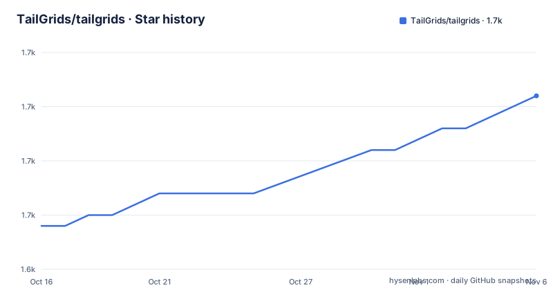
Star history
- TailGrids/tailgrids1,661 ★ · +12
| Repository | 2026-10-16 | 2026-11-06 |
|---|---|---|
| TailGrids/tailgrids | 1.6k | 1.7k |
12 Stars in the last 21 days, measured from the daily GitHub snapshot. Compare with other projects
Editorial analysis
TailGrids' Copy-Source React Workflow
TailGrids addresses a familiar frontend constraint: application teams need buttons, dialogs, form controls, navigation, and page sections, but many design systems still have to be assembled one component at a time. The repository describes 100 or more free React components, with additional premium UI blocks and templates for dashboards, SaaS products, marketing pages, e-commerce, and AI-related interfaces. Its intended users are React developers who already use Tailwind CSS, especially teams working with Next.js or Vite.
The important implementation choice is the delivery model. The installation tutorial does not describe a global React provider, a runtime theme service, or a conventional import from a package that owns every component. It initializes Tailgrids in the application, adds a component, and then imports that component from the application's source tree:
import { Button } from "@/components/core/button";That path is evidence that generated code becomes part of the consuming project. This model gives developers direct access to JSX and Tailwind utility classes. It also makes customization and code review easier. The corresponding cost is equally concrete: later changes in Tailgrids do not automatically update source already copied into an application.
The README positions Tailgrids for accessible, responsive interfaces with dark mode and keyboard navigation. Those are stated design goals rather than evidence that every copied component satisfies a particular accessibility standard. No conformance level, audit report, or automated accessibility test result is documented in the repository information, so those claims should not be treated as certification.
Inside the TailGrids Monorepo and CLI
The repository layout follows an npm workspace and Turborepo monorepo. The root package is private, declares MIT licensing, and organizes workspaces under `apps/*` and `packages/*`. Root scripts cover development, builds, linting, formatting, type checking, and Changesets release operations. This structure is more relevant to contributors and maintainers than to an application developer who only runs the Tailgrids initializer.
The initializer creates configuration and base styles and installs required dependencies. The add command then places a selected component in the project. The README does not document prompts, overwrite behavior, conflict handling, rollback, or a command for updating components that were previously added. Those omissions matter when choosing a component workflow.
The repository includes a dedicated changesets directory, and recent releases include `@tailgrids/[email protected]` and `@tailgrids/[email protected]`. This supports treating the CLI and icons as separately versioned packages. The repository's last push was on 2026-08-04, and it is not archived. That establishes recent repository activity at that date, but the README does not publish a support policy for older major versions or a compatibility matrix for React, Tailwind CSS, Next.js, and Vite.
The root development workflow requires Node 18 or newer, npm 11.6.2, TypeScript 5.9.2, and Turbo 2.6.1 as declared repository tooling. Those versions describe this monorepo checkout, not necessarily a required runtime for an application that consumes generated Tailgrids components.
Initializing TailGrids and Rendering a Button
Start inside an existing React or Next.js project that already uses Tailwind CSS. Run the initializer from the project root. According to the README, it creates the Tailgrids config and base styles, then installs the dependencies needed by the generated setup.
npx @tailgrids/cli@latest initAfter initialization, add the button component. The README presents this as the first component in the workflow, and the generated file location is reflected in the following import path.
npx @tailgrids/cli@latest add buttonYou should then be able to import `Button` from `@/components/core/button`. The `@` path convention is used by the documented example, although the README does not explain how the alias is configured for every framework. If the import fails, inspect the generated component location and the TypeScript or bundler path configuration already used by the application.
A minimal page can use the documented `primary` variant as follows:
import { Button } from "@/components/core/button";

export default function Home() {
  return <Button variant="primary">Hello Tailgrids!</Button>;
}
The repository does not give expected browser output or a development-server command for this consumer example. The root `dev` script belongs to the Tailgrids monorepo and runs development tasks through Turbo, so it should not be confused with starting an unrelated application created by the initializer.
Tailwind Source Ownership Versus Runtime Packages
TailGrids is most closely comparable to copy-and-paste Tailwind component collections, not to a managed headless component package. A headless approach generally exposes primitives and behavior through a package while leaving visual decisions to the application. TailGrids instead presents designed components and blocks as editable React source backed by Tailwind utility classes.
That distinction affects dependency management. Copy-source libraries can produce small application dependency graphs because the generated JSX lives in the repository and does not need to load its design system at runtime. However, the README's statement that Tailgrids has no heavy dependencies does not remove all maintenance work. Each generated component may need updates for framework changes, security fixes, accessibility corrections, or internal API changes. Tailgrids is the origin of the code, but the consuming application becomes the operational owner after generation.
The approach also differs from installing a conventional component package. Package-based systems usually expose versioned imports and can centralize upgrades, although their runtime and styling arrangements vary. Tailgrids favors direct editing. That is useful for product teams that want exact control over markup and classes, but inconvenient when consistency must be enforced across many applications. The available commands initialize and add components, but the repository does not document an automated migration or upgrade path for copied files.
For a single small React application, this trade-off may be acceptable. For a company maintaining many product surfaces from one shared design system, verify how updates would be propagated before adopting the workflow.
TailGrids Boundaries for Production Use
The clearest limitation is the gap between feature claims and verification detail. The README says the components target accessibility, keyboard navigation, dark mode, and responsiveness. It does not provide test matrices, assistive-technology results, browser support, or a statement of WCAG conformance. A component described as accessible should still be reviewed in the context of its labels, focus management, contrast, and application behavior.
Another limitation is update ownership. The CLI can initialize Tailgrids and add a component, but the documented workflow does not explain how to compare generated files with a newer Tailgrids version or reconcile upstream changes with local edits. Copying a component is straightforward. Evolving dozens of copied components without losing product-specific modifications is a separate engineering problem.
Tailgrids is also the wrong choice when developers expect every free feature to arrive through one package. The README distinguishes 100 or more free components from 500 or more sections in premium UI blocks. It does not say that all blocks or templates are included under the MIT repository license or delivered by the same CLI command. License boundaries should therefore be checked on the site for each item intended for use.
Framework compatibility needs similar caution. The README says Tailgrids works with Next.js, Vite, CRA, and major React frameworks. It does not document version ranges, and CRA is presented only as a compatibility claim rather than as a documented installation path. Framework migration behavior should be tested against the application's own compiler and bundler configuration.
TailGrids Maintenance Signals and MIT Scope
TailGrids is not archived, and its last push was on 2026-08-04. Recent package releases include `@tailgrids/[email protected]` on 2026-08-04, `@tailgrids/[email protected]` on 2026-08-04, and `@tailgrids/[email protected]` on 2026-06-21. These are concrete signs that repository and package work continued during that period. They do not establish a long-term maintenance commitment or tell consumers how breaking changes will be scheduled.
The root repository declares `MIT` in both `package.json` and the repository's license metadata. That is a permissive licensing model for code distributed under those terms, but it does not settle every question relevant to a product team. Premium blocks or templates are identified separately from free components, and the README does not state that one license automatically covers every hosted or downloadable asset. Confirm the applicable terms for the exact component, block, template, icon, and template assets before redistribution.
Upgrade cost is probably lower for isolated visual adjustments because developers can edit Tailwind classes directly. It is higher when an organization needs synchronized fixes across many repositories. Tailgrids reduces runtime coupling at the cost of source-level coordination. That is the central adoption decision.
Editorial conclusion
Adopt Tailgrids when a React product team wants editable Tailwind component source and accepts responsibility for maintaining copied code. Do not choose it solely for a small dependency footprint or a fully managed component API. Verify first that the generated styles, import paths, accessibility behavior, and licensing terms fit your existing build.
Frequently asked questions
How do I install TailGrids in a React project?
Run `npx @tailgrids/cli@latest init` in the React or Next.js project. The README says the initializer creates configuration and base styles and installs required dependencies.
How do I add and use a TailGrids Button?
Run `npx @tailgrids/cli@latest add button`, then import `Button` from `@/components/core/button`. The documented example renders it with the `variant="primary"` prop.
Does TailGrids support Next.js, Vite, and dark mode?
The README states that Tailgrids works with Next.js, Vite, CRA, and major React frameworks. It also lists dark mode and responsive design among the component features, but does not provide a version compatibility matrix.
Can TailGrids update components after they are added?
The documented CLI commands cover initialization and adding a component. The README does not document an automated update or migration command for components already copied into an application.
Are TailGrids blocks and templates covered by the MIT license?
The repository declares the MIT license, while the README separately identifies premium UI blocks and templates. It does not state that the repository license covers every premium item, so the terms for the specific asset need confirmation.
Official sources
Add this badge to your README
If you maintain this project, the badge below links readers to this analysis and shows its maintenance status from the daily GitHub snapshot. Paste the markdown into your README; add ?metric=license or ?metric=stars to the image URL for a different field.

[](https://hysenlabs.com/projects/tailgrids-tailgrids)Star history chart for your README
[](https://hysenlabs.com/projects/tailgrids-tailgrids)Was this useful?