prose, five gray scales and per tag modifiers: how Tailwind CSS Typography handles content you did not write
Beautiful typographic defaults for HTML you don't control.
At a glance
- What is it?
- The official Tailwind CSS Typography plugin puts typographic defaults on any HTML you do not control, such as Markdown output or a CMS field, through one base class and a set of modifiers. It is deliberately narrow: everything it styles must sit inside the element that carries prose.
- Who is it for?
- Use the plugin when the markup comes from a Markdown renderer or a CMS and you want it to match the rest of a Tailwind design without writing your own rules for headings, lists and code. Skip it when the content is your own component library, since the element modifiers target content tags such as headings, paragraphs, links, lists and code.
- Can I use it commercially?
- Yes. MIT is a permissive licence: you can use, modify and sell software built on it, as long as you keep its copyright and licence notices.
- Is it still maintained?
- Yes. The repository last received commits 159 days ago.
- What is it written in?
- Mainly JavaScript, according to GitHub's language statistics.
Answers come from the project's GitHub data, last synced on November 14, 2026, and from our analysis. They are not legal advice.
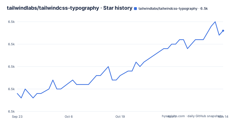
Star history
- tailwindlabs/tailwindcss-typography6,488 ★ · +14
| Repository | 2026-09-23 | 2026-11-14 |
|---|---|---|
| tailwindlabs/tailwindcss-typography | 6.5k | 6.5k |
14 Stars in the last 52 days, measured from the daily GitHub snapshot. Compare with other projects
Editorial analysis
One class on a wrapper, aimed at HTML you did not write
The scope is stated in the project's own description: typographic defaults for HTML you do not control. That covers two common cases, HTML rendered from Markdown and HTML pulled from a CMS, where the tag structure arrives already decided and you cannot attach a class to each heading. The plugin answers that with a single base class on one wrapper element:
<article class="prose lg:prose-xl">{{ markdown }}</article>Nothing else is required. Every descendant of that article inherits the type scale, the heading weights, the list markers and the code block treatment the plugin defines. The second class in the example, lg:prose-xl, is a size modifier applied from the large breakpoint upward. This single wrapper model is the whole architectural decision, and it is also the constraint: only markup inside the wrapper is in scope, which is why the plugin has no opinion about a navbar or a pricing table sitting next to the article.
The v4 @plugin line and the v3 require call register different files
The package installs as a dev dependency, since it is a build time plugin rather than something shipped to the browser:
npm install -D @tailwindcss/typographyRegistering it depends on which major version of Tailwind you are on. With Tailwind CSS v4 the registration is a CSS directive in your main style.css file, next to the tailwindcss import:
  @import "tailwindcss";
+ @plugin "@tailwindcss/typography";
On Tailwind CSS v3 there is no such directive, and the plugin goes into the plugins array of tailwind.config.js instead:
// tailwind.config.js
module.exports = {
  theme: {
    // ...
  },
  plugins: [
    require('@tailwindcss/typography'),
    // ...
  ],
}
The package declares tailwindcss as a peer dependency with the range >=3.0.0 || >=4.0.0 || insiders, so one install line covers both generations while the registration step does not transfer between them.
A gray scale modifier without the prose class does nothing
Five color themes ship by default, one per gray scale in Tailwind, and each has its own modifier: prose-gray, which is the default, plus prose-slate, prose-zinc, prose-neutral and prose-stone. They were generated against a plain Tailwind CSS v2.0 build.
<article class="prose prose-slate">{{ markdown }}</article>The page repeats the requirement twice, once for color and once for size: always include the base prose class. The modifiers follow the multi-class pattern, so they are additions to the base and never replacements. Dark mode is handled by the same mechanism rather than by a separate theme. Each default color theme has a hand designed dark version, switched on with prose-invert and normally combined with the dark variant:
<article class="prose dark:prose-invert">{{ markdown }}</article>Adding a project specific theme is documented as its own task, under adding custom color themes, rather than something the default classes cover.
Five body sizes, tuned as a set rather than one number at a time
The size modifiers are a fixed ladder with stated values: prose-sm at 0.875rem, 14px, prose-base at 1rem, 16px, which is the default, prose-lg at 1.125rem, 18px, prose-xl at 1.25rem, 20px, and prose-2xl at 1.5rem, 24px. They change more than the body font size. The project states that the relationships between font sizes, heading spacing and code block padding were hand tuned as a set, which is the reason to pick a rung on the ladder rather than set your own text size utility.
Because they are ordinary Tailwind utilities, they combine with breakpoint modifiers:
<article class="prose md:prose-lg lg:prose-xl">{{ markdown }}</article>That reads as 16px on small screens, 18px from the medium breakpoint and 20px from the large one. As with the color modifiers, the base prose class has to be present or the size modifier has nothing to modify. Going past the ladder means writing CSS yourself, which the documentation covers under customizing the CSS.
Element modifiers reach individual tags inside the wrapper
When a whole content block needs one adjustment, the modifiers take a utility per element:
<article class="prose prose-img:rounded-xl prose-headings:underline prose-a:text-blue-600">
  {{ markdown }}
</article>
Three classes there do three separate jobs. prose-headings:underline reaches every heading, prose-img:rounded-xl rounds images, and prose-a:text-blue-600 recolours links, which is the case the documentation raises when you want links to match a brand. The enumerated targets cover h1 through h4, p, a, blockquote, figure, figcaption, strong, em, kbd, code, pre, ol, ul, li and dl, with a separate target for anything marked as a lead paragraph through a lead class, and th reached by the headings group. Each modifier takes any Tailwind utility, not a fixed property.
What it leaves to you: components, controls, and any markup outside the wrapper
The element modifier list is the clearest statement of the boundary. It covers headings, text, lists, code and figures. The second limit is structural: prose is scoped to descendants of the element that carries it, so a heading rendered outside the wrapper stays unstyled no matter how many modifiers you add elsewhere. When the defaults are not enough, the documented escape hatches are writing your own color theme or overriding the CSS, both of which mean you are now maintaining a layer the plugin no longer tunes for you.
The bundled demo runs on Next 12 and React 17 while the peer range allows v4
The repository ships a demo application, and its package.json shows what it is built on: next ^12.0.1, react ^17.0.2 and tailwindcss ^3.2.2 in devDependencies, with the scripts aimed at that folder, so dev runs next dev demo, build runs next build demo and start runs next start demo. Tests are jest, wired to a custom matcher file through jest/customMatchers.js. So the sample site in the repository is a Next 12 project on the older Tailwind line, which means the demo exercises the tailwind.config.js registration rather than the v4 @plugin directive even though the plugin supports both.
Two details in the manifest matter for what you install. The only runtime dependency is postcss-selector-parser, pinned to the exact version 6.0.10 while every other range uses carets. And the published files are limited to src/*.js, src/*.d.ts and dist/, with the entry points declared as src/index.js and src/index.d.ts. The project is MIT licensed, and the release line is still 0.5.x: v0.5.18 on 2025-09-19, v0.5.19 on 2025-09-24 and v0.5.20 on 2026-06-08.
Editorial conclusion
Use the plugin when the markup comes from a Markdown renderer or a CMS and you want it to match the rest of a Tailwind design without writing your own rules for headings, lists and code. Skip it when the content is your own component library, since the element modifiers target content tags such as headings, paragraphs, links, lists and code. Before adopting it, check two things: that prose sits on the wrapper element rather than on the inner tags, and that your Tailwind version falls inside the declared peer range of >=3.0.0 || >=4.0.0 || insiders.
Frequently asked questions
What is Tailwind CSS typography?
It is the official Tailwind CSS plugin that adds typographic defaults to vanilla HTML you do not control, such as HTML rendered from Markdown or pulled from a CMS. You apply a base prose class to a wrapper element and its descendants inherit the styling.
How do I install tailwindcss typography?
Install it from npm with npm install -D @tailwindcss/typography, then register it. On Tailwind CSS v4 that is an @plugin "@tailwindcss/typography" line in your main style.css, and on v3 it is a require call in the plugins array of tailwind.config.js.
How do I use tailwindcss typography on content from a CMS?
Wrap the field output in an element carrying the prose class, for example <article class="prose prose-slate">{{ markdown }}</article>, and add a gray scale or size modifier alongside it. Modifiers only work together with the base prose class, and prose-invert handles a dark version of each theme.
Should I use tailwindcss typography or forms?
They solve different problems. This plugin styles rendered HTML content through prose classes and element modifiers for headings, links, lists, code and figures.
What is an alternative to tailwindcss typography?
Its documented customization paths are creating your own color theme and customizing the CSS, and the whole package sits at version 0.5.x with tailwindcss as a peer dependency in the range >=3.0.0 || >=4.0.0 || insiders.
Official sources
Add this badge to your README
If you maintain this project, the badge below links readers to this analysis and shows its maintenance status from the daily GitHub snapshot. Paste the markdown into your README; add ?metric=license or ?metric=stars to the image URL for a different field.

[](https://hysenlabs.com/projects/tailwindlabs-tailwindcss-typography)Star history chart for your README
[](https://hysenlabs.com/projects/tailwindlabs-tailwindcss-typography)Was this useful?