informed: React forms with controlled native inputs and hooks based custom fields
A lightweight framework and utility for building powerful forms in React applications
At a glance
- What is it?
- Informed is a React form library that ships controlled native DOM inputs, conditional fields, array fields, multistep flows and JSON schema rendering, and it lets you replace the whole component set with your own through useForm and useField. The current package is version 4.66.3 under MIT, published from the master branch.
- Who is it for?
- Adopt informed when your React forms need conditional fields, arrays, multistep flows or a shared API for touching form state from outside the form, and when you want to swap in your own markup without fighting the library. Do not adopt it for a two field form, where plain React state is less code and fewer dependencies.
- Can I use it commercially?
- Yes. MIT is a permissive licence: you can use, modify and sell software built on it, as long as you keep its copyright and licence notices.
- Is it still maintained?
- Yes. The repository last received commits 130 days ago.
- What is it written in?
- Mainly JavaScript, according to GitHub's language statistics.
Answers come from the project's GitHub data, last synced on November 7, 2026, and from our analysis. They are not legal advice.
Star history
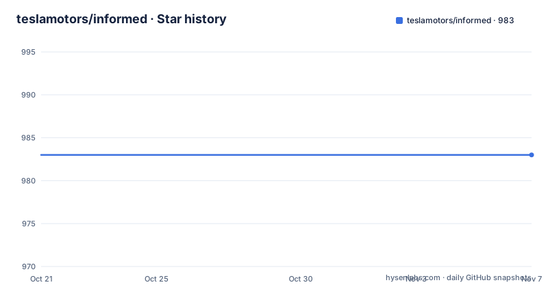
- teslamotors/informed983 ★ · +0
| Repository | 2026-10-21 | 2026-11-07 |
|---|---|---|
| teslamotors/informed | 983 | 983 |
0 Stars in the last 17 days, measured from the daily GitHub snapshot. Compare with other projects
Editorial analysis
A form state layer that ships with its own inputs
Informed is described in the repository as a lightweight framework and utility for building forms in React. The scope is wider than a set of validation helpers. The feature list covers arrays, relevance, form state manipulation, formatting, validation, an API for manipulating state both inside and outside the form, access to field and form data, multistep forms, scoping, JSON schema rendering, dynamic rendering and cleanup behaviour, debugging, and deeply nested value structures.
What ties that list together is a single decision: the library owns the form state, and the components you write read from it.
By default it comes with native DOM inputs that are controlled by Informed, so a text field is a real input element that the library keeps in sync rather than a custom widget. The README also stresses the implementation detail that the library is built on hooks, which is what makes the custom field story possible at all.
For a team that already owns a design system of form controls, that combination is the interesting part. You are not forced to accept the library's markup, and you are not forced to reimplement the state machinery. The question the project answers is narrower than the marketing tone of the README suggests: can the state layer be replaced by the components you already have.
A form built from native elements in one JSX block
The default experience is a single Form element containing inputs, a select, a checkbox and a conditional block. The example from the README:
  <Form onSubmit={onSubmit}>
    <Input name="name" label="Name" placeholder="Elon" />
    <Input name="age" type="number" label="Age" required="Age Required" />
    <Input name="phone" label="Phone" formatter="+1 (###)-###-####" />
    <Select name="car" label="Car" initialValue="ms">
      <option value="ms">Model S</option>
      <option value="m3">Model 3</option>
      <option value="mx">Model X</option>
      <option value="my">Model Y</option>
    </Select>
    <Checkbox name="married" label="Married?" />
    <Relevant when={({ formState }) => formState.values.married}>
      <Input name="spouse" label="Spouse" />
    </Relevant>
    <button type="submit">Submit</button>
Several behaviours are visible in those lines. The `name` prop is the key into the form state, and the label is passed as data rather than written as separate markup. A field can carry a `type`, a `required` message, a `formatter` and an `initialValue`, all as props on the same component.
The `Relevant` component is the conditional mechanism, and it takes a `when` function that receives the form state and decides whether its children render. Here a spouse field appears only when the married checkbox is set. The important property is that the condition reads live state, so the field appears and disappears as the user interacts, and the feature list notes that unmounted fields can either clean up their state or keep it, depending on configuration.
useField is how you replace the built in inputs
The README answers the question of not wanting the out of the box components by showing how the whole set can be rebuilt. It happens in two steps: a form component built on `useForm`, and field components built on `useField`.
The form component pulls a form controller, a render function and the user props from the hook, then renders a plain form element with `noValidate` so that the browser's own validation does not fight the library:
const Form = ({ children, ...rest }) => {
  const { formController, render, userProps } = useForm(rest);

  return render(
    <form noValidate {...userProps} onSubmit={formController.submitForm}>
      {children}
    </form>
  );
};
The field component follows the same shape, and this is the piece that decides what your markup looks like:
const Input = props => {
  const { render, informed, userProps, ref } = useField({
    type: 'text',
    ...props
  });
  const { label, id, ...rest } = userProps;
  return render(
    <>
      <label htmlFor={id}>{label}</label>
      <input id={id} ref={ref} {...informed} {...rest} />
    </>
  );
};
The contract is small enough to state in one line. `useField` takes a type plus your props and returns a render function, the informed attributes to spread onto the DOM element, the user props, a ref, and in the error aware variant the field state. Spreading `informed` onto the input is what wires the DOM element to the library state, and splitting `userProps` from `informed` is what keeps your own props from leaking into the DOM.
The README's example builds four such components, an Input, a Checkbox, an ErrorInput that renders a red border and an error message when `fieldState.showError` is set, and a Select. The pattern is copy and adapt, and the same two hooks are available for your own controls.
Relevance, arrays, multistep and schema rendering
Four capabilities in the feature list are worth separating, because they address different problems.
Relevance is the conditional rendering already seen with `Relevant`, letting a field render based on the state of other parts of the form. Arrays support dynamic arrays of fields, in either flat form such as a list of strings or object form such as a list of records with a name and an age. Multistep support is for forms whose steps are driven by state rather than hard coded routes.
Schema driven rendering is the one that changes the shape of a project. The feature list describes the ability to render forms based on pure JSON schema, which means the form definition can live in data, shipped from a server, or generated by another tool, and the React code becomes a thin renderer.
Scope is the fourth: the ability to group fields, so a subset of a form can be validated, submitted or reset as a unit. That is what makes a multi-section form with its own per section state tractable rather than a pile of independent inputs.
The design goals stated in the contributor section explain why these exist. The library was designed to handle very complex forms at scale, with the ability to render a form with thousands of fields on screen and to bulk update thousands of fields at a time, and to write complex forms with very little code that reads naturally like plain JSX. Those two goals, bulk state operations and readable output, are the ones to test against your own requirements.
Formatting, validation and the difference between display and state
Two features change how you think about a form's data, and both are easy to misread.
Formatting is display formatting, where the format shown to the user can differ from the state of the values stored. The `formatter` prop in the example is the hint, with a phone mask given as a pattern. The practical consequence is that the value in your state is not necessarily the string on screen, so a submit handler that assumes a masked string will surprise you.
Validation supports both synchronous and asynchronous validation in a controlled manner, and the form state exposes which fields have errors, which is what the ErrorInput example reads when it renders a red border and the error message.
The API feature is the other one to understand. It is the ability to manipulate form state both inside and outside the context of the form, which is what a wizard, a save and resume button, or a page that needs to read a field value needs. Combined with the state feature, the ability to access field and form data, you get a form that other parts of the application can talk to.
Debugging is a first class feature rather than a leftover. A `Debug` component can be dropped into the form, and the feature list describes it as a way to easily debug the user's state as well as the internals of the library.
Packaging, versions and where informed stops
The npm package is informed, currently at version 4.66.3, published as an ES module with a CommonJS build alongside it. The package exports map points import at ./dist/esm/index.js and require at ./dist/cjs/index.js, with types from index.d.ts, and the published files are dist/ plus the type definition. The build is a Rollup configuration, the test runner is Jest with a jsdom environment, and type tests run through tsd. There is also a docs build pipeline that produces a static site under docs/ from a Vite based vitedocs directory.
The repository carries two documentation versions in its badges, one labelled V4 and one labelled V3, which tells you that both are still reachable and that a project on the older line has a different set of instructions. The default branch is master and the homepage is teslamotors.github.io/informed.
On maintenance, the repository is not archived and the last push was on 2026-06-30, and it publishes no GitHub releases, so the npm version is the only version marker you can point at. The licence is MIT, which is permissive for both commercial and internal use with no copyleft obligation on the applications that embed it.
The limitation worth naming is scope rather than quality. Informed is a state management library with a component layer attached, and every one of its features adds API surface you have to learn and keep in mind across a codebase. For a form with two fields, a controlled input and a submit handler in plain React is less code, fewer dependencies and no new mental model. The library earns its place when forms have real conditional logic, repeated groups of fields, several steps, or need to be read by code outside the form.
Editorial conclusion
Adopt informed when your React forms need conditional fields, arrays, multistep flows or a shared API for touching form state from outside the form, and when you want to swap in your own markup without fighting the library. Do not adopt it for a two field form, where plain React state is less code and fewer dependencies. Before upgrading, check the version you are on, since the npm package is at 4.66.3 with separate V4 and V3 documentation, note that the repository publishes no GitHub releases, and confirm the last push was on 2026-06-30 before planning around a specific release.
Frequently asked questions
How do I install informed for a React project?
Run npm install --save informed. The package ships an ES module build at dist/esm/index.js and a CommonJS build at dist/cjs/index.js, with TypeScript types from index.d.ts.
Can I use my own form components with informed?
Yes. The README shows building a Form component from useForm and field components from useField, spreading the returned informed props onto your own DOM elements and using render to return your own markup.
How do I show a field only when another field has a value in informed?
Use the Relevant component with a when function that receives the form state, for example Relevant when={({ formState }) => formState.values.married}, wrapping the fields that should appear conditionally.
Does informed support rendering a form from a JSON schema?
Yes. Schema is one of the listed features, described as the ability to render forms based on pure JSON schema, and the package can also manipulate form state from inside and outside the form context.
What licence is informed released under and how is it maintained?
The project is MIT licensed and the npm package is at version 4.66.3. The repository publishes no GitHub releases and the last push was on 2026-06-30, so the npm version is the version marker to rely on.
Official sources
Add this badge to your README
If you maintain this project, the badge below links readers to this analysis and shows its maintenance status from the daily GitHub snapshot. Paste the markdown into your README; add ?metric=license or ?metric=stars to the image URL for a different field.

[](https://hysenlabs.com/projects/teslamotors-informed)Star history chart for your README
[](https://hysenlabs.com/projects/teslamotors-informed)Was this useful?