nextjs-toploader: a top progress bar for Next.js and React apps
A Next.js Top Loading Bar component made using nprogress, works with Next.js 16 , Next.js 15 and React.
At a glance
- What is it?
- nextjs-toploader is a small React component that draws an nprogress-style bar at the top of the screen during client-side navigation, with separate entry points for the app router and the pages router and a hook for driving it yourself. It is a small package with a small job, and the interesting details are in how it plugs into Next.js navigation and how its documentation has drifted from its package metadata.
- Who is it for?
- nextjs-toploader fits a Next.js or React application that wants a familiar top progress indicator during client-side navigation and is content with a component that measures nothing real. It does not fit an app that needs true progress reporting, and it is a poor fit for a codebase that keeps its dependencies tightly pinned to a major version.
- Can I use it commercially?
- Yes. MIT is a permissive licence: you can use, modify and sell software built on it, as long as you keep its copyright and licence notices.
- Is it still maintained?
- Yes. The repository last received commits 110 days ago.
- What is it written in?
- Mainly TypeScript, according to GitHub's language statistics.
Answers come from the project's GitHub data, last synced on November 7, 2026, and from our analysis. They are not legal advice.
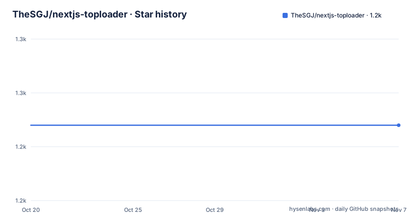
Star history
- TheSGJ/nextjs-toploader1,244 ★ · +0
| Repository | 2026-10-20 | 2026-11-07 |
|---|---|---|
| TheSGJ/nextjs-toploader | 1.2k | 1.2k |
0 Stars in the last 18 days, measured from the daily GitHub snapshot. Compare with other projects
Editorial analysis
What nextjs-toploader actually does
nextjs-toploader is a top loading bar for Next.js applications, built on nprogress, the long-standing progress bar library for the web. The repository description says it works with Next.js 16, Next.js 15 and React, while the README's own first line says it works with Next.js 14 and React, and the package metadata in package.json says Next.js 15 and Next.js 14. Three different claims, in three places, for the same package.
What the component does is narrow. During a client-side navigation it animates a thin bar across the top of the viewport, which is the same visual language users learned from YouTube and GitHub. It does not measure anything: nprogress animates towards a target and completes when the navigation resolves. That is a deliberate design, because a real progress figure for a router transition does not exist, and a bar that lies about a percentage is worse than one that just moves.
The package is a library rather than an app, and the repository is small and conventional: src/ holds the source, tsup.config.ts drives the build, and there are separate entry points in the package exports map for the main component, an ./app subpath and a ./pages subpath. The dist/ output is not in the tree because it is generated.
The audience is any team that wants this specific effect without writing it, and the value of the package is the router integration rather than the bar itself, which is nprogress's work.
Installing it and adding it to the app router layout
The install is a normal dependency add, with npm and yarn forms in the README:
npm install nextjs-toploaderyarn add nextjs-toploaderIn an app router project, the component goes into the root layout, inside the body element of the RootLayout function:
import NextTopLoader from 'nextjs-toploader';

export default function RootLayout({ children }) {
  return (
    <html lang="en">
      <body>
        <NextTopLoader />
        {children}
      </body>
    </html>
  );
}
That is the whole integration. Because the component is mounted once at the root, it is present for every route, and the navigation events it listens to come from the router that owns the tree, which is why placing it higher up in the tree works.
What you should see is a thin blue bar appearing at the top of the viewport when a link is clicked, with a small spinner at the right end by default, and the bar completing when the new route renders. If the bar never appears, the usual cause is placement inside a page component rather than the root layout, where it is unmounted on navigation.
The pages router variant, and why there are two entry points
The pages router has its own component, PagesTopLoader, imported from the pages subpath:
import { PagesTopLoader } from 'nextjs-toploader/pages';

export default function MyApp({ Component, pageProps }) {
  return (
    <>
      <PagesTopLoader />
      <Component {...pageProps} />;
    </>
  );
}
The README is explicit that NextTopLoader can also be used in the pages router, but that PagesTopLoader is recommended there, and it gives a version boundary: useRouter hook support from nextjs-toploader has been available from version 2.6.12 onwards.
That is the substantive difference between the two. The pages router has a different navigation model, and the pages variant hooks into it directly, which is what makes the manual router calls work.
In the app router, triggering the bar from code means importing the hook from the app subpath:
// Import the useRouter hook from nextjs-toploader to trigger the TopLoader

import { useRouter } from 'nextjs-toploader/app';
and calling it where you need the transition to be visible:
const router = useRouter();
router.push('/some-page');
Two exports, two routers, one behaviour. The package exports map makes this explicit, with the root entry, ./app and ./pages as the three published paths.
The useTopLoader hook and its method surface
Beyond the automatic behaviour, the package exposes a hook for handling progress indicators directly. The README's example shows a client component using it:
'use client';

import React from 'react';
import { useTopLoader } from 'nextjs-toploader';

const Component = () => {
  const loader = useTopLoader();
  return (
    <div>
      <button type="button" onClick={() => loader.start()}>
        Start
      </button>
      <button type="button" onClick={() => loader.setProgress(0.5)}>
        Set Progress
      </button>
    </div>
  );
};

export default Component;
The methods are listed in a table in the README, and the list is where the design becomes clear. There is start, which starts the bar, and done, which completes it and can be forced to complete immediately with an optional parameter. remove takes the bar's element out of the DOM. setProgress sets a value between 0.0 and 1.0 by hand, inc increments the bar by a given amount or a small automatic increment if no amount is given, and trickle adds small random increments. The last three are read-only checks: isStarted, isRendered and getPositioningCSS, which returns the positioning CSS property of the bar.
setProgress and inc are the pair that make this useful for work that is not a route change, such as a long data fetch you want to reflect in the same indicator. The read-only helpers exist for people building their own control surface, and getPositioningCSS in particular suggests the component is meant to be inspected and restyled rather than treated as a black box.
Configuration, the default look, and the CSP nonce
If no props are passed, the README documents the default configuration in full, and it is the nprogress defaults with a few additions:
<NextTopLoader
  color="#2299DD"
  initialPosition={0.08}
  crawlSpeed={200}
  height={3}
  crawl={true}
  showSpinner={true}
  easing="ease"
  speed={200}
  shadow="0 0 10px #2299DD,0 0 5px #2299DD"
  template='<div class="bar" role="bar"><div class="peg"></div></div>
  <div class="spinner" role="spinner"><div class="spinner-icon"></div></div>'
  zIndex={1600}
  showAtBottom={false}
/>
The props cover the usual nprogress surface: color for the bar, initialPosition for where it starts as a percentage, crawlSpeed and speed in milliseconds, easing as a CSS easing string, height in pixels, crawl for the auto-incrementing behaviour, showSpinner, shadow, which can be set to false, and template for custom HTML with the bar and spinner roles.
Three of them are specific to this component rather than to nprogress. showAtBottom moves the bar to the bottom, with the README advising you to increase the height so it stays visible on mobile devices. showForHashAnchor decides whether the bar appears for a hash URL, and can be set to false. And nonce exists for Content Security Policy: it adds a nonce to the style tags the component injects, and the README notes that this might require skipping SSR to avoid a hydration error.
That nonce prop is the one to notice in a serious deployment. The component injects a style element at runtime, which a strict policy will block, and the escape hatch the README offers is to skip server-side rendering for that part of the tree, which is a real trade against the reason you installed it in the layout in the first place.
Where nextjs-toploader is the wrong tool
The first limit is that the bar does not represent progress. nprogress animates, and the component completes it when a navigation resolves. If your application has a genuinely long operation with a knowable fraction, this is the wrong instrument, and a real progress value driven by setProgress from your own code is the way to use it, which means the automatic behaviour is decoration around a progress bar you are already implementing.
The second limit is version drift, and it is visible in the package itself. The repository description claims Next.js 16, 15 and React. The README says Next.js 14. The package.json description says Next.js 15 and 14. The topic tags list next13 and next14. The devDependencies pin next to ^13.2.3 and react to ^18.2.0, while the peerDependencies ask for next >= 6.0.0, react >= 16.0.0 and react-dom >= 16.0.0. A peer range that starts at Next 6 is not a compatibility statement, it is an absence of one. Teams that upgrade Next.js majors routinely and care about peer ranges have to verify the behaviour themselves.
The third limit is the scope of the effect. A top bar is a visual convention for client-side transitions, and this package implements that convention for two routers. It does not tell you how long the new route took, it does not survive a full page load, and in the app router it is tied to the navigation events the router exposes.
The alternative is not another progress bar library, it is the platform. React's own transition and Suspense APIs model pending state inside the component tree, which means a route can show a skeleton, a spinner or a disabled button instead of a bar at the top of the window, and the pending state is attached to the thing that is actually pending rather than to the viewport. The difference in approach is where the signal lives: a global bar is one pixel-high element that communicates to every viewer at once, while a component-level state communicates to the person who needs it. If your app has a slow route, the second is usually better, and if it has many slow routes, the first is the only one that scales.
Maintenance, packaging and the licence
The project is not archived, and the last push was on 2026-07-20. The published releases tell a short story: v3.8.16 on 2025-03-25, then v3.9.16 on 2025-09-08 and v3.9.17 on 2025-09-09, two patch releases a day apart after a gap of about five months. The current version in package.json is 3.9.17, and that is the version the README's install guidance points at.
The build setup is modern and small. tsup bundles the library, the scripts are build-lib, lint, format and typecheck, and the toolchain is Yarn 3.2.4 with a .yarnrc.yml and a yarn.lock, plus ESLint with a .eslintrc.json and Prettier with a .prettierrc.json. The published files list covers dist/**/*.js*, dist/**/*.mjs* and dist/**/*.d*, and the exports map publishes the root entry plus the app and pages subpaths, which is why the dual-router support does not cost consumers a bundler alias.
There is also a Deno angle. The repository has deno.json, deno.lock and deno.d.ts, and a JSR.md file, so the package is prepared for publication to the JSR registry as well as npm, and the deno.d.ts file is what makes the types resolve for Deno consumers who are not using node_modules.
Funding and governance are informal but visible: the package.json carries a funding entry pointing at a buymeacoffee page for the author, Shri Ganesh Jha, and the README carries an Open Collective logo for the project. The licence is MIT, with a LICENSE file in the repository root, and a CHANGELOG.md at the root records the release history.
The one upgrade hazard is the version skew described earlier. Because a patch release can arrive with a different set of claims about which Next.js versions work, pinning the version in your own lockfile and reading the CHANGELOG before bumping is the cheap habit that avoids a surprise.
Editorial conclusion
nextjs-toploader fits a Next.js or React application that wants a familiar top progress indicator during client-side navigation and is content with a component that measures nothing real. It does not fit an app that needs true progress reporting, and it is a poor fit for a codebase that keeps its dependencies tightly pinned to a major version. Verify first which entry point you need, the default export for the app router and the pages subpath for the pages router, add the nonce prop if your Content Security Policy blocks inline styles, and pin the version you test against, because the README, the package description and the topic tags name different Next.js majors.
Frequently asked questions
How do I install nextjs-toploader?
Run npm install nextjs-toploader or yarn add nextjs-toploader, then render the component in your root layout. In the app router you add <NextTopLoader /> inside the body of RootLayout in app/layout.js, and in the pages router you add <PagesTopLoader /> from nextjs-toploader/pages to your custom App in pages/_app.js.
What is the difference between NextTopLoader and PagesTopLoader?
They target the two Next.js routers. NextTopLoader is the default export and is meant for the app router, while PagesTopLoader is imported from the nextjs-toploader/pages subpath and is recommended for the pages router, because it supports the useRouter hook from nextjs-toploader, available since version 2.6.12.
What methods does the useTopLoader hook provide?
The README lists start, done with an optional force parameter, remove, setProgress for a value between 0.0 and 1.0, inc, trickle, and the read-only checks isStarted, isRendered and getPositioningCSS, which returns the positioning CSS property of the progress bar.
How do I use nextjs-toploader with a Content Security Policy?
Pass the nonce prop, which adds nonces to the style tags the component injects. The README notes this might require skipping SSR to avoid a hydration error, since the component injects its styles at runtime.
What licence is nextjs-toploader under and what are its recent versions?
The package is licensed under MIT, authored by Shri Ganesh Jha, and published on npm as nextjs-toploader. The recent releases are v3.8.16 on 2025-03-25, v3.9.16 on 2025-09-08 and v3.9.17 on 2025-09-09, and the last push to the repository was on 2026-07-20.
Official sources
Add this badge to your README
If you maintain this project, the badge below links readers to this analysis and shows its maintenance status from the daily GitHub snapshot. Paste the markdown into your README; add ?metric=license or ?metric=stars to the image URL for a different field.

[](https://hysenlabs.com/projects/thesgj-nextjs-toploader)Star history chart for your README
[](https://hysenlabs.com/projects/thesgj-nextjs-toploader)Was this useful?