Untitled UI React: Open-Source Components for Tailwind Interfaces
Untitled UI React is the world’s largest collection of open-source React components built with Tailwind CSS and React Aria. Just copy, paste, and build.
At a glance
- What is it?
- Untitled UI React is an MIT-licensed collection of React components built with React 19.3, Tailwind CSS v4.3, TypeScript 6.0, and React Aria. It targets developers who want a copy-and-paste component library, but the repository does not publish installation commands or a release package.
- Who is it for?
- Adopt the repository if your team already uses React, Tailwind CSS, and React Aria and accepts reviewing component source before adoption. Do not treat it as a published npm package or expect the PRO components under the repository license.
- Can I use it commercially?
- Yes. MIT is a permissive licence: you can use, modify and sell software built on it, as long as you keep its copyright and licence notices.
- Is it still maintained?
- Yes. The repository last received commits 29 days ago.
- What is it written in?
- Mainly TypeScript, according to GitHub's language statistics.
Answers come from the project's GitHub data, last synced on November 7, 2026, and from our analysis. They are not legal advice.
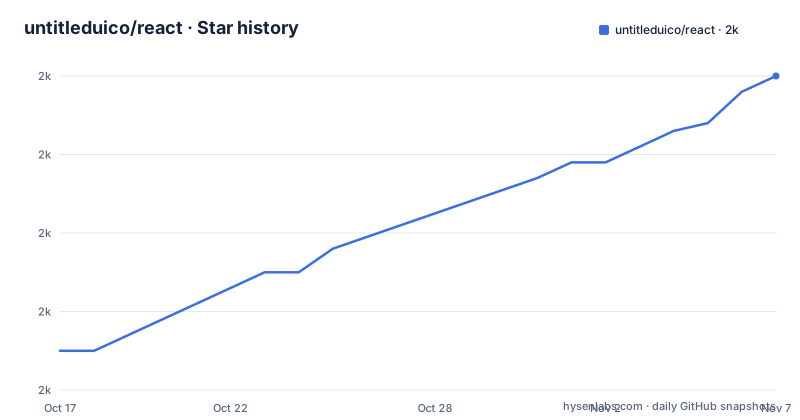
Star history
- untitleduico/react2,000 ★ · +35
| Repository | 2026-10-17 | 2026-11-07 |
|---|---|---|
| untitleduico/react | 2k | 2k |
35 Stars in the last 21 days, measured from the daily GitHub snapshot. Compare with other projects
Editorial analysis
The Copy-and-Paste Component Library
Untitled UI React addresses a specific front-end problem: teams that want reusable interface pieces without building every button, menu, form control, or layout component from scratch. The project is aimed at developers designing web interfaces in React, especially teams that already use Tailwind CSS for styling. Its central workflow is source-level reuse rather than an opaque component service. The README describes the repository as a large collection of open-source React components and says that users can "copy, paste, and build." That wording matters for adoption decisions. The repository is best understood as a source collection and reference implementation, not as a documented application framework.
The design context also includes Untitled UI Figma. The README positions the React collection as built on top of that Figma UI kit and design system. That relationship may help teams compare a design source with implementation patterns, but the README does not specify which Figma components have exact React equivalents, how releases are synchronized, or whether every design asset is included here. The React repository contains components, hooks, styles, utilities, configuration files, and Storybook support, so it is more than a small set of isolated snippets. The repository does not state that it is a drop-in replacement for a particular existing component library.
React Aria, Tailwind, and TypeScript Foundations
The implementation stack is specific: React 19.3, Tailwind CSS v4.3, TypeScript 6.0, and React Aria. The package metadata also names React Aria Components, React DOM, Next.js, and several supporting dependencies. This indicates that the collection targets modern React applications and includes dependencies associated with accessible primitives, forms, motion, charts, dates, carousels, QR codes, notifications, and styling. The repository structure supports that interpretation. Components are separated from hooks and utilities, while Storybook configuration sits at the top level for component inspection and documentation.
React Aria is the important behavioral foundation. The README does not explain the internal event model or accessibility guarantees for each component, so it would be inaccurate to promise that every component exposes a particular keyboard or screen reader behavior. What can be said is that the project intentionally builds on React Aria rather than treating accessibility as styling alone. Tailwind CSS supplies the styling context, and `tailwind-merge` appears as a dependency, which suggests that component class composition is part of the implementation. TypeScript is used throughout the project, while the repository scripts provide static type checking through `tsc --noEmit`. Consumers should still inspect a component's props and dependencies before assuming that it matches an existing application abstraction.
Installation Documentation Is the Starting Point
The README does not provide a complete terminal installation sequence or a ready-to-copy application example. It directs readers to the installation guide at the Untitled UI documentation site. The repository metadata also identifies the package as `@untitledui/react`, but sets `"private": true` and contains no published version because its version field is `0.0.0`. There are no GitHub releases. Consequently, a reader cannot conclude that the repository can be installed from npm with a documented package command.
The safest first step is therefore to open the official installation guide and identify the supported setup for the consumer's React and Tailwind versions. After obtaining the component source through the documented workflow, a useful local check is Storybook, because the package scripts expose it directly. The repository defines this command:
npm run storybookThe script starts Storybook on port `6006` with the `--no-open` option. The README does not document a browser path or a first component import, so this command should be treated as the repository's documented preview entry point rather than a complete installation tutorial.
Running the Repository Checks
The repository defines several checks that can help evaluate source quality before an adoption decision. Its `test` script runs type checking, ESLint, and Prettier checks in sequence. The individual commands are also available as package scripts. These checks are relevant because the project is TypeScript-based and presents itself as a source collection that developers may copy into their own projects.
The commands shown here come directly from `package.json`:
npm run type-checkThis invokes TypeScript with `--noEmit`, so it checks types without producing compiler output. The package also defines:
npm run lint:checkThat runs ESLint without the `--fix` flag used by the editing script. A formatting check is available as:
npm run prettier:checkThe combined `npm run test` command runs all three checks. These are static repository checks, not a claim that components have passed browser, accessibility, visual regression, or application-level tests. The repository files do not define a runtime integration test suite, and there are no GitHub release notes describing compatibility changes.
Where the MIT License Stops
The open-source components in this repository are licensed under the MIT license. The README says they may be used in unlimited commercial projects. That is a permission statement, not a complete review of dependencies or assets. A consumer still needs to inspect any third-party packages, icons, fonts, design resources, and separately offered services used by an application. The README does not provide legal advice, and this article does not replace license review.
The boundary is explicit. Untitled UI React PRO includes additional advanced components and page examples under a separate license agreement. Only components included in this open-source repository are covered by the MIT statement in the README. A team looking for hundreds of additional PRO examples must check the separate terms at the project's license page. The repository also lists related resources, including Untitled UI Icons, file icons, flag icons, avatars, logos, and Figma resources. The presence of those links does not make every linked resource subject to this repository's MIT license.
A practical source review should identify the exact component files copied into a product, then check their imports and any separately licensed resources. The README does not document a changelog, release process, or compatibility policy for migrating copied components.
Limits, Alternatives, and Adoption Boundaries
The main limitation is distribution clarity. The repository is marked private in `package.json`, has version `0.0.0`, and is described through a documentation site rather than a documented npm installation. It has no GitHub releases. That makes it unsuitable for a team that wants a versioned package with an obvious dependency upgrade path unless the project documentation resolves those points.
It is also a source collection, not a complete product. The README does not specify that it includes authentication, data fetching, routing, server rendering, or application state management. It should not be chosen as a replacement for a full application framework. The PRO offering is another boundary rather than an equivalent alternative, because the README explicitly places its additional components and examples under separate terms.
A real alternative is to use React Aria Components directly with Tailwind CSS and write application-specific wrappers. That approach avoids copying a broad visual collection, but it also transfers component styling, composition, and maintenance work to the consuming team. Untitled UI React offers prebuilt patterns and related design resources, while direct React Aria work gives more control over the local abstraction. The choice depends on whether the team values ready-made source examples or a smaller custom component layer.
Current Repository State and Upgrade Work
The repository is not archived, and its last push was on 2026-10-09. That establishes recent repository activity for the stated date, but it does not establish a released version or a formal support policy. There are no GitHub releases, so upgrade planning cannot rely on release tags or migration notes. A team adopting source components must decide whether it will vendor copies, follow the repository's `main` branch, or use the installation guide's intended distribution method once that method is confirmed.
The upgrade cost is therefore higher than it would be for a clearly versioned package with documented migration steps. React 19.3, Tailwind CSS v4.3, TypeScript 6.0, and the listed dependencies may change independently. The repository's `type-check`, `lint:check`, and `prettier:check` scripts can validate its own source, but they do not verify that copied components remain compatible with a consumer's older React, Tailwind, or TypeScript configuration. No compatibility matrix is included in the repository files.
For an engineering decision, inspect the installation documentation and one representative component before importing a large set. Check whether the component depends on the full `package.json` list, whether Tailwind configuration is required, and whether the component's props fit the product's form, data, and accessibility requirements. The repository layout suggests a source-oriented workflow, not a versioned dependency lifecycle.
Editorial conclusion
Adopt the repository if your team already uses React, Tailwind CSS, and React Aria and accepts reviewing component source before adoption. Do not treat it as a published npm package or expect the PRO components under the repository license. Verify the documented installation guide, component imports, dependency requirements, and licensing boundary first.
Frequently asked questions
How do I install Untitled UI React?
The README directs users to the official installation guide at `https://www.untitledui.com/react/docs/installation`, but it does not include the terminal commands. The repository metadata names `@untitledui/react` and marks it private, so verify the documented distribution method before installing it.
What technology is Untitled UI React built with?
The README states that the components are built with React 19.3, Tailwind CSS v4.3, TypeScript 6.0, and React Aria. The package metadata also lists React Aria Components, Next.js, React DOM, Tailwind CSS, and supporting libraries.
Can I use Untitled UI React in commercial projects?
The README says the open-source components are MIT licensed and may be used in unlimited commercial projects. It also states that Untitled UI React PRO has additional components and page examples under a separate license agreement, so the license boundary matters.
Does Untitled UI React publish GitHub releases?
The repository has no GitHub releases. The README also links to external documentation rather than providing a local release or version history.
How can I preview the components in Storybook?
The package scripts define `npm run storybook`, which starts Storybook on port `6006` with `--no-open`. The README does not document the browser route or a first component example.
Official sources
Add this badge to your README
If you maintain this project, the badge below links readers to this analysis and shows its maintenance status from the daily GitHub snapshot. Paste the markdown into your README; add ?metric=license or ?metric=stars to the image URL for a different field.

[](https://hysenlabs.com/projects/untitleduico-react)Star history chart for your README
[](https://hysenlabs.com/projects/untitleduico-react)Was this useful?