Varlet: Material Design 2 and 3 in one Vue 3 package, installed one way
A Vue3 component library based on Material Design 2 and 3, supporting mobile and desktop.
At a glance
- What is it?
- Seventy plus Vue 3 components spanning both Material Design generations, with dark mode, theme customization and a Nuxt module. The catch is that the source tree only installs with pnpm, and accessibility is marked as unfinished.
- Who is it for?
- Varlet suits a Vue 3 team that wants Material Design 2 and 3 components, dark mode and on-demand import without assembling them itself. Before you commit, check that pnpm 9.15.9 is what your pipeline can run, since a preinstall hook turns npm and yarn away, and check the accessibility state of the specific components you need rather than the library as a whole.
- Can I use it commercially?
- Yes. MIT is a permissive licence: you can use, modify and sell software built on it, as long as you keep its copyright and licence notices.
- Is it still maintained?
- Yes. The repository last received commits 2 days ago.
- What is it written in?
- Mainly Vue, according to GitHub's language statistics.
Answers come from the project's GitHub data, last synced on November 15, 2026, and from our analysis. They are not legal advice.
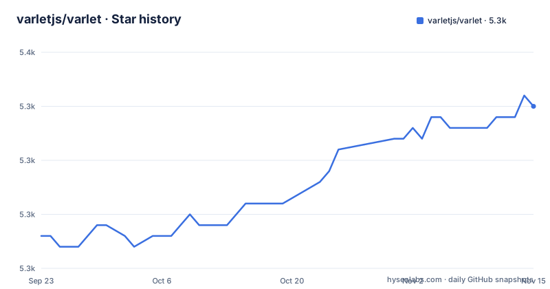
Star history
- varletjs/varlet5,345 ★ · +12
| Repository | 2026-09-23 | 2026-11-15 |
|---|---|---|
| varletjs/varlet | 5.3k | 5.3k |
12 Stars in the last 53 days, measured from the daily GitHub snapshot. Compare with other projects
Editorial analysis
The default branch is dev, and the package is version 3.20.6
Varlet is a Vue 3 component library built on Material Design 2 and 3 for mobile and desktop, maintained by the varletjs organization under the MIT license. The default branch is dev rather than main, which matters when you clone: every documentation link in the README points into /blob/dev/, so the branch you land on is the one those links describe.
Version 3.20.9 is the current package version, and the recent tags cluster: v3.20.9 was published on 2026-10-29, v3.20.8 on 2026-10-25, v3.20.7 on 2026-10-14, and the last push to dev landed on 2026-10-30. A CHANGELOG.md sits at the root for the history, and there is a second README, README.zh-CN.md, which matches the project's claim to carry documentation in Chinese and English.
The repository is a pnpm workspace: packages/ holds the individual packages, pnpm-workspace.yaml and pnpm-lock.yaml define it, and scripts/ carries the bootstrap and release automation that package.json invokes. A vite.config.ts and tsconfig.json at the root confirm the TypeScript toolchain, and .browserslistrc is where the browser targets live.
A preinstall hook turns npm and yarn away from the source
The install instructions for consumers offer three package managers. This is the documented set:
# Install with npm or yarn or pnpm

# npm
npm i @varlet/ui -S

# yarn
yarn add @varlet/ui

# pnpm
pnpm add @varlet/ui
Now look at what the repository requires of anyone who clones it instead of installing the published package. The manifest pins the package manager and the runtime:
"engines": {
  "node": "^22.18.0 || ^24.11.0 || >=26.0.0",
  "pnpm": ">=9.0.0"
},
"packageManager": "[email protected]"
And one script settles the argument for contributors, running npx only-allow pnpm as preinstall, so an npm or yarn install of this tree stops before it starts. Those are two different audiences, and the distinction is easy to miss: npm and yarn remain correct for the dependency you ship, while the source itself belongs to pnpm alone. Note the Node floor as well, since three release lines are named and the oldest accepted is 22.18.0.
The CDN path needs a second script before the desktop looks right
For trying components without a build, the UMD bundle carries all the styles and logic of the library in one file, so three scripts and a mount call are the whole setup:
<div id="app"></div>
<script src="https://cdn.jsdelivr.net/npm/vue"></script>
 <!-- Desktop Adaptation -->
<script src="https://cdn.jsdelivr.net/npm/@varlet/touch-emulator/iife.js"></script>
<script src="https://cdn.jsdelivr.net/npm/@varlet/ui/umd/varlet.js"></script>
<script>
  const app = Vue.createApp({
    template: '<var-button>Button</var-button>'
  })
  app.use(Varlet).mount('#app')
</script>
The line worth noticing is the touch emulator. Varlet's components are built for touch first, so on a desktop browser the touch events they listen for never arrive unless that separate package is loaded. The README carries it as an optional script tagged for desktop adaptation, which means a page that skips it renders fine and then behaves like a mobile layout on a mouse.
With a bundler the same three lines become imports, and the style import is not optional:
import App from './App.vue'
import Varlet from '@varlet/ui'
import { createApp } from 'vue'
import '@varlet/ui/es/style'

createApp(App).use(Varlet).mount('#app')
On-demand import arrives through a resolver, not a build flag
The feature list claims support for on-demand introduction, and the mechanism sits in the surrounding tooling rather than in the component package. @varlet/import-resolver is a resolver for unplugin-vue-components, which is how Varlet components get imported one at a time in a Vite or webpack build instead of pulling the whole library in.
Three more packages shape how you consume those components. @varlet/cli is described as a Vue 3 component library rapid prototyping tool, so it is the scaffolding and command layer rather than a runtime dependency. @varlet/ui-playground is the online editing tool, reachable at varletjs.org/playground, which is where you can try markup before it lands in a project. @varlet/preset-unocss and @varlet/preset-tailwindcss ship presets for those two utility CSS frameworks.
That last pair deserves a decision rather than an assumption. If your project already standardizes on Tailwind or UnoCSS, the presets exist so the generated utility classes match what the components emit. If your styling comes from somewhere else, you are maintaining that mapping yourself.
Two Material Design generations share one package
Most component libraries commit to a single design system generation. Varlet carries both, and the feature list states that it supports Material Design 2 and Material Design 3. For an existing product that already looks like one of them, that means the library can match rather than restyle.
Theme customization and dark mode are listed as separate capabilities on top of the two design systems. The dedicated tool for the newer one is varlet-theme-builder, described as a theme generator for producing theme variables for Varlet Material Design 3. For MD2 there is no equivalent generator named, so treat variable level control there as undocumented and read what the component pages expose.
Related tooling follows the same split. varlet-vscode-extension and vscode-theme-varlet cover editor support, WebStorm syntax highlighting is called out on its own, and a Nuxt Module is supported for server side rendering. Internationalization is listed as supported, which matters for the Chinese and English documentation claim: a component library that localizes its own strings is not the same as one whose docs are translated.
Accessibility is the one feature line marked unfinished
Fifteen bullet points make up the feature list: 70+ general purpose components, lightweight components, on-demand introduction, theme customization, internationalization, WebStorm syntax highlighting, SSR, a Nuxt Module, TypeScript, dark mode, an official VSCode extension, support for both Material Design generations, and Chinese and English documentation with logistics support.
One of those fifteen ends differently from the rest. Accessibility is annotated as still improving, and it is the only place in the README where a capability is flagged as incomplete. No conformance level is named, no target is given, and nothing else in the repository pages describes the current state of focus handling, keyboard navigation or screen reader output.
That matters more for a Material Design library than the phrasing suggests, because accessibility is the part of a design system most often treated as a legal requirement rather than a nice to have. The library can still be a good fit for an internal tool. For a public product with an accessibility commitment, treat the annotation as a prompt to test the specific components you ship rather than as a general caveat about the whole library.
Tests, builds and releases all point into packages/varlet-ui
The root scripts are thin wrappers. Running a test or a build does not happen in the root manifest, it delegates:
"bootstrap": "pnpm install && node scripts/bootstrap.mjs",
"build": "pnpm --dir ./packages/varlet-ui build",
"test": "pnpm --dir ./packages/varlet-ui test",
"release": "node scripts/release.mjs"
There are matching entries for coverage and watch mode, a dev server, and separate build and preview commands for the playground, so you can develop components and the online editor from one checkout. Linting runs vp lint --fix and formatting runs vp fmt, and the manifest links @varlet/cli to the workspace rather than to a published version. Versions for rattail, tinyexec, typescript and vite-plus come from the catalog protocol, and vite and vitest are pinned through the same catalog overrides, so the toolchain is resolved centrally in pnpm-workspace.yaml.
On test coverage, the feature list claims more than 90 percent unit test coverage as a stability guarantee. That is the project's own figure for its own suite, which is a good sign about their tests and no evidence about yours. The coverage you care about is the behaviour of the components you actually depend on.
Editorial conclusion
Varlet suits a Vue 3 team that wants Material Design 2 and 3 components, dark mode and on-demand import without assembling them itself. Before you commit, check that pnpm 9.15.9 is what your pipeline can run, since a preinstall hook turns npm and yarn away, and check the accessibility state of the specific components you need rather than the library as a whole.
Frequently asked questions
What is the Varlet component library?
Varlet is a Vue 3 component library based on Material Design 2 and 3, supporting mobile and desktop, developed and maintained by the varletjs organization under the MIT license. It ships more than 70 general purpose components with theme customization, dark mode and internationalization.
How do I install Varlet with npm, yarn or pnpm?
The documented commands are npm i @varlet/ui -S, yarn add @varlet/ui and pnpm add @varlet/ui. Then import Varlet from @varlet/ui, import the styles from @varlet/ui/es/style, and mount with createApp(App).use(Varlet).mount('#app').
Can Varlet be used from a CDN without a build step?
Yes. The UMD bundle contains all the styles and logic of the library, loaded from cdn.jsdelivr.net along with Vue. On desktop you also load the touch emulator script so touch events reach the components, then mount with Vue.createApp and app.use(Varlet).mount('#app').
Which package manager does the Varlet source tree accept?
pnpm. The root manifest runs npx only-allow pnpm as its preinstall script, declares packageManager [email protected], and its engines field asks for pnpm 9.0.0 or newer with Node ^22.18.0, ^24.11.0 or 26.0.0 and above.
How complete is accessibility support in Varlet?
The feature list marks accessibility as still improving, and it is the only capability in that list flagged as incomplete. No conformance level or completion target is named anywhere else in the repository pages.
Official sources
Add this badge to your README
If you maintain this project, the badge below links readers to this analysis and shows its maintenance status from the daily GitHub snapshot. Paste the markdown into your README; add ?metric=license or ?metric=stars to the image URL for a different field.

[](https://hysenlabs.com/projects/varletjs-varlet)Star history chart for your README
[](https://hysenlabs.com/projects/varletjs-varlet)Was this useful?