Vuepic/vue-datepicker for Vue 3 date and range selection
Datepicker component for Vue 3
At a glance
- What is it?
- Vuepic/vue-datepicker is a Vue 3 component for dates, ranges, times, calendar periods, and multiple selections. It includes TypeScript definitions, UTC and timezone support, theming, and SSR support, but applications must verify model formats and mode-specific behavior in the full documentation.
- Who is it for?
- Adopt Vuepic/vue-datepicker when a Vue 3 application needs configurable date, time, calendar-period, range, or multiple-date selection and can accommodate its model contract. Do not choose it based on assumptions about validation, localization, accessibility level, or timezone behavior that the README does not define.
- Can I use it commercially?
- Yes. MIT is a permissive licence: you can use, modify and sell software built on it, as long as you keep its copyright and licence notices.
- Is it still maintained?
- Yes. The repository last received commits 122 days ago.
- What is it written in?
- Mainly TypeScript, according to GitHub's language statistics.
Answers come from the project's GitHub data, last synced on November 7, 2026, and from our analysis. They are not legal advice.
Star history
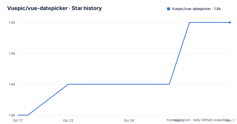
- Vuepic/vue-datepicker1,772 ★ · +3
| Repository | 2026-10-17 | 2026-11-07 |
|---|---|---|
| Vuepic/vue-datepicker | 1.8k | 1.8k |
3 Stars in the last 21 days, measured from the daily GitHub snapshot. Compare with other projects
Editorial analysis
Date Selection Modes for Vue 3 Forms
Vuepic/vue-datepicker addresses a form-design problem shared by Vue applications that need structured date and time values. Its README describes a single picker component for Vue 3, with selection modes for individual dates, ranges, times, months, years, quarters, weeks, and multiple dates. That range lets an application choose the appropriate calendar granularity rather than treating every value as a full timestamp. A reporting screen might select a quarter, while a booking form might need a date range and a time.
The component also lists multiple calendars, text input, week numbers, locale support, UTC support, and timezones. These features matter when a calendar must adapt to the geographic or linguistic context of its users. Text input can also be relevant for forms that accept typed values, although the README does not explain parsing rules, invalid-input handling, or the interaction between typed and calendar-based selection.
The target audience is developers building Vue 3 forms who need a reusable picker interface and included TypeScript definitions. It is not a backend calendar service, form validator, or data persistence layer. The repository contains component development and build tooling, but an application remains responsible for constraints, submission formats, error presentation, and any integration with server APIs. Those boundaries should be clear before adopting the package.
VueDatePicker Registration and v-model Data Flow
The documented integration uses the named `VueDatePicker` export. An application can register it globally through `createApp` and `app.component`, or import it inside a Vue single-file component. The local form is more appropriate when component scope and explicit imports suit the project. Both documented paths also import the package stylesheet from `@vuepic/vue-datepicker/dist/main.css`.
The value flow shown in the README uses `v-model`. A Vue `ref` initially contains `null`, and the template binds that ref to `VueDatePicker`. This keeps selection state in the parent component rather than hiding it inside the picker. The application can pass the selected value to another component or include it in an existing submission flow, subject to the value format required by the selected mode.
The README does not document the exact model shape for range, multiple-date, month, quarter, week, or other modes. It also does not state whether all modes return JavaScript `Date` objects, strings, arrays, or mode-specific combinations. An engineer should not write serialization or backend integration until that shape has been confirmed. The public package documentation at `https://vue3datepicker.com` is the place to check mode-specific props and model behavior.
The package metadata identifies the package as an ES module and describes it as a datepicker component for Vue 3. The repository is written primarily in TypeScript and includes `env.d.ts`, TypeScript configuration, Vue tooling, and declaration-generation tools. This supports typed integration, but the README alone is not a complete component API reference.
Installing and Binding Vuepic/vue-datepicker with npm
The README documents installation with npm, yarn, pnpm, and bun. This tutorial uses npm. Run the command inside the Vue 3 project that will consume the component.
npm install @vuepic/vue-datepickerThe package should now be available as `@vuepic/vue-datepicker`. The component and its stylesheet still need to be imported. In the following local component, `VueDatePicker` is connected to a Vue `ref` through `v-model`, and the initial state is `null`.
<template>
  <VueDatePicker v-model="date" />
</template>

<script setup>
  import { ref } from 'vue';
  import { VueDatePicker } from '@vuepic/vue-datepicker';
  import '@vuepic/vue-datepicker/dist/main.css';

  const date = ref(null);
</script>
The reader should see the component use the package styles rather than omitting a bundler-managed CSS dependency. No mode-specific prop appears in this first example because the README does not provide one. Before adding range, time, locale, timezone, or text-entry behavior, consult the official documentation for the corresponding prop and expected model value.
Global registration is also supported. The documented sequence creates the Vue application, registers `VueDatePicker`, and imports the same CSS file.
import { createApp } from 'vue';
import App from './App.vue';
import { VueDatePicker } from '@vuepic/vue-datepicker';
import '@vuepic/vue-datepicker/dist/main.css';

const app = createApp(App);
app.component('VueDatePicker', VueDatePicker);
This approach makes the component available throughout the app. Local registration is usually easier to trace in a codebase because each consumer imports what it uses, while global registration can simplify applications that rely on a shared component set.
Locale, UTC, Timezone, and Text Input Boundaries
Locale support is listed as a feature, but the README does not provide a locale configuration example, identify the default locale, or describe fallback behavior when a translation is missing. Locale can affect month names, day labels, week rules, and formatting, so an application should not assume that English will be used unless the documentation confirms the default or the application sets one explicitly.
UTC and timezone support address different requirements. UTC supplies a common date reference, while timezone support can associate an interpreted date or time with a named geographic context. The README does not explain their model output, daylight-saving behavior, ambiguous local times, conversion rules, or interaction with `v-model`. Applications that exchange timestamps with an API should verify these points before using the component in a reservation, scheduling, or billing flow.
Text input introduces another boundary. The README lists it as a capability, but it does not document accepted formats, partial input, parser failures, or whether calendar selection overwrites typed content. If an application needs strict input validation, it should implement that rule in its own form layer or confirm a documented component option. The picker should not be treated as proof of backend validation merely because it offers a text mode.
Week numbers are also listed, but the README does not define locale-dependent week numbering rules. Teams that generate reports based on week boundaries should test those reports against the configuration used in production rather than assuming ISO-style numbering in every locale.
Theming, Accessibility, SSR, and Styling Responsibilities
The README lists dark and light themes, accessibility, SSR support, and included type definitions. Each claim is relevant to production use, but each needs a more precise acceptance test. A theme may need to follow an application-wide appearance setting, an accessible implementation needs defined keyboard and assistive-technology behavior, and SSR needs verification under the application's rendering stack. The README does not publish a conformance level, theme token list, SSR example, or hydration procedure.
CSS is a separate part of the integration. Both registration examples import `@vuepic/vue-datepicker/dist/main.css`. Applications need to allow that import to pass through their build process. They also need to check how their own styles interact with the picker, especially if they reset fonts, form controls, layering, or colors globally. The presence of light and dark theme support does not by itself explain whether the component follows a CSS media query, an application class, or a configuration prop.
The repository contains a Vite-based development toolchain, Vue Test Utils, Vitest, coverage tooling, linting configuration, and TypeScript checks. Those files show how the project is developed, but they do not establish measured runtime performance or accessibility results for a consuming application. Package adoption should therefore include tests for the exact form behavior required by that application.
SSR support should be checked with the framework and Vue version used by the project. The README does not identify supported framework versions or show server-only initialization. A mismatch may surface during rendering or hydration, so this is a specific integration risk rather than a feature that can be accepted solely from the feature list.
Release History, SemVer, and MIT License Checks
The repository is not archived, and its last push was on 2026-07-08. The release history lists v14.0.0 on 2026-06-02, v13.0.0 on 2026-05-24, and v12.1.0 on 2025-12-07. This history shows recent versioned work, but it does not establish how quickly a consuming team can migrate or whether every major release has identical model contracts.
The README states that the project follows SemVer, and package.json reports version 14.0.0. For an upgrade, the relevant repository sources are `CHANGELOG.md`, the release tagged for the installed version, and the official documentation. The README does not include migration instructions for v13 or v14. Teams should check those sources for changes to imports, props, model values, styling paths, and peer compatibility before changing a production dependency.
The repository lists an MIT license, with Vuepic identified as the copyright holder. Application owners should read the repository's `LICENSE` file and retain any notice it requires. This review does not interpret the license or replace legal advice. The practical upgrade cost is primarily integration work: test the selected picker mode, verify serialization, check visual behavior in each supported theme, and confirm that the build continues to resolve the documented stylesheet path.
Native Date Inputs for Simpler Vue 3 Forms
A native HTML date input is the clearest alternative for a form that accepts one ordinary date. It uses browser-provided controls and requires no Vue datepicker component, package stylesheet, or application-defined picker state. That makes it a reasonable fit for simple forms whose backend and users need only one browser-mediated date value.
Vuepic/vue-datepicker takes a broader approach. Its documented modes cover ranges, times, months, years, quarters, weeks, multiple dates, and multiple calendars. It also exposes `v-model`, timezone-related features, locale support, and configurable styling. Choose that broader component when the application needs interaction modes or control that a native single-date field does not provide.
The comparison should not be reduced to a performance claim. The README provides no bundle-size figures, benchmarks, or memory measurements, so there is no documented basis for saying that either approach is faster or smaller in a given build. The relevant first check is the required value model. A simple serialized date may justify the native control, while range or calendar-period requirements can justify the component.
Vuepic/vue-datepicker is the better fit when a Vue 3 application needs its documented selection modes and can verify the missing implementation details. The concrete first check is the expected `v-model` value for the required picker mode, followed by serialization to the backend format.
Editorial conclusion
Adopt Vuepic/vue-datepicker when a Vue 3 application needs configurable date, time, calendar-period, range, or multiple-date selection and can accommodate its model contract. Do not choose it based on assumptions about validation, localization, accessibility level, or timezone behavior that the README does not define. Before integration, verify compatibility with the selected Vue 3 version, confirm the value shape required by each picker mode, test UTC and timezone handling, preserve the separate CSS import, and review the MIT license notice requirements.
Frequently asked questions
How do I install Vuepic/vue-datepicker for Vue 3?
Run `npm install @vuepic/vue-datepicker`, or use the documented yarn, pnpm, or bun command. Import `@vuepic/vue-datepicker/dist/main.css` along with the component.
How do I use Vuepic/vue-datepicker with v-model?
Import `VueDatePicker`, initialize a Vue `ref` with `null`, and bind that ref to the component through `v-model`. Confirm the exact value shape for range and other specialized modes in the official documentation.
Which picker modes does Vuepic/vue-datepicker support?
The README lists single date, range, time, month, year, quarter, week, and multiple-date selection. It also lists multiple calendars, text input, UTC support, timezones, locales, and week numbers.
Can Vuepic/vue-datepicker be used with server-side rendering?
The README lists SSR support. It does not provide a server-rendering configuration example or document hydration behavior.
What license does Vuepic/vue-datepicker use?
The README and package.json identify the project as MIT licensed. Review the repository's `LICENSE` file for its exact notice requirements.
Official sources
Add this badge to your README
If you maintain this project, the badge below links readers to this analysis and shows its maintenance status from the daily GitHub snapshot. Paste the markdown into your README; add ?metric=license or ?metric=stars to the image URL for a different field.

[](https://hysenlabs.com/projects/vuepic-vue-datepicker)Star history chart for your README
[](https://hysenlabs.com/projects/vuepic-vue-datepicker)Was this useful?