zircle puts zoom navigation and radial layout in the browser
🚀 zircle-ui is a frontend library to develop zoomable user interfaces.
At a glance
- What is it?
- zircle is a JavaScript library for circular interfaces where clicking a spot zooms into another view. Version 2.0 merges the Orbit layout engine and the Zumly navigation engine into a single package that runs from plain HTML, from a CDN, or from any JavaScript framework with no Vue dependency.
- Who is it for?
- zircle suits teams building an interface where the structure itself is radial and a click should take the user somewhere rather than open a panel, and it suits developers who want the effect without adopting a framework, since the 2.0 package has no Vue requirement and ships as plain ESM, IIFE and CSS files.
- Can I use it commercially?
- Yes. MIT is a permissive licence: you can use, modify and sell software built on it, as long as you keep its copyright and licence notices.
- Is it still maintained?
- Yes. The repository last received commits 56 days ago.
- What is it written in?
- Mainly JavaScript, according to GitHub's language statistics.
Answers come from the project's GitHub data, last synced on November 7, 2026, and from our analysis. They are not legal advice.
Star history
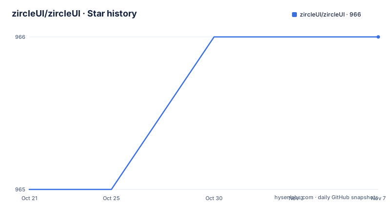
- zircleUI/zircleUI966 ★ · +1
| Repository | 2026-10-21 | 2026-11-07 |
|---|---|---|
| zircleUI/zircleUI | 965 | 966 |
1 Stars in the last 17 days, measured from the daily GitHub snapshot. Compare with other projects
Editorial analysis
A navigation model, not a set of widgets
Most component libraries answer the question of how to arrange elements. zircle answers a different question, which is what happens when the user wants to go somewhere.
The README describes it as a JavaScript library for circular interfaces with zoom navigation: place controls around a view, nest circles inside other circles, and click a spot to zoom into another view. The screen is not a flat layout with a modal on top. It is a set of concentric surfaces, and moving between them is a continuous zoom that a back button or the canvas background reverses.
The primitives are described in a table of five components. z-canvas owns navigation and theme for one app. z-view defines a destination. z-spot places a satellite, link, button or knob around a view. z-list arranges items around a view with pagination. z-dialog opens a circular dialog.
The audience that follows from this is specific. This is for an interface where the structure is genuinely radial, a control surface, a map-like picker, a radial menu, a kiosk display, an instrument panel. It is not for a form, a settings page or a data table, and no amount of configuration changes the fact that a user has to learn a spatial navigation model before they can use the interface at all.
The other thing to know up front is that version 2.0 is a rewrite of a project that used to require Vue.
Version 2.0 merges the Orbit and Zumly engines
The history explains the current package structure, and it is worth understanding because it determines what you can install.
The README tells it directly. Zircle was the author's first project, built with Vue. The layout and navigation were later split out into two separate projects, Orbit for radial layout and Zumly for zoom and view history. Version 2.0 is the first merge of those two projects back into Zircle, with Orbit handling radial layout, Zumly handling zoom and view history, and Zircle providing the components.
That merge is visible in the distribution files. The standalone module includes Orbit and Zumly inside it, so copying one script tag gets you the whole thing. The main package entry point is different: it imports Orbit and Zumly as dependencies, and the stylesheet entry points mirror that split. There is a zircle/style entry that includes the CSS for both engines plus Zircle's own CSS, and a zircle/components.css entry for applications that already load the two engine stylesheets themselves.
For anyone arriving from the older library, the original Vue version is still available under the legacy-vue tag. The current npm package is zircle at version 2.0.0, and the package description states the change plainly, that Zircle's circular components are rebuilt with Orbit and Zumly for the web with no Vue required.
So the modern package is a framework-free component library with two internal engines, and the Vue dependency is a thing of the past rather than something you configure around.
Three ways to load it, one set of elements
The same custom elements work in every distribution mode, which is the practical payoff of the rewrite.
The plain HTML route is two files. You copy the dist directory from the npm package, or from a local build, into your site and serve it over HTTP:
<link rel="stylesheet" href="./dist/zircle.css">
<script type="module" src="./dist/zircle.standalone.js"></script>
The markup is a z-canvas element containing template elements with a data-view attribute, each holding one root z-view, and z-spot elements placed with a slot. A click on a spot zooms into the view it points at, and the back button or the canvas background returns you.
If you cannot use ES modules, the classic script build exposes window.Zircle and registers the same elements, with defer so the browser parses your templates before the library initialises:
<script defer src="./dist/zircle.iife.js"></script>And if you would rather not copy files at all, the same files are served from a CDN:
<link rel="stylesheet" href="https://unpkg.com/[email protected]/dist/zircle.css">
<script defer src="https://unpkg.com/[email protected]/dist/zircle.iife.js"></script>
One rule appears in the HTML section and is easy to miss: load one JavaScript distribution and the stylesheet. The standalone build and the package build both register the same elements, so loading both is how you end up with two copies fighting over the same custom element.
The JavaScript API for people who do not want templates
The JavaScript entry point exists for applications that build their views in code, and the API is small enough to read in one screen.
You add a host element to the page, then initialise the library against it:
import { createZircle } from 'zircle'
import 'zircle/style'

const ui = await createZircle({
  mount: '#explorer',
  initialView: 'home',
  views: {
    home: `<z-view>
      Home
      <z-spot slot="extension" to-view="details" label="Details">+</z-spot>
    </z-view>`,
    details: '<z-view>Details</z-view>'
  },
  theme: 'blue',
  mode: 'light'
})
The views object maps a view name to its markup, which is the same z-view and z-spot vocabulary as the HTML version, just written as strings.
Navigation is exposed as methods. You can move to a view with await ui.setView('details'), go back with await ui.goBack(), and tear the instance down with ui.destroy() when the app is removed from the page. The destroy call matters more than it looks, because without it a view that was mounted in the page keeps its listeners and timers after the surrounding application has moved on.
Events use the standard CustomEvent pattern, and the example listens for viewchange and reads the current view name from event.detail.view. That is the same convention the component-level events use, which is worth knowing since the spot and list elements emit their own events with the same shape.
Geometry rules: angles, distances and slots
The positioning model is worth understanding precisely, because getting it wrong is the usual reason a layout looks wrong.
Angles are degrees, where 0 points right and 90 points down. Distance is a percentage of the parent radius, so 100 places a spot's centre on its parent's circumference and 0 centres it. That is the entire coordinate system: a position is an angle and a distance, and everything else follows from the size scale.
Sizes are named, with xxl, xl, l, m, s, xs and xxs available, and the older aliases extralarge, large, medium, small and extrasmall also work. Views default to xxl and spots default to medium. Sizes scale with the canvas, which means the same markup renders proportionally at different viewport sizes rather than being fixed in pixels.
Content placement is by slot. Ordinary child content sits in the centre of a view. slot="extension" is where surrounding components go, including a spot nested inside another spot. slot="image" is for images and slot="media" is for view media, and when image-path is set it takes precedence over the image slot.
The components use light DOM, which means your markup is not hidden inside shadow roots. You can style them with your own CSS, attach ordinary DOM listeners, and inspect the elements from the console. That is a deliberate trade: less encapsulation than a shadow DOM component library, and much more straightforward integration with existing styles and test tooling.
Controls, lists and dialogs carry their own events
The interactive pieces have behaviour that is specified precisely enough to build against.
A knob and a slider are both z-spot elements with attributes attached. Knobs emit input while changing and change when committed, and the value is read from event.detail.qty. You can update it by setting spot.qty or the qty attribute. The slider attribute keeps its original Zircle meaning, which is a progress ring displaying a percentage rather than a draggable control, and that distinction catches people out.
Lists accept either authored z-spot children or an array with a renderer function, and the renderer returns an element, which means you can build a spot in code, set its attributes and attach a listener before returning it. Pagination starts at page 1, each list has its own pagination state, and a page change emits pagechange carrying page, previousPage and pageCount in event.detail.
Dialogs start closed. You open one with show() and close it with close(). A dialog can close itself automatically with the self-close attribute after 10 seconds, or you can set duration in milliseconds. Completion closes the dialog and emits done, while the close event reports the reason it closed. Two events for two different facts, which is the right split when you need to distinguish the user dismissing a dialog from a timed task finishing.
One note on views that hold state. A view can be an HTML string, an element, or a factory function, and the README recommends factories for state, listeners, timers or framework mounts. The factory form receives a cleanup hook, so the view can tear down what it created when it is left. The security note in the same paragraph is worth repeating: HTML strings are application markup, so untrusted text belongs in textContent.
Build tooling, tests and the gap in the release history
The repository tells you how the package is built and, more interestingly, how the project has moved.
The build is esbuild driven through esbuild.config.mjs, with npm scripts for compile, dev, build and release steps. The dev script runs a script from scripts/dev.mjs and the demo is served locally; the README's own instructions are to clone the repository, run npm ci, npm run compile and npm run dev, then open the local address for the Sun, Earth and Moon demo and the component examples. The test setup runs a Node test file under tests/ and then a Playwright suite, with playwright.config.mjs at the top level, and the test command compiles the library first so the browser tests run against fresh output.
The package metadata requires Node 20 or newer, and the repository enforces a single JavaScript distribution plus the stylesheet.
Now the history, which is the part to weigh before adopting. The most recent GitHub releases are v1.5.4 from 2022-08-27, v1.5.2 from 2022-08-26 and v1.5.1 from 2022-08-25, all from the old Vue era. The current work is version 2.0.0 published to npm, with the repository's last push on 2026-09-12 and the repository not archived. So the tags in the repository do not describe the package you would install today, and the npm version is the one that matters.
The licence is MIT, which is permissive enough for commercial use and for modification, with the usual obligation to keep the notice. The repository also ships documentation for the transition, with docs/MIGRATION.md and docs/ORIGINAL.md included in the published files, which is where to look if you are moving an existing Vue based implementation onto 2.0.
Editorial conclusion
zircle suits teams building an interface where the structure itself is radial and a click should take the user somewhere rather than open a panel, and it suits developers who want the effect without adopting a framework, since the 2.0 package has no Vue requirement and ships as plain ESM, IIFE and CSS files. It is the wrong tool for dense data entry, for long lists that need scrolling, and for anyone whose users expect conventional navigation, because the zoom model has to be learned before it is comfortable. Before you build on it, check that the orbit and zumly engines do what you need by opening the demo, read the migration notes in docs/MIGRATION.md if you are coming from the Vue version, and confirm your project is on Node 20 or newer as the package requires.
Frequently asked questions
Does zircle 2.0 still require Vue?
No. The package description states that Zircle's circular components are rebuilt with Orbit and Zumly for the web with no Vue required. The original Vue library is still available under the legacy-vue tag.
How do I install and try the zircle demo?
Use Node.js 20 or newer, clone the repository, then run npm ci, npm run compile and npm run dev, and open the local address for the Sun, Earth and Moon demo. For use in an application, npm install zircle and load the stylesheet as zircle/style.
How are positions calculated in zircle?
An angle of 0 points right and 90 points down, and distance is a percentage of the parent radius, where 100 places a spot's centre on its parent's circumference and 0 centres it. Sizes are named values that scale with the canvas.
What is the difference between Orbit and Zumly in zircle 2.0?
Orbit handles radial layout and Zumly handles zoom and view history, and version 2.0 merges both back into Zircle with Zircle providing the components. The standalone bundle includes both engines, while the package imports them as dependencies.
How do I zoom between views and listen for navigation?
In JavaScript you can call await ui.setView('details') and await ui.goBack(), and you can listen for the viewchange event and read the view name from event.detail.view. In plain HTML, clicking a spot zooms in and the back button or canvas background returns you.
Official sources
Add this badge to your README
If you maintain this project, the badge below links readers to this analysis and shows its maintenance status from the daily GitHub snapshot. Paste the markdown into your README; add ?metric=license or ?metric=stars to the image URL for a different field.

[](https://hysenlabs.com/projects/zircleui-zircleui)Star history chart for your README
[](https://hysenlabs.com/projects/zircleui-zircleui)Was this useful?