SmoothUI: animated React components you copy into your repo, not a package you import
SmoothUI is a collection of beautifully designed components with smooth animations built with React, Tailwind CSS, Shadcn/ui and Motion
At a glance
- What is it?
- SmoothUI is a collection of animated React components distributed through a shadcn style registry, installed with a CLI that writes the component files into your project. This looks at how the installation model works, what the registry guarantees, and where the copy-and-own trade leaves you.
- Who is it for?
- SmoothUI fits a React team that wants animated components with a modern look, that already uses Tailwind and shadcn conventions, and that prefers owning component source in its own repository over depending on a component package's release cycle. It does not fit a team that wants a single versioned dependency to upgrade, because the components land in your repo and become your code to maintain, and it is the wrong choice outside the React and Tailwind ecosystem.
- Can I use it commercially?
- Yes. MIT is a permissive licence: you can use, modify and sell software built on it, as long as you keep its copyright and licence notices.
- Is it still maintained?
- Yes. The repository last received commits 1 day ago.
- What is it written in?
- Mainly TypeScript, according to GitHub's language statistics.
Answers come from the project's GitHub data, last synced on November 7, 2026, and from our analysis. They are not legal advice.
Star history
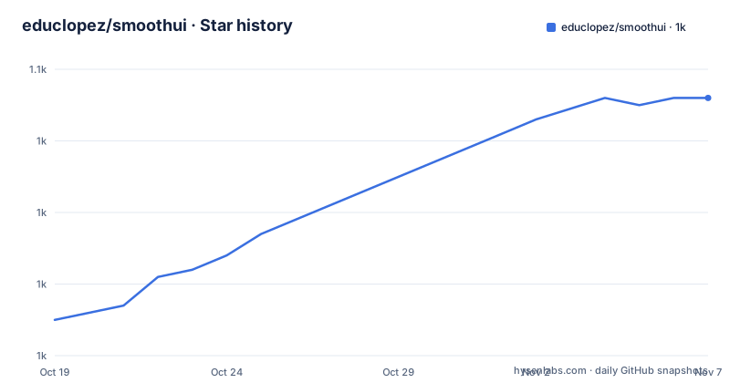
- educlopez/smoothui1,046 ★ · +31
| Repository | 2026-10-19 | 2026-11-07 |
|---|---|---|
| educlopez/smoothui | 1k | 1k |
31 Stars in the last 19 days, measured from the daily GitHub snapshot. Compare with other projects
Editorial analysis
The components land in your repository, which is the whole model
SmoothUI is a collection of designed components with animations, built with React, Tailwind CSS and Motion, and its distribution model is the shadcn one. You do not add a dependency and import a component. You run a command, and the component's source files are written into your project.
That distinction decides most of the trade-offs, so it is worth being explicit. The component is now your code. You can read it, edit it, adapt its props, and delete what you do not use. You also own the maintenance: when the project fixes a bug in a component, you are not getting that fix through a package upgrade, you are taking the new source. The same is true of the dependencies the component pulls in, except that those are ordinary npm packages and do follow your dependency manager.
The project presents itself as reusable UI components that enhance user experience through animations and modern design patterns, and the feature list is explicit about the audience being developers. The listed features cover a modern design system with a new mascot called Smoothy, animations powered by Motion, fully responsive components designed with Tailwind CSS, light and dark theme support out of the box, a dynamic color switcher for theme customisation, documentation with props and examples, enhanced accessibility features across all components, full TypeScript support with type definitions, and dedicated CLI tools.
The site is smoothui.dev, the licence is MIT, and the last push to the repository was on 2026-10-16.
Three ways in, and the manual path expects you to write a utility
The quick start is one command, and there are two CLIs that can do it.
# Using SmoothUI CLI (recommended)
npx smoothui-cli add siri-orb

# Or using shadcn CLI
npx shadcn@latest add @smoothui/siri-orb
The SmoothUI CLI is described as an interactive way to browse and install components with automatic dependency resolution. It has more surface than a single add: you can add several components at once, run it with no arguments for an interactive picker with search and categories, and list everything available:
# Add multiple components
npx smoothui-cli add siri-orb rich-popover float-input

# Interactive mode - browse and select components
npx smoothui-cli add

# List all available components
npx smoothui-cli list
Its documented behaviours are the practical part. It auto-detects the package manager, npm, pnpm, yarn or bun. It auto-detects component paths and tsconfig aliases. It shows a dependency tree before installation. It prompts on file conflicts rather than overwriting silently. And it auto-installs npm dependencies.
The shadcn CLI path is available because SmoothUI is an official shadcn registry, so components are addressable in the `@smoothui` namespace.
The manual path is the one to read closely, because it does not do anything for you. You install the runtime dependencies yourself:
pnpm add motion tailwindcss lucide-react clsx tailwind-mergethen copy the component files from the components directory, then create the utility that shadcn components expect:
# Create lib/utils/cn.ts
mkdir -p lib/utils
and write it yourself:
// lib/utils/cn.ts
import { clsx, type ClassValue } from "clsx";
import { twMerge } from "tailwind-merge";

export function cn(...inputs: ClassValue[]) {
  return twMerge(clsx(inputs));
}
That last step is the one people miss, and it is why the documentation has a troubleshooting entry for import path issues.
The registry is the contract, and it has its own failure modes
SmoothUI describes a registry system with two named properties: automatic dependencies, and component structure, plus a list of registry features. The registry is what makes the copy-into-your-repo model work, because it defines what a component is, which files it brings, and what it needs installed alongside it.
The troubleshooting section in the documentation is short and specific, which is a good sign about what actually goes wrong. There are four entries. The first is a 401 authentication error, which comes from the registry endpoint rather than from your code. The second is registry not found, which is the case where the component identifier does not resolve. The third is import path issues, which is the `cn` utility problem described above, where the component imports a path that does not exist in your project. The fourth is missing dependencies, which is the case where a component was added without its peer packages.
Those four cover the realistic failure modes of a registry model: a bad identifier, an unauthenticated request, a source file that assumes a project structure you do not have, and a dependency that was skipped.
The documentation also has an MCP support section, described as AI assistant integration with a quick MCP setup, which points at the CLI and the registry being usable by an AI coding assistant. That is worth noting for a library whose whole selling point is that an assistant can fetch a component into your codebase, because the registry is what an assistant would call to do it.
What the components actually are
The component catalogue is organised into four groups: UI components, interactive components, layout components and utility components. The documentation gives the SiriOrb as the flagship UI component, an animated orb with smooth color transitions, and the usage example shows how configurable it is.
import { SiriOrb } from "@/components/smoothui/ui/SiriOrb";

export default function App() {
  return (
    <div className="flex min-h-screen items-center justify-center">
      <SiriOrb
        size="200px"
        colors={{
          bg: "oklch(95% 0.02 264.695)",
          c1: "oklch(75% 0.15 350)",
          c2: "oklch(80% 0.12 200)",
          c3: "oklch(78% 0.14 280)",
        }}
        animationDuration={20}
      />
    </div>
  );
}
The colour props are in oklch, which is a detail with consequences: the components are styled with modern CSS colour, and your Tailwind and browser support have to be up to it.
The advanced usage example pulls in two more components, RichPopover and ScrollableCardStack, the latter taking an array of items with an id, name, handle, avatar, video and href, which is the shape of a social profile card. The patterns are familiar: animated orb, rich popover, scrollable card stack. That is the visual language of the component set, and it is the reason a team might reach for it rather than assembling something from primitives.
The import path convention is worth noticing too: `@/components/smoothui/ui/SiriOrb`. The components are written into a `smoothui/ui` subdirectory of your components folder, which is what lets the CLI and the registry keep component identity inside your project.
A monorepo with a registry, a CLI and a docs app
The repository is a pnpm workspace with Turbo, and the root manifest shows how much machinery sits behind the simple install command.
The workspace is named `smoothui-monorepo` and is private. `apps/` holds the applications, including the docs app that produces the site image at `apps/docs/public/readme.png`. `packages/` holds the publishable packages, including the CLI and a `packages/shadcn-ui` directory that the `bump-ui` script targets when refreshing the shadcn component set. Turbo runs the tasks, so `pnpm build` and `pnpm dev` fan out across the workspace.
Quality tooling is more than a linter here. `lint` and `check` run `ultracite check`, with `fix` running `ultracite fix`, and the repository also carries a `biome.jsonc` configuration. There are two test layers: Playwright for browser tests and Vitest for a risk configuration, and the `test` script runs the risk suite before the Turbo test task, which reads as a deliberate ordering rather than a default.
Releases are managed with release-please, with a `RELEASING.md` documenting the process, and the CLI is packaged and verified separately, with `pack:cli` and a `verify:cli-package` script that checks a packed JSON manifest and artifacts against the source package. Dependency updates have their own script, `bump-deps`, which runs npm-check-updates with an exclusion list, and `bump-ui` updates the shadcn base components and runs a Radix migration.
There is also a `calculate-sizes` script that computes bundle sizes, which tells you the project is paying attention to what a component costs to ship, and a `lockfile:check` script written in Ruby, which is an unusual choice that suggests a specific pain point around lockfile validation.
Where SmoothUI is the wrong tool
The limits come from the model rather than the components.
The first is ecosystem. React, Tailwind CSS, Motion, shadcn conventions and Radix primitives are all assumptions baked into the code that lands in your repository. A Vue or Svelte team is out, and a team on plain CSS is out. That is not a defect, it is a component library for a specific stack, but it does mean the library is not a way to standardise a company with mixed frontends.
The second is that the components are not a design system. There is no governance layer, no versioning contract for the collection, and no test that your copy still matches the upstream behaviour. What you get is well made source and a documentation site. Two teams can install the same component on different days and end up with different code, and nobody will be notified. Compare that with a versioned package, where a change arrives as a dependency bump with a changelog, and the difference in cost of ownership is the thing to weigh.
The third limit is the registry as a runtime dependency. Your components are copied, but the registry and the CLI are remote services that your installation process talks to. An air-gapped build, a locked down CI runner, or an organisation that audits every install step will want the manual path, and the manual path means you own the dependency list, the file layout and the `cn` utility yourself.
And the fourth is accessibility. The feature list claims enhanced accessibility features across all components, but a team with a formal accessibility requirement should check the individual component pages rather than take the claim at face value.
MIT terms and a release cadence measured in days
The licence is MIT, with the licence file at the repository root, which is the expected choice for source that is copied into your project rather than installed as a dependency. Because you own the copy, the MIT grant applies to what you received, and you may modify your copy, keeping the copyright notice.
The release rhythm is the striking part. v4.0.0 was published on 2026-10-15, the CLI package moved to v1.2.0 on the same day, and v3.9.1 came on 2026-09-24. The last push to the repository was on 2026-10-16. A major version and a CLI release on the same afternoon, with a push to the source tree the next day, is a fast cadence for a component library.
That speed has a consequence for anyone who copied components rather than installing them. When v4.0.0 lands, there may be source-level changes in the components, and your copy does not receive them. The registry model assumes you will re-add or diff a component when you want the new version, which is manageable for one component and tedious for thirty.
The rest of the project setup is conventional and points to a maintained project: a `CONTRIBUTING.md`, a `SECURITY.md`, a `CODE_OF_CONDUCT` equivalent in the contributing docs, an `AGENTS.md` and `CLAUDE.md` for AI tooling, a `COMPONENT_BACKLOG.md` and `DEMO_BACKLOG.md` that make the roadmap visible, an `ANIMATION_IMPROVEMENTS.md` changelog-style document, and a Vercel OSS Program badge in the readme.
Editorial conclusion
SmoothUI fits a React team that wants animated components with a modern look, that already uses Tailwind and shadcn conventions, and that prefers owning component source in its own repository over depending on a component package's release cycle. It does not fit a team that wants a single versioned dependency to upgrade, because the components land in your repo and become your code to maintain, and it is the wrong choice outside the React and Tailwind ecosystem. Before you install, read the troubleshooting section, because a 401 authentication error and a registry not found are the two failures the documentation calls out, and check the `cn` utility, since the manual installation path expects you to create `lib/utils/cn.ts` yourself.
Frequently asked questions
How do I install a SmoothUI component?
Run `npx smoothui-cli add siri-orb`, or use the shadcn CLI with the namespace, `npx shadcn@latest add @smoothui/siri-orb`. The SmoothUI CLI can also add several components at once, run an interactive picker, or list everything available with `npx smoothui-cli list`.
Do SmoothUI components go into my own project as source code?
Yes. The components are written into your repository, for example at `@/components/smoothui/ui/SiriOrb`, and the manual installation path expects you to copy the files yourself and create the `lib/utils/cn.ts` utility that combines clsx and tailwind-merge.
What happens if a SmoothUI component fails to import?
The documentation lists import path issues as one of four common problems, alongside a 401 authentication error, a registry not found error and missing dependencies. An import failure usually means the expected `cn` utility at `lib/utils/cn.ts` was not created.
Which libraries do SmoothUI components depend on?
The manual installation path installs `motion tailwindcss lucide-react clsx tailwind-merge`. The components are built with React, Tailwind CSS and Motion, and SmoothUI is an official shadcn registry, so the components follow shadcn and Radix conventions.
How often does SmoothUI release new versions?
Quickly. Version 4.0.0 and the CLI version 1.2.0 were both published on 2026-10-15, and v3.9.1 on 2026-09-24, with the last push to the repository on 2026-10-16.
Official sources
Add this badge to your README
If you maintain this project, the badge below links readers to this analysis and shows its maintenance status from the daily GitHub snapshot. Paste the markdown into your README; add ?metric=license or ?metric=stars to the image URL for a different field.

[](https://hysenlabs.com/projects/educlopez-smoothui)Star history chart for your README
[](https://hysenlabs.com/projects/educlopez-smoothui)Was this useful?