Material Design Icons: The Repository Behind Google's Icon Sets
GitHub describes it as Material Design icons by Google (Material Symbols). The metadata lists the Apache-2.0 license. This article stays within the project description and details documented in the GitHub repository README.
At a glance
- What is it?
- Google's material-design-icons repository hosts two icon families: the classic Material Icons and the newer Material Symbols. This review covers what each set offers, how to use them, and where the project's maintenance status creates real trade-offs.
- Who is it for?
- Adopt Material Symbols if you need variable font axes like Fill, Grade, or Optical Size, and if your users run modern browsers that support variable fonts. Stick with Material Icons if you require two-tone icons, static font weights, or need to support older browsers like Internet Explorer.
- Can I use it commercially?
- Yes. Apache-2.0 is a permissive licence: you can use, modify and sell software built on it, as long as you keep its copyright and licence notices.
- Is it still maintained?
- Yes. The repository last received commits 24 days ago.
- What is it written in?
- GitHub does not report a main language for this repository.
Answers come from the project's GitHub data, last synced on November 15, 2026, and from our analysis. They are not legal advice.
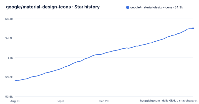
Star history
- google/material-design-icons54,302 ★ · +539
| Repository | 2026-08-13 | 2026-11-15 |
|---|---|---|
| google/material-design-icons | 53.8k | 54.3k |
539 Stars in the last 94 days, measured from the daily GitHub snapshot. Compare with other projects
Editorial analysis
Two Icon Sets, One Repository
The repository google/material-design-icons is the source for two distinct icon families from Google. Material Icons is the classic set, introduced years ago and frozen in 2022. Material Symbols is the current set, built on variable font technology. The README is explicit: Material Icons is no longer updated, while Material Symbols is the default choice shown on the Google Fonts icon browser. If you are starting a new project today, the README's language points you toward Material Symbols, but the repository itself contains both, so you need to know which one you are actually pulling from.
What Each Set Actually Contains
Material Icons comes in five styles: Outlined, Filled, Rounded, Sharp, and Two tone. The font version of the filled style is simply called Material Icons, as it is the oldest. The repository directories android, font, ios, png, and src hold Material Icons content. Material Symbols, in contrast, has only three font families: Outlined, Rounded, and Sharp. There is no separate filled font, because the Fill axis in the variable font handles that. The symbols and variablefont directories contain Material Symbols content. The README also lists what is missing from each set. Material Symbols lacks two-tone icons and only has 20px and 24px versions with perfect pixel-grid alignment. Material Icons lacks variable fonts, weights other than Regular, grades other than Regular, and any way to animate Fill transitions. These gaps matter if your design calls for a specific style.
Variable Font Axes: The Core Mechanism
Material Symbols is built as variable fonts first. Each font has four design axes that you can vary in CSS or in design apps. Optical Size (opsz) ranges from 20 to 48 px, with a default of 24. Weight ranges from 100 to 700, with Regular at 400. Grade ranges from -50 to 200, with a default of 0; the README suggests -50 for white icons on black backgrounds. Fill ranges from 0 to 100, with a default of 0. The Fill axis is the interesting one, because it allows an animated fill effect to indicate user selection, something static fonts cannot do. The README notes that static icons are available for Material Symbols, but they do not have all the variations, because that would mean hundreds of styles. So if you need a specific weight or grade combination, you likely need the variable font.
Getting Started: Fonts, CSS, and npm Packages
The README points to the Google Fonts developer guide for full instructions. The simplest path for web projects is to link to the hosted font. For Material Icons, you use a link tag with family=Material+Icons. For Material Symbols, you use family=Material+Symbols+Outlined. The repository also contains pre-generated font files in the font and variablefont folders, which you can include directly if you prefer self-hosting. For npm users, the README is careful to state that Google does not maintain the npm package for this repo past v3 from 2016. Instead, a user named marella hosts several packages, including material-symbols, material-icons, @material-design-icons/font, and @material-design-icons/svg. These are automatically updated via GitHub Actions, but Google does not monitor or vet them. That is a significant caveat: you are relying on a third party for package updates, and the README says so plainly.
License and Contribution Constraints
The repository is licensed under Apache-2.0, and the README notes that the license changed to Apache 2.0 in the 3.0.0 update from 2016. That is permissive, but it is not legal advice; you should check what the license requires for your use case. On contributions, the README is blunt: Google does not accept pull requests for icon files, whether they are new suggestions or fixes for existing icons. The reason is that the repo is generated from upstream source files, and Google Fonts has strict guidelines for Material icons. You can submit icon requests as GitHub issues, and you can point to external examples, but you cannot submit finished SVG designs. Third-party logos are also excluded for legal reasons, and some that were included in the past have been removed. So if your project depends on a specific third-party logo, you will not find it here.
Maintenance Status and Upgrade Path
The repository's last release is 4.0.0 from August 31, 2020, but the default branch was last pushed on October 23, 2026. The README says Material Icons is no longer updated (updates were halted in 2022), while Material Symbols is the current set. If you rely on the npm packages, the third-party maintainer updates them, but you have no guarantee of timeliness. For upgrades, the practical path is to switch to the Google Fonts hosted CSS or to the third-party npm packages, depending on your setup. Moving from Material Icons to Material Symbols means changing font family names and possibly adjusting for the missing two-tone style. That is a real cost if you have an existing codebase using the classic set.
Limitations and Wrong-Tool Scenarios
The README lists several concrete limitations. Material Symbols does not have two-tone icons, which could be a dealbreaker for interfaces that use that style for emphasis. It also only has 20px and 24px versions with perfect pixel-grid alignment, so if you need a 48px icon at a specific pixel grid, you may see blurriness. Material Icons lacks variable fonts and any weight other than Regular, so you cannot get a thin or bold icon without switching to Material Symbols. The wrong tool scenario is clear: if you need two-tone icons, do not choose Material Symbols. If you need variable font axes, do not choose Material Icons. And if you need a stable, Google-maintained npm package, this repository is not the right source, because the README admits Google does not maintain it.
Alternatives and How They Differ
The most direct alternative is to use the Google Fonts hosted service instead of this repository. That is not a competitor; it is the same icons, but served via CSS from fonts.googleapis.com. The difference is that you get the latest Material Symbols updates without touching the repo, and you avoid the maintenance burden of self-hosting. Another alternative is the third-party npm packages mentioned in the README, such as @material-design-icons/svg, which optimizes SVGs with SVGO and gives you individual SVG files rather than fonts. That approach differs fundamentally: instead of loading a font and using ligatures or codepoints, you embed SVG files directly, which can be better for performance if you only need a few icons. The trade-off is that you lose the variable font axes unless you use the material-symbols package that includes the variable fonts. For a non-Google alternative, you might consider icon sets like Font Awesome, but those have different design language and licensing, so the comparison is not apples to apples.
Editorial conclusion
Adopt Material Symbols if you need variable font axes like Fill, Grade, or Optical Size, and if your users run modern browsers that support variable fonts. Stick with Material Icons if you require two-tone icons, static font weights, or need to support older browsers like Internet Explorer. Before committing, verify which npm package you plan to use, since Google does not maintain these; check the package's update frequency and whether it includes the exact icon styles you need. Also confirm that the Apache-2.0 license aligns with your project's distribution model, and note that the repository itself has not seen a release since August 2020.
Frequently asked questions
What are material design icons?
They are two official Google icon sets built on the same underlying designs. Material Symbols is the current set, introduced in April 2022 and built on variable font technology, while Material Icons is the classic set, no longer updated. Both are released under the Apache 2.0 license and are designed under the Material Design guidelines.
Is material design icon free?
The icons are published under Apache 2.0 for use in your products. What is not covered by that is the npm distribution: Google stopped maintaining its npm package past v3 from 2016, and the packages on the registry today are published and updated by a third party without Google monitoring or vetting them.
Can I customize material icons?
Customization in Material Symbols is limited to four design axes: Optical Size from 20 to 48 px, Weight from 100 Thin to 700 Bold, Grade from -50 to 200, and Fill from 0 to 100. The classic Material Icons font has no variable axes, so it offers Regular weight and Regular grade only, and it cannot animate Fill transitions.
how to use material design icons in html
Link the stylesheet from Google Fonts rather than shipping files, using one link for Material Icons and another for Material Symbols Outlined. The guidance says linking to the hosted web font is generally better, even though pre-generated files sit in the font and variablefont directories for projects that want them locally.
how to install material design icons
For fonts, either link the Google Fonts stylesheet or include the pre-generated files from the font and variablefont directories. For npm, install one of the four community packages, which are hosted by @marella and published automatically with GitHub Actions, and pin the version, since Google does not maintain or vet them.
Official sources
Add this badge to your README
If you maintain this project, the badge below links readers to this analysis and shows its maintenance status from the daily GitHub snapshot. Paste the markdown into your README; add ?metric=license or ?metric=stars to the image URL for a different field.

[](https://hysenlabs.com/projects/google-material-design-icons)Star history chart for your README
[](https://hysenlabs.com/projects/google-material-design-icons)Was this useful?