Intent UI for React: Accessible Components and Copy-and-Paste Customization
Intent UI is a chill set of React components, built on top of React Aria Components and Tailwind CSS. Easy to customize and just copy & paste into your React projects.
At a glance
- What is it?
- Intent UI is a React component collection built on React Aria Components and Tailwind CSS for developers who want accessible foundations and direct control over component source. Its copy-and-paste model favors customization over conventional package installation.
- Who is it for?
- Intent UI fits React developers who want React Aria behavior, Tailwind styling, and direct ownership of copied component code. It is less suitable for teams expecting a conventional npm-installed component library with a stable public package boundary.
- Can I use it commercially?
- Yes. MIT is a permissive licence: you can use, modify and sell software built on it, as long as you keep its copyright and licence notices.
- Is it still maintained?
- Yes. The repository last received commits 1 day ago.
- What is it written in?
- Mainly TypeScript, according to GitHub's language statistics.
Answers come from the project's GitHub data, last synced on November 7, 2026, and from our analysis. They are not legal advice.
Star history
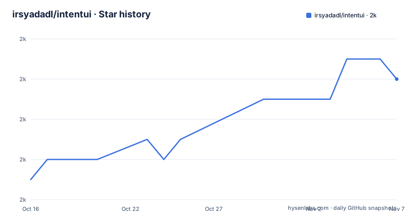
- irsyadadl/intentui1,980 ★ · +5
| Repository | 2026-10-16 | 2026-11-07 |
|---|---|---|
| irsyadadl/intentui | 2k | 2k |
5 Stars in the last 22 days, measured from the daily GitHub snapshot. Compare with other projects
Editorial analysis
Intent UI's Copy-and-Paste React Component Model
Intent UI addresses a recurring tension in React interface development. A component library can save implementation time, but a prebuilt package can also make it harder to change markup, styling, or project-specific behavior. Intent UI takes a source-oriented route. The README describes its components as something users can "copy & paste" into React projects, which means customization happens through direct code changes rather than only through configuration exposed by a remote package.
The collection is built on React Aria Components, and the README says its purpose is keeping the web accessible. That foundation is the project's clearest technical distinction from a visual component collection made only with Tailwind CSS. Tailwind CSS supplies the styling foundation, while React Aria Components provides the interaction and accessibility layer identified by the repository. For engineers, that division matters because component behavior and visual customization are not treated as the same problem.
The intended users are React developers who already understand Tailwind CSS and want reusable interface building blocks without accepting an opaque dependency. It may fit an application whose design system is intentionally maintained in its own repository. It is a poorer fit when product requirements demand installation from a stable package, centralized version upgrades, or minimal local changes to component source.
Intent UI also points to design.intentui.com for blocks and templates. That is a separate design workflow, while the component documentation lives at intentui.com. The repository does not present either site as a mandatory runtime service, so the core component model remains centered on React source files.
React Aria and Tailwind Inside Intent UI
The visible architecture has two declared layers. React Aria Components supplies the accessible component base, and Tailwind CSS controls the presentation. Intent UI combines these layers into components intended for direct use in a React project. This architecture can reduce the amount of keyboard and interaction behavior that an application team must assemble from scratch, although the README does not document each component's accessibility implementation.
The repository is primarily TypeScript. Its package scripts include `typecheck`, `test`, and `lint`, indicating that the project has separate checks for static types, automated tests, and lint rules. The exact test coverage and supported browser matrix are not described in the README, so those details need to be checked in the documentation before an application adopts the collection.
The repository layout also shows documentation and registry-related infrastructure. The `registry.json` file and scripts such as `registry:generate`, `build:icons`, and `build:search` suggest that components and related generated artifacts are assembled through the project build process. That is relevant for contributors who update the collection, but it is not the same as a documented npm installation workflow for application users. The README points users to the getting-started documentation instead of providing a complete application setup command.
For daily development, the practical architecture is therefore likely a set of React components plus their local dependencies and styles. The exact import paths, required providers, Tailwind settings, and component-specific variants are not included in the README. Those details should be taken from the linked documentation rather than inferred from the repository topic list.
Starting with Intent UI's Documented Agent Skills
The repository does not provide a complete installation command for using Intent UI components in an application. It directs users to the getting-started documentation at `intentui.com/docs/getting-started/introduction`. For teams that want to use the repository's official agent skills, the README gives one installable command. These skills cover component, premium design, and v3-to-v4 migration workflows according to the README.
Run this from the project context where you want the skill tooling to be available:
npx skills add irsyadadl/intentuiAfter the command completes, the agent skill files are installed through the `skills` command. The README does not specify the destination directory, output format, or supported agent clients, so the command's exact result will depend on the tool invoked. It should not be confused with installing the React components into an application.
For the first real component use, the next documented destination is the Intent UI introduction guide. A developer should read that guide for the component import, dependency installation, Tailwind setup, and first example, then copy the selected component into the React project. The README does not include those commands. The first-use tutorial therefore stops at the documented entry point rather than presenting an unverifiable code sample.
The repository also advertises blocks and templates through `https://design.intentui.com`. That is useful when a team wants page-level starting material, but the README does not say whether those assets are generated code, hosted previews, or a separate service. Verify the format and licensing terms before incorporating them into an application.
TypeScript Checks, Tests, and Registry Maintenance
Intent UI's repository includes engineering commands that clarify how development is organized. Static checking is performed with `tsc --noEmit`, while automated tests use Vitest. The package also defines `oxlint` for linting and `oxfmt` for formatting. These are repository maintenance commands, not application installation steps, but they show that the project treats component code as a codebase that is checked independently from its documentation site.
The build process is more involved than a single component compile. The `prebuild` script runs MDX generation, icon metadata generation, search generation, registry generation, component extraction, and stub generation. `registry:generate` itself invokes a registry generator, `shadcn build`, and a cleanup script. This suggests that Intent UI produces or maintains registries used to distribute component source. It may explain why the project is distributed by copying source rather than by treating the repository itself as a runtime package.
The repository's `package.json` identifies `intentui` with the version `3.0.0` and marks it as private. Recent release entries include `v4.0.1`, `v4.0.0`, and `v3.9.0`, while the default branch is `4.x`. These version details create a concrete upgrade concern: repository metadata and the current release line should be checked before following instructions written for another major version. The README explicitly mentions v3-to-v4 migration workflows in the agent skills, so migration guidance exists, but its commands and compatibility rules are not reproduced here.
The project is not archived, and the last push was on 2026-10-15. That supports describing the repository as receiving recent changes, but it does not establish that every component is stable or that upgrade work will be inexpensive. Reviewing changes to copied files remains necessary.
Accessibility as the Intended Boundary of the Stack
The main reason to consider Intent UI over a purely visual React component set is its declared accessibility base. React Aria Components is named in the README, and the project says it is "all about keeping the web accessible." That does not mean an application is automatically accessible after copying a component. Application developers still need to provide correct labels, relationships, content structure, focus handling at the page level, and meaningful states around the component.
The README does not document a formal conformance target, audit report, screen-reader matrix, or browser support policy for Intent UI. It also does not claim that every component has been verified against a particular accessibility standard. Consequently, the safe conclusion is narrower: Intent UI chooses React Aria Components as its accessibility-oriented foundation. Teams with formal accessibility requirements should review the individual component documentation and test their actual product flows.
Tailwind CSS adds a separate set of design decisions. Class composition can make component variants easy to inspect in source, especially when an application already uses Tailwind, but copied components may also carry project-specific class conventions. The repository includes a script named `check-duplicated-classes`, which indicates attention to duplicated classes during development. It does not, by itself, document how Intent UI handles conflicts with an application's Tailwind configuration. That check belongs in the adoption review.
The practical result is a library that is useful when accessibility primitives and styling conventions are both important. It is not a substitute for accessibility acceptance testing after integration.
Why Direct Source Ownership Changes Upgrade Work
Copy-and-paste distribution gives the adopter control over the code, but control has a cost. Once a component enters an application, later library improvements do not automatically flow into the local copy. A team must decide whether to replace the file, merge upstream changes, or keep its local version. This differs from upgrading an npm dependency and reviewing a package-level change.
That model can be a good fit for a product with an intentional fork of UI primitives. If a team frequently changes component markup, class names, props, or behavior, owning source files can make those changes direct. The cost becomes clearer when many teams copy the same component and later need to apply an upstream fix or migration. Intent UI does provide a v3-to-v4 migration workflow through its agent skills, but the README does not describe a centralized migration format or automatic reconciliation tool.
The `registry.json` file and registry-related scripts indicate that source distribution is a first-class part of the repository. They do not prove that a consuming application will receive deterministic updates. Application teams should therefore treat the copy operation as a code dependency change, with review, tests, and ownership assigned to an internal team.
This distinction is the main reason not to describe Intent UI as a drop-in npm UI package. The project documentation should be consulted for the exact registry or CLI workflow used by a particular version. Without that documentation, a team that requires centralized version management should assume that local component maintenance is part of adoption.
React Aria Components and Copy-Only Libraries
A relevant alternative is React Aria Components used directly with Tailwind CSS. React Aria Components provides the accessibility-oriented primitives, while the application or an internal design system controls the visual implementation. That approach avoids Intent UI's precomposed component layer, but it also means more decisions about component APIs, variants, composition, and visual consistency.
Intent UI adds value when a team wants a curated starting point rather than assembling every primitive itself. Its copy-and-paste components can serve as a design-system starting point for a React application, with Tailwind styling already present according to the README. React Aria Components alone is more appropriate when the team wants direct control over every component contract and has the capacity to maintain that layer.
Another alternative is a conventional packaged component library installed through a package manager. Such a library generally makes dependency upgrades and version declarations more centralized, although the exact distribution model varies by project and cannot be asserted here. Intent UI is different because the application owns copied source. The choice depends on whether direct customization outweighs the extra work of maintaining those files.
Intent UI does not need to replace every UI approach. It is most relevant when React Aria's interaction foundation is wanted and Tailwind is already part of the application. A team with an established package-based design system may find the copy workflow unnecessary.
Intent UI License and Recent Release Line
The repository is licensed under the MIT License. The README says the components may be tweaked, shared, and remixed with proper attribution. That is a project licensing statement, not a guarantee about every asset linked from the documentation, template site, or external icon package. An application team should inspect the license files for any separate resources it copies, especially if it uses premium design assets or third-party packages.
The repository's package metadata currently shows `intentui` at version `3.0.0` and marks the package as private, while the release list includes `v4.0.1` and `v4.0.0`. The default branch is `4.x`, and the last push was on 2026-10-15. These facts indicate recent release activity around the v4 line, but they do not establish API stability or the effort required to migrate an application.
Upgrade planning should start with the v4 documentation and migration workflow rather than the repository package version alone. Check whether copied components changed between v3 and v4, whether Tailwind configuration changed, and whether application-owned files have diverged. The README's mention of migration skills is a useful entry point, but it does not substitute for reviewing the actual diffs.
Editorial conclusion
Intent UI fits React developers who want React Aria behavior, Tailwind styling, and direct ownership of copied component code. It is less suitable for teams expecting a conventional npm-installed component library with a stable public package boundary. Before adoption, inspect the v4 documentation for installation and migration details, compare the required source changes with your current UI conventions, and confirm that copying generated components will fit your repository's review and upgrade process.
Frequently asked questions
What is Intent UI?
Intent UI is a collection of React components built on React Aria Components and Tailwind CSS. The README describes it as accessible, customizable, and intended to be copied and pasted into React projects.
How do I install Intent UI components in a React project?
The README does not provide a complete application installation command for the components. It directs users to the Intent UI introduction documentation at `https://intentui.com/docs/getting-started/introduction` for setup details.
Does Intent UI use React Aria Components and Tailwind CSS?
Yes. The README identifies React Aria Components as the accessibility-oriented foundation and Tailwind CSS as the styling layer. It does not document the accessibility verification details for each component.
Can I install Intent UI's agent skills with npm?
The README gives the command `npx skills add irsyadadl/intentui` for installing official component, premium design, and v3-to-v4 migration workflows. This command installs skills, not the React components themselves.
Official sources
Add this badge to your README
If you maintain this project, the badge below links readers to this analysis and shows its maintenance status from the daily GitHub snapshot. Paste the markdown into your README; add ?metric=license or ?metric=stars to the image URL for a different field.

[](https://hysenlabs.com/projects/irsyadadl-intentui)Star history chart for your README
[](https://hysenlabs.com/projects/irsyadadl-intentui)Was this useful?