itshover: a React animated icon library you copy into your own codebase
Icons that move with intent
At a glance
- What is it?
- itshover ships 186+ animated SVG icons as React components installed through the shadcn CLI or copied by hand. It suits Next.js projects that want hover motion without a runtime icon dependency, and it is the wrong tool for Vue, hosted icon services, or design systems that forbid local component copies.
- Who is it for?
- Adopt itshover if you are building a React or Next.js interface, already use shadcn conventions, and want to own the icon source so you can tune stroke width, colors and animation timing. Do not adopt it if you need Vue, a hosted icon service, or a single package that updates itself.
- Can I use it commercially?
- Yes. Apache-2.0 is a permissive licence: you can use, modify and sell software built on it, as long as you keep its copyright and licence notices.
- Is it still maintained?
- Yes. The repository last received commits 6 days ago.
- What is it written in?
- Mainly TypeScript, according to GitHub's language statistics.
Answers come from the project's GitHub data, last synced on November 21, 2026, and from our analysis. They are not legal advice.
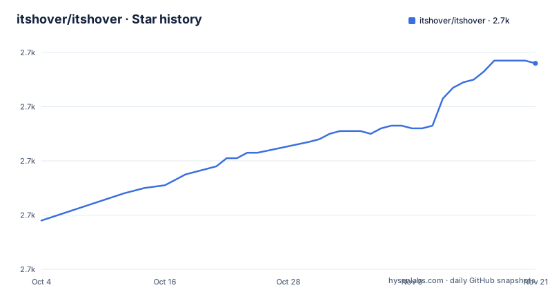
Star history
- itshover/itshover2,736 ★ · +58
| Repository | 2026-10-04 | 2026-11-21 |
|---|---|---|
| itshover/itshover | 2.7k | 2.7k |
58 Stars in the last 48 days, measured from the daily GitHub snapshot. Compare with other projects
Editorial analysis
What itshover solves, and who it is actually for
Static SVG icon sets give you a shape and nothing else. When you want an icon to react to a pointer, you either write the animation yourself or pull in a whole animation library and wire it up per icon. itshover takes the middle position: each icon is a finished React component that already contains its own animation, so the interaction is part of the file rather than something you assemble.
The README describes the intent plainly: icons "designed to move with intent, not decoration." The library covers UI essentials such as arrows, checks and navigation, social marks including GitHub, Twitter, Discord and LinkedIn, tech logos such as Docker, Node.js, Python and TypeScript, action icons for copy, send, cart and settings, currency symbols including Bitcoin, Ethereum, Dollar and Rupee, and status icons for alerts, notifications and loading states.
The audience is narrow and worth naming. This is for React developers building interfaces where a hover state carries meaning, and specifically for teams already working inside the shadcn ecosystem, since installation goes through the shadcn CLI and the icons are distributed as registry entries. If your project is Vue, Svelte or plain HTML, nothing here applies to you. If your design system treats icons as a versioned dependency you never edit, the copy-in model will feel backwards.
How the animation mechanism works
There is no runtime icon provider and no sprite sheet. According to the README, each icon follows a three-part pattern: an SVG wrapped in a React component, an animation triggered on hover using motion/react, and an export with ref forwarding for imperative control. The dependency that makes this work is motion, listed in package.json as motion ^12.23.26.
That ref forwarding detail matters more than it looks. Because the component forwards a ref, you can drive the animation imperatively from outside, for example starting a motion sequence after a form submits rather than waiting for a pointer. The README does not document the imperative API surface, so treat ref forwarding as an available hook rather than a documented contract.
The repository is also a working Next.js application, not just a component folder. package.json lists next 16.1.0, react >=18.0.0, Tailwind CSS 4 and shadcn ^3.6.2. The top-level layout separates icons/ (the animated components), components/ (UI pieces), app/ (Next.js app router pages), lib/ (utilities), models/ and scripts/ (including a registry generation script). registry.json sits at the root as the shadcn registry configuration, and the registry:build script runs npx tsx scripts/generate-registry.ts followed by shadcn build, then formats registry.json and public/r with Prettier. That pipeline is how a new icon in icons/ becomes an installable registry entry.
Installing itshover icons with the shadcn CLI
The README gives two installation paths. The fast one uses the shadcn CLI against the hosted registry, substituting the icon name you want:
npx shadcn@latest add https://itshover.com/r/[icon-name].jsonReplace [icon-name] with a real entry from the library, then look inside your components directory for the generated file. Because this goes through shadcn, the CLI writes the component into your project rather than adding a package dependency, which is the whole point of the distribution model.
The manual path exists for anyone who does not use shadcn. Install the animation dependency first:
npm install motionThen copy the icon component you want out of the icons/ directory into your own project and import it. The README shows this usage:
import GithubIcon from "@/icons/github-icon";

export default function Example() {
  return <GithubIcon className="h-6 w-6" />;
}
The className prop is how you size it, exactly as with any other React icon component. Note the import path: the README writes it as @/icons/github-icon, so your path alias has to resolve there or you adjust the import to wherever you copied the file. Nothing in the README describes a props API beyond className and the forwarded ref.
The copy-in model is the limitation, not a footnote
Once an icon is in your repository, it is yours. Upstream fixes to that icon's animation will not reach you through a package manager. You will not see them in a lockfile diff, and npm update will do nothing. If itshover changes how the GitHub icon animates in a later release, you find out by reading the project, not by upgrading.
That is a deliberate trade. The README lists customization as a feature: copy the source, modify animations, adjust stroke width and colors. You cannot do that with a compiled icon package, and you cannot do it without accepting maintenance responsibility. Teams with many icons should decide up front whether they are vendoring or tracking upstream, because doing both informally produces a directory of files nobody can date.
The second limitation is platform. Everything here is React components built on motion/react. There is no Vue build in the repository, no framework-agnostic web component, and no icon font. A search phrase like "itshover vue" has no answer in the repository: the tech stack is Next.js, React and Tailwind, and the components are .tsx files. If your application is not React, this library is the wrong tool, and no amount of copying will change that.
The third is documentation depth. The README covers installation, the icon categories and the contributing pattern. It does not document the props beyond className, does not list which icons exist beyond pointing at itshover.com/icons, and does not describe how to reduce the animation or disable it for users who prefer reduced motion. If accessibility around motion is a requirement in your project, you are reading the component source to answer that question yourself.
How it compares with other animated icon options
The related searches around this project point at Lordicon, React-icons, Blendicons and Potlabicons, and the differences are structural rather than cosmetic.
React-icons is a packaging layer over many static icon sets. It gives you thousands of glyphs as importable components and no animation at all. If you need breadth and do not care about motion, React-icons covers ground itshover never tries to.
Lordicon is a hosted animated icon service. You get icons through their platform and embed them, which means the animation logic lives outside your repository and updates on their schedule. itshover inverts that: the source lands in your codebase and updates on yours, or not at all.
Blendicons and Potlabicons are design-side icon products rather than component libraries. The practical difference for an engineer is that a designer can hand you an asset from those, while itshover hands you a .tsx file that already contains the interaction.
Against all of them, the distinguishing fact is the shadcn registry. itshover is distributed as registry entries consumed by npx shadcn@latest add, which means it fits a workflow you may already have rather than introducing a second one. That integration is the strongest argument for choosing it over a generic animated icon set, and the strongest argument against it if you do not use shadcn and do not want to copy files by hand.
Maintenance, licensing and what the repository actually commits to
The last push to the master branch was on 2026-07-23, which is recent enough that the repository is not dormant. The most recent release listed is 0.2.0, tagged "New Icons added" on 2026-02-13, following v0.1.0 on 2026-01-13. Release cadence is low and the content of releases is additive: icons, not API changes. That is consistent with a library whose surface is a folder of components.
Licensing is where the repository contradicts itself, and you should know that before you adopt. The README states the project is "MIT licensed, community owned" and links an Apache 2.0 LICENSE file, while package.json declares "license": "MIT". The repository metadata also lists Apache-2.0. Those are not the same licence and they carry different patent and attribution terms. Resolve this with the maintainer or your own counsel before shipping the code in a commercial product; nothing in the repository settles which one governs.
Upgrade cost follows from the distribution model. There is no version to bump for an installed icon. If you want a newer animation, you re-run the shadcn add command for that icon and reconcile the diff against your local edits, or you copy the file again and lose your changes. Budget for that as a manual step, and keep local modifications small enough that re-copying is cheap. The package.json version field reads 0.1.0 even though releases have moved past it, so do not read that field as the project's release state.
Editorial conclusion
Adopt itshover if you are building a React or Next.js interface, already use shadcn conventions, and want to own the icon source so you can tune stroke width, colors and animation timing. Do not adopt it if you need Vue, a hosted icon service, or a single package that updates itself. Before committing, open one icon file in the icons/ directory and confirm the motion/react version it expects matches yours, because the animation code lives in your repository from the moment you install it.
Frequently asked questions
How do you use itshover icons in a React project?
Install an icon with npx shadcn@latest add https://itshover.com/r/[icon-name].json, or run npm install motion and copy the component out of the icons/ directory. Then import it and pass a className, as in <GithubIcon className="h-6 w-6" />.
Why would you use itshover instead of a static icon set?
Because the animation is part of each component rather than something you wire up separately. The README describes the icons as built with motion/react and animating on interaction, with the source available to modify for stroke width, colors and animation timing.
What does the hover effect mean in itshover icons?
It is the interaction trigger: each icon component animates when the pointer hovers it. The README frames the design goal as icons that "move with intent, not decoration", and the contributing guide states that animation is triggered on hover using motion/react.
Does the itshover hover effect work on mobile?
The README does not address touch devices or mobile behaviour, and it does not document a reduced-motion or non-hover fallback. Since the animation is triggered on hover, verify the behaviour on a touch device yourself before relying on it.
Official sources
Add this badge to your README
If you maintain this project, the badge below links readers to this analysis and shows its maintenance status from the daily GitHub snapshot. Paste the markdown into your README; add ?metric=license or ?metric=stars to the image URL for a different field.

[](https://hysenlabs.com/projects/itshover-itshover)Star history chart for your README
[](https://hysenlabs.com/projects/itshover-itshover)Was this useful?