Frimousse for React: An Unstyled Emoji Picker with Composable Parts
A lightweight, unstyled, and composable emoji picker for React.
At a glance
- What is it?
- Frimousse is a lightweight React emoji picker that exposes composable parts instead of prescribing a visual design. It suits applications that need custom styling, emoji search, keyboard navigation, and local emoji-data caching.
- Who is it for?
- Adopt Frimousse when the application already owns its React UI and needs an emoji picker without surrendering control of layout or styling. Do not choose it if you need a complete, pre-styled picker with a surrounding popover already included.
- Can I use it commercially?
- Yes. MIT is a permissive licence: you can use, modify and sell software built on it, as long as you keep its copyright and licence notices.
- Is it still maintained?
- Yes. The repository last received commits 48 days ago.
- What is it written in?
- Mainly TypeScript, according to GitHub's language statistics.
Answers come from the project's GitHub data, last synced on November 7, 2026, and from our analysis. They are not legal advice.
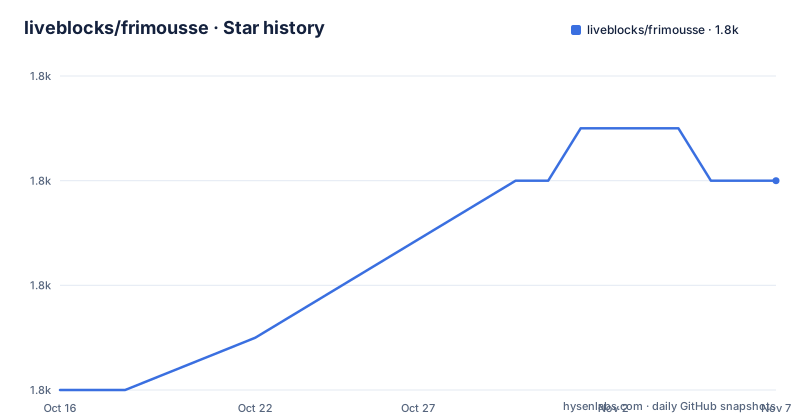
Star history
- liveblocks/frimousse1,810 ★ · +4
| Repository | 2026-10-16 | 2026-11-07 |
|---|---|---|
| liveblocks/frimousse | 1.8k | 1.8k |
4 Stars in the last 22 days, measured from the daily GitHub snapshot. Compare with other projects
Editorial analysis
Why Frimousse separates emoji behavior from visual design
Frimousse solves a specific React integration problem: supplying emoji selection behavior without forcing an application to accept a fixed picker design. The README describes it as lightweight, unstyled, and composable. That distinction matters for products that already have a design system, custom CSS approach, or wrapper component. The library does not present a finished product surface that must be restyled around. It exposes parts that the application can arrange.
The intended audience is developers building React interfaces that need an emoji picker rather than developers looking for a general-purpose visual component. The documented compatibility is React 18 and 19, with TypeScript 5.1 and above. The package is also marked as dependency-free and tree-shakable in the README. Those properties address bundle and integration concerns, although the repository does not publish a measured bundle-size result in the information available here.
The project originated in the default components for Liveblocks Comments, according to the README. That origin explains its focus on a picker that can fit into an existing product interface, but it does not mean Frimousse includes the rest of a comments system. It provides the emoji picker itself. A popover, dialog, toolbar, or surrounding layout remains the application developer's responsibility.
The data flow behind Frimousse's emoji list
Frimousse is based on Emojibase, as stated in the README's credits. The package is designed to fetch the latest emoji data when needed and cache it locally. The public documentation does not expose the internal fetcher, cache key, cache duration, network endpoint, or exact serialization format. Those implementation details should not be inferred from the public API shown in the README.
The user-facing flow is compositional. The application places `EmojiPicker.Root` around a search area, a viewport, loading feedback, an empty state, and the emoji list. The library renders the parts while leaving the surrounding application responsible for presentation. The README says that a few sizing and overflow defaults exist, but the parts otherwise arrive without styles.
The picker is virtualized and the README states that it is designed for minimal re-renders. Virtualization is relevant for a large emoji collection because it reduces the number of list items represented in the active view. The documentation does not state a maximum item count, a measured render time, or the exact interaction between the list and search. Unsupported emoji are automatically hidden, according to the README, which can also reduce visible results.
Accessibility is built into the component direction rather than left entirely to application styling. The README states that the picker is keyboard navigable and screen reader friendly. That makes Frimousse a more credible candidate for a product interface than a purely visual popup, although developers still need to verify focus behavior in the context of their own popover or dialog.
Installing Frimousse and composing the first React picker
The documented installation uses npm and adds the package to a React application. After installation, import the `EmojiPicker` namespace and compose its parts. The following example is the README's basic usage shape, with explicit loading and empty states so the application can communicate what happens while data is unavailable or a search returns no match.
import { EmojiPicker } from "frimousse";

export function MyEmojiPicker() {
  return (
    <EmojiPicker.Root>
      <EmojiPicker.Search />
      <EmojiPicker.Viewport>
        <EmojiPicker.Loading>Loading…</EmojiPicker.Loading>
        <EmojiPicker.Empty>No emoji found.</EmojiPicker.Empty>
        <EmojiPicker.List />
      </EmojiPicker.Viewport>
    </EmojiPicker.Root>
  );
}
For a shadcn/ui project, the README also documents a pre-built component route through the shadcn CLI. That option is separate from the plain npm package and is intended to integrate with shadcn/ui variables and components. The command below is the documented installation path.
npm i frimousseThe plain package is imported from `frimousse`, and the example is TypeScript JSX. The application must still decide where the picker is mounted and how its visible states are styled. The README specifically points to Radix UI, Base UI, Headless UI, and React Aria as possible popover providers if the application does not already have one.
Styling Frimousse without losing the composable API
The main engineering trade-off is explicit control paired with additional UI work. Frimousse does not supply a finished theme, so a team adopting it needs a visual plan for the root, search field, viewport, list, loading state, empty state, and selected emoji. The README names Tailwind CSS, CSS-in-JS, vanilla CSS, inline styles, classes, and selectors based on `[frimousse-*]` attributes as possible approaches.
That flexibility is useful when the emoji picker must match an existing comment composer, message editor, or application toolbar. It also creates a clear boundary. Frimousse does not provide the popover component, focus-management wrapper, or design tokens that may be required to make the picker look like a complete product feature. Those pieces need to be selected and integrated separately.
The presence of small sizing and overflow defaults means the component is not completely unconstrained, but the README does not describe those defaults in detail. Developers should inspect the generated markup and package documentation before assuming that a parent layout will correctly contain the viewport. The application also needs to consider how the search input and emoji list behave at different widths, since no responsive styling recipe is provided in the README.
Compatibility, releases, and the MIT package boundary
Frimousse declares compatibility with React 18 and React 19 and requires TypeScript 5.1 or above when TypeScript is used. In `package.json`, React and TypeScript are peer dependencies, and TypeScript is marked optional. The package is distributed as an ES module and also exposes CommonJS entry points through its exports configuration. Its package metadata includes both `dist/index.js` and `dist/index.cjs`, with corresponding type declaration files.
The repository is not archived. Its last push was on 2026-09-21, and the listed recent release is `v0.4.0` on 2026-09-21. Earlier listed releases are `v0.3.0` on 2025-07-15 and `v0.2.0` on 2025-04-02. This indicates recent release activity, but the 0.x version line should still be treated as an early API surface rather than as evidence of a long-term compatibility promise.
The project uses the MIT license. That permits use and modification under the license's terms, but it does not remove the need to review the license text and comply with its notice and disclaimer requirements. The README does not document a semver policy, migration guide, or support commitment for older versions. The repository contains `CHANGELOG.md`, but its contents were not provided, so version-specific migration claims cannot be made.
Where Frimousse is the wrong component choice
Frimousse is a poor fit when the requirement is a complete picker that is ready to place in a page with minimal assembly. It does not include a popover, and its parts are intentionally unstyled. Choosing it means accepting responsibility for the surrounding interaction and presentation. A team that wants to standardize on a ready-made picker may prefer an alternative that bundles more of the user interface.
A concrete alternative approach is to use a fully packaged component library or a pre-built shadcn/ui component. Frimousse itself documents the shadcn route, which adds a prepared component that integrates with shadcn variables. That is a different adoption model: the application accepts a larger opinionated surface in exchange for less initial composition work. The README lists Radix UI, Base UI, Headless UI, and React Aria as popover options, not as complete Frimousse replacements, so they should not be described as such.
Frimousse is also not the right tool if the product cannot rely on fetching emoji data when needed or if local caching behavior conflicts with the application's offline or data-governance model. The README confirms fetching and local caching, but it does not define cache controls. Teams with strict offline requirements should verify those details before adoption.
Development commands and release verification points
The repository is a monorepo containing the `frimousse` package at the root and the `frimousse.liveblocks.io` site in the `site` directory. The README documents root-level dependency installation and a development build. The site is intended as a playground and is built through the root package with Turborepo.
npm i
npm run dev
The development site command starts the site workspace through the root task. It is useful when reviewing the examples in a browser, although the README does not describe a specific route or expected visual output.
npm run dev:siteThe package test command runs Vitest. Tests that use browser mode require a browser installation, and the README gives a Playwright command for Chromium.
npx playwright install chromium
npm run test:coverage
The repository also defines `build`, `lint`, `format`, and `release` scripts in `package.json`. Releases are triggered through a GitHub action using `release-it`, while pull-request commits can receive continuous releases through `pkg.pr.new`. The exact release workflow is not documented in the README, so this describes the documented automation rather than a guarantee about every release or deployment path.
Editorial conclusion
Adopt Frimousse when the application already owns its React UI and needs an emoji picker without surrendering control of layout or styling. Do not choose it if you need a complete, pre-styled picker with a surrounding popover already included. Verify React and TypeScript compatibility, loading and empty states, styling work, and local emoji-data caching before adoption. The repository is not archived, its last push was on 2026-09-21, and the listed release is v0.4.0, so its development activity is recent while its API remains a young 0.x package.
Frequently asked questions
Is Frimousse a pre-styled emoji picker for React?
No. Frimousse is an unstyled and composable React emoji picker. It provides parts such as `Root`, `Search`, `Viewport`, `Loading`, `Empty`, and `List`, while the application supplies its own styling.
What React and TypeScript versions does Frimousse support?
The README lists React 18 and 19 compatibility and TypeScript 5.1 and above. In `package.json`, React and TypeScript are peer dependencies, with TypeScript marked optional.
How is Frimousse installed and used with shadcn/ui?
The README documents installation with `npm i frimousse`. For shadcn/ui, it documents `npx shadcn@latest add https://frimousse.liveblocks.io/r/emoji-picker`, which installs a pre-built component integrated with shadcn/ui variables.
Does Frimousse include a popover for displaying the emoji picker?
No. The README says Frimousse provides the emoji picker itself. It suggests libraries such as Radix UI, Base UI, Headless UI, and React Aria as possible popover providers.
Does Frimousse hide emoji that the current platform cannot display?
Yes. The README states that unsupported emojis are automatically hidden. It does not document the detection rules or platform-specific exceptions.
Official sources
Add this badge to your README
If you maintain this project, the badge below links readers to this analysis and shows its maintenance status from the daily GitHub snapshot. Paste the markdown into your README; add ?metric=license or ?metric=stars to the image URL for a different field.

[](https://hysenlabs.com/projects/liveblocks-frimousse)Star history chart for your README
[](https://hysenlabs.com/projects/liveblocks-frimousse)Was this useful?