MahApps.Metro.IconPacks for WPF icon integration
Awesome icon packs for WPF and UWP in one library
At a glance
- What is it?
- MahApps.Metro.IconPacks packages many icon collections as XAML-oriented controls, markup extensions, and converters for Windows applications. It is most relevant to WPF teams that want one package catalog but still need to choose individual icon sets carefully.
- Who is it for?
- WPF teams that want multiple icon sources behind one API should adopt the combined package when package size is acceptable, or select one icon-specific package for a smaller dependency. Teams building Avalonia applications should use the separate IconPacks.Avalonia packages instead, while cross-platform or UWP users should first confirm that their target fits the README's current WPF and Windows scope.
- Can I use it commercially?
- Yes. MIT is a permissive licence: you can use, modify and sell software built on it, as long as you keep its copyright and licence notices.
- Is it still maintained?
- Activity is slowing. The repository last received commits 6 months ago.
- What is it written in?
- Mainly C#, according to GitHub's language statistics.
Answers come from the project's GitHub data, last synced on November 7, 2026, and from our analysis. They are not legal advice.
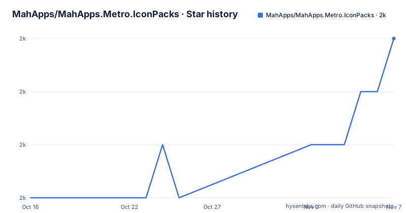
Star history
- MahApps/MahApps.Metro.IconPacks1,966 ★ · +3
| Repository | 2026-10-16 | 2026-11-07 |
|---|---|---|
| MahApps/MahApps.Metro.IconPacks | 2k | 2k |
3 Stars in the last 22 days, measured from the daily GitHub snapshot. Compare with other projects
Editorial analysis
Why MahApps.Metro.IconPacks belongs in a WPF project
MahApps.Metro.IconPacks addresses a specific XAML integration problem: WPF applications often need icons from several visual families, but each family may otherwise require a different control, font resource, or conversion pattern. The library places controls, markup extensions, and converters around a shared icon-pack concept. According to the README, this lets application developers use the included icons through their applications "in a simple way."
The catalog covers Bootstrap Icons, multiple generations of Boxicons, Codicons, Feather Icons, File Icons, Font Awesome Free v5, and other collections. Individual packages let a project depend on one collection, while `MahApps.Metro.IconPacks` combines all listed icons into one package. That choice affects package size and upgrade scope. The README reports 69,328 icons for the complete collection, so an application needing only a small, stable subset may gain little from taking the combined dependency.
The intended users are developers building Windows Presentation Foundation applications and selecting icons in XAML. The repository metadata and topics still mention UWP, but the cleaned README describes the library as icon packs for WPF and states support for .NET Framework 4.6.2 or later and .NET 6 or later on Windows. That mismatch matters. A team whose target is specifically UWP should not treat the older description as proof of current package support without checking the package target itself.
There is also no homepage listed for the repository. The README points to NuGet pages for each collection and to GitHub releases, so those are the documented places to obtain and inspect packages rather than an independent project website.
Controls, markup extensions, converters, and XAML flow
The library's abstraction is centered on three WPF-facing mechanisms: controls, markup extensions, and converters. The README does not expose their individual APIs or an XAML example, so the exact property names and enum structure should not be inferred. What can be established is the division of responsibility. Controls can represent icons in the visual tree, markup extensions support declarative XAML usage, and converters make icons available to binding scenarios that need a value transformation rather than a dedicated control.
This design fits WPF because the repository is C# and the icon packs are consumed through XAML-oriented library components. A developer can choose a control when layout and icon rendering are part of the visual hierarchy, a markup extension when the icon is more naturally selected inline in XAML, or a converter when existing binding infrastructure needs to supply the icon value. The documentation names these mechanisms but does not document their exact dispatch rules, fallback behavior, or resource-loading requirements.
The collections themselves carry independent upstream versions in the README table. Examples include Bootstrap Icons 1.13.1, Boxicons v2 2.1.4, Boxicons v3 3.0.0, Codicons 0.0.41, Feather Icons 4.29.1, and Font Awesome Free v5 5.15.4. Those versions are collection versions, not necessarily versions of MahApps.Metro.IconPacks itself. The recent project releases listed for the library are 6.2.1 on 2025-11-02, 6.2.0 on 2025-10-31, and 6.1.0 on 2025-08-10.
A practical consequence is that an upgrade can affect more than C# APIs. It can change bundled icon artwork, glyph keys, collection versions, generated resources, and the set of controls exposed by the package. The README does not publish a migration or deprecation guide, so teams with saved XAML references should inspect release notes and compare the target collection's glyph identifiers during an upgrade.
Choosing the combined NuGet package or one icon package
The README provides a direct route to NuGet but does not give a package-manager command, installation snippet, or first-use XAML sample. Consequently, there is no documented command to reproduce here. A first real setup begins by opening the linked `MahApps.Metro.IconPacks` NuGet page if the application wants the full catalog, or by opening the page for the relevant collection package.
For example, the table links `MahApps.Metro.IconPacks.BootstrapIcons` for Bootstrap Icons and `MahApps.Metro.IconPacks.BoxIcons` for Boxicons v3. The README states that the project supports .NET Framework 4.6.2 or later and .NET 6 or later on Windows. Those are support statements, not an installation command. The package page and the project's selected target framework remain the sources for confirming compatible assets.
Before adding a package, decide which icon vocabulary the interface will actually use. An application that mixes Bootstrap Icons, Boxicons, and Font Awesome Free v5 may prefer `MahApps.Metro.IconPacks`, because the README describes that package as the complete collection. A focused application should choose a specific package when it needs one collection and can avoid carrying unrelated resources. The README does not publish package-size measurements, load-time behavior, or trimming guidance, so it cannot support a stronger claim about which option is smaller at runtime.
The first useful design step is to name the collections in the user interface, check their listed versions, and inspect the package documentation for the actual XAML names. Then establish one collection as the default and treat additional families as exceptions. That avoids committing the application to a mixed icon vocabulary merely because the combined package exposes it.
Package boundaries for Font Awesome, Material, and bundled families
The combined package is convenient because the README lists 69,328 icons, but convenience comes with a broad dependency boundary. Icon ownership and licensing are not uniform merely because MahApps distributes the packages under one repository. The repository license is MIT, while the included icon sets have their own upstream projects and versions. The README does not reproduce those upstream license terms or explain redistribution implications, so the MIT repository license should not be treated as a blanket clearance for every bundled asset without checking the selected icon collection.
The table also reveals that similarly branded families are separated. Boxicons v2 is represented by `MahApps.Metro.IconPacks.BoxIcons2`, while Boxicons v3 uses `MahApps.Metro.IconPacks.BoxIcons`. Font Awesome is shown as Font Awesome Free v5 through `MahApps.Metro.IconPacks.FontAwesome5`. Selecting a package from memory could therefore select an older or different icon vocabulary, especially in XAML where saved glyph keys may not map to the intended collection.
The repository's topic list includes Material and Material Design, and its original description refers to WPF and UWP. The visible collection table demonstrates several named families but does not fully establish the package name for every Material icon set. That makes the README's linked NuGet pages more authoritative than the topic labels or old summary for determining whether a particular Material package exists in the release being considered.
For applications with licensing review requirements, inventory the chosen upstream collections separately from the MahApps package. This review is not a claim that conflicts exist. It is a recognition that the repository states one license for itself while exposing multiple third-party icon families whose own terms are not included in the visible text.
Maintenance signals and the cost of changing icon sets
The repository is not archived, and its last push was on 2026-04-25. Those are the available maintenance signals; they do not establish compatibility for every target framework or package. The release history also shows that updates are not confined to old preview labels. Versions 6.1.0, 6.2.0, and 6.2.1 were released within the documented release history, with 6.2.1 published on 2025-11-02.
Maintenance effort is more likely to appear at the icon vocabulary than in ordinary application logic. An icon upgrade can add icons, revise artwork, change an upstream collection version, or alter generated XAML resources. The README does not document whether removed glyphs are retained as aliases, how deprecations are announced, or whether breaking changes follow semantic versioning. A team that stores icon identifiers directly in XAML should therefore review the relevant GitHub release notes before changing the IconPacks version.
The repository layout includes `build.cake`, `build.ps1`, `build/`, `.github/`, and package configuration files, which indicates that packaging and release work are repository activities. That layout alone does not document contributor onboarding or upgrade procedures. For consumers, the upgrade cost depends on whether the application uses the complete package, several individual collections, or a stable small set of glyph keys.
A collection-specific package is the lower maintenance choice when that package contains every required icon. It limits unrelated icon updates and makes upstream version review more focused. The complete package makes switching between bundled families easier, but an upgrade can expose the application to changes across every collection it carries. The README does not quantify either risk, so package granularity is a concrete design decision rather than a proven performance optimization.
Avalonia as the documented alternative for cross-platform XAML
The closest documented alternative is `IconPacks.Avalonia`, which the README links as a separate MahApps project for Avalonia applications. The difference is the UI framework rather than the general goal. MahApps.Metro.IconPacks serves WPF applications and documents Windows target support, while IconPacks.Avalonia is presented as the way to make the same kind of icon packs available to Avalonia applications.
This is a framework-specific choice. An Avalonia team should not assume that WPF controls or XAML markup from MahApps.Metro.IconPacks will load in an Avalonia project merely because the icon collections are related. Conversely, a WPF application that needs UWP or Avalonia compatibility should verify its actual target rather than relying on the repository description's historical mention of UWP. The visible README confirms the WPF scope and separately points to Avalonia, but it does not explain migration instructions between the two packages.
Neither option is documented as an alternative for applications that need vector files without an icon-control or converter model. For such use cases, the upstream icon projects are the more direct source because the README links each collection's own site or repository. The distinction matters: MahApps packages adapt icon families to application frameworks, while the upstream collections define the artwork and icon vocabulary.
A framework decision should therefore happen before package selection. WPF developers can assess MahApps.Metro.IconPacks directly. Avalonia developers should inspect IconPacks.Avalonia. Teams targeting UWP or another cross-platform stack need separate confirmation because neither the visible README table nor its installation section establishes current support for them.
Editorial conclusion
WPF teams that want multiple icon sources behind one API should adopt the combined package when package size is acceptable, or select one icon-specific package for a smaller dependency. Teams building Avalonia applications should use the separate IconPacks.Avalonia packages instead, while cross-platform or UWP users should first confirm that their target fits the README's current WPF and Windows scope. Before adoption, verify the exact collection version, package target, required glyph key, and any license obligations belonging to the icon set itself.
Frequently asked questions
What frameworks does MahApps.Metro.IconPacks support?
The README describes MahApps.Metro.IconPacks as a WPF library supporting .NET Framework 4.6.2 or later and .NET 6 or later on Windows. It also links IconPacks.Avalonia for Avalonia applications.
Should I install the complete MahApps.Metro.IconPacks package or a single icon package?
Use `MahApps.Metro.IconPacks` when an application needs the complete bundled collection. If it uses only one family, such as Bootstrap Icons or Boxicons v3, an icon-specific package can keep the dependency and review scope focused.
What license applies to icons bundled with MahApps.Metro.IconPacks?
The repository identifies MahApps.Metro.IconPacks under the MIT license. Because it bundles icons from several upstream collections, check the selected collection's own license as well; the visible README does not reproduce those terms.
Does MahApps.Metro.IconPacks work with Avalonia?
The README directs Avalonia users to the separate `IconPacks.Avalonia` packages. It does not state that the WPF packages can be used directly in Avalonia applications.
Which MahApps.Metro.IconPacks release is documented as the latest?
The release list identifies IconPacks 6.2.1 as the latest listed release, published on 2025-11-02. The repository was not archived, and its last push was on 2026-04-25.
Official sources
Add this badge to your README
If you maintain this project, the badge below links readers to this analysis and shows its maintenance status from the daily GitHub snapshot. Paste the markdown into your README; add ?metric=license or ?metric=stars to the image URL for a different field.

[](https://hysenlabs.com/projects/mahapps-mahapps-metro-iconpacks)Star history chart for your README
[](https://hysenlabs.com/projects/mahapps-mahapps-metro-iconpacks)Was this useful?