FluentUI React Native: installation, components, and alpha limits
A react-native component library that implements the Fluent Design System.
At a glance
- What is it?
- FluentUI React Native provides customizable React Native controls based on the Fluent Design System for Windows, macOS, iOS, and Android. Its cross-platform interface hides real platform differences, and the project still labels every supported platform as alpha.
- Who is it for?
- Developers already using React Native who need Fluent-aligned controls can evaluate this package, especially after checking the relevant SPEC.md for platform support. Projects that require documented production readiness across all four platforms should wait or choose a more mature alternative.
- Can I use it commercially?
- Yes. MIT is a permissive licence: you can use, modify and sell software built on it, as long as you keep its copyright and licence notices.
- Is it still maintained?
- Yes. The repository last received commits 1 day ago.
- What is it written in?
- Mainly TypeScript, according to GitHub's language statistics.
Answers come from the project's GitHub data, last synced on November 7, 2026, and from our analysis. They are not legal advice.
Star history
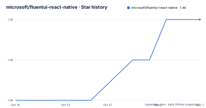
- microsoft/fluentui-react-native1,448 ★ · +2
| Repository | 2026-10-16 | 2026-11-07 |
|---|---|---|
| microsoft/fluentui-react-native | 1.4k | 1.4k |
2 Stars in the last 22 days, measured from the daily GitHub snapshot. Compare with other projects
Editorial analysis
FluentUI React Native's target applications
FluentUI React Native addresses developers who want controls that follow the Fluent Design System inside React Native applications rather than assembling each interface control independently. The package covers Windows, macOS, iOS, and Android at the repository level, and the README describes its controls as built on React Native and customizable. That makes it relevant to applications that need a shared component vocabulary across supported platforms rather than four entirely separate UI implementations.
The central trade-off appears in that same goal. Cross-platform does not mean every component has identical availability or behavior. The README specifically says a control can be missing on a supported platform, expose properties unavailable elsewhere, provide limited support for a property, or behave differently enough that application code must account for it. A single component page therefore cannot be treated as a complete platform compatibility contract. The component-specific SPEC.md files are the more useful place to check those boundaries.
This is a UI component layer, not a complete application framework. The repository documentation does not claim that it provides navigation, data storage, networking, or application-wide state management. Its specific problem is narrower: supplying reusable controls with Fluent styling and customization mechanisms for React Native development.
Package structure behind the public component API
The published package is imported as `@fluentui/react-native`. Components are exported from that package, as shown by the README's use of `CheckboxV1 as Checkbox` in the complete example. This means consumers interact with a package-level API rather than importing implementation files from individual directories.
The repository itself is a TypeScript monorepo organized with Yarn workspaces. Its `package.json` declares workspaces for the root, `apps/*`, `packages/**`, and `scripts`. The top-level build delegates to `lage root-build`, while `root-build` invokes `tsc -b`. This layout separates the public package work from repository-level applications, scripts, framework code, and other packages without requiring consumers to reproduce the monorepo when installing the npm package.
The documentation points to separate packages for theme definitions, tokens, slots, and composition. The theming documentation therefore reflects a framework organized around more than fixed component styles. Still, the README does not provide a single architecture diagram or a complete API trace from a button press through platform code, so it does not establish a more detailed runtime sequence.
Installing @fluentui/react-native in an existing app
Start with an existing React Native project that already has the standard React Native dependencies, Node.js, and a configured React Native development environment. The README also directs developers without an application to the React Native Windows Getting Started documentation. Once that application exists, install FluentUI React Native with npm from the application root:
npm i @fluentui/react-nativeThe package name and command should match the README exactly. After installation, imports can come from `@fluentui/react-native`. The README contains both a basic import example and a fuller application example, but their exported checkbox names differ. The simple import uses `Checkbox`:
import { Checkbox } from '@fluentui/react-native';The complete example instead uses `CheckboxV1`. Before wiring a control into production code, check the component's current SPEC.md and exported name rather than assuming those examples are interchangeable. The absence of GitHub releases also means the repository page does not provide a named release history for checking adoption boundaries.
Rendering the first CheckboxV1 control
The README's first real application example places a FluentUI checkbox inside a centered React Native view. Keep the code as shown if you are using the documented `CheckboxV1` export, and adjust your own entry file only as required by that project:
import React from 'react';
import { View, Text } from 'react-native';
import { CheckboxV1 as Checkbox } from '@fluentui/react-native';
function HelloWorldApp() {
  return (
    <View
      style={{
        flex: 1,
        justifyContent: 'center',
        alignItems: 'center',
      }}
    >
      <Text>Hello, world!</Text>
      <Checkbox label="Hello World Checkbox" />
    </View>
  );
}
export default HelloWorldApp;
A successful first use should place the label next to the checkbox within the centered view. This example verifies package resolution, JavaScript transformation, and basic rendering on the selected platform. It does not establish parity for every property or platform.
If the app reports `pragma and pragmaFrag cannot be set when runtime is automatic`, the README suggests switching the React Babel preset to the classic runtime. That is a troubleshooting path for this specific transform error, not a general sign that every automatic-runtime project needs the same change.
Theme, tokens, slots, and customization boundaries
Customization is organized through FluentUI React Native's theming documentation rather than a promise that every visual detail is controlled by one component prop. The README links `docs/pages/Theming/Basics.md` for an overview and `ThemedStylesheet.md` for stylesheets. It also points to package-level documentation for theme settings, theme references, tokens, slots, and composition under `packages/framework/`.
That structure suggests distinct responsibilities. Themes provide configuration, tokens expose named design values, and slots describe component composition points. The exact behavior of each API is not reproduced in the main README, so an application should consult the linked file for its installed version instead of inferring the contract from component examples.
Customizability is one of the package's stated benefits, but platform remains a constraint. A customization that appears in one component's documentation can still be limited on another operating system. The README's instruction to distinguish availability, properties, property support, and behavior is especially relevant here. A shared theme can reduce duplicated styling decisions without eliminating the need to inspect each control on Windows, macOS, iOS, and Android.
Repository development with Yarn and Lage
Contributors do not install the library with npm inside the repository. The project requires Yarn, uses Yarn workspaces, and runs repository tasks through Lage. The documented setup is:
git clone https://github.com/microsoft/fluentui-react-native.git
cd fluentui-react-native
yarn
yarn build
After a successful build, the README says to use FluentUI Tester to explore the controls. Its separate `apps/fluent-tester/README.md` contains the launch instructions, which are not reproduced here. The root also supports narrower repository commands. Formatting is managed with oxfmt, and fix mode is invoked with:
yarn format:fixLage caches task output and normally produces limited output. The README documents `--no-cache` when cached results need to be bypassed and `--verbose` for more detail. For full repository validation, `yarn lage buildci` runs the configured build, lint, test, and repository checks according to the project documentation. This distinction matters: `yarn test` and `yarn lage buildci` are not described as interchangeable.
Alpha status, maintenance, and adoption constraints
The README labels FluentUI React Native an alpha project for both the components and the repository. Its platform table marks Windows, macOS, iOS, and Android as `Alpha (in progress)`. It also warns that people trying the components may encounter problems. This is the clearest constraint for adoption and outweighs the repository's recent development activity when judging production suitability.
The repository is not archived, and its last push was on 2026-10-16. The repository has no GitHub releases, so there is no documented GitHub release cadence to evaluate. Repository scripts do show specific change-management mechanisms through `.changeset/`, scripts named `changeset:version` and `change:check`, and checks such as `check-publishing`. These mechanisms do not guarantee stable package releases.
The MIT license permits reuse under its terms, but this review does not interpret those terms. The practical upgrade question is whether the application can absorb alpha API or behavior changes. Before adoption, inspect the exact component SPEC.md, its available properties on the target platform, the installed package export, and whether the desired theme customization is shared across platforms.
Editorial conclusion
Developers already using React Native who need Fluent-aligned controls can evaluate this package, especially after checking the relevant SPEC.md for platform support. Projects that require documented production readiness across all four platforms should wait or choose a more mature alternative. The first adoption decision should be based on whether the specific component, property, and platform are marked alpha, unavailable, limited, or behaviorally different.
Frequently asked questions
How do I install FluentUI React Native in an existing React Native app?
Install `@fluentui/react-native` from the app root with `npm i @fluentui/react-native`. The README also requires Node.js, standard React Native dependencies, and a configured React Native development environment.
Is FluentUI React Native production-ready for Windows, macOS, iOS, and Android?
The README describes both the repository and its components as alpha, and marks Windows, macOS, iOS, and Android as `Alpha (in progress)`. It warns that users may encounter problems.
Why do the README examples use Checkbox and CheckboxV1 for FluentUI React Native?
The basic import example names `Checkbox`, while the complete application example imports `CheckboxV1 as Checkbox`. The README does not explain the difference, so the component's current SPEC.md and package export should be checked before choosing one.
Official sources
Add this badge to your README
If you maintain this project, the badge below links readers to this analysis and shows its maintenance status from the daily GitHub snapshot. Paste the markdown into your README; add ?metric=license or ?metric=stars to the image URL for a different field.

[](https://hysenlabs.com/projects/microsoft-fluentui-react-native)Star history chart for your README
[](https://hysenlabs.com/projects/microsoft-fluentui-react-native)Was this useful?