PanelUI: 141 Tailwind-styled React Native components that run in Expo Go
High-performance React Native components for Expo.
At a glance
- What is it?
- PanelUI is a TypeScript component library for Expo apps that avoids native modules, styles through Uniwind and Tailwind v4, and now has a separate React web package. Its limits are the Expo SDK 57 floor, a three-file manual setup and a web set that is not a port.
- Who is it for?
- Pick PanelUI if you are on Expo SDK 57 or newer, want Tailwind classes on every component and need to stay inside Expo Go. Skip it if you are on an older SDK, expect to share components with a web app, or need a long track record, since v1.0.0 only shipped on 2026-11-02.
- Can I use it commercially?
- Yes. MIT is a permissive licence: you can use, modify and sell software built on it, as long as you keep its copyright and licence notices.
- Is it still maintained?
- Yes. The repository last received commits 1 day ago.
- What is it written in?
- Mainly TypeScript, according to GitHub's language statistics.
Answers come from the project's GitHub data, last synced on November 7, 2026, and from our analysis. They are not legal advice.
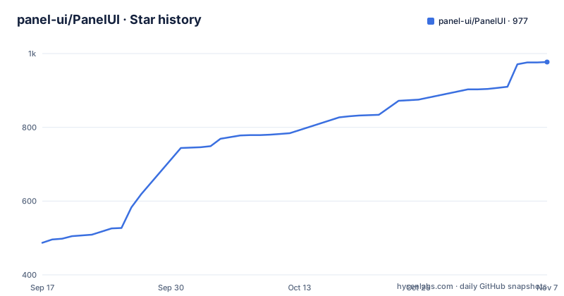
Star history
- panel-ui/PanelUI977 ★ · +490
| Repository | 2026-09-17 | 2026-11-07 |
|---|---|---|
| panel-ui/PanelUI | 487 | 977 |
490 Stars in the last 51 days, measured from the daily GitHub snapshot. Compare with other projects
Editorial analysis
No native modules is the promise that keeps Expo Go working
PanelUI is described as pure TypeScript with no native modules. The practical result is that it runs in Expo Go with no prebuild, no Xcode and no Android Studio. For a team that wants to try a screen on a phone within minutes of installing a library, that is the main selling point, and the rest of the design follows from it.
The animation layer is Reanimated 4. Press feedback, switches, sheets, dialogs and tabs are said to run on the UI thread, so the JavaScript thread is not involved in those transitions. Theme switching is described as applied natively, without re-rendering your tree, and the semantic colour tokens are precomputed to static values for native.
The catch is that the library does not ship its own native code, so it leans on packages you install next to it. The install command pulls in uniwind, tailwindcss, react-native-reanimated, react-native-worklets, react-native-gesture-handler, react-native-safe-area-context, react-native-svg, @react-native-masked-view/masked-view and expo-linear-gradient. Those are the packages your app carries, and their versions are tied to your Expo SDK.
Two ways in: the npm package or source copied into your repo
There are three entry points. A new app can start from the scaffolder, which does everything below for you:
npx create-panelui-app@latestAn existing Expo app takes the package and its peers through expo install:
npx expo install panelui-native
npx expo install uniwind tailwindcss react-native-reanimated react-native-worklets react-native-gesture-handler react-native-safe-area-context react-native-svg @react-native-masked-view/masked-view expo-linear-gradient
The third route is panelui-cli, which copies a component's source into your project so you own and edit it:
npx panelui-cli@latest init
npx panelui-cli@latest add button
Both approaches are supported and they can be mixed. The trade is the usual one. Importing from panelui-native keeps you on the maintainers' fixes as you upgrade. Copying a component gives you a file you can change freely, and from then on that file is yours to reconcile when the library moves. The CLI also has its own test target in the monorepo, test:cli, and a verify:cli-packages script, which suggests it is treated as a first-class part of the project rather than an add-on.
The one-command install stops short of a working app
After the two expo install commands, PanelUI still needs three files: a Metro config, a CSS entry and the provider. The commands above do not create them. The installation guide at panelui.dev/docs/installation walks through each one and lists a fix for every error people hit.
If you skip the guide and only run the commands, you have the packages but not the wiring, and the first screen will not render with the library's styling. That is the real cost of the existing-app path. The scaffolder avoids it, because it ships with that setup already done, so a greenfield project gets the shortest route.
There are also hard floors. The scaffolder needs Node 20 or newer. The existing-app instructions are for Expo SDK 57 and above, and nothing in the repository text says what happens on an older SDK. On an app pinned to an earlier SDK, the safe reading is that the documented path does not apply to you, and you should test on a throwaway project before committing a migration.
Every component takes className, so Tailwind classes restyle anything
Styling goes through Uniwind, which brings Tailwind v4 to React Native with no Babel transform. The project claims it is around 2.4 to 3 times faster than the alternatives. That is a number from the project itself, not something verified here, and it does not say which alternatives were measured.
What matters day to day is the className prop. Every component accepts it, and components with an inner label expose a second hook, labelClassName:
<Button className="w-full rounded-full" labelClassName="uppercase">
  Continue
</Button>
The design tokens are semantic: background, primary, muted, destructive and so on, shared across light and dark. If your existing app uses a different colour vocabulary, you either map your palette onto these names or accept two systems side by side. Because the tokens are precomputed to static values for native, they are not meant to be looked up dynamically at render time in the way a web CSS variable would be.
Compound components make the markup read like the screen
The API is compound: Card.Header, Dialog.Content and Table.Row compose in the order the markup reads. The usage example builds a create-project card out of Card, Card.Header, Card.Title, Card.Description, Card.Content, Card.Footer, Input, Dialog, Dialog.Trigger, Dialog.Content, Dialog.Title and Button, all imported from panelui-native in one line.
The design has a consequence for reading code. A dialog is a wrapper with a Trigger child and a Content child, rather than a boolean prop on a flat component, so open state is part of the tree. Teams used to a visible prop will need a little time to adjust, and anything you wrap around these parts has to preserve the nesting.
Accessibility is a stated default: every interactive component wires up accessibilityRole and mirrors its state. The monorepo backs that up with scripts named test:a11y, test:a11y:browser and test:a11y:native, but the script names are all that can be said about them here, since no results are available.
141 modules sorted into eight families, with charts and AI chat included
The component count is 141 modules, and the list is broader than most Expo UI kits. Layout and content covers Card, Table, Timeline, Steps, Accordion, Carousel and Skeleton. Forms include Form, Field, Combobox, TagInput, OtpInput, Signature, ColorPicker, DatePicker, MarkdownEditor and Questionnaire. Actions and navigation include Menu, ContextMenu, Sortable, Tabs, Breadcrumb, Pagination and Tree. Overlays include Dialog, BottomSheet, Drawer, Popover, Tooltip, Toast and Tour.
Data visualisation is the largest family: LineChart, LiveLineChart, AreaChart, BarChart, CandlestickChart, PieChart, SankeyChart, TreemapChart, RadarChart, HeatmapChart, Kpi, Map, Flow and QRCode, among others. The AI family has Message, MessageScroller, Response, Reasoning, Plan, Task, Sources, CodeBlock, Shimmer, ThinkingOrb and Soundwave. There are also Social components such as Post, ImageViewer and Compare, and scroll and motion pieces such as ScrollHeader, ScrollFade, Marquee and TextAnimation.
Around these sit the primitives: PanelUIProvider, Portal, AnimatedPressable, useTheme, useThemeMode, useToast and cn. A count of 141 is a count of modules, not a promise that each one has equal depth, so check the props table for any component you plan to depend on.
panelui-web is its own forty components, not the native set ported
The web package is for React on the web: Next.js, Vite, React Router, or anything else that runs React 18 or newer with Tailwind CSS v4. It is explicitly not a port of the native components. It is forty components of its own, styled with Tailwind on the tokens a shadcn project already defines, and the examples named include a prompt for an AI assistant, a board of cards you drag, a canvas of nodes and edges, a globe and KPI cards.
The consequence is that you cannot write a screen once and expect it to render in both places. 141 modules on native and forty on the web are separate codebases that share a visual language, so a team with an Expo app and a web dashboard still maintains two component trees, even if the look is aligned. Anyone hoping for a single cross-platform import should read that as a limit, not a roadmap item.
The web side is also younger. The recent releases include web-v0.11.0, tagged as panelui-web v0.11.0, alongside the native v1.0.0 on 2026-11-02, so the web package is still on a 0.x version number.
A 1.0 tag three days after 0.116 means the changelog matters
The release history is short and recent. v0.116.0 was tagged on 2026-10-30, and v1.0.0 followed on 2026-11-02, with web-v0.11.0 published two seconds apart from it. The last push to the repository was also on 2026-11-02, and the repository is not archived, so it is actively maintained by its own timestamps.
The project did run through 116 minor versions before calling anything 1.0, and a version jump that fast gives you no long period of stable 1.x behaviour to lean on. A CHANGELOG.md sits at the top of the repository, alongside CONTRIBUTING.md and CODE_OF_CONDUCT.md. The root package.json also includes release:check, catalogue:check and themes:check scripts, which point at release parity, a component catalogue manifest and a theme manifest being checked in CI-style tooling.
Practically, pin an exact version of panelui-native, read the changelog for the version you land on, and keep an upgrade branch for the first few weeks of 1.0. The license is MIT, so copying source with the CLI carries no extra licensing step.
Editorial conclusion
Pick PanelUI if you are on Expo SDK 57 or newer, want Tailwind classes on every component and need to stay inside Expo Go. Skip it if you are on an older SDK, expect to share components with a web app, or need a long track record, since v1.0.0 only shipped on 2026-11-02. Check the installation guide and CHANGELOG.md before upgrading.
Frequently asked questions
What is a panel in UI, and is PanelUI the same thing?
PanelUI is not a generic panel widget. It is an open-source React Native component library for Expo apps with 141 component modules, styled with Tailwind CSS v4 and animated with Reanimated 4.
What is a panel in software, as PanelUI uses the term?
In PanelUI the name is the library itself, written in TypeScript. It ships components such as buttons, forms, dialogs, bottom sheets, charts and AI chat pieces.
What is PanelUI?
PanelUI is a TypeScript library of accessible, typed React Native components for Expo, with light and dark themes. A separate panelui-web package offers forty components for React on the web.
Official sources
Add this badge to your README
If you maintain this project, the badge below links readers to this analysis and shows its maintenance status from the daily GitHub snapshot. Paste the markdown into your README; add ?metric=license or ?metric=stars to the image URL for a different field.

[](https://hysenlabs.com/projects/panel-ui-panelui)Star history chart for your README
[](https://hysenlabs.com/projects/panel-ui-panelui)Was this useful?