react-spring defaults to springs, and v11 is still on the next branch
✌️ A spring physics based React animation library
At a glance
- What is it?
- react-spring is a spring-physics animation library for React, installed per renderer as @react-spring/web or @react-spring/three, where an animated component carries a spring by default and durations with easings are the exception. The trade for a thin, readable API is that the README documents almost nothing beyond the first example, and the default branch is next, where v11 lives in beta.
- Who is it for?
- react-spring fits a team that wants fluid, interruptible motion with a small declarative surface, and that is willing to read react-spring.dev for the configuration surface rather than a README. It does not fit a project that needs one animation library for every renderer in one dependency, because there is no umbrella package and each target is installed on its own.
- Can I use it commercially?
- Yes. MIT is a permissive licence: you can use, modify and sell software built on it, as long as you keep its copyright and licence notices.
- Is it still maintained?
- Yes. The repository last received commits 14 days ago.
- What is it written in?
- Mainly TypeScript, according to GitHub's language statistics.
Answers come from the project's GitHub data, last synced on November 14, 2026, and from our analysis. They are not legal advice.
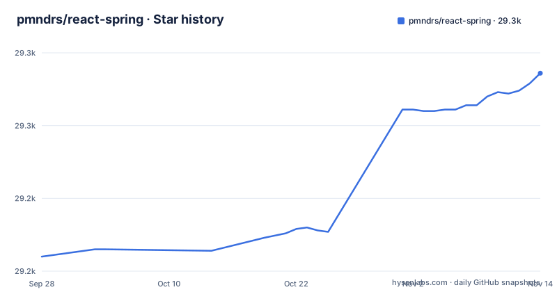
Star history
- pmndrs/react-spring29,286 ★ · +126
| Repository | 2026-09-28 | 2026-11-14 |
|---|---|---|
| pmndrs/react-spring | 29.2k | 29.3k |
126 Stars in the last 47 days, measured from the daily GitHub snapshot. Compare with other projects
Editorial analysis
Springs are the default, durations are the exception
The name is the design decision. By default an animation in react-spring is a spring, and the stated reason is fluid interactivity, which is what makes a gesture that changes direction mid-flight look continuous instead of restarting. Durations with easings are supported as well, so the escape hatch exists.
The smallest example in the README sets that up with a `from` and a `to`:
const styles = useSpring({
  from: {
    opacity: 0
  },
  to: {
    opacity: 1
  }
})

<animated.div style={styles} />
Two things are worth noticing in five lines. The hook returns a style object rather than a state value, and the object is handed to an `animated` component instead of a plain element, so the animated wrapper is not optional decoration. And nothing here configures the spring itself: the README names no stiffness, damping or mass parameters, which is both the appeal of the default and the reason a reader has to leave the README to go further.
There is no umbrella package, you install the renderer you need
react-spring is cross-platform in a specific sense: it supports `react-dom` and `react-three-fiber`. Each has its own package, and the README's install instruction is to pick the target rather than to install a single library.
# Install the target you need
npm install @react-spring/web
# or, for react-three-fiber
npm install @react-spring/three
The consequence is a dependency decision instead of a one-liner. A product that renders a marketing site with react-dom and a product tour with three.js carries two packages, and the imports come from different module paths, as the second example shows by importing `animated` and `useSpring` from `@react-spring/web` rather than from a shared entry point.
What the README does not do is widen that set. It names two renderers and no others, and it does not claim support for a native or a server renderer, so a project that animates React Native screens is outside what this page describes.
Toggling a value is the whole first exercise
The jump start example is the one to copy. It takes an `isVisible` prop, derives both opacity and a vertical offset from it, and returns the animated element with its children inside:
import { animated, useSpring } from '@react-spring/web'

const FadeIn = ({ isVisible, children }) => {
  const styles = useSpring({
    opacity: isVisible ? 1 : 0,
    y: isVisible ? 0 : 24,
  })

  return <animated.div style={styles}>{children}</animated.div>
}
The pattern is what most projects end up repeating: a boolean in, two animated values out, and no transition events or manual tweening. The README frames it as the way to get scroll-in animations, and the `y` offset of 24 is the only tuning in the example.
The library describes itself as usable declaratively or imperatively. The README does not show that path, which is a good reason to read the documentation before assuming the declarative form is the only one.
The default branch is next, and v11 has been beta since June
The repository's default branch is `next`, which is the first thing to know before reading anything else here, because the README on that branch describes the line in progress rather than the release most installs resolve to.
The tags show both lines moving on the same day. v11.0.0-beta.0 and v10.1.2 were both published on 2026-06-24, a minute apart, and v11.0.0-beta.1 followed on 2026-10-01. So a project that installs the stable major and a project that follows the default branch are reading different documentation, and the beta has moved to beta.1 without a stable v11 tag following it.
The repository is not archived and the last push was on 2026-11-01, so neither line is abandoned. The practical step is small: record which major your lockfile resolved before anyone copies an example from the documentation site into a v10 codebase.
pnpm, turbo and three vitest projects run the repository
Contributing means using the toolchain the root package.json declares, which is pnpm rather than npm. The root is a private package called `react-spring--root`, workspaces are wired through pnpm-lock.yaml and pnpm-workspace.yaml, and task running goes through turbo: `build` is `turbo run build`, `build-ci` filters out the docs package, and `dev` runs the workspace in parallel.
Tests are three vitest projects rather than one command: `test` chains `test:unit`, `test:types` and `test:e2e`, each a `vitest run` with a different project, and `test:cov` adds coverage to the unit project. Linting uses oxlint over `packages/*/src`, `targets/*/src`, `docs/app`, `docs/scripts` and `demo/src`, and formatting uses oxfmt, so the repository does not run eslint or prettier.
Releases go through changesets. `release` is a clean, install, build and `changeset publish --no-git-tag` chain, `vers` runs `changeset version`, husky is installed by `prepare`, renovate.json keeps dependencies moving, and commitlint extends the conventional config with the body line length limit turned off.
The documentation site is a container on port 8080
The docs are part of the monorepo, and the Dockerfile in the repository root says how they are built and served. The builder stage runs on node:24.22.0-alpine with corepack enabled, installs with `pnpm install --frozen-lockfile`, builds the docs and everything they depend on, and produces a production-only directory with `pnpm --filter @react-spring/docs deploy --prod /out`.
One comment in that file is worth keeping: pnpm deploy does not carry the build output, so the build directory is copied in afterwards. The runtime stage is the same Alpine Node image with `PORT` set to 8080, that port exposed, and `react-router-serve` started against `./build/server/index.js`, which means the documentation is a server-rendered React Router application rather than a static bundle.
For a reader this is a small but useful fact: react-spring.dev can be self-hosted from this repository, and anyone doing that has to reproduce the deploy-then-copy sequence rather than assuming a static export.
The README is a pitch, and the site carries the reference
The README is short by design, and what it does say is aimed at a first five minutes: the two-line opacity example, the install instruction, and a FadeIn component. Everything past that is on the documentation site, with each page carrying its own examples and a CodeSandbox link for a deeper look at the card demo under `demo/src/sandboxes/card`.
Adoption signals are named too. The README lists Next.js, CodeSandbox and Aragon among the projects using it, and points funding at the pmndrs Opencollective. The package is authored by Paul Henschel and maintained by Josh Ellis, which matters for a library this central to an app's feel.
For a reader weighing the library, the gap is the point to name. The README documents no spring configuration, no gesture or drag API, no interruption handling, no accessibility or reduced-motion behaviour, and no server-side rendering guidance. All of that is a documentation-site question, so budget an hour with the site before deciding, and pin the major version you tested against.
Editorial conclusion
react-spring fits a team that wants fluid, interruptible motion with a small declarative surface, and that is willing to read react-spring.dev for the configuration surface rather than a README. It does not fit a project that needs one animation library for every renderer in one dependency, because there is no umbrella package and each target is installed on its own. Before adopting, confirm which major you get: the default branch is next, v11.0.0-beta.0 was tagged on 2026-06-24 alongside v10.1.2, v11.0.0-beta.1 followed on 2026-10-01, and the last push was on 2026-11-01, so the beta line and the stable line are moving separately.
Frequently asked questions
What is react-spring?
It is a cross-platform, spring-physics first animation library for React, where animations use springs by default for fluid interactivity and durations with easings are supported too. The README says you can be declarative or imperative.
What is @react-spring/web?
It is the react-dom target of react-spring, the one you import animated components and useSpring from. The library also ships @react-spring/three for react-three-fiber, and the README names no other renderer.
How do I install react-spring?
Install the target you need: `npm install @react-spring/web` for react-dom, or `npm install @react-spring/three` for react-three-fiber. There is no single umbrella package covering both.
How do I use react-spring for a fade or slide animation?
Call useSpring with the animated values derived from a prop, such as opacity and y toggled by isVisible, and pass the result to an animated element rather than a plain div. The README's jump start example builds exactly that FadeIn component.
Official sources
Add this badge to your README
If you maintain this project, the badge below links readers to this analysis and shows its maintenance status from the daily GitHub snapshot. Paste the markdown into your README; add ?metric=license or ?metric=stars to the image URL for a different field.

[](https://hysenlabs.com/projects/pmndrs-react-spring)Star history chart for your README
[](https://hysenlabs.com/projects/pmndrs-react-spring)Was this useful?