gruvbox-material: a softer gruvbox for people who stare at text all day
Gruvbox with Material Palette
At a glance
- What is it?
- Eighteen previews, three palettes, and one decision: keep morhetz's original colours available as an escape hatch from the softer defaults.
- Who is it for?
- gruvbox-material makes one change to an established palette and then refuses to make it irreversible. The softened contrast is the whole thesis, and keeping the original available as a selectable palette is what makes the scheme safe to try: if the softer version turns out to wash out syntax you rely on, the fallback is one variable rather than an uninstall.
- Can I use it commercially?
- Yes. MIT is a permissive licence: you can use, modify and sell software built on it, as long as you keep its copyright and licence notices.
- Is it still maintained?
- Activity is slowing. The repository last received commits 6 months ago.
- What is it written in?
- Mainly Vim Script, according to GitHub's language statistics.
Answers come from the project's GitHub data, last synced on October 24, 2026, and from our analysis. They are not legal advice.
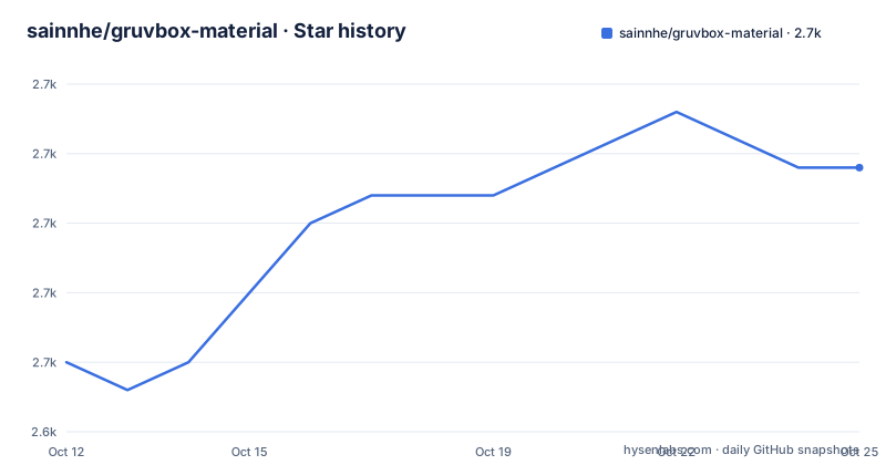
Star history
- sainnhe/gruvbox-material2,657 ★ · +7
| Repository | 2026-10-12 | 2026-10-24 |
|---|---|---|
| sainnhe/gruvbox-material | 2.7k | 2.7k |
7 Stars in the last 12 days, measured from the daily GitHub snapshot. Compare with other projects
Editorial analysis
One variable changed, and the rest kept identical
The README states the change in one sentence: this is a modified version of gruvbox, with the contrast adjusted to be softer in order to protect developers' eyes. That is the entire concept, and it is worth sitting with how small it is. Gruvbox is already a scheme built around warm, desaturated retro colours on a brown-grey background, and it is already fairly low contrast by the standards of a modern dark theme. Softening it further is a decision about where the readability threshold sits.
The motivation is stated as eye protection, which for a terminal means something specific rather than something aesthetic. Text sits on a background for hours, and high luminance contrast between foreground and background is what makes glyph edges crisp at the cost of continued brightness. Lowering it trades a small amount of sharpness for a dimmer, steadier read. Whether that trade is right depends entirely on the display, the ambient light, and the font, which is exactly why the scheme ships so many previews rather than one.
What is not changed is as important as what is. The hue families, the warm background, the retro terminal aesthetic, the syntax colour assignments. If you switch from gruvbox to gruvbox-material and something looks unfamiliar, it should be the weight of the contrast, not the colours themselves. This is a modifier of an existing scheme, not a new one, and that framing explains why a repository with no code and no releases has 2,650 stars: people are not adopting a design, they are adjusting one they already like.
The project also adds modern editor features on top of the original. The feature list names rich support for common file types and plugins, tree-sitter support, and semantic highlighting support. Those three are the ones that matter in 2026 for a scheme originally written for an older Vim plugin architecture: tree-sitter changes how many editors parse code, and a colour scheme that predates it would leave whole classes of highlighting unstyled.
Three palettes times three contrasts times two backgrounds
The documentation is a preview matrix, and the matrix is the design. Three palettes are available: material, which is described as carefully designed to have a soft contrast; mix, which is described as a colour palette obtained by calculating the mean of the other two; and original, which is the palette used in the upstream gruvbox.
Each palette is previewed across three contrast levels, hard, medium and soft, and each of those across dark and light backgrounds. That is eighteen previews per palette set, which is a lot of images for a README and exactly the right amount for the decision being supported. The choice of contrast is the one people agonise over, and it is the one hardest to reason about from hex values alone.
The mix palette deserves a note because of what it implies about the colour work. It is generated by taking the mean of the other two palettes, which means it is a derivation rather than an independent design. That is a cheap way to produce a third option and it produces something genuinely between the two by construction. It also means mix carries the compromises of averaging: colours that were deliberately picked to avoid clashing get blended toward their arithmetic middle, which is not the same thing as designed to sit well together. Anyone who finds both material and original slightly off in the same direction may find mix satisfies them, and anyone who finds them disagreeing will not.
The default is material, and the README says you can use a global variable to switch to another palette. So the choice is one setting rather than a file replacement. That is the single most useful implementation detail in the whole project: with the original available at the same contrast levels you are using, you can compare like for like rather than guessing which upstream variant you would have preferred.
A Vim plugin laid out the conventional way
The repository is declared as Vim Script, and the tree follows the standard layout for a Vim colour scheme plugin:
.githooks/
.github/
CHANGELOG.md
autoload/
colors/
doc/
lua/
README.md
Two of these directories carry most of the weight. The colours directory is what Vim loads when a scheme is applied, and the autoload directory holds functions loaded on demand rather than at startup, which is how a scheme defines helper logic without slowing down every launch. The lua directory is the more interesting signal, because it says the scheme has a Lua component, and Vim's Lua support has been the recommended way to write plugin logic for years now. A colours-only scheme would not need it.
The doc directory holds the Vim help file. This matters more than it looks for a project of this kind, because Vim help files are what make a scheme discoverable through the editor's own search rather than through a web search. That is also where palette names and the variable for switching them would be documented, which matters given the README's choice to preview rather than explain.
There is a .githooks directory and a .github directory but no tests directory, no build configuration and no linting setup. That is consistent with what the project is: a set of colour definitions plus an editor plugin, where a broken build is not a failure mode. There is a changelog rather than releases, and the repository has no tagged versions at all, which is a decision worth flagging for anyone who wants to pin a specific revision rather than track the master branch.
Maintenance that looks slow and is probably deliberate
The last recorded push to this repository was 2026-04-15, and the default branch is master. It carries 2,650 stars, 191 forks and nine open issues, is MIT licensed, and is not archived.
Read cold, a colour scheme with a quiet commit history and a modest issue count looks neglected. Read in context, it looks like a finished artifact. There is nothing to break in a file of colour definitions, and there is no dependency to track, no build to break against a new editor release, and no upstream API to adapt to. A palette that works continues to work. The way to change it is to edit the file, and the way to distribute an update is to push a commit, which is why the changelog exists in place of releases.
The forks tell a similar story. With 191 forks, a meaningful number of people have taken a copy and modified it, and for a colour scheme that is the normal pattern rather than a contribution statistic. People build personal variants on top of gruvbox the way people build dotfile repositories on top of anything else, and the soft contrast of this variant is a reasonable base for that.
The topics attached to the repository are a decent guide to where it is used: vim, themes, theme, color, color-schemes, plus airline and lightline, which are two statusline plugins. Naming those plugins as topics rather than listing them as features tells you the theme has been checked against the two most popular statusline configurations, which is where colour scheme incompatibilities usually surface first.
What the README does not settle
Two gaps are worth naming, because both affect how you should use the scheme. The first is the absence of a compatibility statement for anything outside Vim and Neovim. The related searches around this project turn up ports for other editors, and plenty of people maintain unofficial ports of gruvbox for VS Code and for terminal emulators, but this repository does not declare any of them as supported. The README also does not explain the word itself, and the upstream project's name is left as given rather than defined.
Neither gap is a defect for a Vim plugin. A colour scheme that works in one editor and is silently expected to work in another is a common and avoidable source of confusion, so a reader who wants a VS Code version should treat a community port as a separate project with its own maintenance story. The same goes for the name: the upstream gruvbox project is the authority on what the word refers to, and a derivative scheme has no reason to relitigate it.
The second gap is versioning. With no tagged releases and a master branch as the default, there is no named version to pin, no upgrade notes tied to a release, and no way to ask for help with a specific version. The changelog is the substitute, and it is a good one for a project that changes rarely. But it does mean that reproducing somebody else's configuration later depends on the commit you happened to be on, and if you maintain a dotfiles repository that others clone, recording that commit is your responsibility rather than the project's.
Set against eighteen previews, three palettes, and a one-variable switch between them, these are small costs. The scheme does the hard part of the work, which is deciding what softer should mean and then making every combination of that decision visible before you commit to it.
Editorial conclusion
gruvbox-material makes one change to an established palette and then refuses to make it irreversible. The softened contrast is the whole thesis, and keeping the original available as a selectable palette is what makes the scheme safe to try: if the softer version turns out to wash out syntax you rely on, the fallback is one variable rather than an uninstall. The eighteen-preview matrix is unusually honest documentation for a colour scheme, because it lets you pick a contrast level from a picture rather than by editing a file and guessing. What the repository does not do is explain how it reaches editors other than Vim and Neovim, and it ships no releases, so pulling a specific version means tracking the master branch. For anyone who already uses gruvbox and finds it slightly too crisp, this is a small, well-scoped change with a clear escape hatch.
Frequently asked questions
What is the difference between Gruvbox and Gruvbox Material?
Gruvbox Material is a modified version of gruvbox with the contrast adjusted to be softer, to reduce brightness for long reading sessions. Hues, background warmth and syntax colour assignments are kept. The original palette is still included as a selectable option, so the change is reversible.
How do I install gruvbox-material in Vim or Neovim?
The repository is laid out as a standard Vim plugin, with colour definitions in colors/, lazily loaded helpers in autoload/, a Lua component in lua/ and a help file in doc/. Any plugin manager that clones the repository onto your runtime path will pick it up. The README itself does not document installation steps, so the layout is the guide.
What palettes does gruvbox-material ship and which is the default?
Three. Material is the default and is designed for soft contrast. Mix is computed as the mean of the other two palettes. Original is the palette from the upstream gruvbox project. Each is previewed at hard, medium and soft contrast across dark and light backgrounds, and you switch between them with a global variable.
Does gruvbox-material have tagged releases I can pin?
No. The repository has no tagged versions and tracks master as its default branch, with a changelog in place of releases. If you need a specific revision for reproducibility, record the commit hash in your own configuration.
Official sources
Add this badge to your README
If you maintain this project, the badge below links readers to this analysis and shows its maintenance status from the daily GitHub snapshot. Paste the markdown into your README; add ?metric=license or ?metric=stars to the image URL for a different field.

[](https://hysenlabs.com/projects/sainnhe-gruvbox-material)Star history chart for your README
[](https://hysenlabs.com/projects/sainnhe-gruvbox-material)Was this useful?