TanStack Table's default branch is named beta, and its root holds the maintainers' notes
Headless UI for building powerful tables & datagrids for TS/JS - React-Table, Vue-Table, Solid-Table, Svelte-Table.
At a glance
- What is it?
- TanStack Table is a headless datagrid library: one framework-agnostic core with ten adapters, handling sorting, filtering, grouping, aggregation and row selection while you keep the markup. The repository publishes packages such as table-core, alpine-table and vue-table-devtools at version 9.3.1 on the same day, runs its build through Nx and a size limit, and commits its own perf notes to the root.
- Who is it for?
- Use TanStack Table if you need datagrid behaviour without adopting a component library's styling, and if you are prepared to own the markup, the accessibility work and the virtualisation. Do not reach for it expecting rendered components.
- Can I use it commercially?
- Yes. MIT is a permissive licence: you can use, modify and sell software built on it, as long as you keep its copyright and licence notices.
- Is it still maintained?
- Yes. The repository last received commits 11 days ago.
- What is it written in?
- Mainly TypeScript, according to GitHub's language statistics.
Answers come from the project's GitHub data, last synced on November 13, 2026, and from our analysis. They are not legal advice.
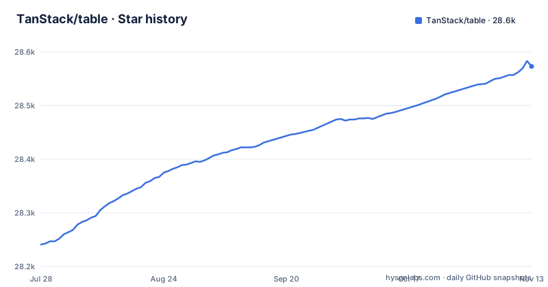
Star history
- TanStack/table28,573 ★ · +332
| Repository | 2026-07-28 | 2026-11-13 |
|---|---|---|
| TanStack/table | 28.2k | 28.6k |
332 Stars in the last 108 days, measured from the daily GitHub snapshot. Compare with other projects
Editorial analysis
Headless means the markup is yours, and that is the contract
The definition is one sentence and it sets the expectation for everything else.
TanStack Table is a headless table library for building powerful datagrids with full control over markup, styles and behavior.
The feature list spells out what that costs and what it buys. You get 100% customization, described as bring your own UI, components and styles. The library contributes the behaviour: sorting, filtering, grouping, aggregation and row selection.
So a table built on it is not a component you drop in. It is a state machine for a grid plus the functions to read from it, and the elements between the state and the screen are yours to write.
That is a real trade rather than a marketing position. In exchange for owning the markup you also own the semantics: what a sort button announces, how a keyboard user moves through rows, and whether the virtualisation you add later fights the row model you built on. The README claims the result is lightweight, virtualizable and server-side friendly, which are properties of the design rather than of a rendered widget.
Ten adapters over one core, and eleven example directories
The number that matters for planning is the adapter count, and it is larger than the name suggests.
There is a note explaining that you may know the project by its adapter names: Angular Table, Lit Table, Octane Table, Preact Table, React Table, Solid Table, Svelte Table, Vue Table, Alpine Table and Ember Table.
That is ten, and the feature list states the structure behind them: a framework-agnostic core with bindings for React, Preact, Octane, Vue, Solid, Svelte, Angular, Ember, Lit and Alpine.
The examples directory carries a project per adapter, and it has eleven entries rather than ten: alpine, angular, ember, lit, octane, preact, react, solid, svelte, vanilla and vue. The extra one is a vanilla project, which is the natural consequence of a framework-agnostic core: you can drive the core with nothing in between.
So the cost of this library is not the core. It is that a behavioural change in the core lands in ten adapters, and a framework's own reactivity rules decide how much of the headless API is idiomatic in each.
The features are data operations, not rendering
Reading the feature list as a group, every entry is an operation on rows rather than an element on a screen.
Sorting, filtering, grouping, aggregation and row selection. Those are the five verbs, and they are the vocabulary the whole API is built around. Grouping and aggregation together are what turn a grid into something you can summarise in place rather than exporting to analyse.
Then three adjectives: lightweight, virtualizable and server-side friendly.
Virtualizable means the row model is not tied to a fixed set of rendered rows, which is what lets a grid hold more data than fits on screen. Server-side friendly is the same property seen from the other end: the model can hold rows that have not arrived yet, so sorting and filtering can be pushed to a query rather than applied to an array.
Neither of those is documented further in the README, so the practical question of how a partial data source maps onto the row model is one you answer from the docs rather than from here. What the list does establish is the shape of the library: data in, row state out, rendering entirely your problem.
Agent skills ship inside the adapter packages and version with them
There is a section addressed to people using a coding agent, and the mechanism is unusual enough to read twice.
TanStack Table ships TanStack Intent skills inside each adapter package. After installing the library you run:
npx @tanstack/intent@latest installThat adds skill-loading guidance for your agent, with Claude Code, Cursor and Copilot named. The same CLI also exposes a list command to browse available skills and a load command that prints one for inspection.
Two constraints are stated and both matter. The skills are versioned with the library, so an agent gets guidance that matches the version of the framework package you installed rather than the latest documentation. And the whole thing is only available for v9 and above.
So the guidance is not a static document sitting in the repository. It is a per-version artefact that has to be installed into the agent separately, after the library, and it disappears on older majors.
The default branch is named beta and the last release is 9.2.4
The release feed shows three packages versioned in lockstep, published on 2026-10-12.
They are the Alpine adapter at 9.3.1, the core package at 9.3.1, and the Vue devtools package at 9.3.1. Same version, same day, same operation.
That pattern is what a coordinated monorepo release looks like, and it tells you the adapters do not version independently in practice even though they are separate packages.
Now the branch. The default branch of this repository is named beta, not main and not master. The last push was on 2026-11-02 and the repository is not archived.
So the branch a clone lands on is the one carrying the next version, while the published tags sit at 9.3.1. Anyone installing from a package registry gets the tagged release; anyone building from the repository is building whatever beta contains. The README does not explain the branch policy.
The README is copied into seventeen package directories by a script
The manifest at the root is private and belongs to the workspace rather than to a published package, but two things in it are worth reading.
The first is how the build works. There are three build commands, and the default one asks Nx to build only what changed, with the examples directory excluded, then runs a size limit check. There is a variant that builds everything and the same size limit, and a third that builds only the core package and the size limit.
So every build, whether incremental or full, ends in a bundle size gate. That is the mechanism behind the lightweight claim, and it is enforced rather than asserted.
The second is a script called copy:readme, which is one long chain of copies: the repository README is copied into seventeen package directories, including the core, the devtools packages, every framework adapter and a match-sorter utilities package.
The environment is declared in the same file: Node 20 or newer, pnpm 11.9.0 or newer, a pinned package manager version, and the package marked as an ES module.
The repository root holds the maintainers' working notes
Look at the top level and you find the project mid-way through its own process.
There are five markdown files that are not documentation, all prefixed perf: perf-agg.md, perf-done.md, perf-new.md, perf-skipped.md and perf-todo.md.
That is a performance backlog committed to a public repository.
The rest of the root is tooling. There is an Nx workspace, a knip configuration for unused code, both a Vitest workspace file and a Playwright configuration, a changesets directory, an editorconfig, an npmrc and an nvmrc, separate ESLint and Prettier configurations, and an _artifacts directory.
Below that, the README lists three partners and the wider TanStack ecosystem: Config, DB, DevTools, Form, Pacer, Query, Ranger, Router, Start, Store and Virtual. So the table is one member of a family, and its neighbours cover the other half of what an application needs.
Editorial conclusion
Use TanStack Table if you need datagrid behaviour without adopting a component library's styling, and if you are prepared to own the markup, the accessibility work and the virtualisation. Do not reach for it expecting rendered components. Before you install, note two things: the default branch is named beta, so an install from the repository is not the same as a published release, and agent skill guidance is only available from v9, so an older major gets neither the framework parity nor the tooling. Then check the package list, because the release feed shows the adapters released at the same version as the core.
Frequently asked questions
What is TanStack Table?
It is a headless table library for building powerful datagrids with full control over markup, styles and behavior. A framework-agnostic core handles sorting, filtering, grouping, aggregation and row selection, and bindings exist for React, Preact, Octane, Vue, Solid, Svelte, Angular, Ember, Lit and Alpine.
How do I install TanStack Table?
The README links the npm package and the documentation rather than carrying an install command. Each framework has its own package, for example @tanstack/react-table, and the examples directory contains a working application per adapter. There is also an optional step for coding agents: npx @tanstack/intent@latest install adds skill-loading guidance, and it is only available for v9 and above.
What is the difference between TanStack Table and a component library?
TanStack Table is described as headless and 100% customizable, with you bringing your own UI, components and styles. A component library renders the grid for you. TanStack Table supplies the behaviour, sorting, filtering, grouping, aggregation and row selection, and is described as lightweight, virtualizable and server-side friendly, while the markup stays yours.
Which frameworks does TanStack Table support?
Ten bindings are listed: React, Preact, Octane, Vue, Solid, Svelte, Angular, Ember, Lit and Alpine, each known by an adapter name such as Vue Table or Svelte Table. The examples directory has a project for each adapter plus a vanilla one.
Official sources
Add this badge to your README
If you maintain this project, the badge below links readers to this analysis and shows its maintenance status from the daily GitHub snapshot. Paste the markdown into your README; add ?metric=license or ?metric=stars to the image URL for a different field.

[](https://hysenlabs.com/projects/tanstack-table)Star history chart for your README
[](https://hysenlabs.com/projects/tanstack-table)Was this useful?