svelte-ux: A Component Library for Highly Interactive Svelte Apps
Collection of Svelte components to build highly interactive applications.
At a glance
- What is it?
- svelte-ux is a Svelte component collection of over 200 components, actions, stores and utilities, built on Tailwind with theming, variants and granular class overrides as the extension model. It ships as a pnpm monorepo with a create-svelte-ux starter template and a separate chart library alongside it.
- Who is it for?
- svelte-ux fits a team building a Svelte application with a lot of interaction, where the alternative is assembling a component set from scratch and ending up with an inconsistent set of buttons, dialogs and inputs.
- Can I use it commercially?
- Yes. MIT is a permissive licence: you can use, modify and sell software built on it, as long as you keep its copyright and licence notices.
- Is it still maintained?
- Yes. The repository last received commits 2 days ago.
- What is it written in?
- Mainly Svelte, according to GitHub's language statistics.
Answers come from the project's GitHub data, last synced on November 7, 2026, and from our analysis. They are not legal advice.
Star history
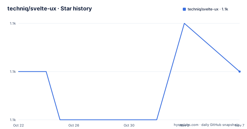
- techniq/svelte-ux1,130 ★ · +0
| Repository | 2026-10-22 | 2026-11-07 |
|---|---|---|
| techniq/svelte-ux | 1.1k | 1.1k |
0 Stars in the last 16 days, measured from the daily GitHub snapshot. Compare with other projects
Editorial analysis
Two Hundred Pieces for Interactive Applications
svelte-ux is a collection of Svelte components to build highly interactive applications, and the stated aim is to simplify building highly interactive and visual applications. It provides over 200 components, actions, stores and utils, with many more planned.
The size of the collection is the point rather than an accident. An application with a lot of interaction needs a button, a dialog, a dropdown, a toast, a table with sorting and filtering, a date picker, a combobox, a form field, and each of them has to look like the others. Assembling that set by hand is where the inconsistency comes from, and a collection that ships the set already is the shortcut.
The four kinds of thing in the list are worth separating, because they are not all components. Components are the visible parts. Actions are the behaviours that attach to an element, the kind of thing Svelte makes easy to reuse. Stores are the reactive state containers that a component library has to provide, since a combobox needs to be controllable from outside. Utils are the small helpers that go with them.
So the library is not only a set of visuals, it is a set of the interactive mechanics as well, which is what a highly interactive application needs.
Theming, Variants and Class Overrides
The components are built using Tailwind, with extensibility and customization in mind through the use of theming, variants, granular class overrides and slots. A rich design token system is also currently in the works.
The four mechanisms are different tools and they are listed in the order you would reach for them.
Theming is the global level, where a design system is expressed once and every component picks it up, and slots are the escape hatch, where a component hands part of itself back to the caller so the caller can put their own content in it. Variants are the middle level, a named set of style options on a component, a size or a tone, that you pick from rather than build.
Granular class overrides are the fine level, where you replace or extend one specific class on one specific part of one component, rather than reimplementing the component to change a border radius. For a Tailwind based library this is the mechanism that makes the difference between usable and not, because the alternative is forking the component.
The design token system is the piece still in progress, and it is the one to watch, since tokens are how a collection like this eventually replaces a hand rolled design system rather than sitting beside it.
Actions, Stores and Utilities Are Part of the Contract
Most component libraries ship visual components and leave the behaviour to the application, and that is where a codebase ends up with three different dropdown implementations.
This one includes actions, stores and utils in the same package. An action is a Svelte primitive that attaches behaviour to an element, for example handling a click outside a panel, and because actions are plain functions they are the easiest thing in the collection to read and copy.
Stores are the part that has the most leverage. A combobox that cannot be controlled from the parent is a combobox you will work around, and a store per component lets the parent hold the open state, the selected value and the query, which is what makes a set of components compose into a form rather than sitting next to each other.
The utilities are the third layer, and they are the least visible and the most likely to be quietly reused across a project. The test suite badge in the README is for the unit tests, and with a collection of this size the coverage that keeps the behaviours consistent is what makes it safe to depend on rather than copy from.
A Monorepo With a Starter Template
The repository is a pnpm workspace monorepo, with the root package named svelte-ux-monorepo and a packages/ directory holding the individual packages, including packages/svelte-ux and packages/create-svelte-ux.
The create-svelte-ux package is the scaffolding tool, and it ships a starter template. The README links to that template in three places, SvelteLab, StackBlitz and CodeSandbox, which is a neat way to show that the template runs in a browser without a local install. It is also the fastest way to evaluate the library, since you can open a working application rather than reading the documentation.
The root package.json is the orchestrator, and its scripts are the whole workflow in one place. The build script removes the dist directories and builds every package in the workspace, the test script runs the unit tests across the workspace, and the lint, format and check scripts do the same for their respective tools.
The toolchain is pnpm 10.5.1, with a pnpm-lock.yaml and a pnpm-workspace.yaml, and there is a shell.nix for people who want the toolchain pinned through Nix as well. The dev dependencies are small: the changesets CLI, a changesets changelog plugin, prettier with the Svelte plugin, rimraf for the clean step, and wrangler.
The Commands You Need Day to Day
The contributing section is short and practical, and it reads like a normal pnpm monorepo workflow.
Installing dependencies is pnpm i at the root. To run the dev server for the svelte-ux package specifically, you change into packages/svelte-ux and run pnpm dev. To run the tests for that package, the same directory and pnpm test:unit. To run the tests for all packages, pnpm -r test:unit from the root, and to run a script from the root against one package, pnpm -F svelte-ux dev.
pnpm i

cd packages/svelte-ux
pnpm dev
So there are two ways to do the same thing, and the difference is which directory you are in. The filter form from the root is the one to use when you are switching between packages, and the cd form is the one a contributor will use when they are working in one package for a while.
The last command in the contributing section is the one that matters for anyone sending a change. pnpm changeset creates a changeset, which is what includes the change in the changelog and determines the next version. The library uses changesets for its releases, and the .changeset/ directory at the root is where those entries live.
Versioning, the 2.0 Line and the Companion Chart Library
The release history shows two tracks running at once, and the order of the tags in the README is worth reading carefully.
The most recent published version is svelte-ux at 1.0.11 from 2026-08-20, and alongside it in the list are 2.0.0-next.26 from 2026-08-12 and 2.0.0-next.25 from 2026-06-18. So the stable 1.x line is being published while a 2.0 line is being prepared as a series of next releases, and the next releases carry a build counter that increments with each one.
That pattern is what you would expect from a library that is preparing a breaking change while keeping the stable line installable, and it is a question to ask before you depend on it: which line do you want, and how long will the 1.x line keep getting patches.
The companion library is LayerChart, referenced as a large collection of composable chart components to build a wide range of visualizations. So the ecosystem is split: svelte-ux for the interface, LayerChart for the visualisation, both from the same author and both hosted in the same community, which is the LayerStack Discord server that the README points at for questions and collaboration.
The licence is MIT, the project is not archived, and the last push was on 2026-10-14.
Editorial conclusion
svelte-ux fits a team building a Svelte application with a lot of interaction, where the alternative is assembling a component set from scratch and ending up with an inconsistent set of buttons, dialogs and inputs. It is a poor fit for a small static site, because a component library has a cost in bundle size and in the number of decisions you inherit, and it is a poor fit if you need a specific component to behave in a way the library does not model, since the extension model is styling rather than behaviour. Before adopting it, check the Tailwind version your project is on, since the components are built with Tailwind, and read the variants and class override documentation, because that is where the library's flexibility lives. The library is MIT licensed, the newest published version is 1.0.11 from 2026-08-20, and the last push was on 2026-10-14.
Frequently asked questions
What does svelte-ux provide?
It provides over 200 components, actions, stores and utils for building highly interactive Svelte applications, with many more planned. The components are built with Tailwind and are extensible through theming, variants, granular class overrides and slots, and a rich design token system is in the works.
How do I extend the svelte-ux components?
Through four mechanisms at different levels: theming for the global design, variants for named style options on a component, granular class overrides to change one specific class on one part of one component, and slots to replace part of a component's content. A design token system is being added on top of these.
How do I run the svelte-ux development server and tests?
Install with `pnpm i` at the root, then `cd packages/svelte-ux` and `pnpm dev` for the dev server or `pnpm test:unit` for that package's tests. From the root, `pnpm -r test:unit` runs the tests for all packages and `pnpm -F svelte-ux dev` runs a script for one package.
How are changes to svelte-ux released?
With changesets. Running `pnpm changeset` creates an entry that includes the change in the changelog and determines the next version, and the entries live in the .changeset/ directory. The repository publishes a stable 1.0.11 line while a 2.0 line is being prepared through next releases.
Does svelte-ux include charting components?
No, the charting lives in a companion library, LayerChart, which is described as a large collection of composable chart components for building a wide range of visualizations. Both projects come from the same author and share the LayerStack community.
Official sources
Add this badge to your README
If you maintain this project, the badge below links readers to this analysis and shows its maintenance status from the daily GitHub snapshot. Paste the markdown into your README; add ?metric=license or ?metric=stars to the image URL for a different field.

[](https://hysenlabs.com/projects/techniq-svelte-ux)Star history chart for your README
[](https://hysenlabs.com/projects/techniq-svelte-ux)Was this useful?