react-native-dropdownalert for non-blocking React Native alerts
An alert to notify users about an error or something else
At a glance
- What is it?
- react-native-dropdownalert adds a promise-based alert to React Native applications without replacing the current screen. It suits teams that need errors and status messages dismissible by user action, timing, gestures, or code, provided its navigation and modal placement constraints are understood.
- Who is it for?
- Adopt react-native-dropdownalert when a React Native application needs an in-place, promise-based notification that can coexist with normal navigation. Do not choose it as a replacement for modal dialogs or without first checking that it can be mounted below StackNavigator and remains available inside every modal tree.
- Can I use it commercially?
- Yes. MIT is a permissive licence: you can use, modify and sell software built on it, as long as you keep its copyright and licence notices.
- Is it still maintained?
- Yes. The repository last received commits 154 days ago.
- What is it written in?
- Mainly TypeScript, according to GitHub's language statistics.
Answers come from the project's GitHub data, last synced on November 7, 2026, and from our analysis. They are not legal advice.
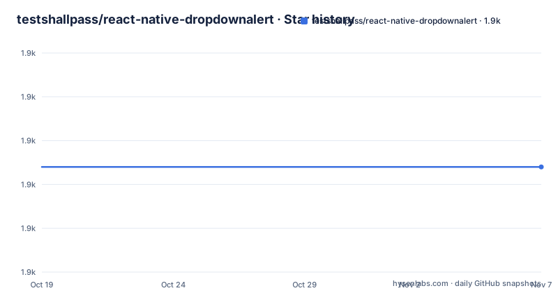
Star history
- testshallpass/react-native-dropdownalert1,874 ★ · +0
| Repository | 2026-10-19 | 2026-11-07 |
|---|---|---|
| testshallpass/react-native-dropdownalert | 1.9k | 1.9k |
0 Stars in the last 19 days, measured from the daily GitHub snapshot. Compare with other projects
Editorial analysis
Where DropdownAlert fits in a React Native screen
react-native-dropdownalert addresses a specific interface problem: showing an error, warning, success, or informational message without forcing the user into a conventional modal alert. The package description calls it an alert for notifying users about an error "or something else," and its exported types include `DropdownAlertType`, with the repository metadata listing error, info, warning, and success as use cases.
It is intended for application developers working in React Native. That boundary matters because the package is not a general notification service for email, push notifications, or server-side events. Its documented interface receives alert data in the running application and renders feedback over the current React Native view tree. It also does not replace React Native's modal system. The README specifically warns that a modal can overlap the alert when `DropdownAlert` is outside the modal's document tree.
The main design choice is that application code obtains an alert function from the mounted component rather than creating a new alert component at every call site. That suits code that centralizes status presentation around actions such as a failed request or completed operation. It is a poor fit when the required behavior is an explicit decision dialog, because the documented data and rendering model is centered on notification content and dismissal rather than choice buttons.
The promise bridge from DropdownAlert to application code
The package exposes a component and communicates with calling code through a promise-based function. The README instructs developers to initialize a function variable that accepts `DropdownAlertData` and returns a `Promise<DropdownAlertData>`. Mounting `DropdownAlert` assigns its alert function to that variable through the component's `alert` prop. Application code can then await an alert call.
The documented flow has three concrete parts. First, the module imports `DropdownAlert`, `DropdownAlertData`, and `DropdownAlertType`. Second, the root component mounts one `DropdownAlert` instance and receives its callable interface. Third, any code with access to the resulting function invokes it with fields such as `type`, `title`, and `message`. The call returns a promise, which allows asynchronous application logic to continue after invoking the alert.
This arrangement reduces repeated JSX for transient feedback, but it also makes placement important. The README directs developers to add the component as the last component in the document tree so it can overlap other UI components. It additionally says to place `DropdownAlert` below `StackNavigator`. Those are compatibility requirements, not cosmetic preferences. A root instance mounted in the wrong branch may be hidden by a navigator screen or modal even when the alert function itself works.
Installing the package in a React Native application
The README offers both Yarn and npm installation commands. Choose the command that matches the package manager already used by the application, rather than introducing a second package manager solely for this dependency.
For a Yarn project, this installs the package:
yarn add react-native-dropdownalertFor an npm project, this records the package in the application dependencies:
npm i react-native-dropdownalert --saveAfter installation, the documented minimum platform versions for package version `v5.0.0` are React `v16.8.0` and React Native `v0.61.0`. The reason given in the support table is the package's use of React hooks. The repository's current development configuration lists newer React Native, React, and TypeScript dependencies, but that development setup is not the same as a blanket compatibility guarantee for every application version.
No native linking command is documented in the README. Adopters should therefore follow this installation as written and verify that the existing React Native and React versions satisfy the stated support boundary before integrating it deeper into the application.
Creating the first promise-based error alert
Start with the imports documented by the README. The type import is useful in TypeScript because it describes the payload accepted by the alert function.
import DropdownAlert, {
  DropdownAlertData,
  DropdownAlertType,
} from 'react-native-dropdownalert';
Next, create the promise-returning function variable documented by the package. The initial resolver shown in the README establishes the shape; the mounted component replaces the function with its callable alert implementation.
let alert = (_data: DropdownAlertData) => new Promise<DropdownAlertData>(res => res);Mount `DropdownAlert` last in the document tree so its rendered alert can overlap the application's other UI. The callback assigns the component's alert function to the variable.
<DropdownAlert alert={func => (alert = func)} />With the component mounted, invoke the function and await the returned promise. This first example uses the documented error type, title, and message fields.
const alertData = await alert({
  type: DropdownAlertType.Error,
  message: 'Something went wrong.',
  title: 'Error',
});
The README does not define what `alertData` contains when the alert is dismissed or which resolution value should be used for each dismissal method. Do not build state transitions that depend on undocumented response fields without inspecting the actual `DropdownAlertProps` and runtime behavior required by your application.
Dismissal behavior and custom alert content
The README states that an alert can be dismissed in several ways: by pressing it, cancelling it, automatic dismissal, a pan gesture, or programmatic control. That range is the main distinction between this package and a static banner. The application can present transient feedback while keeping the underlying screen visible, and the user can interact with the alert rather than route through a separate dialog decision.
The package also allows developers to supply children. These replace the predefined child components when the alert is invoked. The README presents two equivalent-looking forms: nested children or a `children` prop. The placeholder comments represent custom components, not literal JavaScript that can be copied as application logic.
<DropdownAlert>{/* insert child component(s) */}</DropdownAlert><DropdownAlert children={/* insert child component(s) */} />The repository includes platform-oriented examples named `NotificationAndroid.tsx` and `NotificationIOS.tsx`, plus `example/App.tsx`, indicating that custom notification presentation is part of the example application. However, the cleaned README does not specify the exact props available for custom content beyond directing developers to `DropdownAlert.tsx`.
For teams needing a branded alert layout, the `children` feature is relevant. For teams needing only a standard message, the predefined alert is simpler. This is a focused extension point rather than a complete notification framework.
Navigation and modal boundaries in DropdownAlert
The clearest limitation is visual layering. The README says that modals can overlap `DropdownAlert` when it is not inside the modal's document tree. A root-level alert can therefore be functionally invoked but visually covered by a modal. This is a React Native view hierarchy issue, not a problem solved by changing the alert type or message.
The second documented boundary concerns navigation. Developers should place `DropdownAlert` below `StackNavigator`. That location gives the component a place from which it can overlap navigator-managed screens. Placing it inside an individual screen may make its lifetime and coverage depend on that screen's mount state. Placing it outside the relevant modal hierarchy can produce the overlap described above.
These constraints make the package less suitable for applications whose primary feedback occurs inside isolated native modal trees, unless the application can guarantee that `DropdownAlert` is mounted there too. They also mean that mounting exactly one global component is not automatically correct for every architecture. The README does not explain whether duplicate instances are safe, how multiple modal trees should coordinate, or how queued alerts behave across separate instances. Those cases should not be inferred from the documented usage example.
Navigation tests should include opening the relevant modal after invoking the alert. Testing only from the initial screen would miss the documented failure mode.
Release activity, licensing, and upgrade work in v5.2.0
The repository is not archived. Its last push was on 2026-06-06, so it has recent repository activity. The latest listed release is `v5.2.0`, published on 2025-09-04. Earlier listed releases include `v5.1.0` from 2023-08-08 and `v5.0.0` from 2023-07-31.
The package uses the MIT license. That license is recorded in `package.json` and the repository includes a `LICENSE` file. This review does not provide legal advice, so applications should review the license text against their own compliance requirements before redistribution or integration.
The largest documented upgrade boundary is the move to package `v5.0.0`, which requires React `v16.8.0` and React Native `v0.61.0` because the implementation uses React hooks. The current `v5.2.0` repository package also has development dependencies on React `19.0.0`, React Native `0.79.2`, TypeScript `5.5.4`, and related testing packages. Those dependency versions describe the repository's development configuration, not an explicit compatibility range for consumers.
The repository provides `test`, `lint`, `lint:fix`, and `prettier` scripts. These scripts offer specific checks for a project that adopts the source through its own development workflow. The README does not document a migration guide from earlier major versions or a formal deprecation policy, so upgrading from an old release requires checking application code against the exported props in `DropdownAlert.tsx`.
Editorial conclusion
Adopt react-native-dropdownalert when a React Native application needs an in-place, promise-based notification that can coexist with normal navigation. Do not choose it as a replacement for modal dialogs or without first checking that it can be mounted below StackNavigator and remains available inside every modal tree. The first integration check is whether an alert invoked after navigation appears above the intended UI.
Frequently asked questions
How do I install react-native-dropdownalert in a React Native project?
The README documents `yarn add react-native-dropdownalert` for Yarn projects and `npm i react-native-dropdownalert --save` for npm projects. For package `v5.0.0` and later, it lists React `v16.8.0` and React Native `v0.61.0` as minimum versions.
Where should react-native-dropdownalert be mounted in React Native?
The README says to add it as the last component in the document tree so it can overlap other UI components. It also says to place `DropdownAlert` below `StackNavigator`.
Can react-native-dropdownalert appear over a React Native modal?
Only when it is inside that modal's document tree. The README warns that modals can overlap `DropdownAlert` when the component is mounted outside the modal's tree.
How does react-native-dropdownalert expose alert behavior to application code?
The component assigns an alert function to a variable through its `alert` prop. Calling that function with `DropdownAlertData` returns a promise, allowing application code to await the documented alert invocation.
Official sources
Add this badge to your README
If you maintain this project, the badge below links readers to this analysis and shows its maintenance status from the daily GitHub snapshot. Paste the markdown into your README; add ?metric=license or ?metric=stars to the image URL for a different field.

[](https://hysenlabs.com/projects/testshallpass-react-native-dropdownalert)Star history chart for your README
[](https://hysenlabs.com/projects/testshallpass-react-native-dropdownalert)Was this useful?